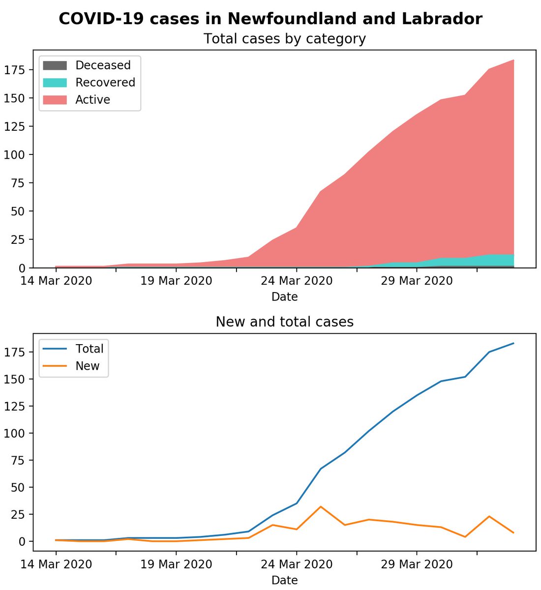
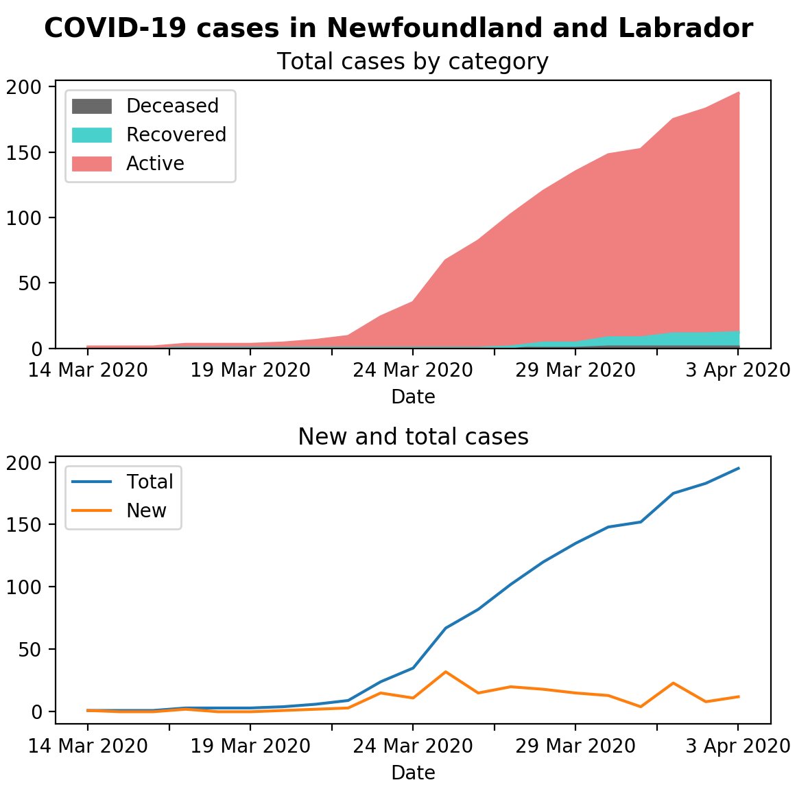
A simple (though grim) example of using Matplotlib and Pandas for data visualization in Python (this time with correct data!). Don& #39;t think I& #39;ve seen these kinds of #covid19 graphs published locally yet. #covid19nfld
Code @ https://gist.github.com/trombonehero/b7b2ec2667dab2bf3bb09399984a8046
Data">https://gist.github.com/tromboneh... @ https://docs.google.com/spreadsheets/d/1vyBnGK-3c5e9wsL5e278NR1G3uTqdUH6wOwCRzgUb4I">https://docs.google.com/spreadshe...
Data">https://gist.github.com/tromboneh... @ https://docs.google.com/spreadsheets/d/1vyBnGK-3c5e9wsL5e278NR1G3uTqdUH6wOwCRzgUb4I">https://docs.google.com/spreadshe...
Updated with today& #39;s #covid19nfld numbers, as well as an `x=& #39;Date& #39;` argument to the plandas `DataSeries.plot()` invocation. #COVIDー19 #COVID19Pandemic

 Read on Twitter


