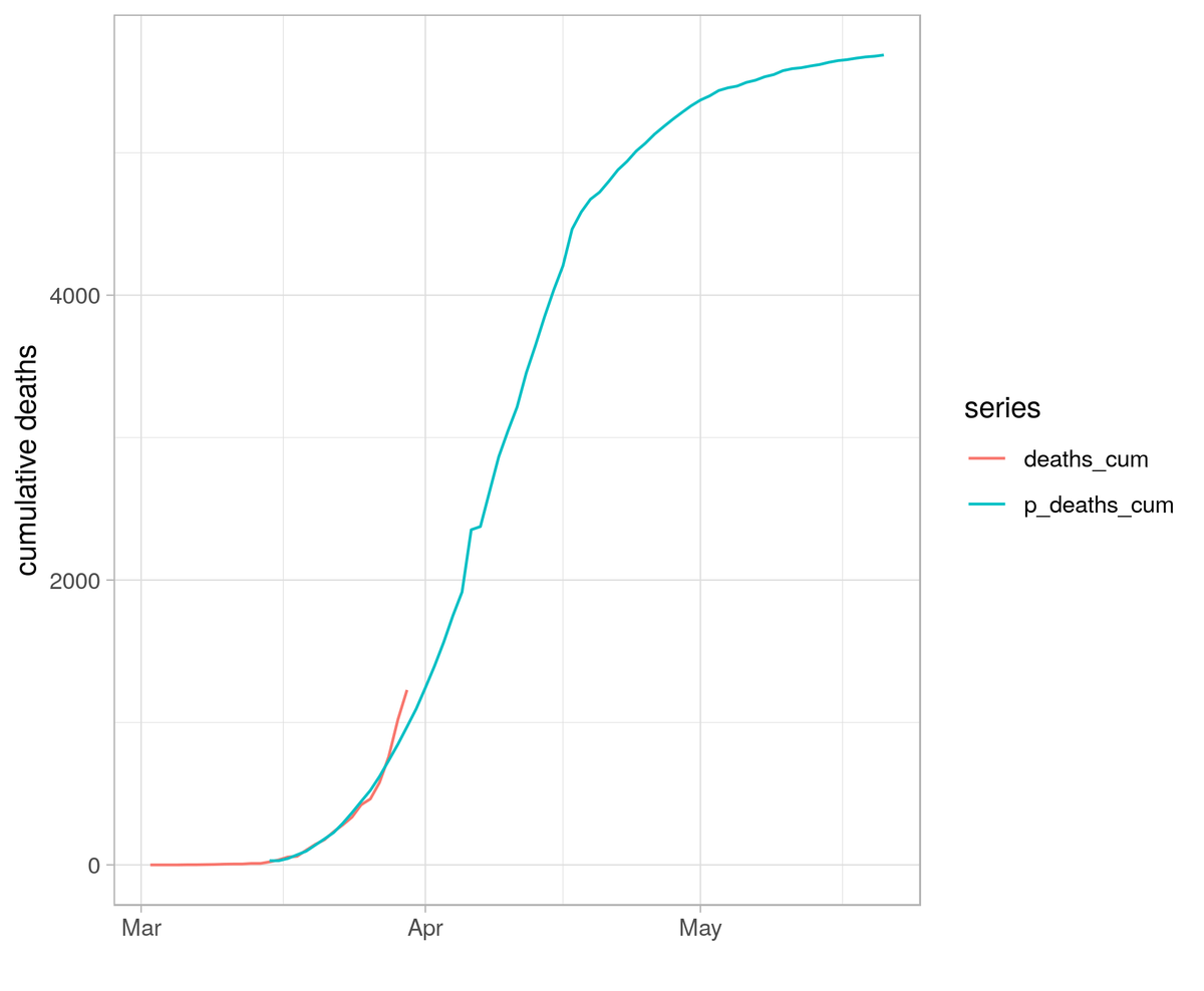
I decided to take try and reproduce the results of the "5700 UK deaths" paper. These results have been cited by several high profile accounts on here and was reported in the Observer yesterday as "new research from Imperial College London" 1/ https://www.medrxiv.org/content/10.1101/2020.03.25.20041475v1.full.pdf">https://www.medrxiv.org/content/1...
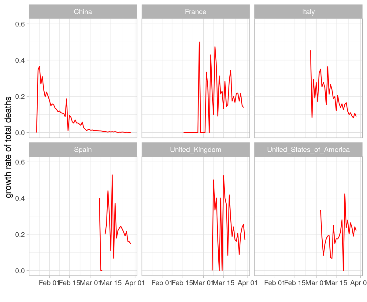
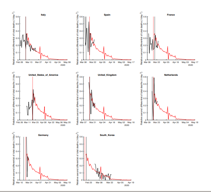
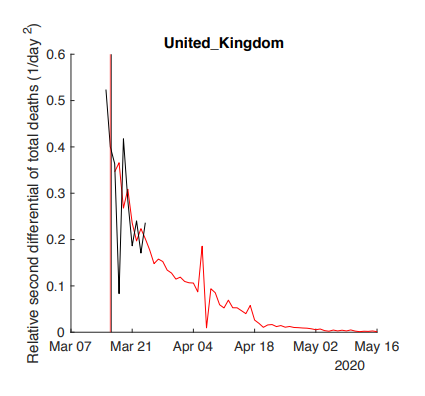
The paper claims to calculate a relative second derivative from the ECDC data. I tried, unsuccessfully, to reproduce the figures using various transformations that approximate a second derivative. 2/
It turns out not to be a second derivative -- the figures are generated by dividing daily deaths by total deaths. The indicator is thus the growth rate of total deaths. 3/
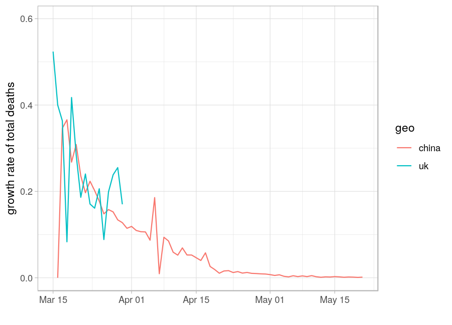
The authors then align the death growth rate for each country to that of China. The alignment procedure isn& #39;t clear and seems to be an eyeball test. I& #39;ve reproduced the alignment for the UK, with a few days of extra data appended. 4/
At the aligment date, the number of deaths in the UK is then divided by the number of deaths in China to give a multiplier. In the case of the UK this works out at 1.72 5/
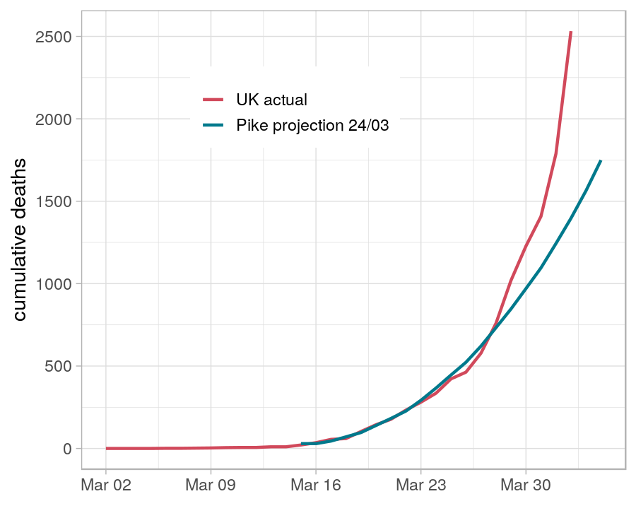
The projections seem to be generated simply by taking the Chinese time series and multiplying by the per-country multiplier. This gives the projection for total deaths shown in blue, with actual numbers in red 6/
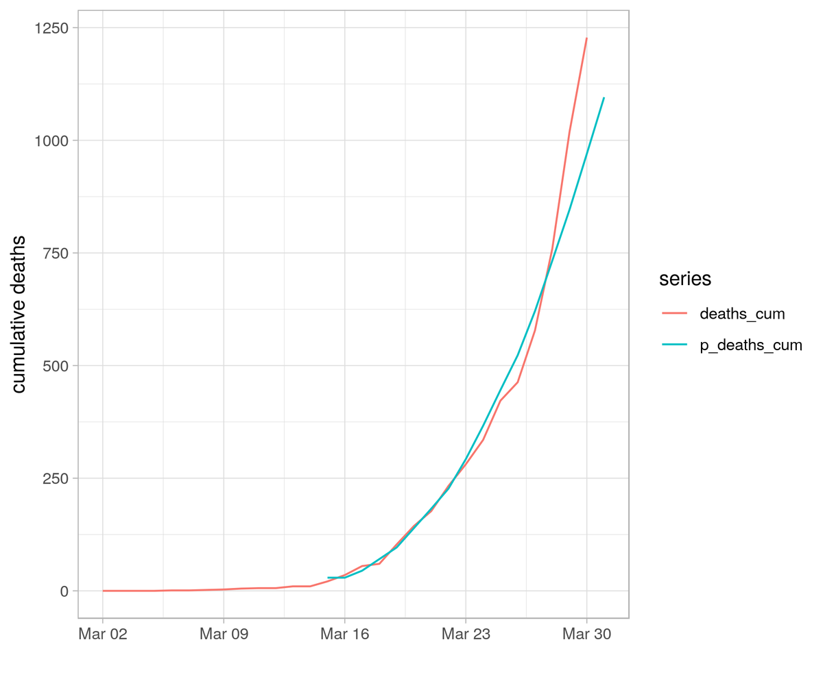
Zooming in suggests that total UK deaths is already diverging from this projection, but it is too early to be conclusive. 7/
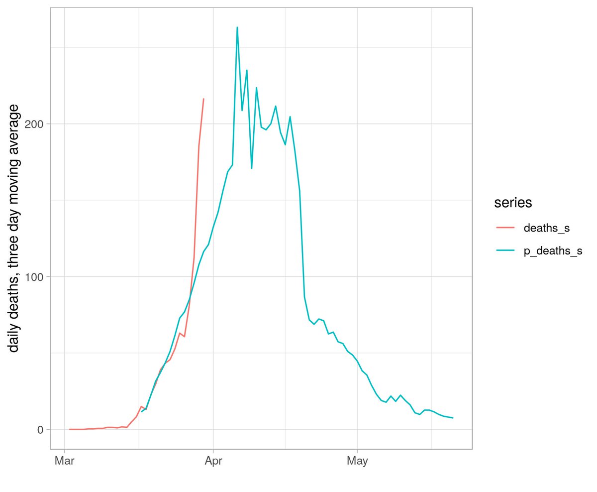
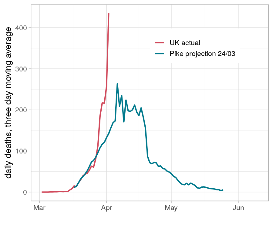
The daily death rate estimates are produced by taking a three day moving average of the Chinese daily death rate * 1.72, to give a peak of 260 daily deaths in early April. 3-day moving average of actual daily deaths shown in red. 8/
The paper isn& #39;t clear on how to interpret these projections. They are described as a lower bound that can be achieved with strict social distancing, but the paper also states that countries *are* converging on this path. 9/
I& #39;ll run these off again in a week or so when we have some more data. 10/
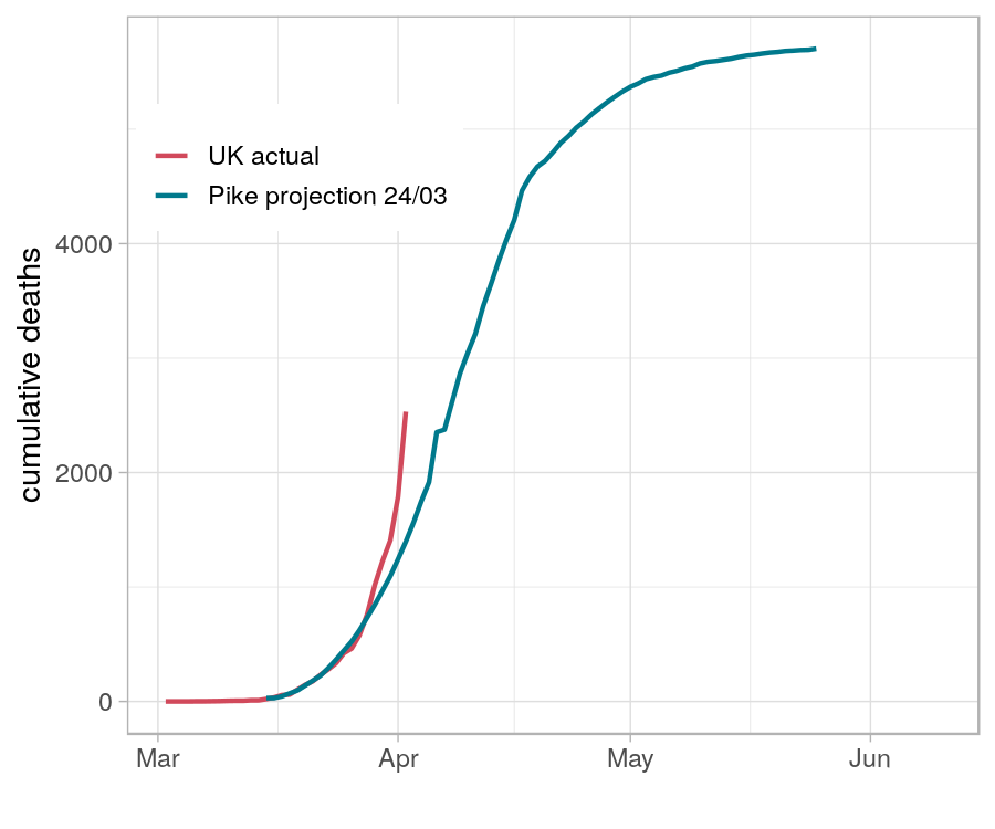
OK, let& #39;s take another look. Here& #39;s Pike& #39;s projection compared with the latest actual cumulative deaths total. 1/
Let& #39;s zoom in a bit. /2
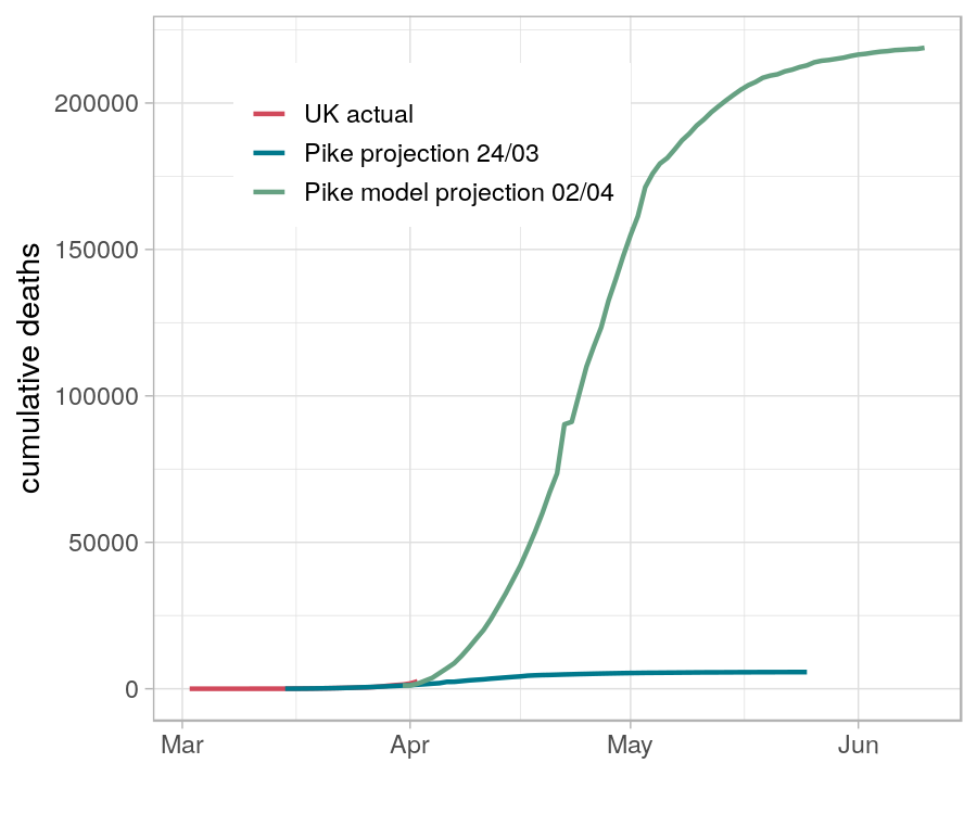
OK, so the data has changed a bit. Lets run the model again. Assume we now transition to the Chinese path. To get the "Pike multiplier", we compare the three-day moving average of deaths at the start of the Chinese series (6.67), with the UK current UK three-day average (346) 4/
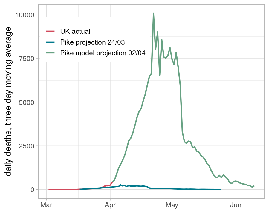
That gives a multiplier of 66. So we scale the Chinese path up 66 times and append it to the UK actual figures. So the Pike model is now predicting something in the order of 250k deaths. 5/
Please can I have some newspaper articles with a photograph of me with big splash "new modelling from UWE Bristol predicts over 10,000 deaths per day" headlines?

 Read on Twitter
