A short thread about exponential curves, because suddenly they are extremely popular. 1/17
Simplified models of things like disease transmission often involve exponential curves: if you assume that each person who catches a disease becomes infectious X days later and passes it on to Y other people, you get an exponential. 2/17
I stress, these are SIMPLIFIED models. We are in "assume a spherical cow" territory here. https://en.wikipedia.org/wiki/Spherical_cow">https://en.wikipedia.org/wiki/Sphe... In real life, everything is more complex, and exponentials will often not be an adequate approximation. 3/17
If you want rigorous, well-designed models of infection rates... please ask an epidemiologist. I am not an epidemiologist and this is not something that can adequately be DIYed by somebody with a general maths/stats background and a spreadsheet. 4/17
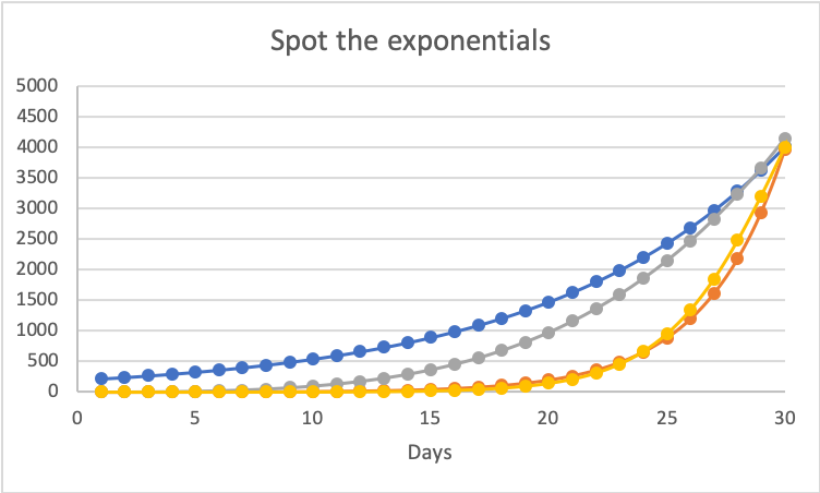
One of the biggest pitfalls is our tendency to look at graphs and say "exponential" when what we& #39;re seeing isn& #39;t actually exponential. For example: 5/17
Before reading on, which of the four curves above do you think is exponential? 7/17
And which do you think will show the lowest numbers if continued for another 10 days, out to day 40? 8/17
Answers to poll #1:
Blue and orange are both exponentials - count yourself correct if you ticked either of these. Grey is a fourth-power curve, and yellow is a logistic curve. 9/17
Blue and orange are both exponentials - count yourself correct if you ticked either of these. Grey is a fourth-power curve, and yellow is a logistic curve. 9/17
These are simulated data with none of the "noise" that complicates RL data analysis. Even with these perfect error-free curves, it& #39;s all but impossible to eyeball the difference between exponentials and any other "increasing at increasing rate" curve. 10/17
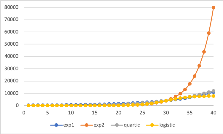
Now let& #39;s look at day 40: 11/17
Back in the day-30 plot, yellow and orange looked almost identical. But at day 40, yellow is the lowest of the four, and orange is about 7x higher than any of the rest. 12/17
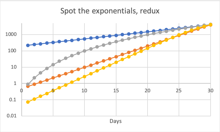
Why is it so hard to see the difference? A big part of it is that most of the information about curve shapes is lost when we plot on a linear axis. Let& #39;s look at the exact same data on a log scale: 13/17
With this transformation it& #39;s much easier to visualize growth rates. We can see that blue and orange are straight lines on this log plot (i.e. exponential growth) and we can see that grey is flattening, sub-exponential. So is yellow, if you look closely. 14/17
But if the methods you& #39;re using for data analysis and visualization aren& #39;t capable of catching the differences between these similar-looking shapes, they *will not* be at all reliable for forecasting. 15/17
Even with a log transform, it& #39;s hard to analyze this kind of data - I& #39;m staying out of making predictions because twelve years working in stats and related areas doesn& #39;t make me competent in this field. 16/17
But linear plots of maybe-exponential data are pretty much useless for conveying any information beyond "this number is accelerating". (And even there, not terribly reliable, b/c once the slope is steep it& #39;s hard to visualize just *how* steep.) 17/17

 Read on Twitter


