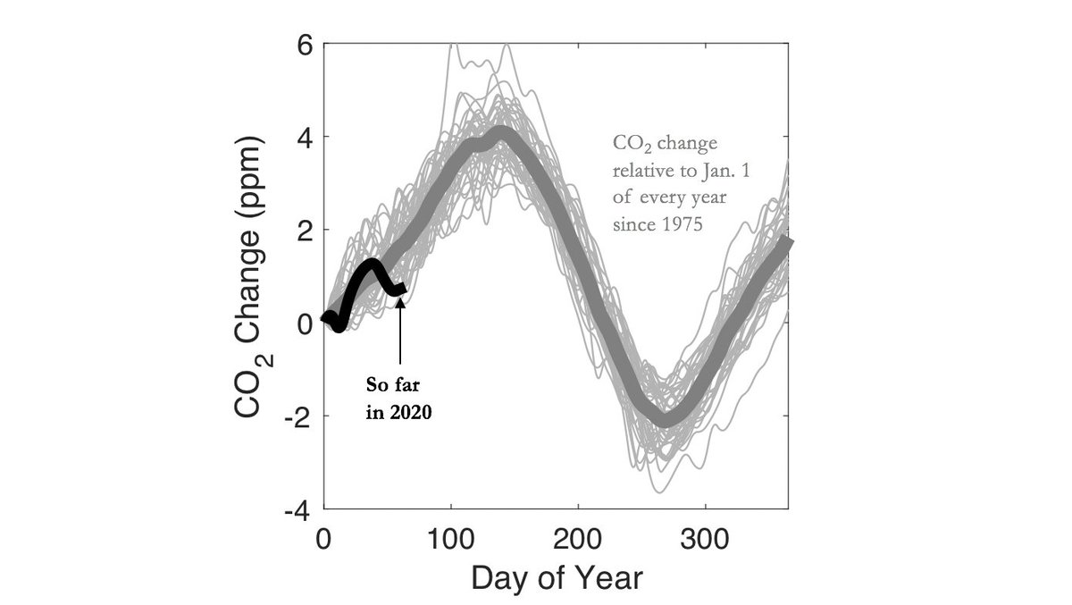
I& #39;m not certain this is caused by #COVID19 but there have only been two years since 1975 when CO2 rose less since the first of the year.
Please don& #39;t misunderstand. CO2 still higher today than on same day in any year since 1975. The graph refers to how much CO2 has grown since the first of the year. Here is a visualization of how the graph was produced. Data from NOAA: https://www.esrl.noaa.gov/gmd/ccgg/trends/data.html">https://www.esrl.noaa.gov/gmd/ccgg/...
And if this year turns out to be unprecedented in terms of the seasonal evolution of CO2 (i.e., low growth in concentration), it does NOT imply that it was a "good" thing. But it DOES demonstrate that we humans have the ability to flatten more than one curve.

 Read on Twitter


