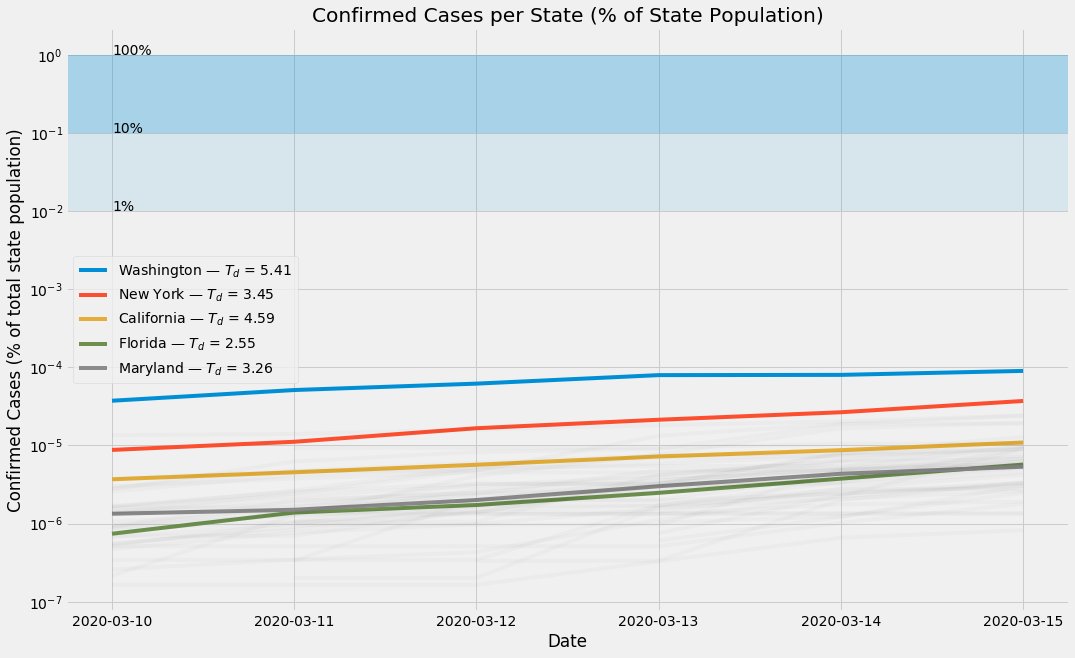
Total Confirmed Coronavirus Cases (% of State Population) for all 50 states
(Log-Y)
[data via @JohnsHopkins and @WHO March 11 2020]
#CoVID19
1/?
(Log-Y)
[data via @JohnsHopkins and @WHO March 11 2020]
#CoVID19
1/?
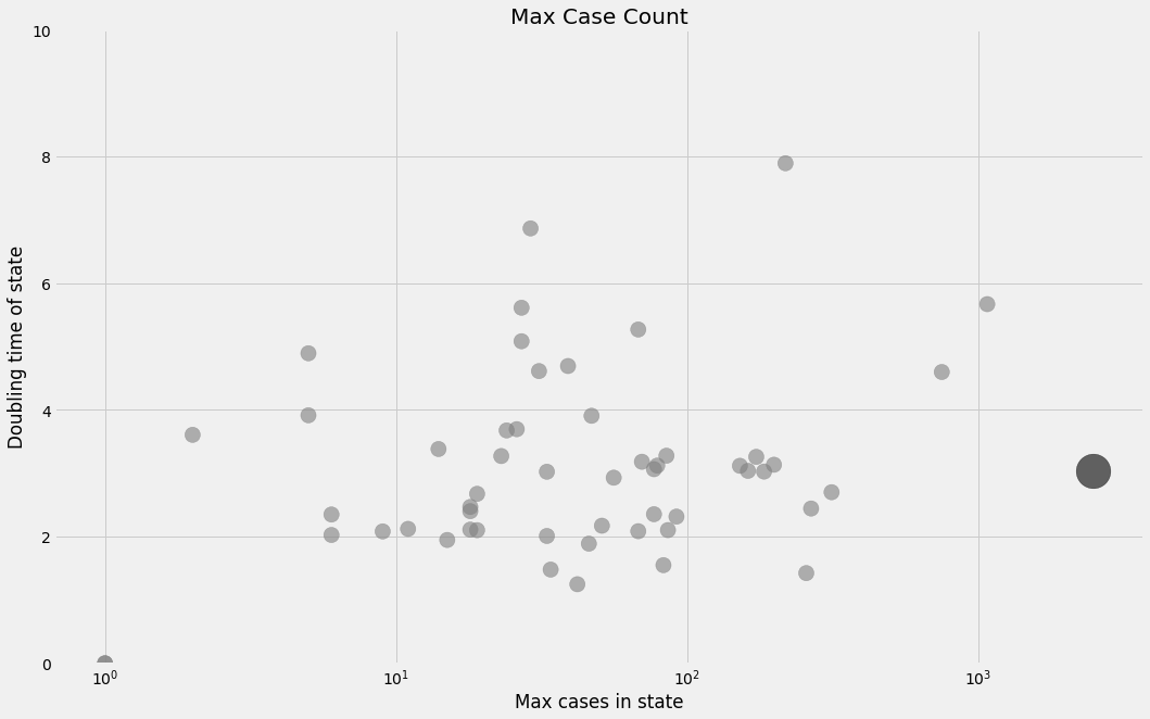
Doubling time (on this VERY noisy and small-n #CoVID19 dataset) appears to be ~3–4 days for most states, with a few outliers. These numbers are almost definitely wrong (and pessimistic), but I& #39;m curious how test-kit availability will affect the #& #39;s over the next few days.
2/?
2/?
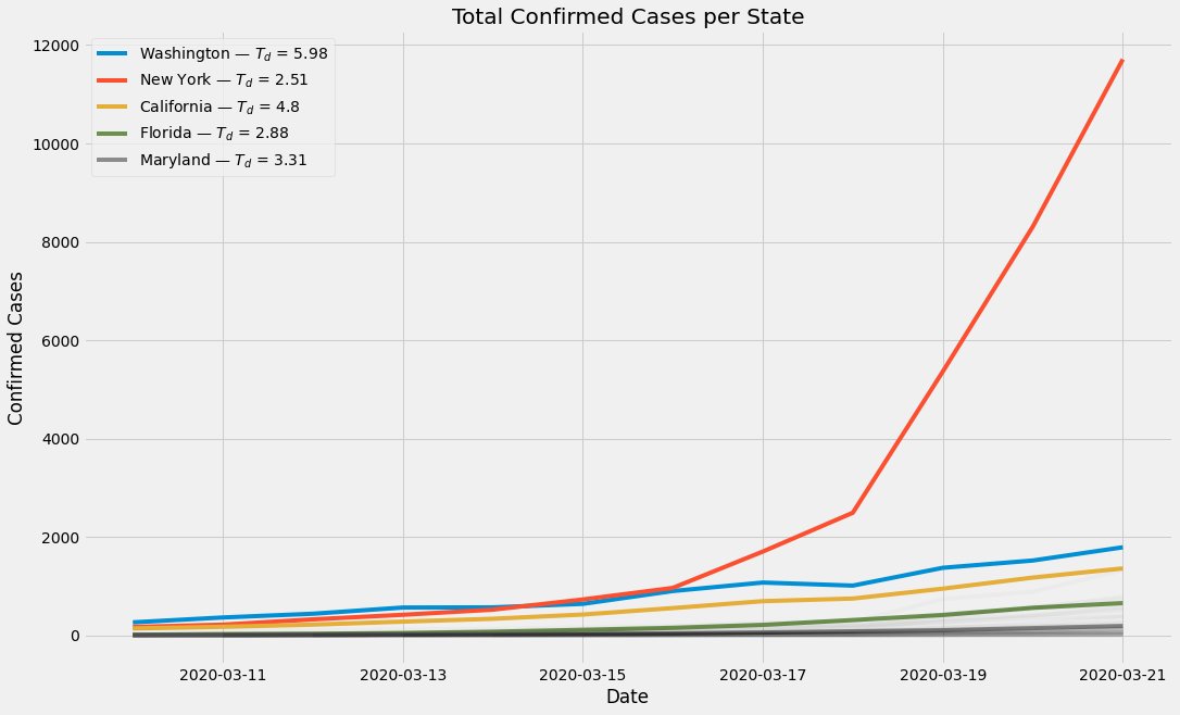
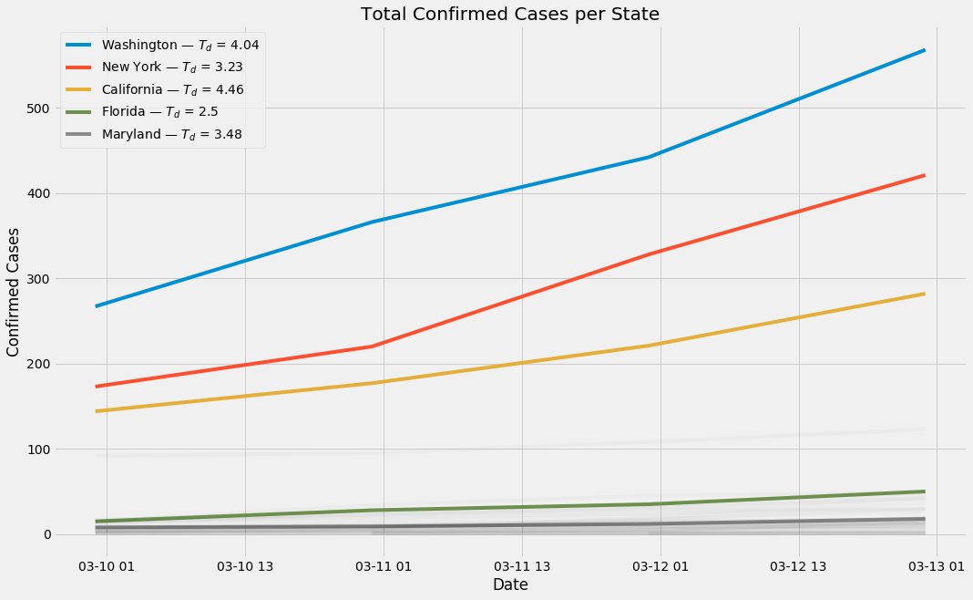
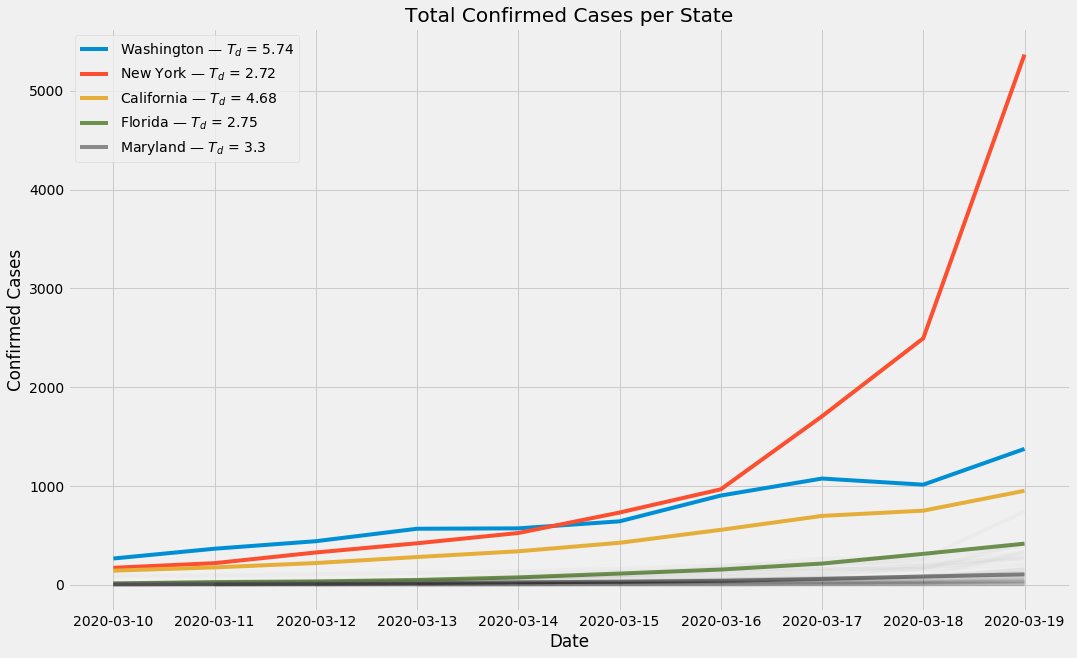
Here, y (linear) is total count of confirmed #coronavirus cases per state. Legend has doubling-time estimates for each state, which (as I mentioned upthread) is very noisy, but seems to agree w early Chinese reports.
Yes my coping mechanism is science+data, why do you ask?
3/?
Yes my coping mechanism is science+data, why do you ask?
3/?
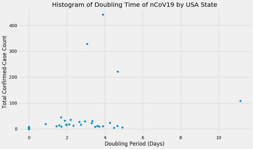
Here& #39;s estimated #coronavirus doubling-time (Td) as more estimates came in over the past few days.
You can see that we& #39;re sorta-ish-kinda-ish converging around 2.5–5 day doubling times. Td=2.5 is really scary. Td=5 is only *mostly* scary. (Spikes on left side are noise.)
4/?
You can see that we& #39;re sorta-ish-kinda-ish converging around 2.5–5 day doubling times. Td=2.5 is really scary. Td=5 is only *mostly* scary. (Spikes on left side are noise.)
4/?
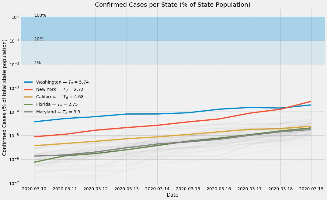
Not a particularly attractive graphic, but it& #39;s illustrative of why we are way further into this pandemic than it may feel:
Log y (update of tweet #1 in this thread, data via @JohnsHopkins)
5/?
Log y (update of tweet #1 in this thread, data via @JohnsHopkins)
5/?
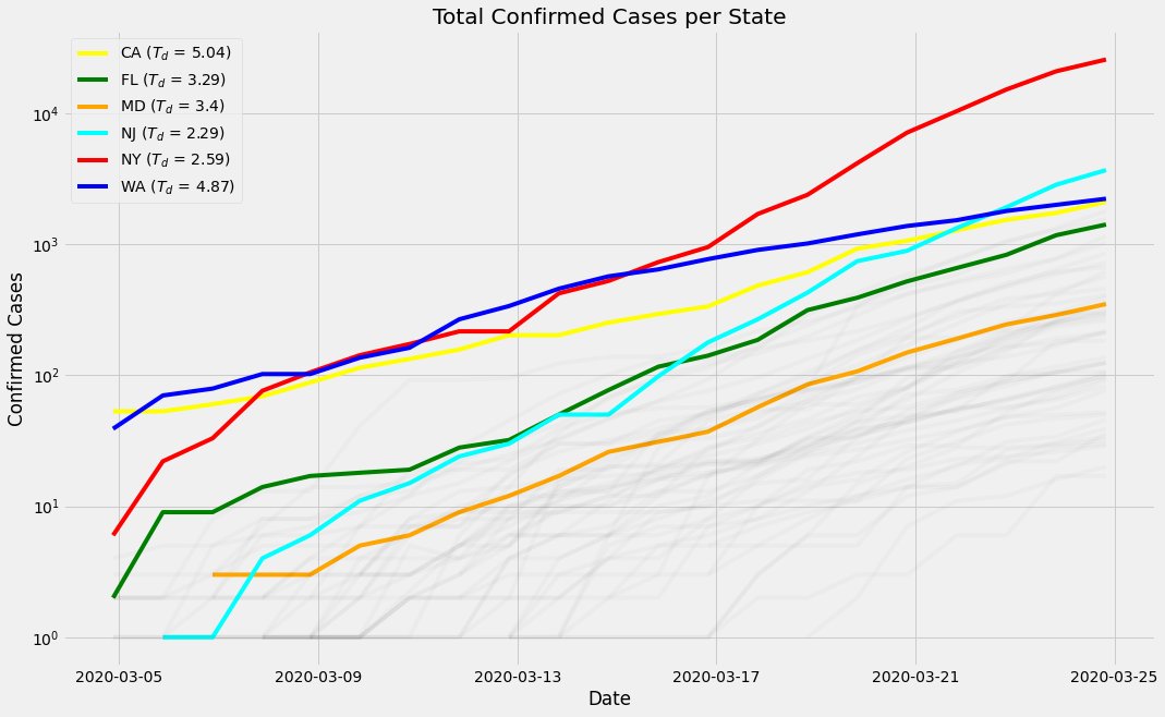
Things in the US are finally starting to look like the scary exponential #coronavirus curves we& #39;ve seen elsewhere around the world. Washington& #39;s Td is likely only so optimistic bc the plateau artifact messes with curve-fitting on such small n.
[data via @JohnsHopkins]
6/?
[data via @JohnsHopkins]
6/?
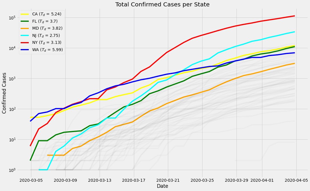
...hooooo-leeeeeey smokes, New York [red line]. Go home and stay home.
Relatedly: What& #39;s going on in Washington [blue line]? Is this still a byproduct of data artifacts, I wonder?
#coronavirus
7/?
Relatedly: What& #39;s going on in Washington [blue line]? Is this still a byproduct of data artifacts, I wonder?
#coronavirus
7/?
re: prev img, this is not a prediction — I& #39;m not an epidemiologist — but your HS alg teacher wants me to say:
The #coronavirus Td (y-axis) for NY is similar to other states& #39;. In other words, NY is not worse off. It& #39;s just further along the curve, & others are close behind.
8/?
The #coronavirus Td (y-axis) for NY is similar to other states& #39;. In other words, NY is not worse off. It& #39;s just further along the curve, & others are close behind.
8/?
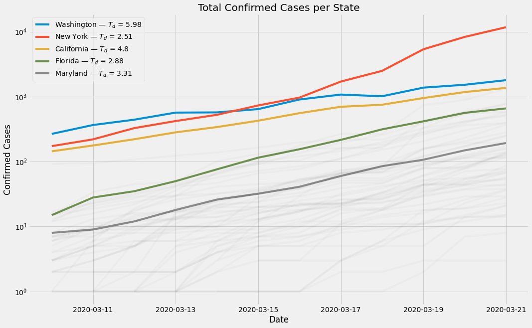
I guess this is why we plot things on a log scale!
(Note that the y axes mean different things in these two images)
#coronavirus
9/?
(Note that the y axes mean different things in these two images)
#coronavirus
9/?
Small dataset, but NY& #39;s doubling-time is decreasing (≈[disease spreading faster]), while other states& #39; appear to be more-or-less stationary.
10/?
10/?
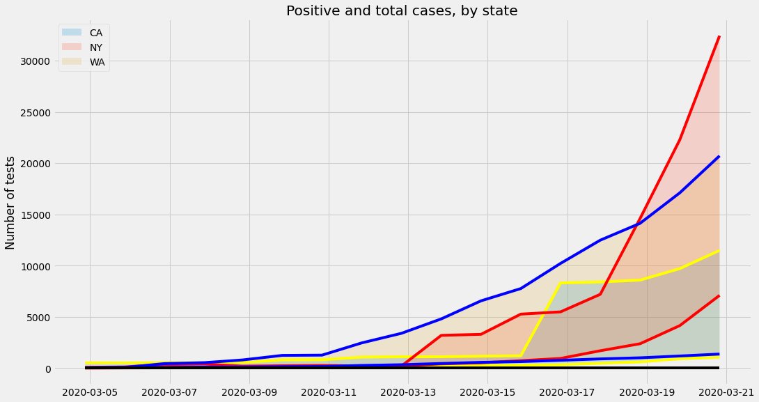
As predicted, the percentage of positive vs total #coronavirus tests is really hard to parse visually (cc @huvegi), especially because the number of tests is so low. (If you recently disbanded a US pandemic response office, I blame you.)
...thought continued in next tweet
11/?
...thought continued in next tweet
11/?
defo not the prettiest fig I& #39;ve ever made, but it helps tell the story. The TOP of the area is the total number of cases. The BOTTOM of the area is # of positive cases.
Most people aren& #39;t testing positive, but the ratios differ; i.e. illustrates statewise testing bias.
12/?
Most people aren& #39;t testing positive, but the ratios differ; i.e. illustrates statewise testing bias.
12/?
It& #39;s been a few tweets since a caveat, so... CAVEAT: I& #39;m still not an #coronavirus epidemiologist. I am Carla and Molly making mozzarella and you are a very patient Italian man politely throwing away all of my garbage work.
https://www.youtube.com/watch?v=Z0TcF-pe3As
13/?">https://www.youtube.com/watch...
https://www.youtube.com/watch?v=Z0TcF-pe3As
13/?">https://www.youtube.com/watch...
If the situation in NY vs other states looks like a huge gap to you ("they must have done something differently/wrong/been under different circumstances"), it& #39;s because you& #39;re not thinking with exponentials. These are the same figure with different y scale:
#coronavirus
14/?
#coronavirus
14/?
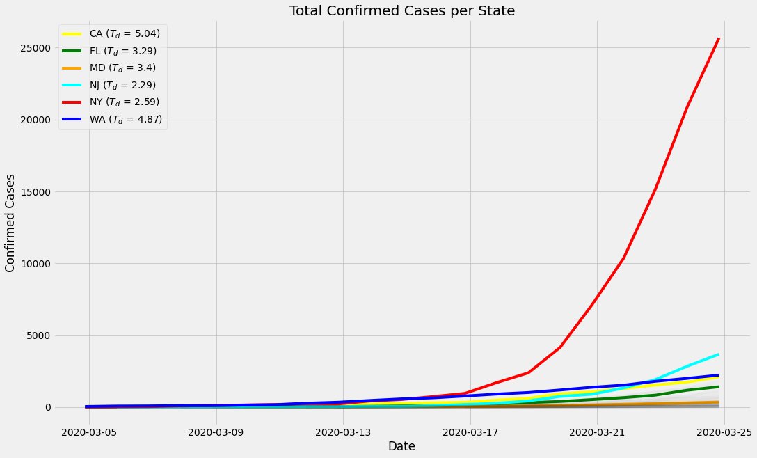
It& #39;s frustrating to see that these #coronavirus plots are barely deviating day-to-day (such is the nature of an exponential curve; 1000 people changing their behavior today barely looks like a blip, where it& #39;d have been huge last week).
15/?
15/?
What is this?! Au contraire! When plotted on a log-y axis, it becomes clear that the #coronavirus growth curves are bowing under the changes we are making to our everyday behavior.
• Keep washing your hands
• Stay in your house
• Do not follow medical advice from the president
• Keep washing your hands
• Stay in your house
• Do not follow medical advice from the president
When you& #39;re feeling bored and stir-crazy and miss your friends, look at these lines slowly curving back toward health. That& #39;s why we& #39;re staying in!
Been a while since I added to this thread, but... Keep your eyes on the prize. This curve back to normal is a HUGE impact we& #39;ve made against #coronavirus already:

 Read on Twitter
![Total Confirmed Coronavirus Cases (% of State Population) for all 50 states(Log-Y)[data via @JohnsHopkins and @WHO March 11 2020] #CoVID19 1/? Total Confirmed Coronavirus Cases (% of State Population) for all 50 states(Log-Y)[data via @JohnsHopkins and @WHO March 11 2020] #CoVID19 1/?](https://pbs.twimg.com/media/ES_-PgUXsAA7aKv.png)

![Things in the US are finally starting to look like the scary exponential #coronavirus curves we& #39;ve seen elsewhere around the world. Washington& #39;s Td is likely only so optimistic bc the plateau artifact messes with curve-fitting on such small n.[data via @JohnsHopkins]6/? Things in the US are finally starting to look like the scary exponential #coronavirus curves we& #39;ve seen elsewhere around the world. Washington& #39;s Td is likely only so optimistic bc the plateau artifact messes with curve-fitting on such small n.[data via @JohnsHopkins]6/?](https://pbs.twimg.com/media/ETWW2e7WAAAa8UO.jpg)
![...hooooo-leeeeeey smokes, New York [red line]. Go home and stay home.Relatedly: What& #39;s going on in Washington [blue line]? Is this still a byproduct of data artifacts, I wonder? #coronavirus7/? ...hooooo-leeeeeey smokes, New York [red line]. Go home and stay home.Relatedly: What& #39;s going on in Washington [blue line]? Is this still a byproduct of data artifacts, I wonder? #coronavirus7/?](https://pbs.twimg.com/media/ETb_8-0XsAECkRu.jpg)
![Small dataset, but NY& #39;s doubling-time is decreasing (≈[disease spreading faster]), while other states& #39; appear to be more-or-less stationary.10/? Small dataset, but NY& #39;s doubling-time is decreasing (≈[disease spreading faster]), while other states& #39; appear to be more-or-less stationary.10/?](https://pbs.twimg.com/media/ETmbyURXYAogqCi.jpg)
![Small dataset, but NY& #39;s doubling-time is decreasing (≈[disease spreading faster]), while other states& #39; appear to be more-or-less stationary.10/? Small dataset, but NY& #39;s doubling-time is decreasing (≈[disease spreading faster]), while other states& #39; appear to be more-or-less stationary.10/?](https://pbs.twimg.com/media/ETmb1BpWoAM9nlz.jpg)

