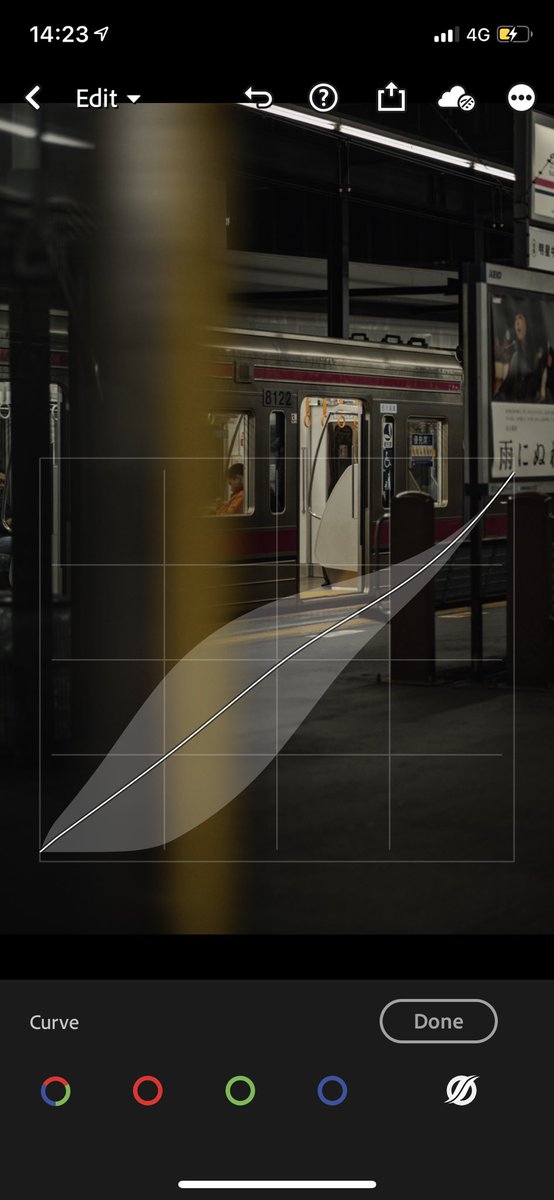
in technical terms, the curve represents shadows on the left, highlights on the right. and mid tones in the middle.
the left axis represents brightness and darkness of certain regions— push it up, the brighter the tones get.
the left axis represents brightness and darkness of certain regions— push it up, the brighter the tones get.
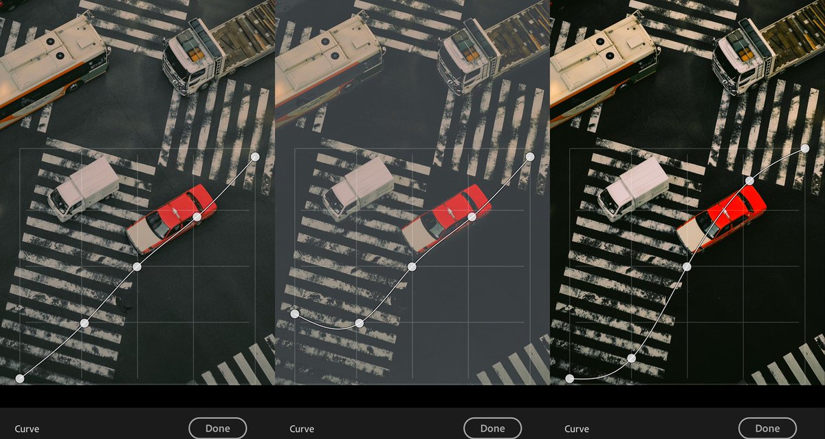
see for example this image. a lot of photographers start with the S curve for striking contrasts and highlights (right). the left is a W curve which is mostly used for subtle fade (both shadows and highlights slightly pulled down). the middle is an exaggerated sample...
... of what happens when you push up the left axis, increasing the brightness. this setting is for the general “light” tone curve. there are curves for each of the RGB color as well
the RGB curves are for fine-tuning the tints and shadows in specific regions. adjusting one color priotizes one tone over the other:
1. red is the opposite of cyan
2. green for magenta
3. blue for yellow
increasing one color, reduces its opposite.
1. red is the opposite of cyan
2. green for magenta
3. blue for yellow
increasing one color, reduces its opposite.
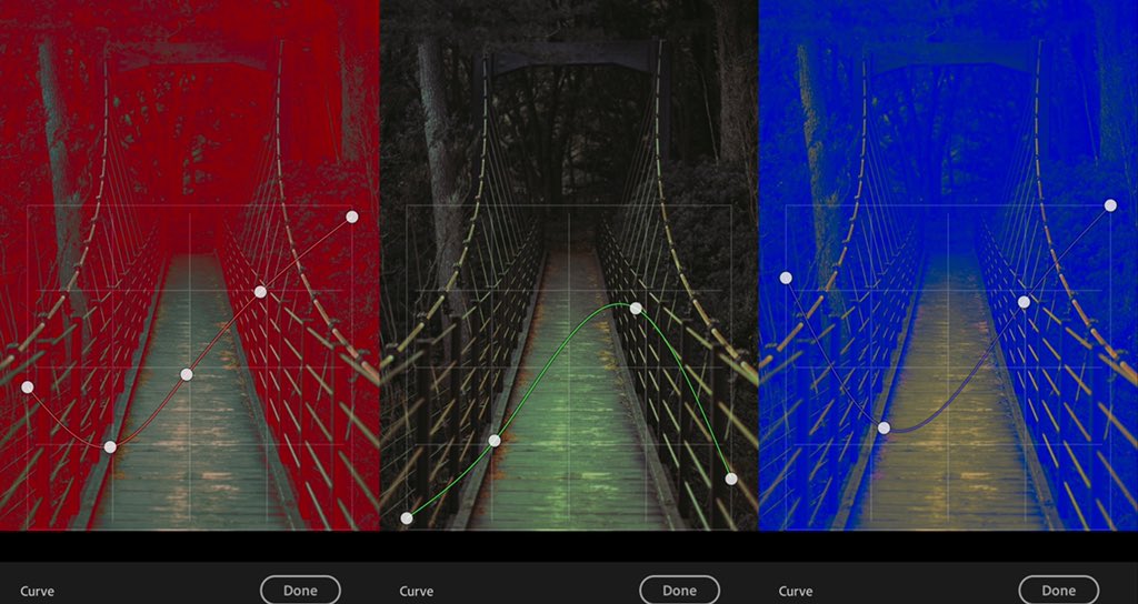
sample L-R: blown up red shadows, blown up green highlights, blown up blue shadows. subtle adjustment can give you the tints you like for certain mood/aesthetics.
tip: most film presets focus on the green highlight and red shadows https://abs.twimg.com/emoji/v2/... draggable="false" alt="😏" title="Smirking face" aria-label="Emoji: Smirking face">
 https://abs.twimg.com/emoji/v2/... draggable="false" alt="😏" title="Smirking face" aria-label="Emoji: Smirking face">
tip: most film presets focus on the green highlight and red shadows
here’s a sample vid on the effects of each of the curve on certain shadow/highlight region.
on lightroom, there is a fifth curve which a flexible region based light curve. instead of doing the points, it uses a gradient per region to soften the adjustments. i personally enjoy working on this using a W curve then pulling both downwards.
happy editing! i’m still overwhelemed from all the positive response/messages re my last post. hoping to share my process as truthfully as possible!
and if u haven’t: http://instagram.com/qarloscuiapo ">https://instagram.com/qarloscui... https://abs.twimg.com/emoji/v2/... draggable="false" alt="♥️" title="Heart suit" aria-label="Emoji: Heart suit">
 https://abs.twimg.com/emoji/v2/... draggable="false" alt="♥️" title="Heart suit" aria-label="Emoji: Heart suit">
and if u haven’t: http://instagram.com/qarloscuiapo ">https://instagram.com/qarloscui...

 Read on Twitter

 https://abs.twimg.com/emoji/v2/... draggable="false" alt="😏" title="Smirking face" aria-label="Emoji: Smirking face">" title="sample L-R: blown up red shadows, blown up green highlights, blown up blue shadows. subtle adjustment can give you the tints you like for certain mood/aesthetics. tip: most film presets focus on the green highlight and red shadows https://abs.twimg.com/emoji/v2/... draggable="false" alt="😏" title="Smirking face" aria-label="Emoji: Smirking face">https://abs.twimg.com/emoji/v2/... draggable="false" alt="😏" title="Smirking face" aria-label="Emoji: Smirking face">" class="img-responsive" style="max-width:100%;"/>


