NEW with @ChrisGiles_:
https://www.ft.com/content/c9db4c66-5971-11ea-a528-dd0f971febbc
The">https://www.ft.com/content/c... UK has a regional inequality problem, but it& #39;s much more nuanced than the typical hot take.
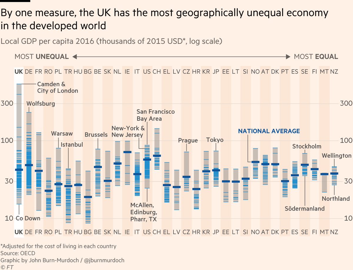
You& #39;ve probably seen a version of this chart before, showing the UK as a https://abs.twimg.com/emoji/v2/... draggable="false" alt="😱" title="Vor Angst schreiendes Gesicht" aria-label="Emoji: Vor Angst schreiendes Gesicht"> outlier for regional inequality.
Look how rich London is!
https://www.ft.com/content/c9db4c66-5971-11ea-a528-dd0f971febbc
The">https://www.ft.com/content/c... UK has a regional inequality problem, but it& #39;s much more nuanced than the typical hot take.
You& #39;ve probably seen a version of this chart before, showing the UK as a
Look how rich London is!
But.
OECD& #39;s TL3 regions compare "Camden & City of London" (population 263k) to sprawling San Francisco Bay Area (pop 9.7m) and the entire New York - Newark region (pop 23.7m).
You can& #39;t compare richest hub of one city with huge regions containing cities, suburbs & rural areas.
OECD& #39;s TL3 regions compare "Camden & City of London" (population 263k) to sprawling San Francisco Bay Area (pop 9.7m) and the entire New York - Newark region (pop 23.7m).
You can& #39;t compare richest hub of one city with huge regions containing cities, suburbs & rural areas.
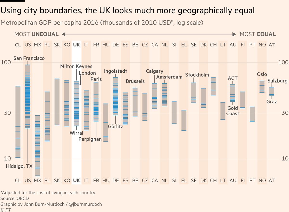
Essentially, UK is divided into smaller units than its peer countries, meaning more concentrated rich pockets, so it *looks* more geographically unequal than it is.
Luckily, the OECD can help solve its own problem. Here& #39;s the same chart, but using its Functional Urban Areas https://abs.twimg.com/emoji/v2/... draggable="false" alt="™️" title="Registered-Trade-Mark-Symbol" aria-label="Emoji: Registered-Trade-Mark-Symbol">
Luckily, the OECD can help solve its own problem. Here& #39;s the same chart, but using its Functional Urban Areas
These improve upon the previous regions by including a complete city in each unit. Now we can compare regional inequality using the same framework in each country, and look:
The UK remains fairly unequal, but much less so than the US, and very similar to Italy, France, Germany.
The UK remains fairly unequal, but much less so than the US, and very similar to Italy, France, Germany.
So UK is not an outlier for geographical inequality, but it is still unequal. Why?
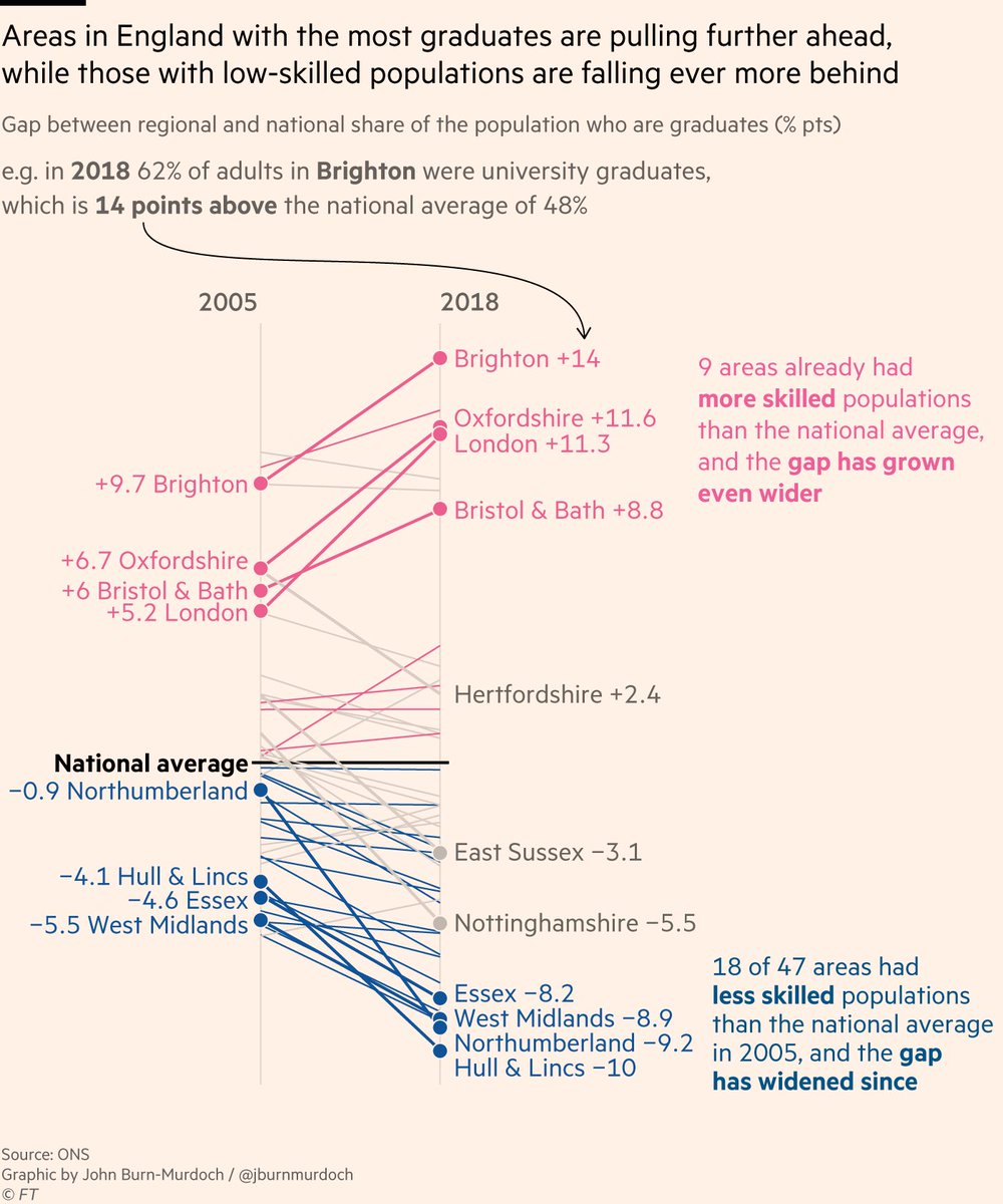
Big part of it is about distribution of skilled workers, and this is getting worse. Parts of UK with the most graduates are gaining even more, and those with the fewest are falling further behind.
Big part of it is about distribution of skilled workers, and this is getting worse. Parts of UK with the most graduates are gaining even more, and those with the fewest are falling further behind.
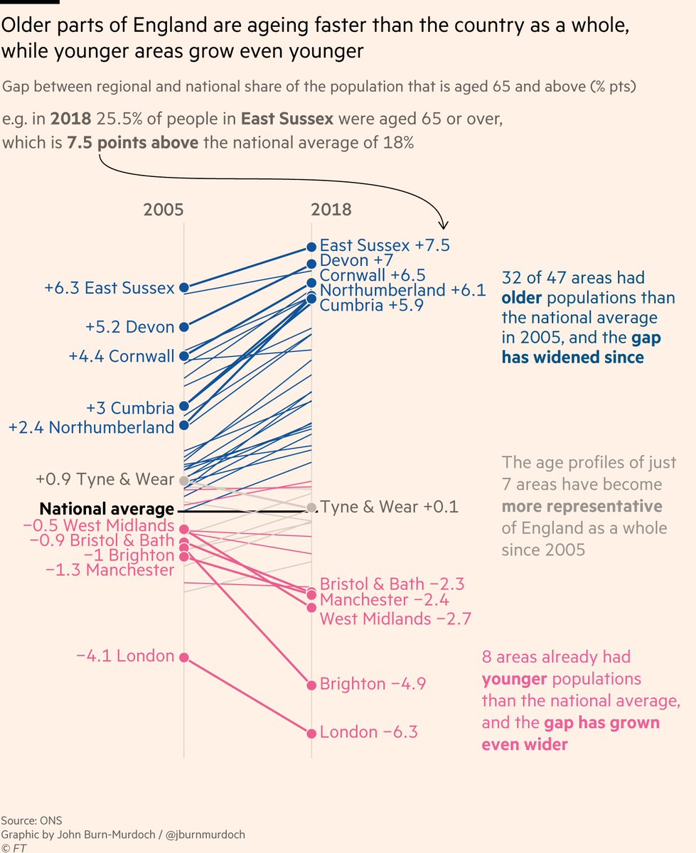
The same thing is happening with age.
Places that are older than the national average are ageing faster than the country as a whole, as their youth migrate to the younger and more dynamic areas, making those even younger than the average.
Places that are older than the national average are ageing faster than the country as a whole, as their youth migrate to the younger and more dynamic areas, making those even younger than the average.
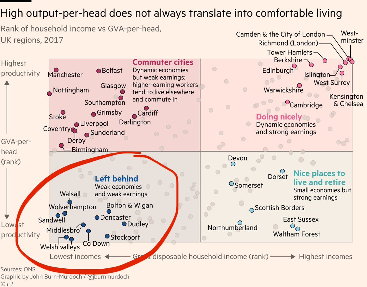
None of this bodes well for "levelling up" the UK, but we must be careful not to assume economic dynamism always means high standards of living, & vice versa.
Many economically punchy areas are poor on income measures; many economic backwaters are pleasant homes for the affluent
Many economically punchy areas are poor on income measures; many economic backwaters are pleasant homes for the affluent
By combining these two measures — a place& #39;s economic output and its residents& #39; incomes — we can also begin to paint a clearer picture of "left behind" areas:
Places where the local economy is stagnant *and* incomes are low. These are the places most in need of intervention.
Places where the local economy is stagnant *and* incomes are low. These are the places most in need of intervention.
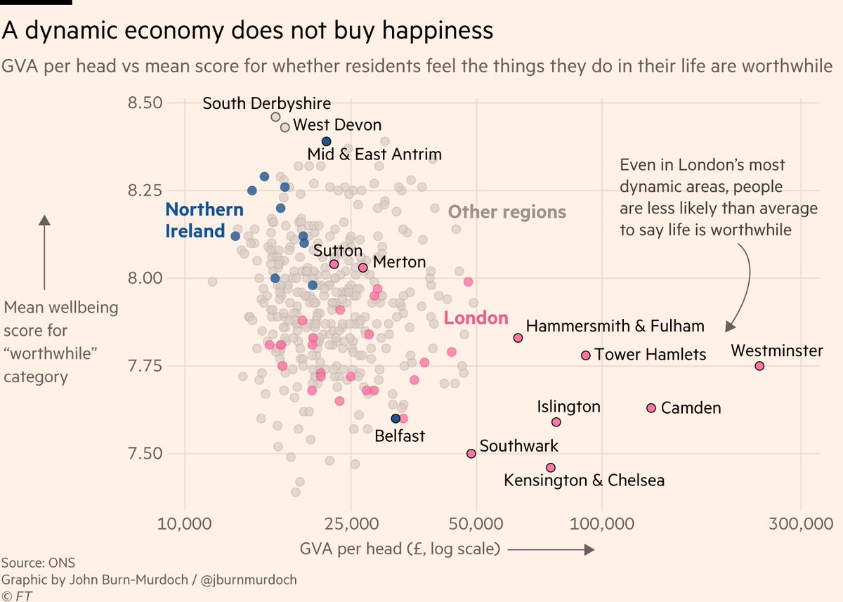
But again, it& #39;s important to think about *what* we& #39;re trying to optimise for.
The @ONS now puts out regular wellbeing data, and these routinely find that the richest and most economically dynamic pockets of London are those where people are among the *least* happy https://abs.twimg.com/emoji/v2/... draggable="false" alt="🤔" title="Denkendes Gesicht" aria-label="Emoji: Denkendes Gesicht">
The @ONS now puts out regular wellbeing data, and these routinely find that the richest and most economically dynamic pockets of London are those where people are among the *least* happy
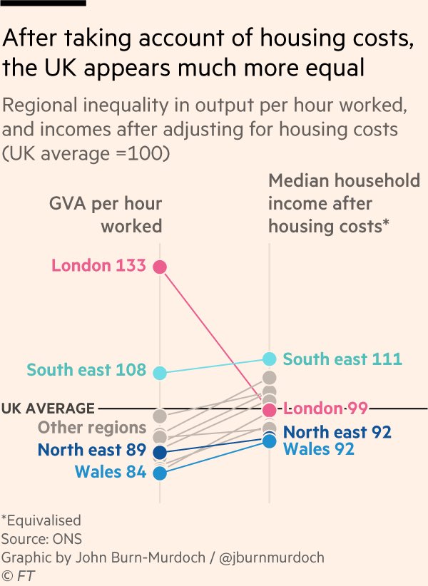
One possible reason for this is that despite a thriving economy and high incomes, London& #39;s exorbitant housing costs put its residents under constant stress.
In fact, after housing costs have been subtracted, Londoners take home *less than* the national average income.
In fact, after housing costs have been subtracted, Londoners take home *less than* the national average income.
So. A lot to take in here, but I& #39;d boil it down to these three points:
1/ UK economy is geographically unequal, but less so than the US and not noticeably more than other peers
2/ Internal flows of young and skilled people are perpetuating that economic inequality
1/ UK economy is geographically unequal, but less so than the US and not noticeably more than other peers
2/ Internal flows of young and skilled people are perpetuating that economic inequality
And
3/ Policies aimed at levelling up UK& #39;s regions should consider the above, but should not blindly optimise for economic dynamism without considering how and why quality of life is much higher in some places than others regardless of local economic vigour
3/ Policies aimed at levelling up UK& #39;s regions should consider the above, but should not blindly optimise for economic dynamism without considering how and why quality of life is much higher in some places than others regardless of local economic vigour
Read @ChrisGiles_& #39; full story here, and believe it or not there are also *more* charts  https://abs.twimg.com/emoji/v2/... draggable="false" alt="🤓" title="Nerd-Gesicht" aria-label="Emoji: Nerd-Gesicht"> https://www.ft.com/content/c9db4c66-5971-11ea-a528-dd0f971febbc
This">https://www.ft.com/content/c... thread may be of interest to:
• @thomasforth
• @TorstenBell
• @danc00ks0n
• @benatipsosmori
• @robfordmancs
• @centrefortowns
• @CentreforCities
This">https://www.ft.com/content/c... thread may be of interest to:
• @thomasforth
• @TorstenBell
• @danc00ks0n
• @benatipsosmori
• @robfordmancs
• @centrefortowns
• @CentreforCities
Oh, and coming up later on, a separate #dataviz Process Thread https://abs.twimg.com/emoji/v2/... draggable="false" alt="™️" title="Registered-Trade-Mark-Symbol" aria-label="Emoji: Registered-Trade-Mark-Symbol"> on the considerations and iterations for that opening regional inequality distributions chart
  https://abs.twimg.com/emoji/v2/... draggable="false" alt="🤓" title="Nerd-Gesicht" aria-label="Emoji: Nerd-Gesicht">
fin.
fin.

 Read on Twitter
 outlier for regional inequality.Look how rich London is!" title="NEW with @ChrisGiles_: https://www.ft.com/content/c... UK has a regional inequality problem, but it& #39;s much more nuanced than the typical hot take.You& #39;ve probably seen a version of this chart before, showing the UK as a https://abs.twimg.com/emoji/v2/... draggable="false" alt="😱" title="Vor Angst schreiendes Gesicht" aria-label="Emoji: Vor Angst schreiendes Gesicht"> outlier for regional inequality.Look how rich London is!" class="img-responsive" style="max-width:100%;"/>
 " title="Essentially, UK is divided into smaller units than its peer countries, meaning more concentrated rich pockets, so it *looks* more geographically unequal than it is.Luckily, the OECD can help solve its own problem. Here& #39;s the same chart, but using its Functional Urban Areashttps://abs.twimg.com/emoji/v2/... draggable="false" alt="™️" title="Registered-Trade-Mark-Symbol" aria-label="Emoji: Registered-Trade-Mark-Symbol">" class="img-responsive" style="max-width:100%;"/>


 " title="But again, it& #39;s important to think about *what* we& #39;re trying to optimise for.The @ONS now puts out regular wellbeing data, and these routinely find that the richest and most economically dynamic pockets of London are those where people are among the *least* happy https://abs.twimg.com/emoji/v2/... draggable="false" alt="🤔" title="Denkendes Gesicht" aria-label="Emoji: Denkendes Gesicht">" class="img-responsive" style="max-width:100%;"/>
 on the considerations and iterations for that opening regional inequality distributions chart https://abs.twimg.com/emoji/v2/... draggable="false" alt="🤓" title="Nerd-Gesicht" aria-label="Emoji: Nerd-Gesicht">fin." title="Oh, and coming up later on, a separate #dataviz Process Threadhttps://abs.twimg.com/emoji/v2/... draggable="false" alt="™️" title="Registered-Trade-Mark-Symbol" aria-label="Emoji: Registered-Trade-Mark-Symbol"> on the considerations and iterations for that opening regional inequality distributions chart https://abs.twimg.com/emoji/v2/... draggable="false" alt="🤓" title="Nerd-Gesicht" aria-label="Emoji: Nerd-Gesicht">fin." class="img-responsive" style="max-width:100%;"/>


