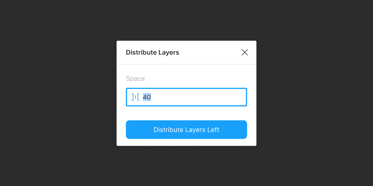
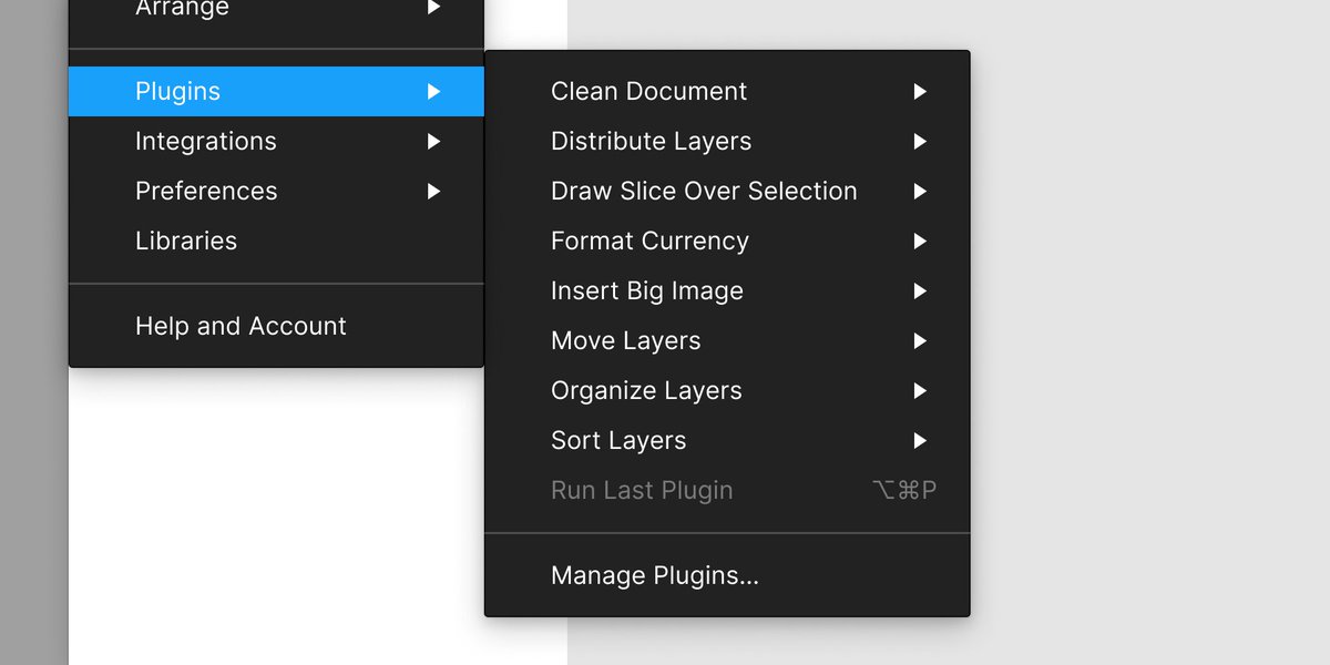
The UX of Figma plugins: 10 heuristics.
 https://abs.twimg.com/emoji/v2/... draggable="false" alt="👇" title="Down pointing backhand index" aria-label="Emoji: Down pointing backhand index"> A thread.
@figmadesign @FigmaPlugins #figma #figmaplugins #ux
@figmadesign @FigmaPlugins #figma #figmaplugins #ux
Draw inspiration from Figma’s native features. Using your plugin should feel as similar as possible to using Figma itself.
Use colors, styles, and components from Figma’s design system.
The most efficient plugin possible is a plugin that gets to work immediately when it is run.
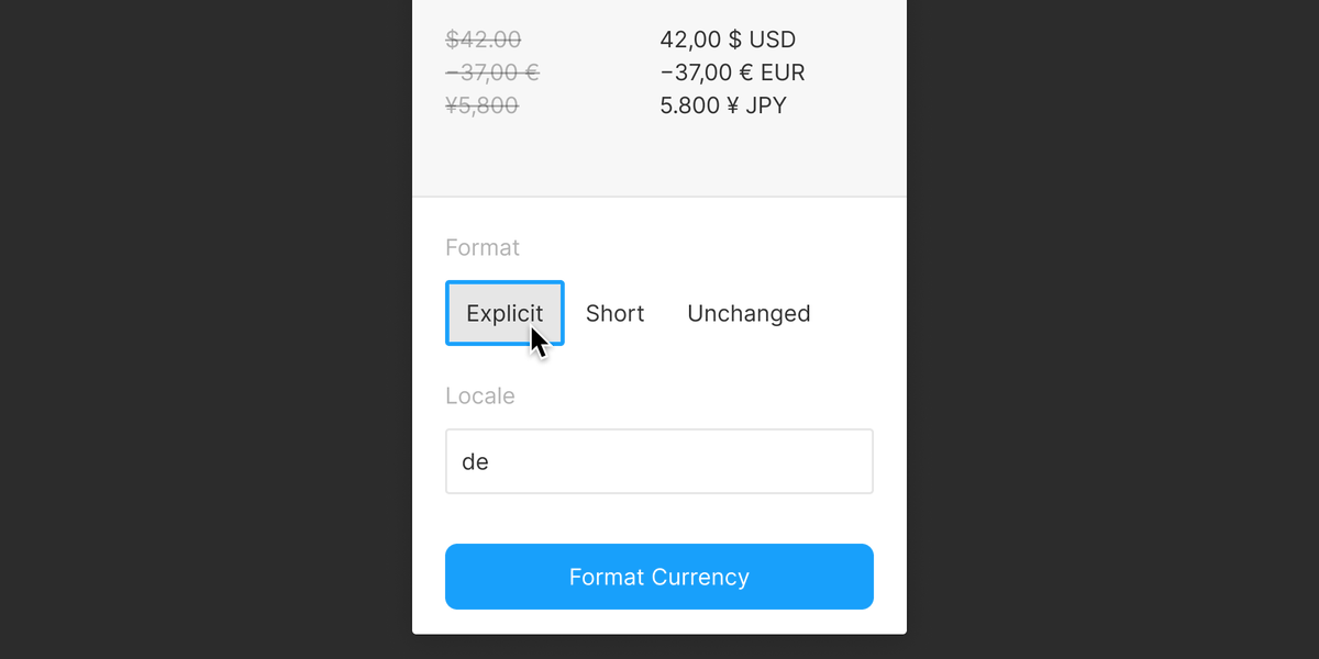
If a UI is required, choose form controls that permit the efficient configuration of your plugin.
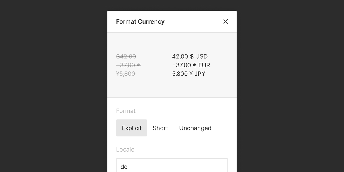
Here, changing the “Format” setting requires only one click because a Segmented Control is used.
Here, changing the “Format” setting requires only one click because a Segmented Control is used.
The first form control should be in focus when the UI is initially displayed, so that the user can make changes immediately.
Options that tend to be selected should be selected by default, or selectable with a bare minimum of user actions — ideally, a single click.
Your plugin should do just one thing (or, a few closely-related things) well.
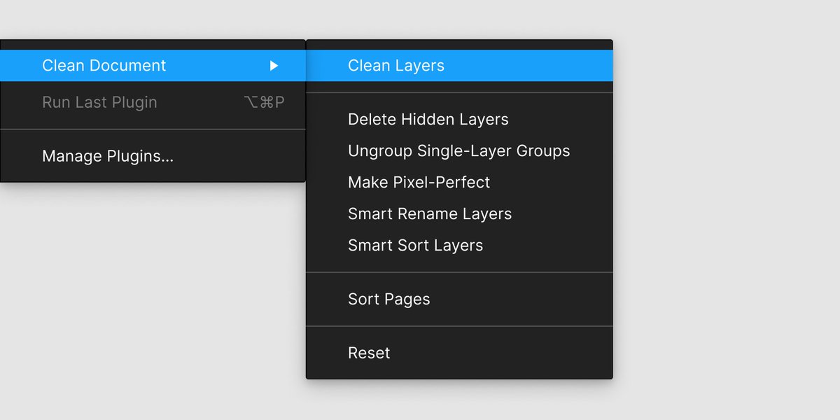
Consider if functionality can be “decomposed” and built as sub-commands that can be run independently.
Here, the functionality of the “Clean Layers” command is also available as separate sub-commands.
Here, the functionality of the “Clean Layers” command is also available as separate sub-commands.
All form controls should have an obvious focus state, and be reachable by pressing the “Tab” key.
Refrain from modifying the natural tab order of the form controls.
Pressing “Esc” should close the plugin UI.
Pressing “Enter” should execute the plugin with the currently configured settings in the plugin UI.
Pressing “Enter” should execute the plugin with the currently configured settings in the plugin UI.
A reasonable approach: Default to operating on layers in the user’s selection, but if the selection is empty, operate on all layers on the current page.
State the active scope of operation in your plugin UI.
Here, the “Padding” setting is pre-populated with the user’s previous input.
This is important in plugins that tend to be run repeatedly.
Show success and error messages as toast notifications.
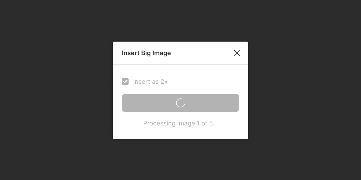
Include a loading state if there could be more than a few seconds of wait time — for example, when awaiting an API response.
The preview should update in real-time as the user adjusts settings in the plugin UI, or when there is a change in the user’s selection.
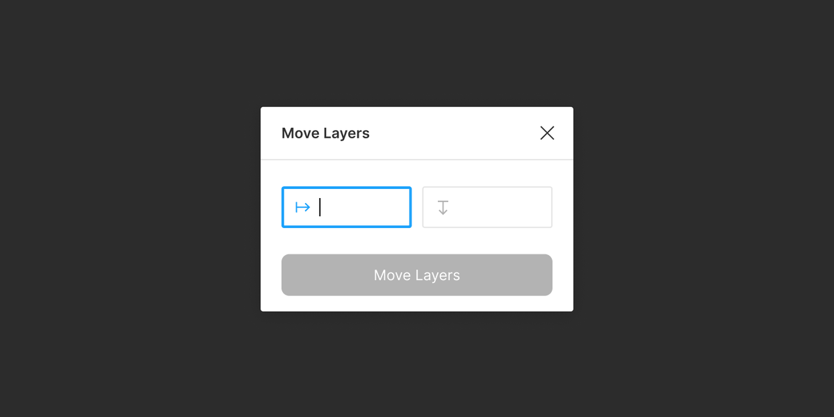
Certain concepts could be challenging to represent unambiguously with an icon. For clarity, use a label, written in plain language.
A reasonable rule: Only use icons that are already in use in the Figma UI.
Here, an icon from Figma’s “Properties” panel is used.
Here, an icon from Figma’s “Properties” panel is used.
Use four words or less, in Title Case.
Be specific, use familiar words, and avoid made-up words.
The best thing that you can say is that your plugin does exactly what it says on the tin.

 Read on Twitter
 A thread. @figmadesign @FigmaPlugins #figma #figmaplugins #ux" title="The UX of Figma plugins: 10 heuristics.https://abs.twimg.com/emoji/v2/... draggable="false" alt="👇" title="Down pointing backhand index" aria-label="Emoji: Down pointing backhand index"> A thread. @figmadesign @FigmaPlugins #figma #figmaplugins #ux" class="img-responsive" style="max-width:100%;"/>
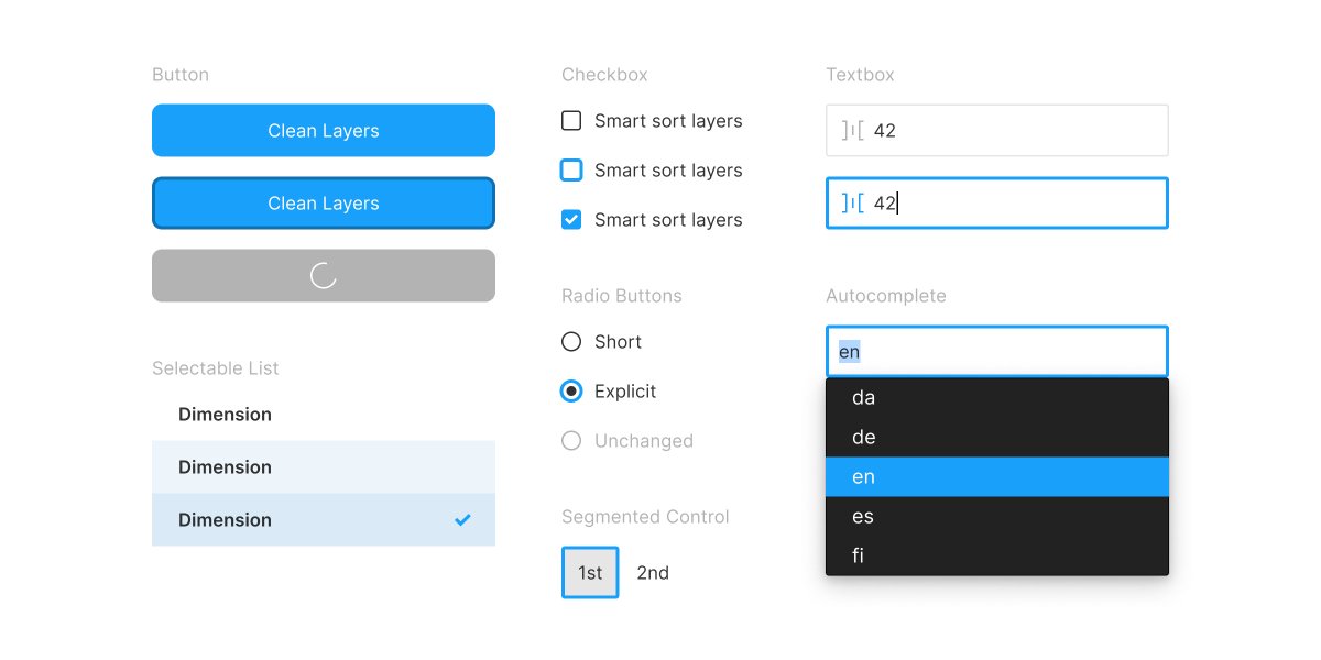 — Use UX patterns and UI components that are familiar to Figma users.Draw inspiration from Figma’s native features. Using your plugin should feel as similar as possible to using Figma itself.Use colors, styles, and components from Figma’s design system." title="https://abs.twimg.com/emoji/v2/... draggable="false" alt="1⃣" title="Keycap digit one" aria-label="Emoji: Keycap digit one"> — Use UX patterns and UI components that are familiar to Figma users.Draw inspiration from Figma’s native features. Using your plugin should feel as similar as possible to using Figma itself.Use colors, styles, and components from Figma’s design system." class="img-responsive" style="max-width:100%;"/>
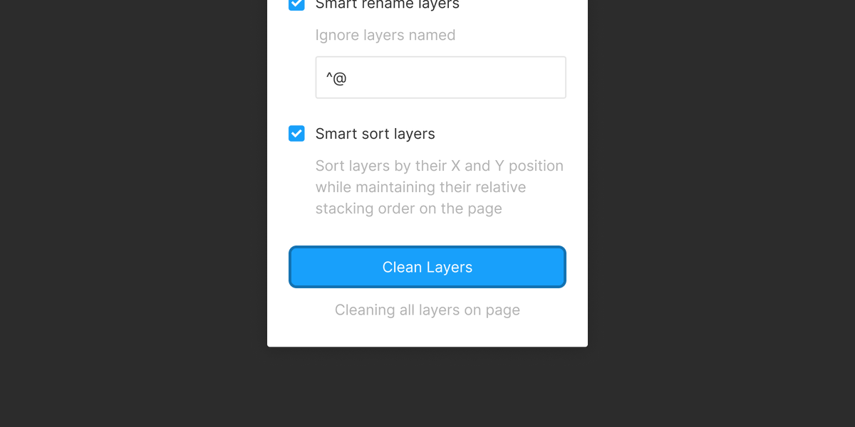 — Define a scope of operation for your plugin.A reasonable approach: Default to operating on layers in the user’s selection, but if the selection is empty, operate on all layers on the current page.State the active scope of operation in your plugin UI." title="https://abs.twimg.com/emoji/v2/... draggable="false" alt="5⃣" title="Keycap digit five" aria-label="Emoji: Keycap digit five"> — Define a scope of operation for your plugin.A reasonable approach: Default to operating on layers in the user’s selection, but if the selection is empty, operate on all layers on the current page.State the active scope of operation in your plugin UI." class="img-responsive" style="max-width:100%;"/>
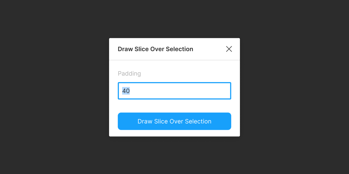 — Retain the user’s previous inputs.Here, the “Padding” setting is pre-populated with the user’s previous input.This is important in plugins that tend to be run repeatedly." title="https://abs.twimg.com/emoji/v2/... draggable="false" alt="6⃣" title="Keycap digit six" aria-label="Emoji: Keycap digit six"> — Retain the user’s previous inputs.Here, the “Padding” setting is pre-populated with the user’s previous input.This is important in plugins that tend to be run repeatedly." class="img-responsive" style="max-width:100%;"/>
 — Show a live preview of the result of running your plugin.The preview should update in real-time as the user adjusts settings in the plugin UI, or when there is a change in the user’s selection." title="https://abs.twimg.com/emoji/v2/... draggable="false" alt="8⃣" title="Keycap digit eight" aria-label="Emoji: Keycap digit eight"> — Show a live preview of the result of running your plugin.The preview should update in real-time as the user adjusts settings in the plugin UI, or when there is a change in the user’s selection." class="img-responsive" style="max-width:100%;"/>
