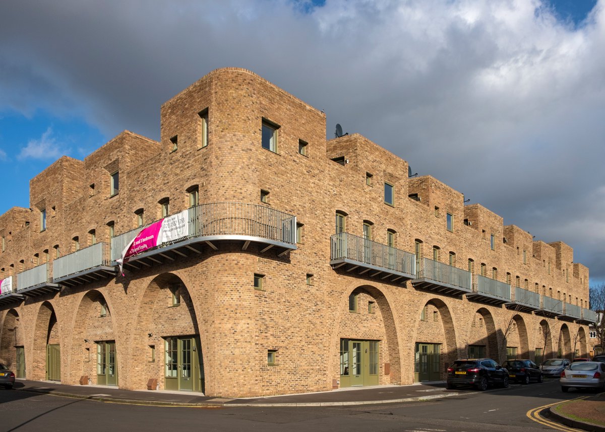
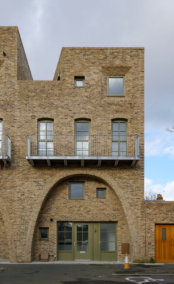
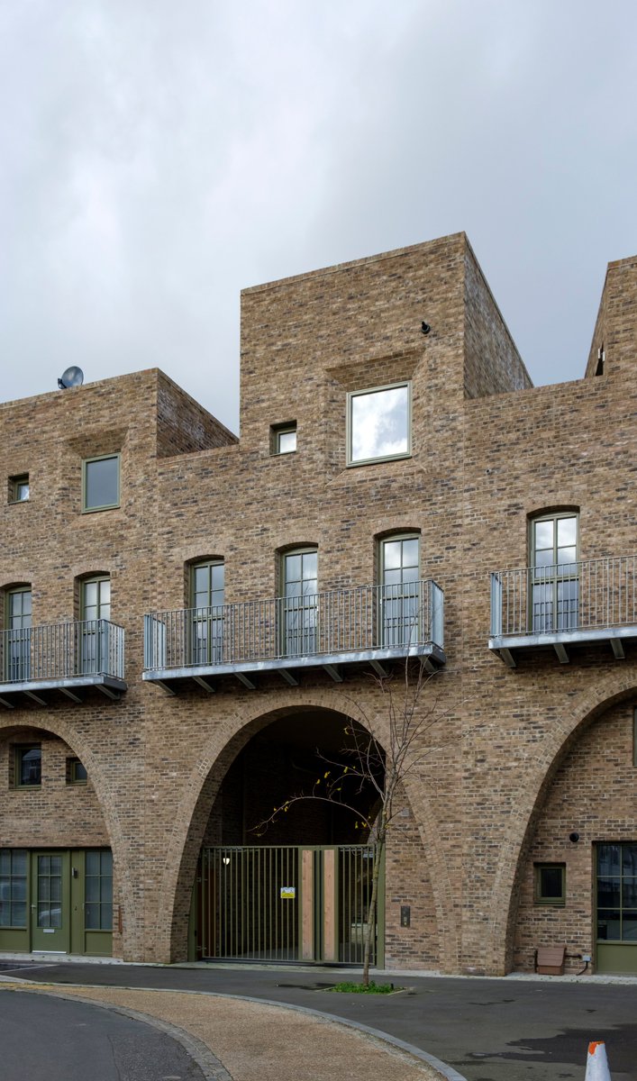
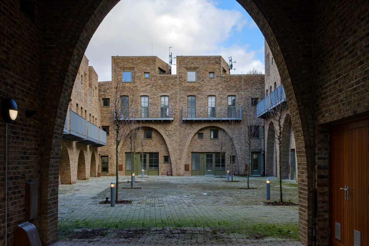
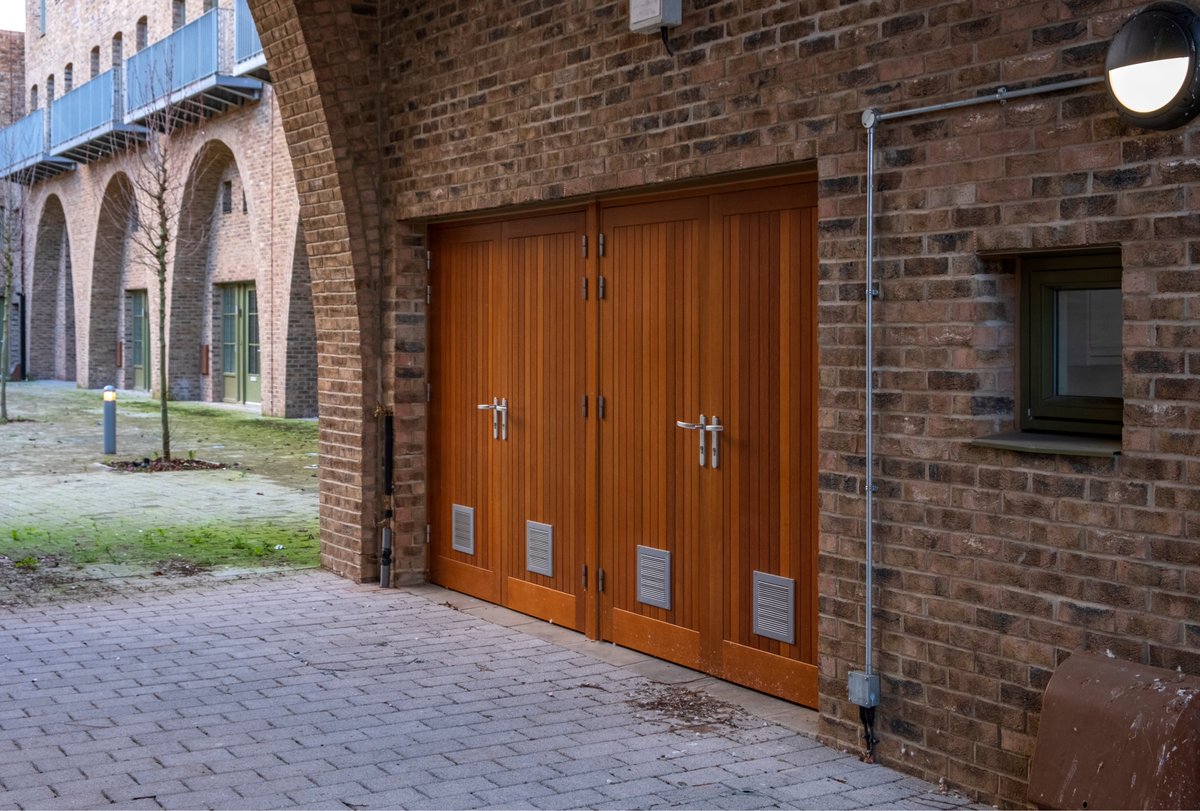
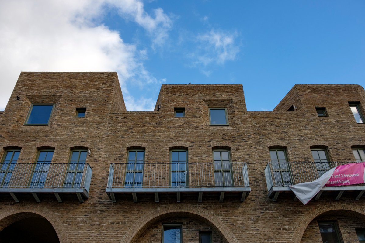
I admire many of the buildings by architect Peter Barber and occasionally go out of my way to see them. In a sea of banality they stand out. Yesterday I visited two and here are some thoughts and photos. Cont...
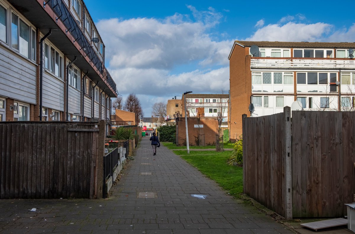
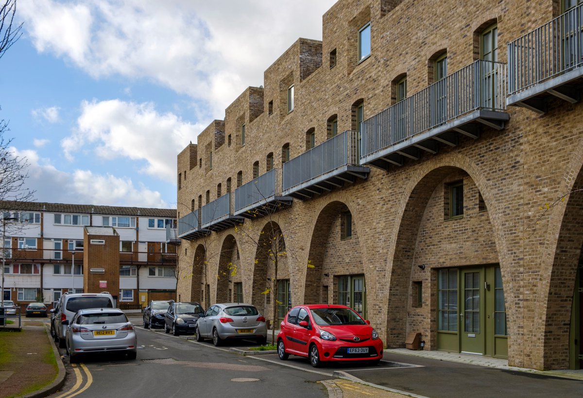
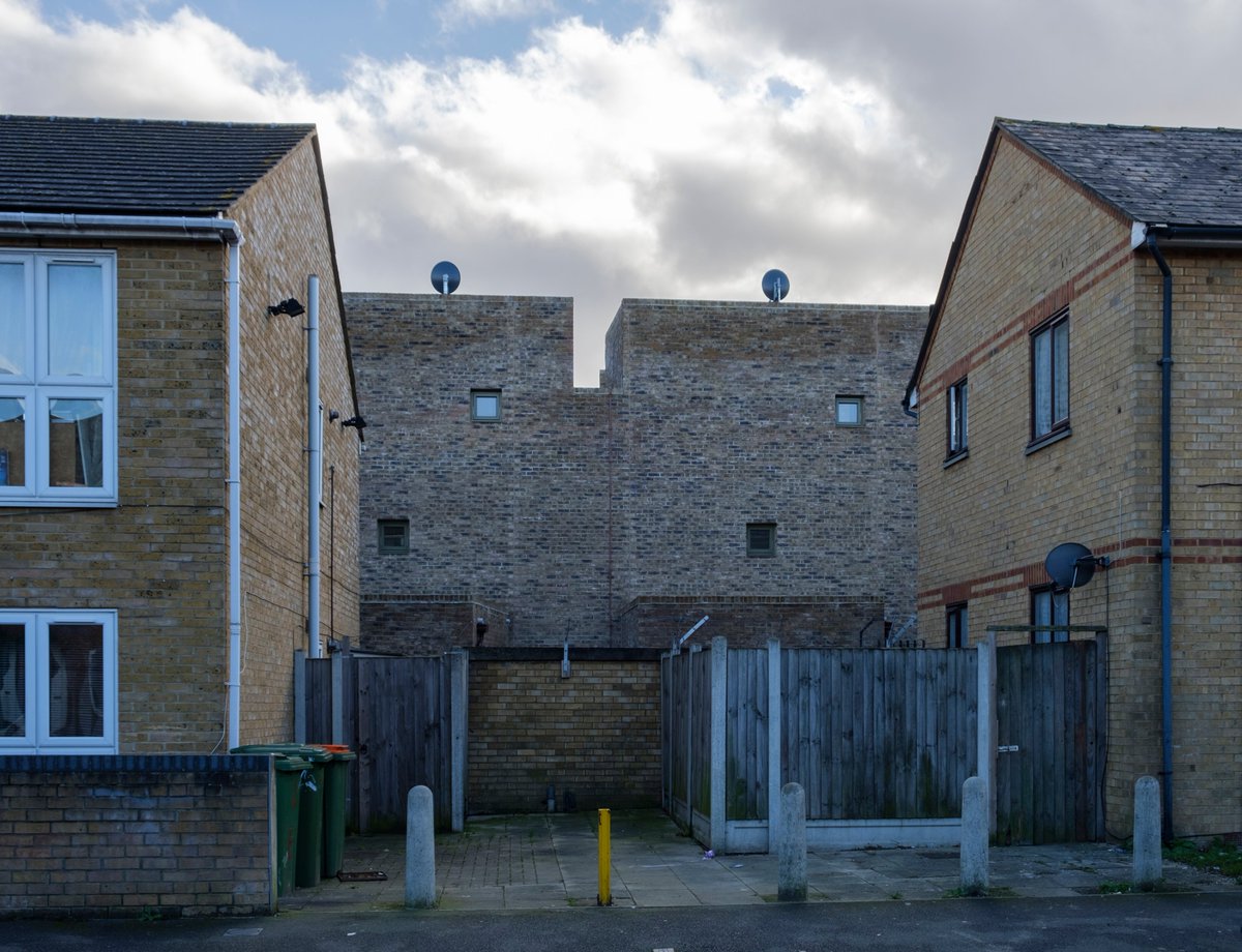
2) McGrath Road was built for Newham Council as shared equity houses. It& #39;s a short bus ride east of Stratford in East London. Here& #39;s the context, set amidst a not particularly nice council estate. It certainly doesn& #39;t aim to blend in (a good thing in this case).
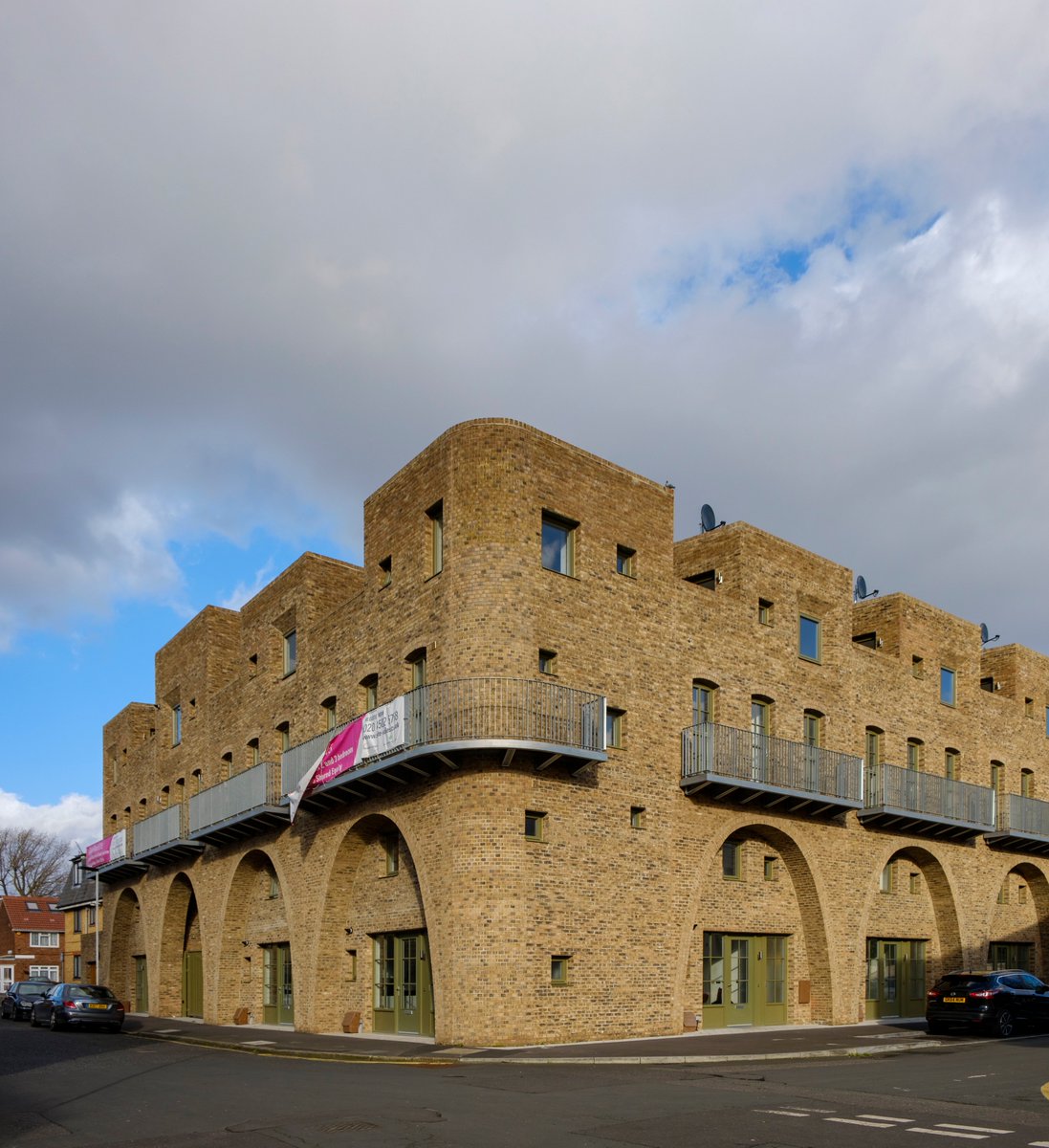
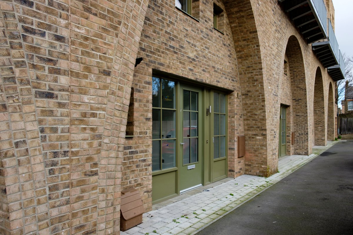
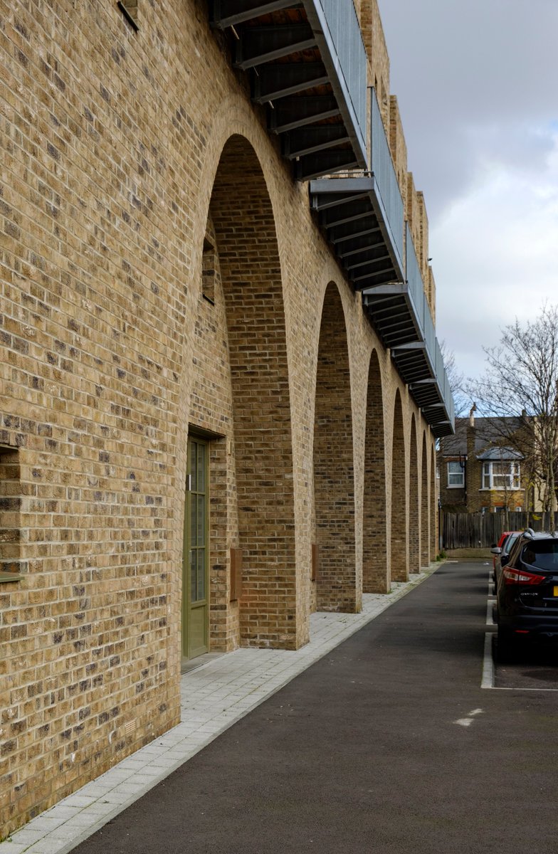
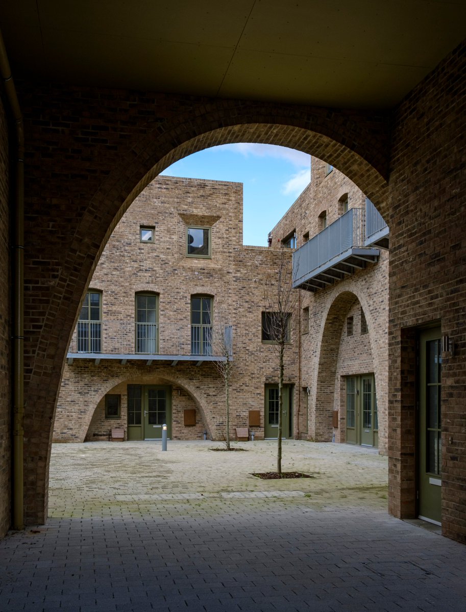
3) Barber is fond of Morocco and you can definitely see that fondness reflected in the architecture. It looks like a kasbah reinterpreted for London. I think it& #39;s his most striking work to date. It& #39;s stark, but the arches are a delightful touch and humanize the design.
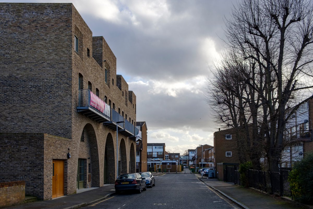
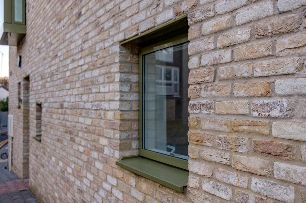
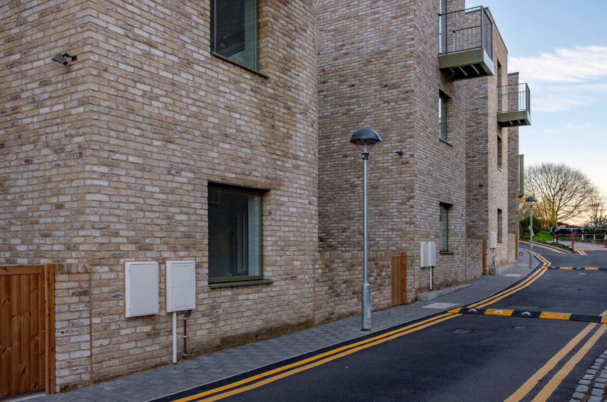
4) The brickwork has been done to a very high standard. Generally the craftsmanship is impressive, apart from a few utility boxes here and there (more on that later). The brick arch lintels above the second storey windows are especially nice.
5) The houses are set around an internal courtyard, which hopefully becomes greener once residents put out some plants (Barber stresses letting residents make their homes their own). As it stands it& #39;s quite a hardscape. The courtyard is accessed through two arched gateways.
6) The solution for bin storage is particularly worth commendation. Compared to most new developments, the bin storage is discreet, out of the way, and the doors seem to be beautiful solid timber.
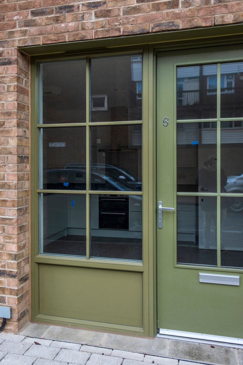
7) Not all is perfect. In fact, some things downright odd. Streetfront entrance into some homes is directly into the kitchen. Worse, there& #39;s not even storage directly by the door. Not good. I& #39;m sure alternative solutions were sought, but still seems like big oversight.
8) The public realm outside is pretty stark, too. Disappointing to see asphalt paving/sidewalks (when will we stop using so much asphalt?). There are a few trees. Again, it could be much better once residents green their own space, though of course no guarantee that they will.
9) I don& #39;t know the story why, but the building has been completed for several months, yet only two homes seemed to be occupied. The council& #39;s shared equity scheme not a success? Another plus, however, is that parking seems to be mainly on-street parking.
10) Overlooking guidelines which don& #39;t permit large windows within 20 meters of neighboring homes likely contributed to the barren backside. Not a great sight. Georgian and Victorian homes aren& #39;t pretty in the back, either, but better than this with their generous windows.
11) On balance, despite the quirks, I left McGrath Road impressed by what I saw. It shows you can build high-quality, interesting homes, even for a council. Private developers have no excuses to build the dehumanizing crap they do in the face of this.
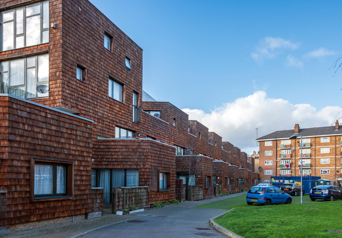
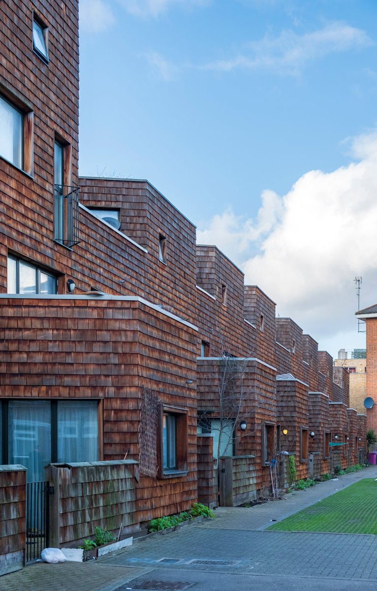
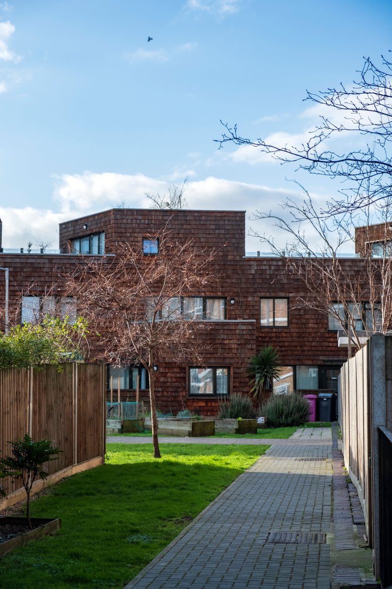
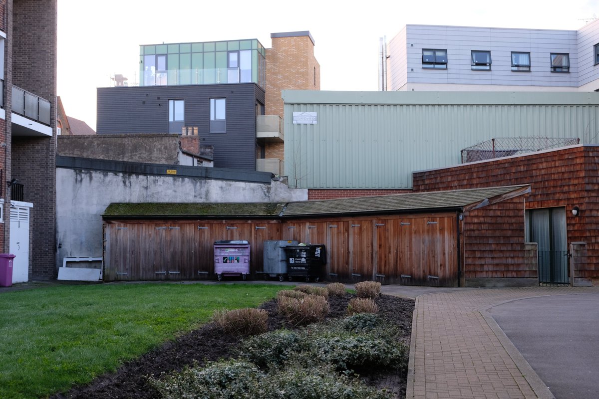
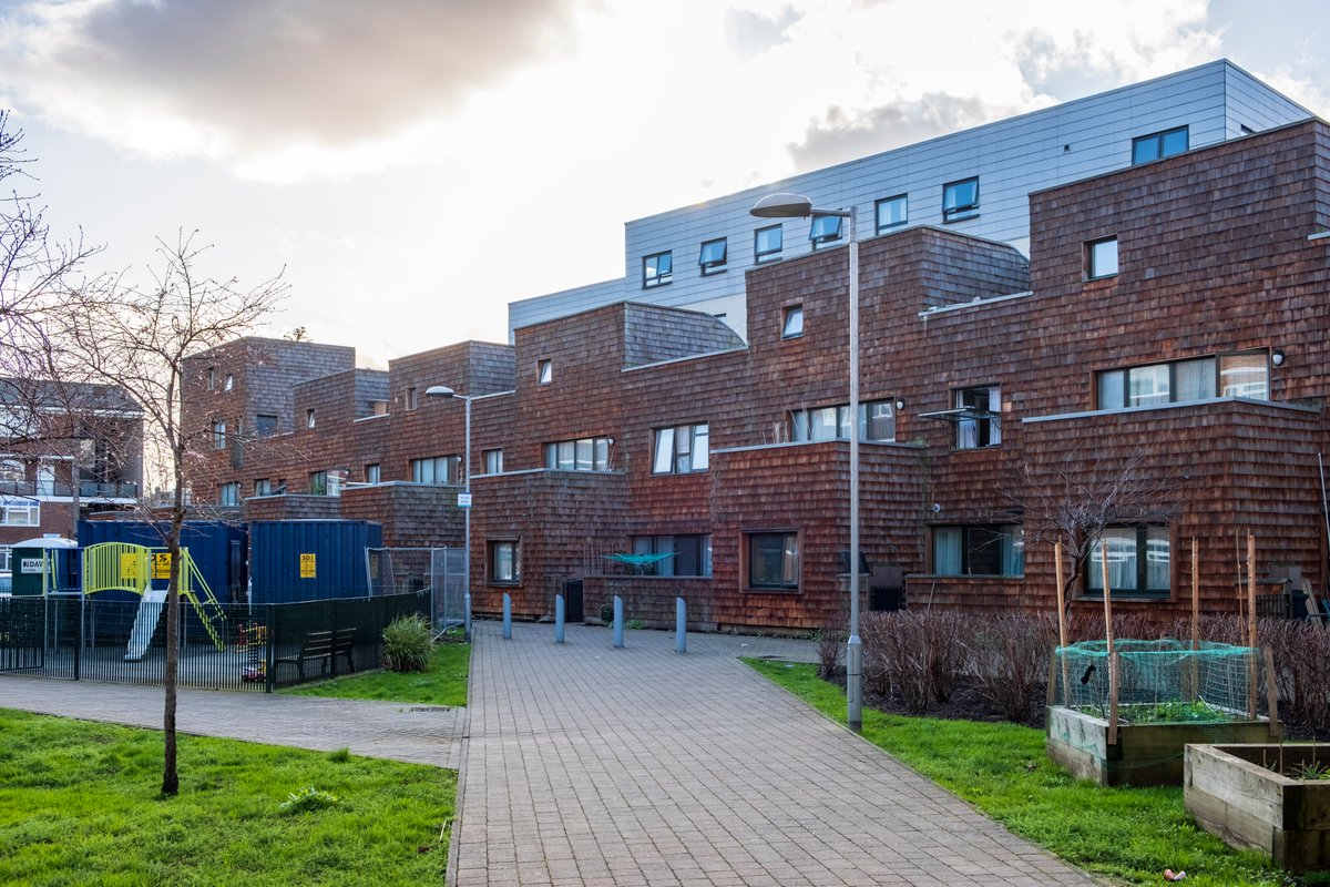
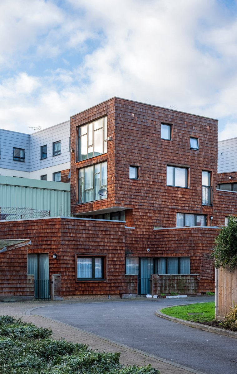
12) I continued my tour going back westwards to Stepney Green, where you& #39;ll find Hannibal Road. I expected to really like this project. I thought it would be one of my favorite Barber projects, based on photos I& #39;d seen. Alas, it is not. I found it pretty bleak.
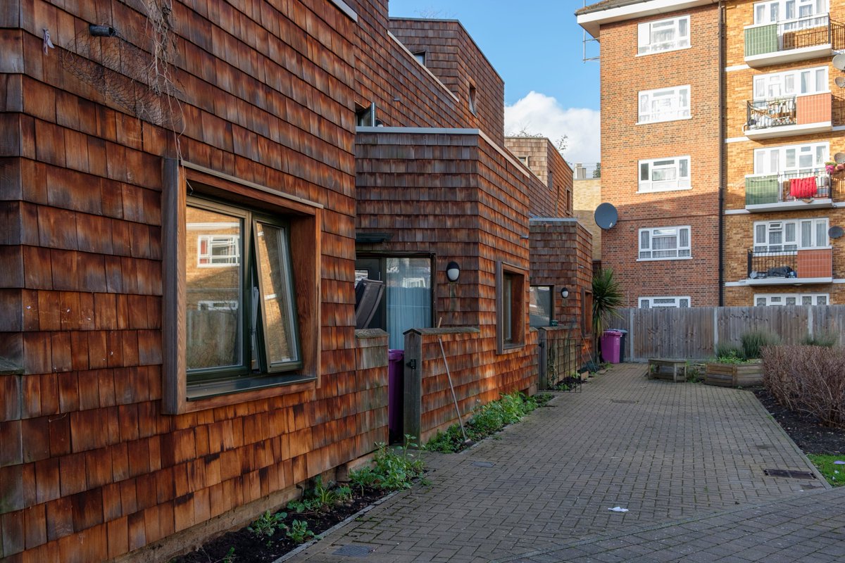
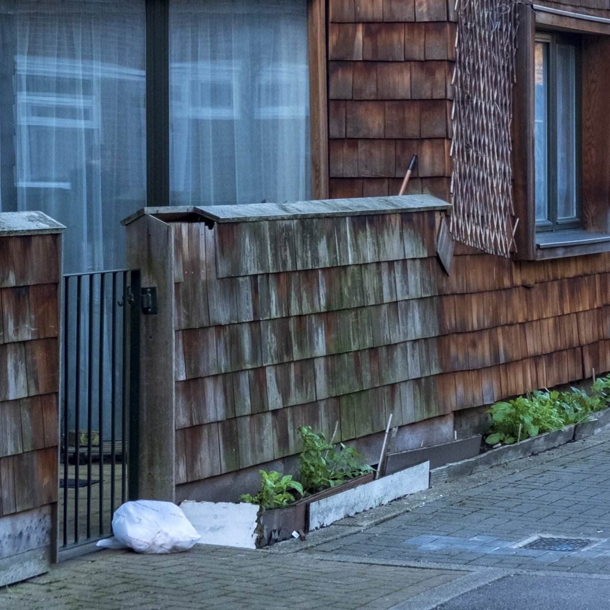
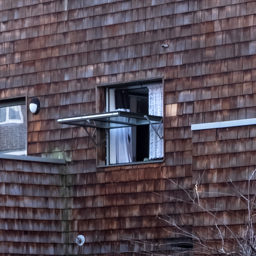
13) The use of timber cladding should have been a home run, but it& #39;s not aging well. The use of modern forms is partly to blame. Traditionally timber cladding would be protected from the elements by deep eaves, which you don& #39;t find here.
14) Maybe it looks better in the summer with lush plants, but the timber will require more maintenance than brick would have, and I already saw some of the doors and windows heavily scratched up, some boards missing, dangling. It does not give a sense of permanence and solidity.
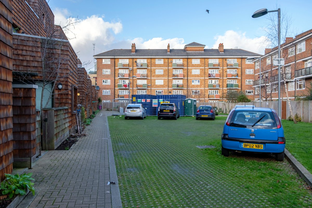
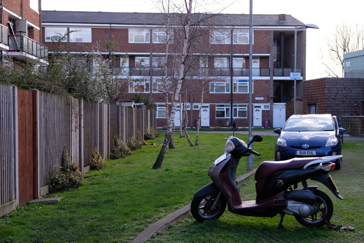
15) The public realm design is a mixed bag. Judging by early designs on Barber& #39;s website, it was not anticipated to have such a large car park out front (thankfully not asphalt). There are a few nice touches: small plants along the fence edge, planters, birch trees...
16) The bin solution here is disappointing. It& #39;s the first thing that greets you when you turn into the lane. It& #39;s large, cheaply built, and I doubt will last more than a couple decades (if that).
17) Can I comment generally on how terrible modern windows are? Ugly, no sense of proportions, cheap, and really awkward opening mechanisms. Who thought it& #39;d be convenient for a window to open like this? Give me a beautiful sash or casement window any day of the week.
18) I left Hannibal Road with the opposite impression compared to McGrath. Despondent and disappointed, however... this isn& #39;t one of Barber& #39;s newest projects and he hasn& #39;t built with this kind of cladding since. If anything, it shows he& #39;s an architect who learns from mistakes.
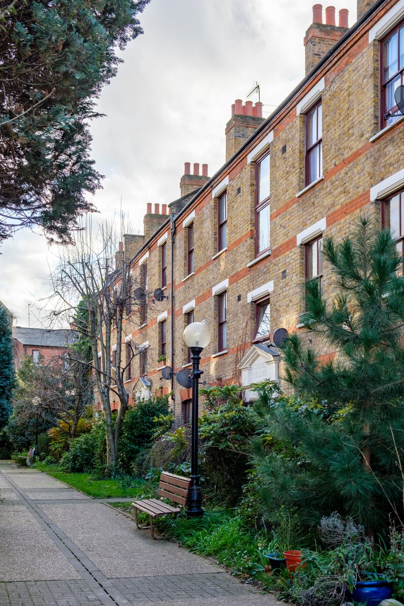
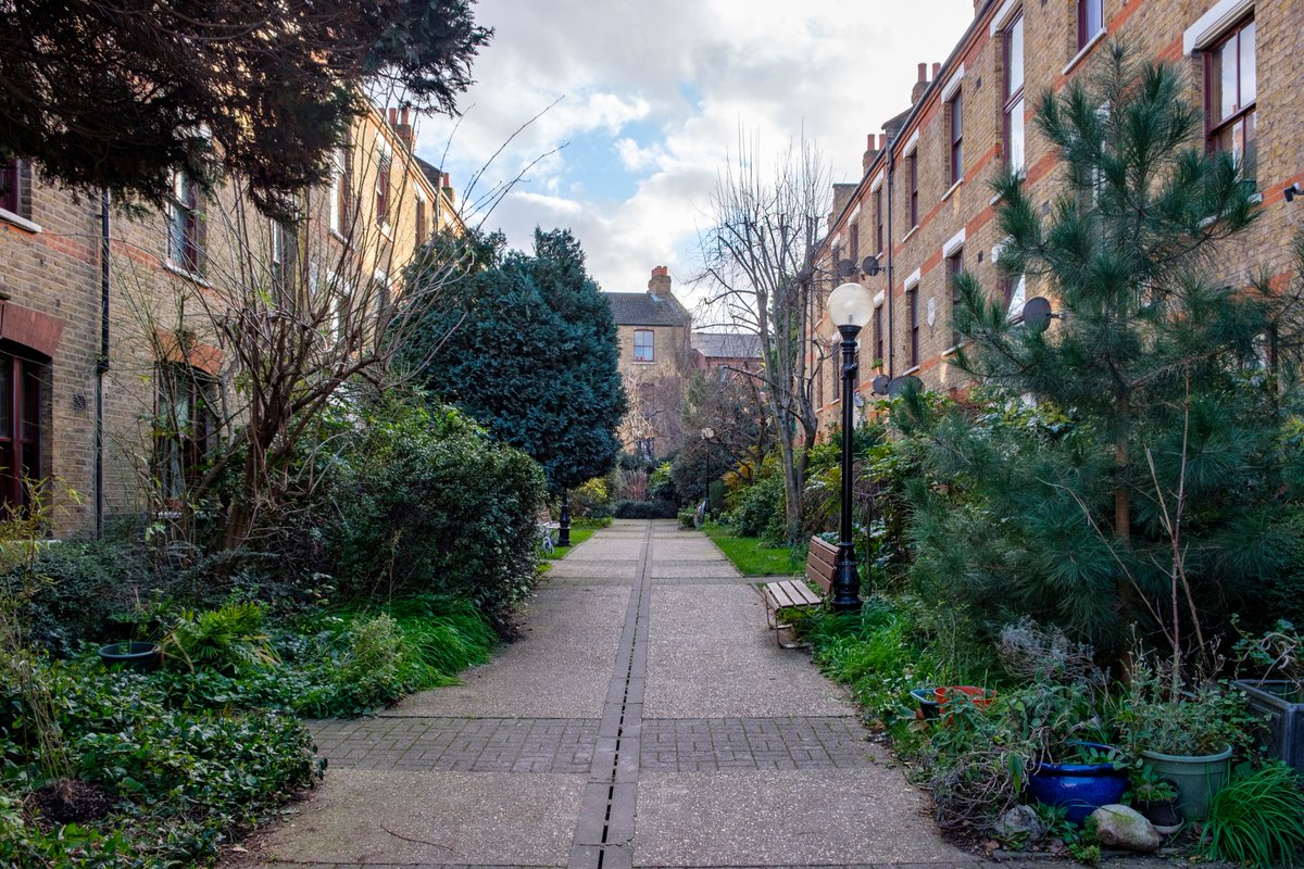
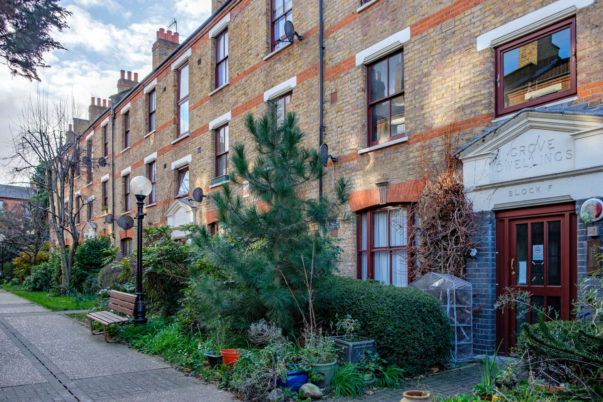
19) Just around the corner is 1898 Victorian housing called Grove Dwellings. The buildings are simple, but they& #39;re brought to life by a splendid garden, vibrant even in February! I can& #39;t speak for the inside, but wouldn& #39;t it be nice to see this in the McGrath Rd courtyard?
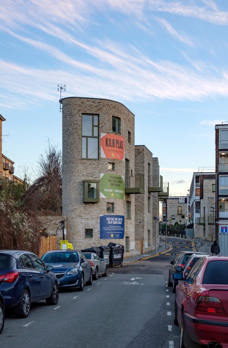
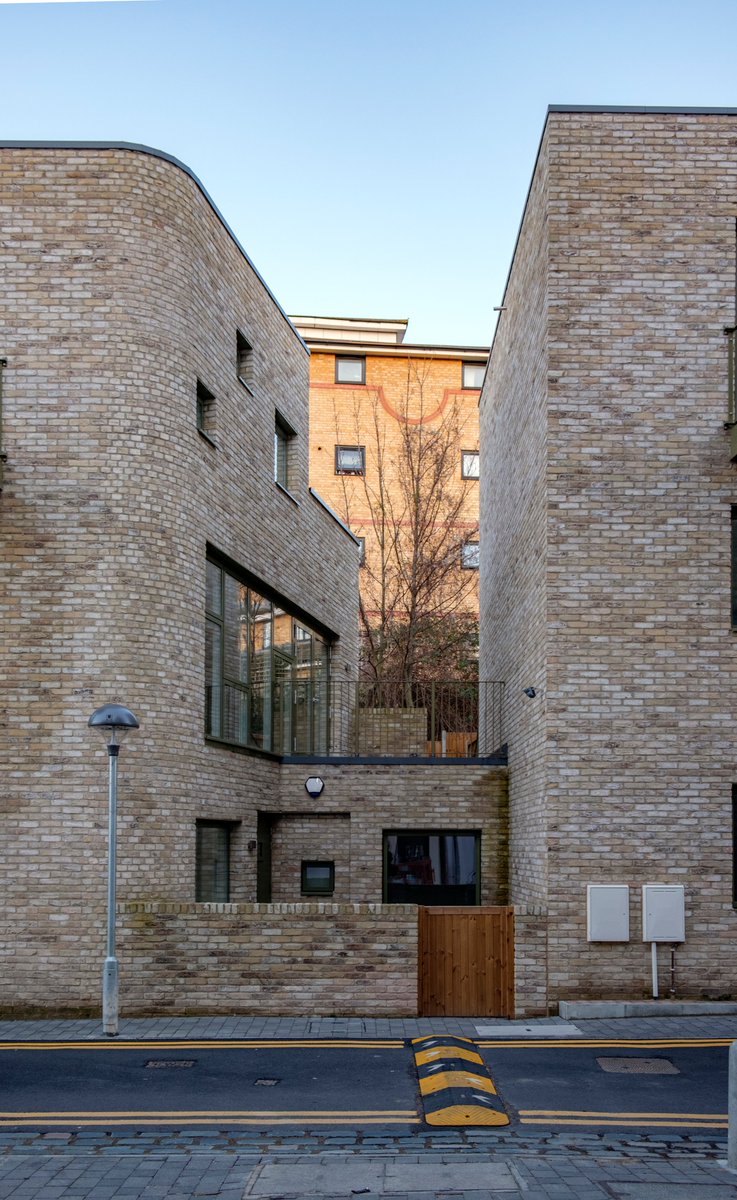
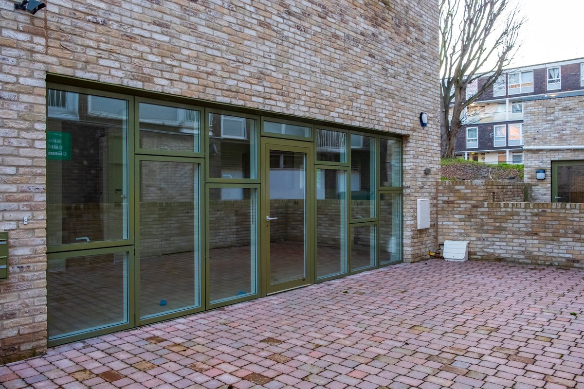
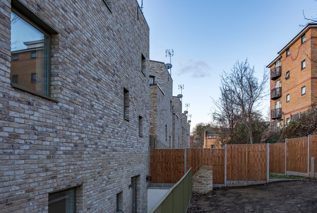
20) I few weekends ago I visited Kiln Place, just south of Gospel Oak Station, which I believe is Peter Barber& #39;s most recently completed project. Built by Camden council, according to the large banner, to "help us pay for new council homes, schools and community spaces".
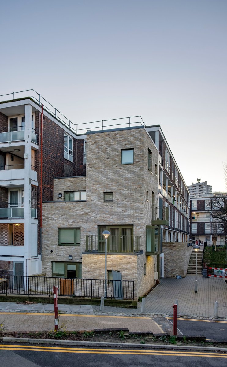
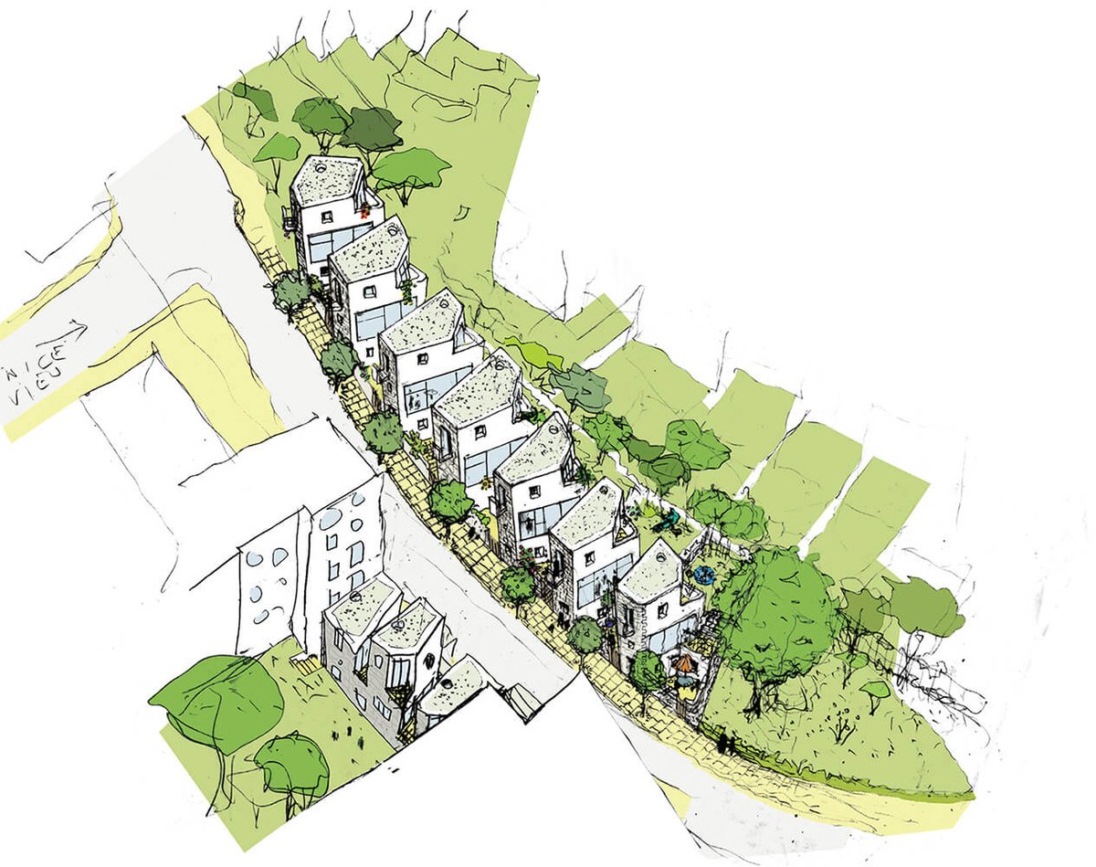
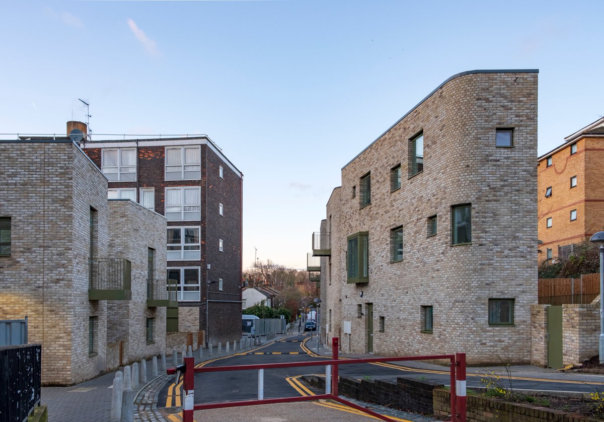
21) This is a part infill, part regeneration project within an existing estate, with a row of new houses on what used to be a disused steep slope, and a few new additions built into the existing estate buildings.
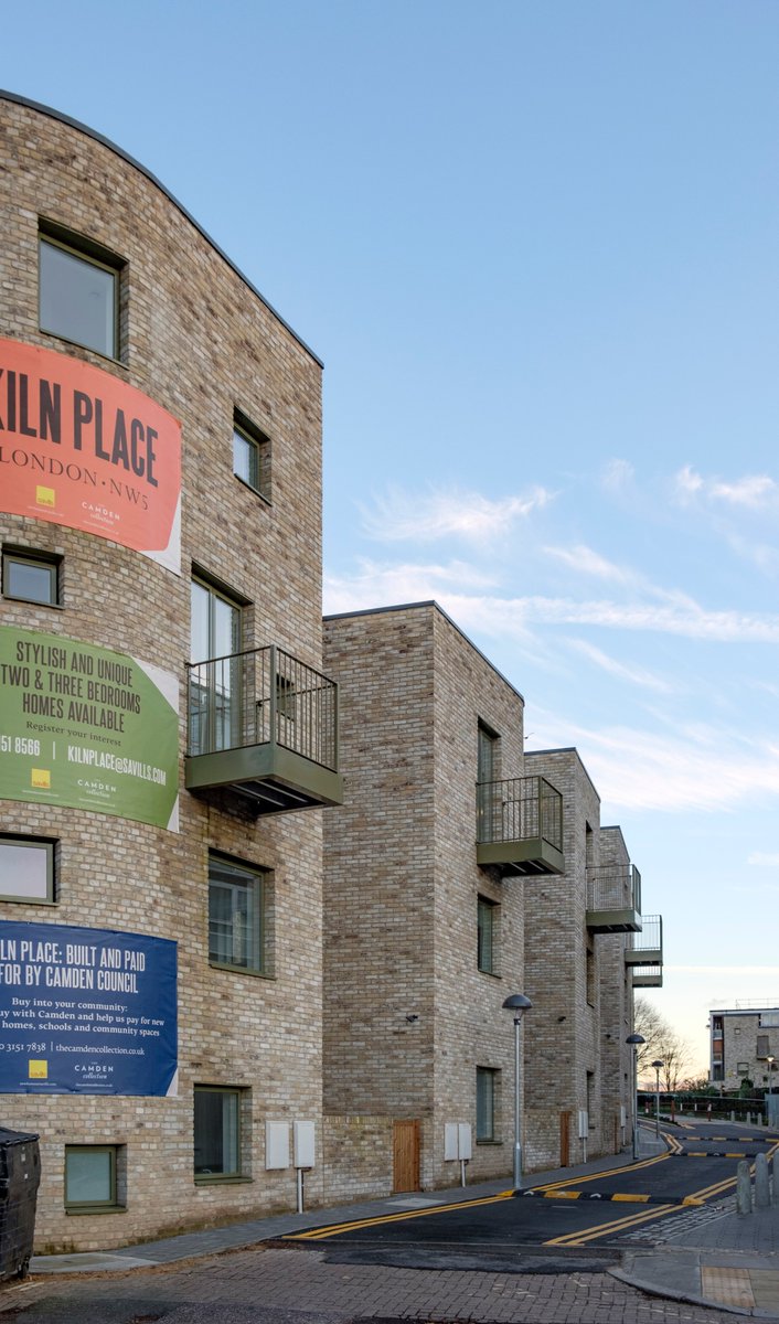
22) These are pretty good. The brickwork is again impressive and there are plenty of private spaces in the form of patios, terraces, balconies, and back gardens.
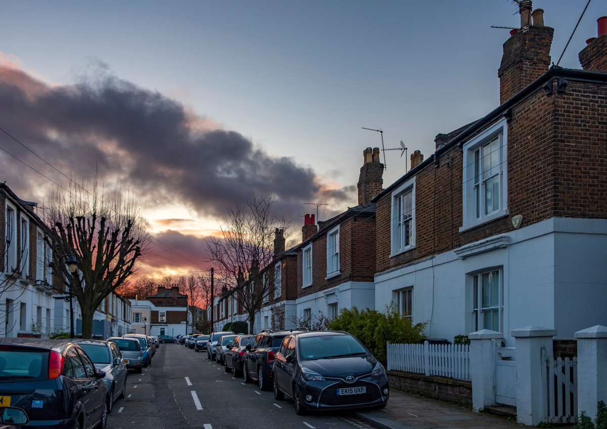
23) The eye-level ground floor windows, however, look directly into bedrooms (quite small and wedge shaped). Unsurprisingly, the one occupied home had the blinds drawn. Georgians and Victorians resolved this by making small setbacks and windows elevated above eye level.
24) The trees on the early drawings don& #39;t seem to have made it through to reality.
Earlier I said I& #39;d come back to utility boxes. Here too they& #39;re unsightly barnacles on the homes. The street lights are also ugly. We underestimate what an eyesore ugly street furniture is.
Earlier I said I& #39;d come back to utility boxes. Here too they& #39;re unsightly barnacles on the homes. The street lights are also ugly. We underestimate what an eyesore ugly street furniture is.
25) The smallest of details can disfigure a steetscape. The massive double yellow lines are completely unnecessary on such a narrow, lightly used lane. If you& #39;re such a discourteous driver as to think you could park here, perhaps you shouldn& #39;t have a license.

 Read on Twitter