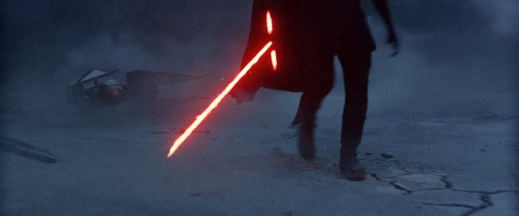
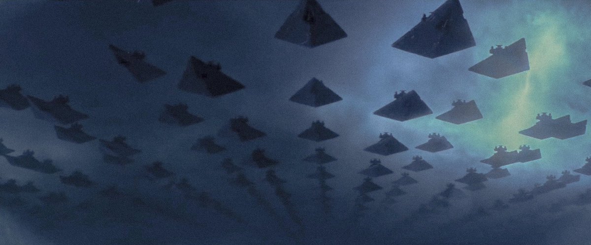
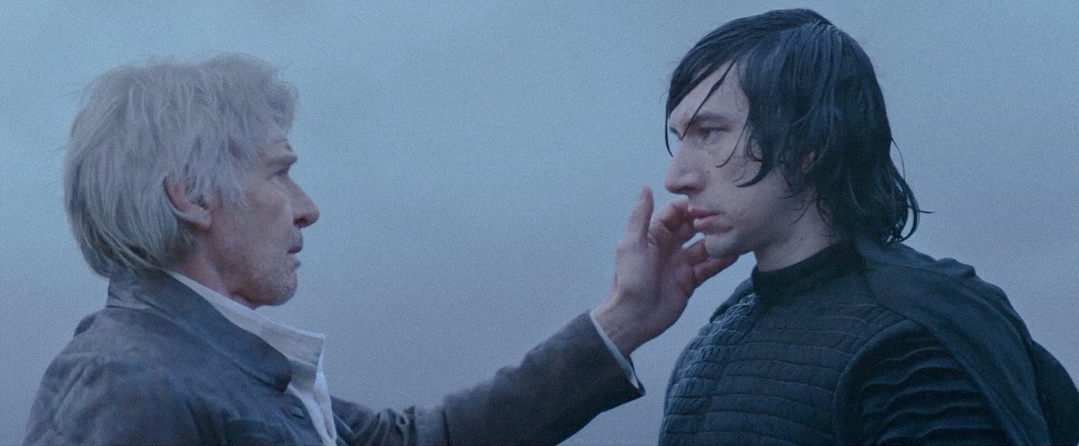
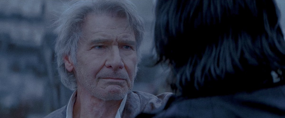
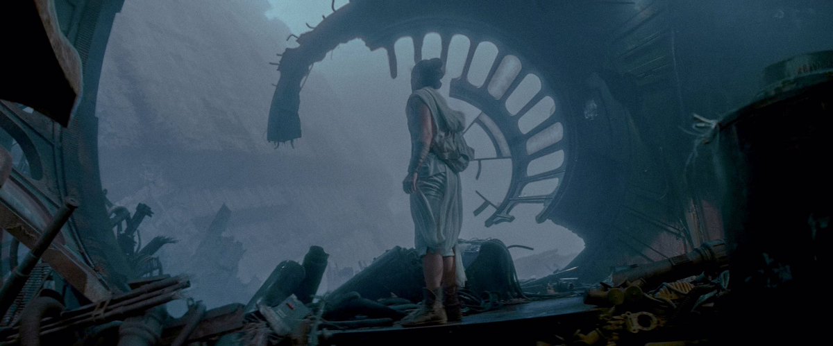
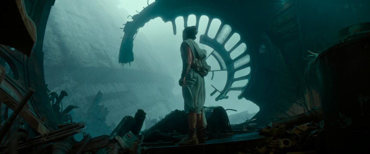
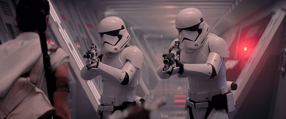
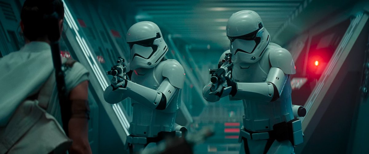
I colour corrected some stills from #StarWars #TheRiseOfSkywalker to be less blue. Added some grain aswell. For this I made Exegol have more of a gray look to add a lifeless feel to it. It also allows Kylo’s saber to pop against the darker colours. More in the thread.
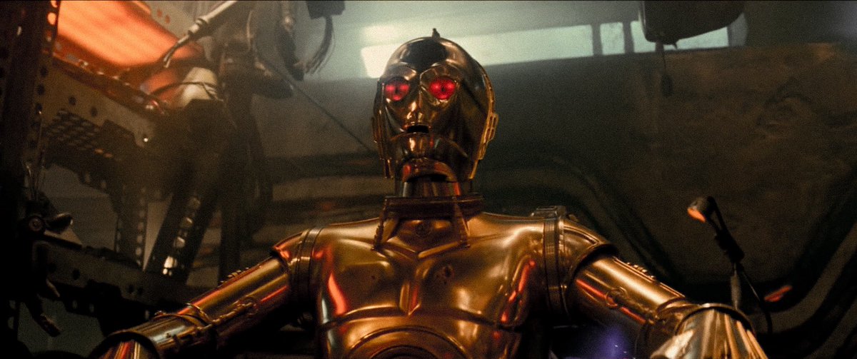
Babu’s workshop seemed too dark in the film. I thought that being a droidsmith he would need lots of light to see properly around the droid parts. So I upped the brightness & shifted the blue tint to a more yellow gold one. Since it’s 3P0’s scene, it features his primary colour.
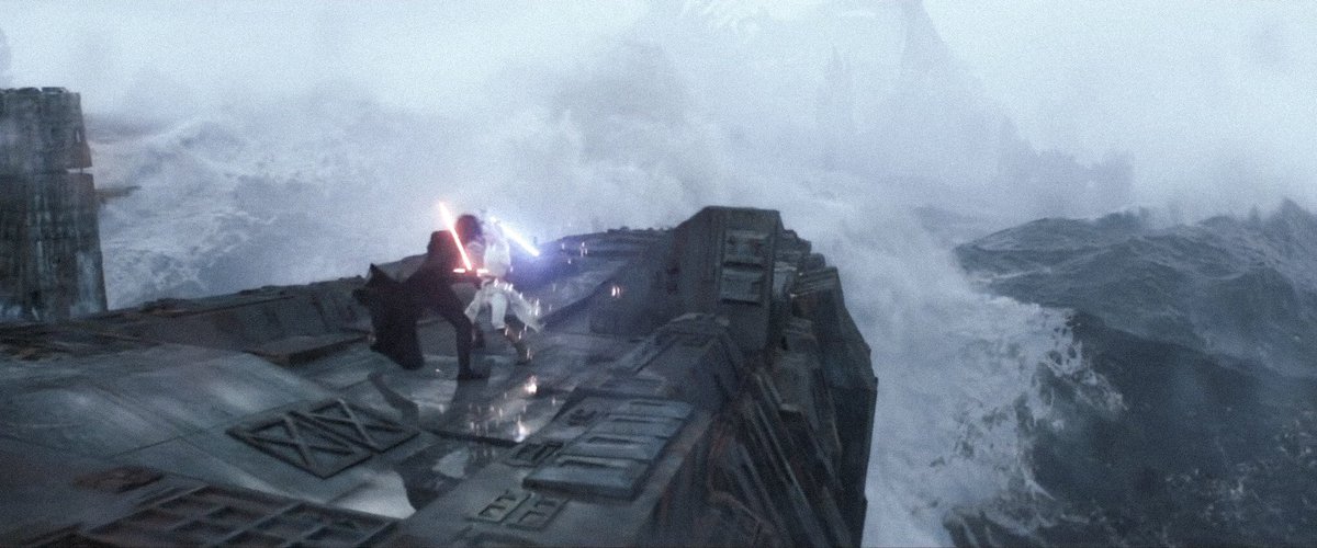
Kef Bir. While the heavy blue is appropriate for a water world, I wanted to do something different. Make the moon seem colder by making the blue white. Also with white, the distant Death Star becomes shrouded in a fog. I like it.
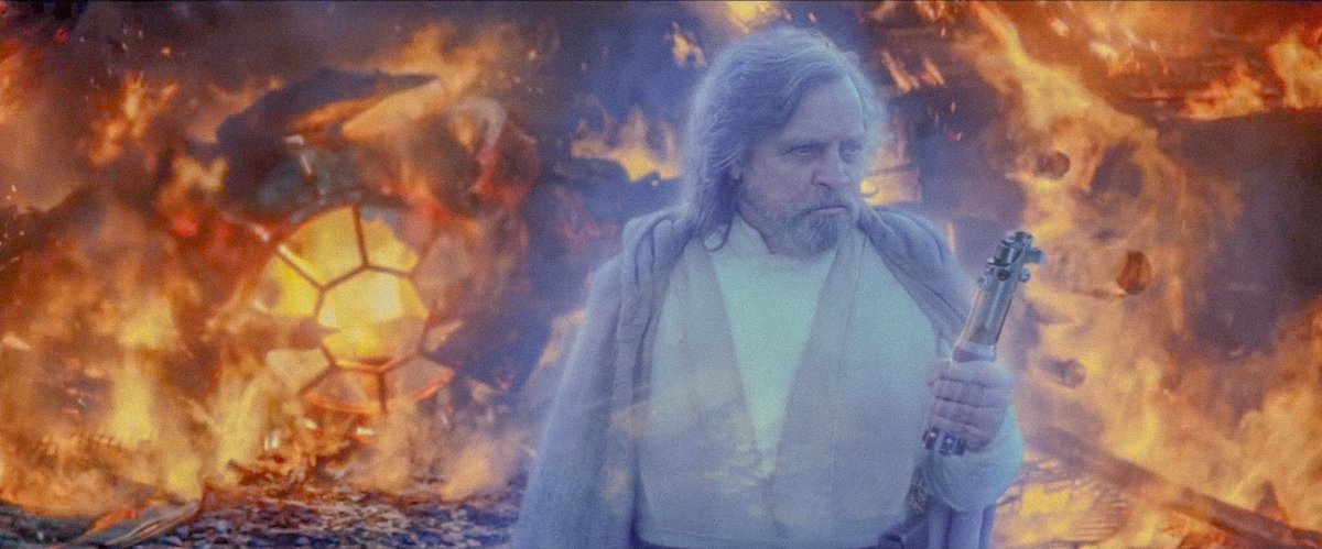
As of today I am expanding the thread! Let’s begin with Luke on Ahch-To. Here I made the fire a bit more clear, same thing with Luke.
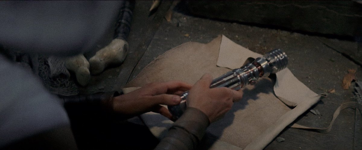
Rey finds Leia’s saber! Lots of blue in the scene. I wanted a more green and brown palette to match the island. Here we can see that the colours pop so much more. Especially the bronze on Leia’s lightsaber. #StarWars
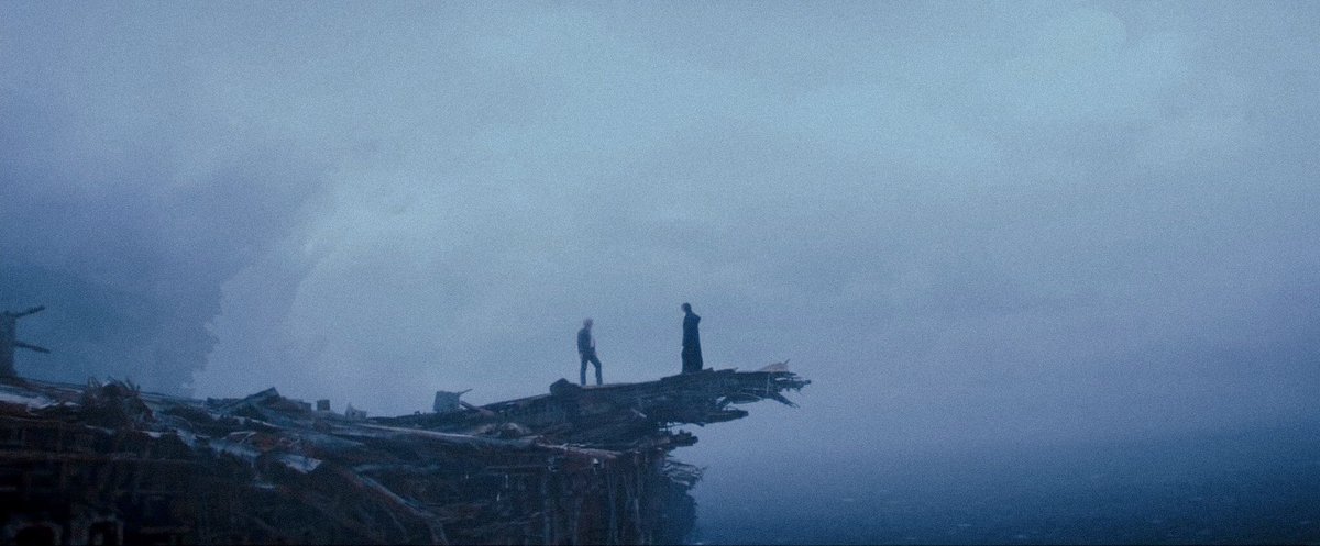
I’m saving the best for last here. Han and Ben. I toned down the overall blue to allow the ocean’s colour to take the spotlight. I also tried to make the colours on the wreckage itself come out more. We can finally see the lovely set itself!
“I know.”
I hope you enjoyed my attempts to add some flair to the look of #TheRiseOfSkywalker
That’s all folks! (For now)
#StarWars
I hope you enjoyed my attempts to add some flair to the look of #TheRiseOfSkywalker
That’s all folks! (For now)
#StarWars
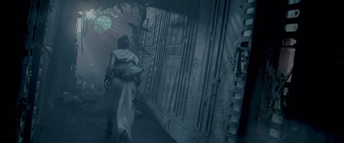
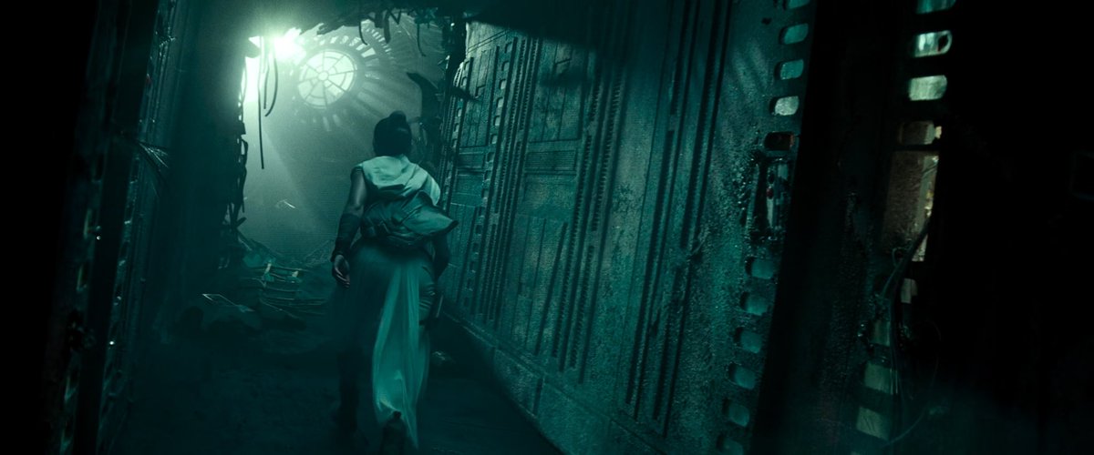
The thread continues! Another Death Star one here. I gave this frame the same colours as my Han & Ben frames since they’re on the same planet. It makes the wreck feel cold and dead. It’s very appropriate.
My favourite shot in the film here. I gave it my pastel blue makeover and it allows some rust to shine through around the room. Adding to the station’s decay.

 Read on Twitter