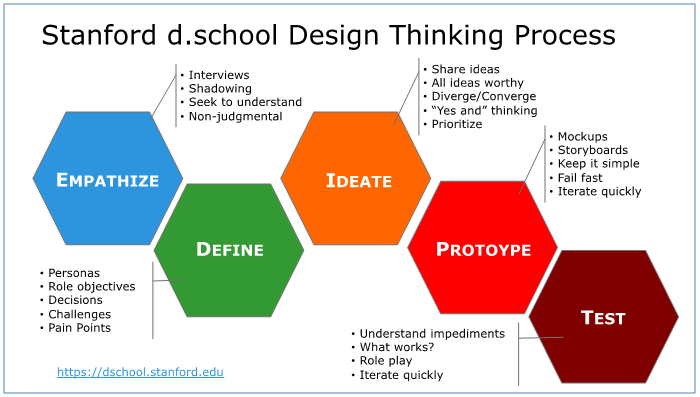
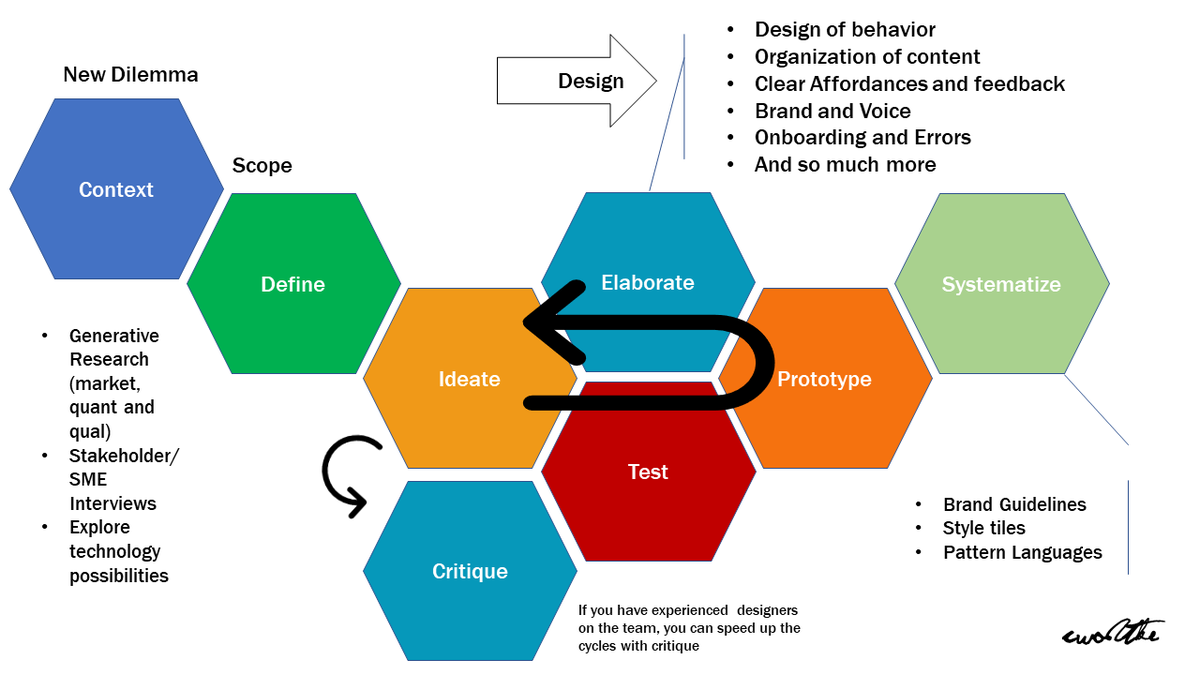
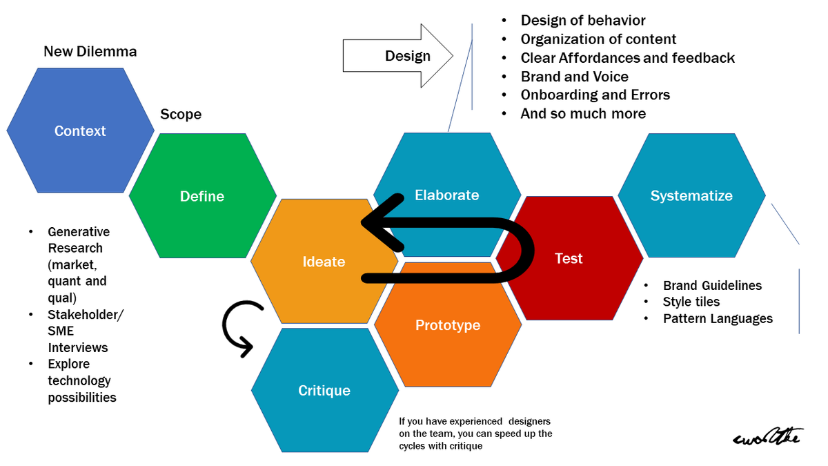
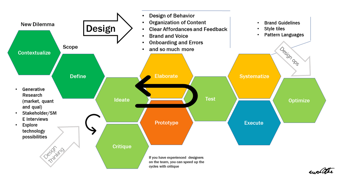
Since working at Stanford, I& #39;ve been staring at the design thinking hex-model a bunch. Finally (maybe it was @lauraklein& #39;s ranting at me) I see the giant missing puzzle piece.
"Elaborate" is the shortest way to say "huge amounts of fucking detailed thoughtful work."
Also: loop.
"Elaborate" is the shortest way to say "huge amounts of fucking detailed thoughtful work."
Also: loop.
I& #39;m sure @stephenanderson would have a few things to say about this (we& #39;ve done visual thinking workshops together.) This model is problematic in its linear nature. See this quote https://twitter.com/cwodtke/status/1205942041617682432?s=20">https://twitter.com/cwodtke/s...
IDEO themselves admits design thinking is not design, nor did they invent it. https://designthinking.ideo.com/history ">https://designthinking.ideo.com/history&q...
So as people have commented on this thread, I’ve noticed a a few misunderstandings about models.
1. Making a good model takes a lot of time and iterations. http://boxesandarrows.com/how-to-make-a-concept-model/">https://boxesandarrows.com/how-to-ma...
1. Making a good model takes a lot of time and iterations. http://boxesandarrows.com/how-to-make-a-concept-model/">https://boxesandarrows.com/how-to-ma...
You can make models to think, to communicate, or to critique. The ones you make for thinking don’t have to make sense to anyone but you, but if they serve the other two purposes they need to be tested.
PEOPLE is you make anything for someone who isn’t you, you must test.
PEOPLE is you make anything for someone who isn’t you, you must test.
People kept saying, why don’t you make what you think is a good model. That’s like saying, this should be a short story or why don’t you build a website for that. I’ve got classes to design! Books to write!
Plus a bad model is GREAT for conversation.
Plus a bad model is GREAT for conversation.
A important thing about models: every aspect holds semantic weight.
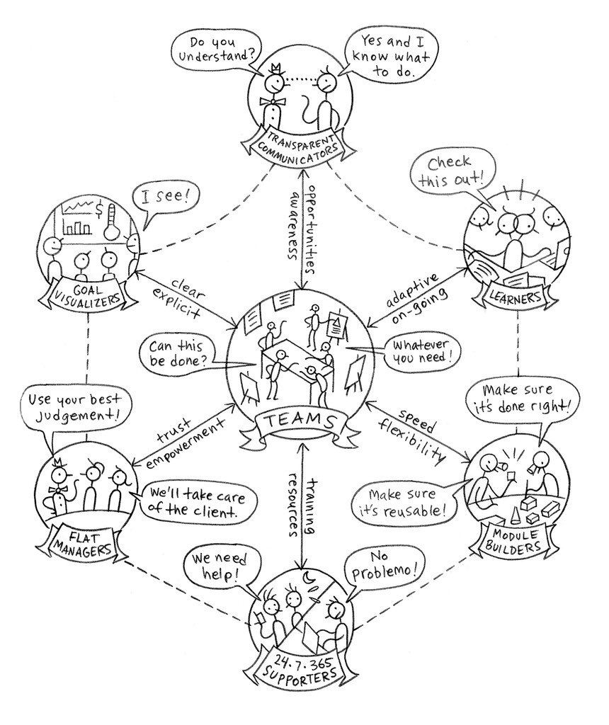
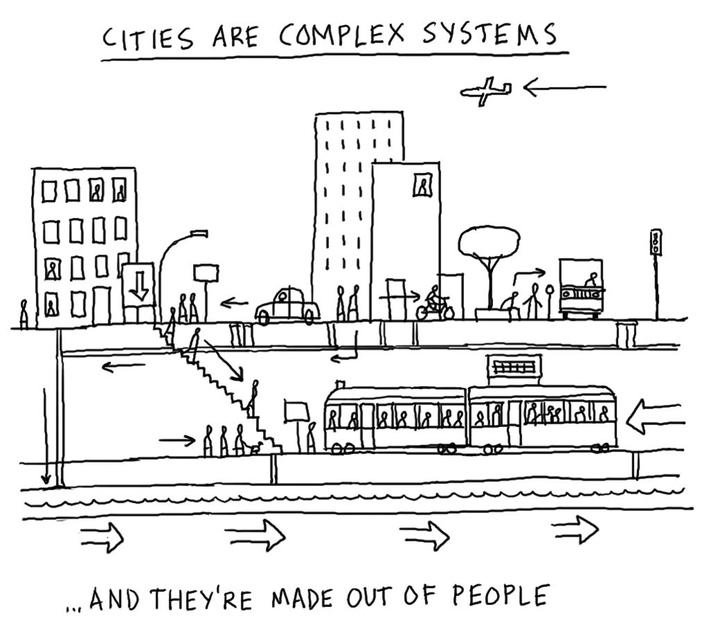
Look at these two Dave Gray works. One is a model and one is an an illustration. You can tell the difference by trying to move one of the elements. If meaning stays essentially the same it’s an illustration.
Look at these two Dave Gray works. One is a model and one is an an illustration. You can tell the difference by trying to move one of the elements. If meaning stays essentially the same it’s an illustration.
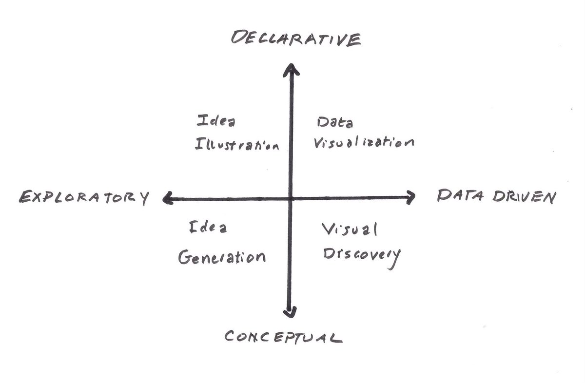
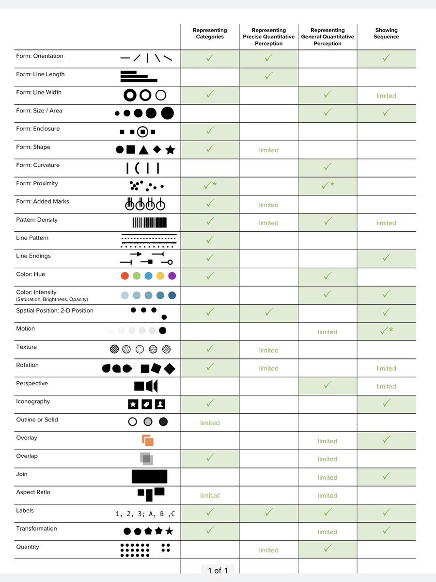
So let’s consider other elements! Color, line, placement... all carry meaning. (Via @stephenanderson )
It’s a reason the dschool process doc is infuriating. What do hexes mean? What do the colors mean? Why is it linear? Is it MECE?
A good model does not have to be MECE... it is worth considering though.
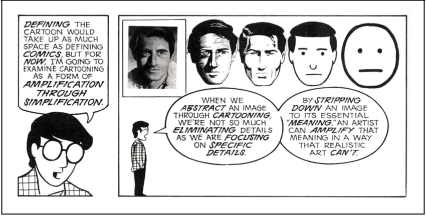
A great model is simple as possible but no simpler. Each element is there to tell one particular story, not all. Over complication is always a danger. But so is over simplification. It’s a tricky balance.
A great model is simple as possible but no simpler. Each element is there to tell one particular story, not all. Over complication is always a danger. But so is over simplification. It’s a tricky balance.
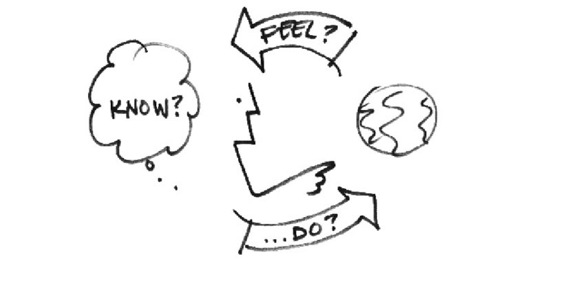
For example, Bill Verplanks model of interaction design is very elegant. In many ways, the core of interaction design is designing affordances and feedback.
I also have a deep fondness for “napkin” models. They can go viral in a way more complex ones can’t.
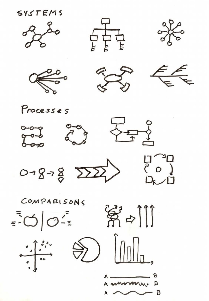
Another problem a lot of folks new to creating models is a lack of vocabulary. https://link.medium.com/ShV2stEDG2 ">https://link.medium.com/ShV2stEDG...
Once you try to model complexity, it’s absolutely required that you use line weight AT LEAST to make it readable.
Using line weight rather than color both helps ppl with color blindness and avoids ugly
If you need it, add color last and make sure the color means something.
Using line weight rather than color both helps ppl with color blindness and avoids ugly
If you need it, add color last and make sure the color means something.

 Read on Twitter