A thread about Monsta X& #39;s logos, typography and symbolism
I started this thread a long time ago when everyone was complaining about the logo change. I put it on hold because there was a lot of research to be done - I& #39;m very detail-oriented - but I was busy with college. I thought now would be a good time to finish it.
The reason is another fandom thinks they are the first to have a official fandom logo, but when a Monbebe showed the first logo released in 2016 they said it& #39;s not a logo, just letters.
I won& #39;t let you insult a memory so precious that many of us even have it tattooed.
I won& #39;t let you insult a memory so precious that many of us even have it tattooed.
𝐂𝐥𝐚𝐬𝐬𝐢𝐜 𝐋𝐨𝐠𝐨
𝐈𝐧𝐭𝐫𝐨𝐝𝐮𝐜𝐞𝐝: April 30th, 2015
𝐓𝐲𝐩𝐞: Monsta X only
𝐕𝐞𝐫𝐬𝐢𝐨𝐧: 1.0
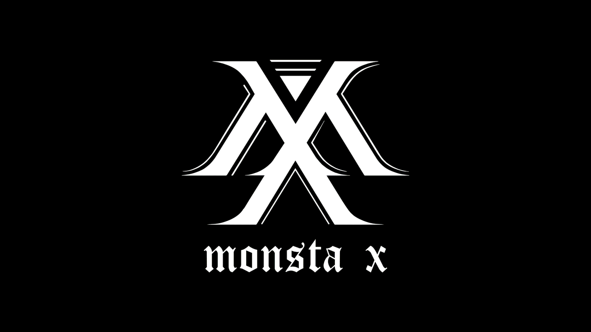
Monsta X& #39;s first logo is an overlaid M and X, the design is based on the blackletter font style.
𝐈𝐧𝐭𝐫𝐨𝐝𝐮𝐜𝐞𝐝: April 30th, 2015
𝐓𝐲𝐩𝐞: Monsta X only
𝐕𝐞𝐫𝐬𝐢𝐨𝐧: 1.0
Monsta X& #39;s first logo is an overlaid M and X, the design is based on the blackletter font style.
The font used for the group name under it is Cloister Black, also blackletter.
Blackletter is a script that dates back to early 12th century. Its gothic strong effect is in opposition to the triangle above.
Blackletter is a script that dates back to early 12th century. Its gothic strong effect is in opposition to the triangle above.
The triangle is a contemporary form, it brings a nonconforming aspect that connects very well with the strong hip-hop sound of their earliest albums.
Overall, it& #39;s a bold and distinguishable design, perfect for the monster rookies taking over K-Pop.
Overall, it& #39;s a bold and distinguishable design, perfect for the monster rookies taking over K-Pop.
𝐌𝐗𝐌𝐁 𝐋𝐨𝐠𝐨
𝐈𝐧𝐭𝐫𝐨𝐝𝐮𝐜𝐞𝐝: April 18th, 2016
𝐓𝐲𝐩𝐞: Monbebe only
𝐕𝐞𝐫𝐬𝐢𝐨𝐧: 1.1
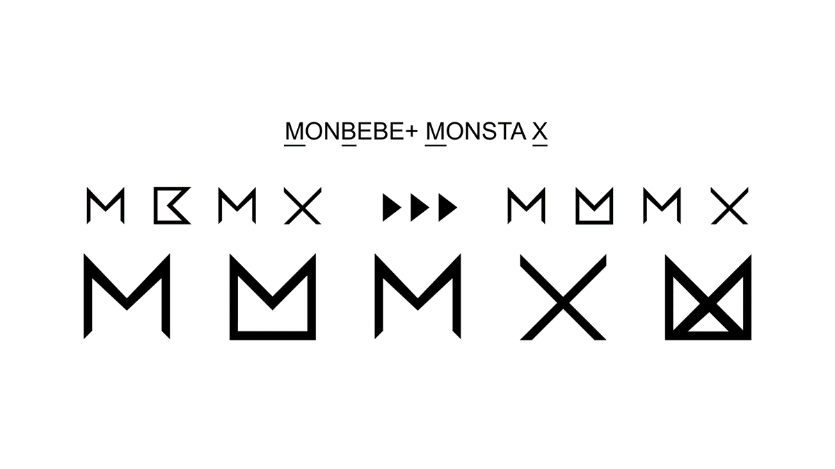
The official Monbebe logo was designed by the members themselves.
𝐈𝐧𝐭𝐫𝐨𝐝𝐮𝐜𝐞𝐝: April 18th, 2016
𝐓𝐲𝐩𝐞: Monbebe only
𝐕𝐞𝐫𝐬𝐢𝐨𝐧: 1.1
The official Monbebe logo was designed by the members themselves.
The minimalistic design is composed of all the letters in MBMX (M̲onb̲ebe + M̲onsta X̲) overlaid and represents a deep connection between idols and fans.
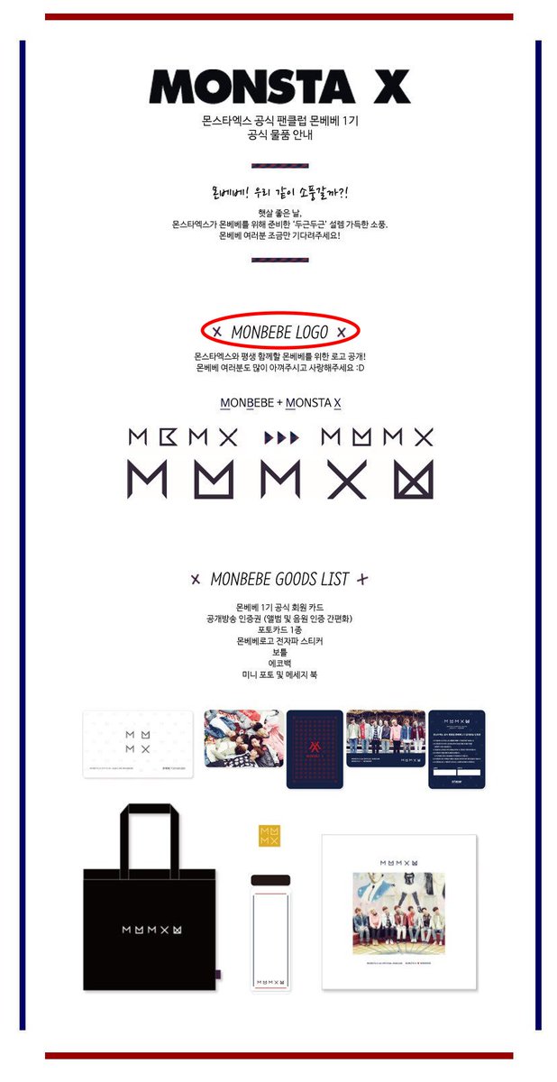
This is the official announcement image, I can only see LOGO written there and definitely not "just letters".
This is the official announcement image, I can only see LOGO written there and definitely not "just letters".
𝐗-𝐂𝐋𝐀𝐍 𝐋𝐨𝐠𝐨
𝐈𝐧𝐭𝐫𝐨𝐝𝐮𝐜𝐞𝐝: May 18th, 2016
𝐓𝐲𝐩𝐞: Members only
𝐕𝐞𝐫𝐬𝐢𝐨𝐧: 1.2
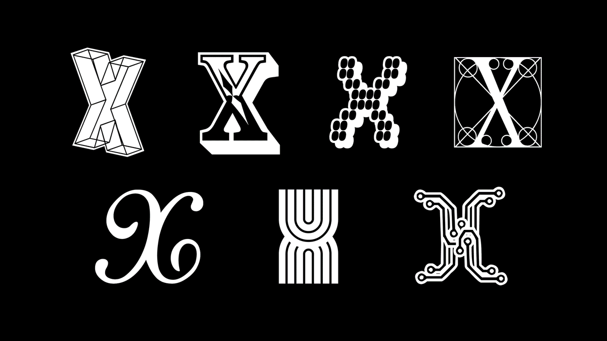
With the start of & #39;The Clan Part.1: Lost& #39;, each member got an X that represents their identities as members of The Clan.
𝐈𝐧𝐭𝐫𝐨𝐝𝐮𝐜𝐞𝐝: May 18th, 2016
𝐓𝐲𝐩𝐞: Members only
𝐕𝐞𝐫𝐬𝐢𝐨𝐧: 1.2
With the start of & #39;The Clan Part.1: Lost& #39;, each member got an X that represents their identities as members of The Clan.
𝐒𝐡𝐨𝐰𝐧𝐮
Let& #39;s start with our leader, the font is & #39;Plexifont BV& #39;, its 3D effect gives his X a lot of movement, perfect for a main dancer.
Let& #39;s start with our leader, the font is & #39;Plexifont BV& #39;, its 3D effect gives his X a lot of movement, perfect for a main dancer.
𝐖𝐨𝐧𝐡𝐨
This is & #39;Rosewood Std Regular& #39;, a old west woodcut font. Like Wonho this font is mysterious and funny at the same time, like an enigma.
This is & #39;Rosewood Std Regular& #39;, a old west woodcut font. Like Wonho this font is mysterious and funny at the same time, like an enigma.
𝐌𝐢𝐧𝐡𝐲𝐮𝐤
For Minhyuk they used the font & #39;Diskoteque& #39;, it& #39;s meant to look fun and bright, just like Minhyuk& #39;s personality.
For Minhyuk they used the font & #39;Diskoteque& #39;, it& #39;s meant to look fun and bright, just like Minhyuk& #39;s personality.
𝐊𝐢𝐡𝐲𝐮𝐧
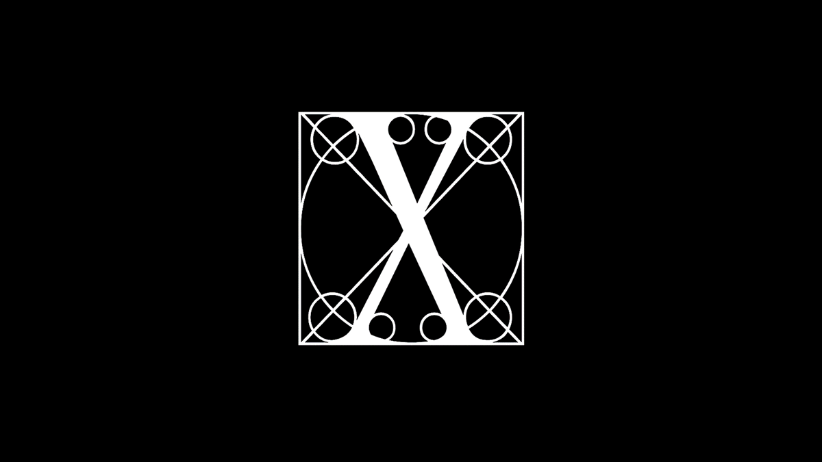
This is & #39;Leonardo& #39;, inspired by Leonardo Da Vinci& #39;s anatomic drawings, it has circles showing the radius used to make each letter& #39;s curves and serifs, reminds of Kihyun& #39;s meticulous character.
This is & #39;Leonardo& #39;, inspired by Leonardo Da Vinci& #39;s anatomic drawings, it has circles showing the radius used to make each letter& #39;s curves and serifs, reminds of Kihyun& #39;s meticulous character.
𝐇𝐲𝐮𝐧𝐠𝐰𝐨𝐧
& #39;Beamie& #39; is a techno font, its urban and groovy feel reminds me of Hyungwon& #39;s DJing, it also has a very unique distinguishable style.
& #39;Beamie& #39; is a techno font, its urban and groovy feel reminds me of Hyungwon& #39;s DJing, it also has a very unique distinguishable style.
𝐉𝐨𝐨𝐡𝐞𝐨𝐧
There& #39;s something musical about & #39;Adage Script JF& #39;, kinda like a partiture. Jooheon is very invested in lyricism and composing so it& #39;s a good combination.
There& #39;s something musical about & #39;Adage Script JF& #39;, kinda like a partiture. Jooheon is very invested in lyricism and composing so it& #39;s a good combination.
𝐈.𝐌
This font - & #39;Park Tech CG& #39; - was made to look like electronic circuits. Changkyun is the youngest, always connected and kind of a nerd so this is a good match.
This font - & #39;Park Tech CG& #39; - was made to look like electronic circuits. Changkyun is the youngest, always connected and kind of a nerd so this is a good match.
𝐁𝐞𝐚𝐮𝐭𝐢𝐟𝐮𝐥 𝐋𝐨𝐠𝐨
𝐈𝐧𝐭𝐫𝐨𝐝𝐮𝐜𝐞𝐝: June 11th, 2017
𝐓𝐲𝐩𝐞: Monsta X and members
𝐕𝐞𝐫𝐬𝐢𝐨𝐧: 2.0
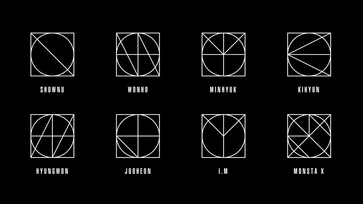
The font used is Helvetica Ultra Compressed. The logos are Monogram diagrams created for Monsta X& #39;s fisrt World Tour & #39;Beautiful& #39;.
𝐈𝐧𝐭𝐫𝐨𝐝𝐮𝐜𝐞𝐝: June 11th, 2017
𝐓𝐲𝐩𝐞: Monsta X and members
𝐕𝐞𝐫𝐬𝐢𝐨𝐧: 2.0
The font used is Helvetica Ultra Compressed. The logos are Monogram diagrams created for Monsta X& #39;s fisrt World Tour & #39;Beautiful& #39;.
Monograms are a motif of two or more letters, theirs were used to write their names.
Shownu& #39;s H seems to be missing though but let& #39;s pretend it& #39;s a lower case "h" using the vertical lines and the upper half of the circle... Maybe that& #39;s actually it.
Shownu& #39;s H seems to be missing though but let& #39;s pretend it& #39;s a lower case "h" using the vertical lines and the upper half of the circle... Maybe that& #39;s actually it.
𝐓𝐡𝐞 𝐂𝐨𝐝𝐞 𝐋𝐨𝐠𝐨
𝐈𝐧𝐭𝐫𝐨𝐝𝐮𝐜𝐞𝐝: October 30th, 2017
𝐓𝐲𝐩𝐞: Monsta X and members
𝐕𝐞𝐫𝐬𝐢𝐨𝐧: 3.0
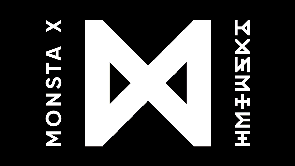
The font used in this version is Gilroy Bold. This logo is M and X, hourglass, infinite symbol and rune, all at the same time.
𝐈𝐧𝐭𝐫𝐨𝐝𝐮𝐜𝐞𝐝: October 30th, 2017
𝐓𝐲𝐩𝐞: Monsta X and members
𝐕𝐞𝐫𝐬𝐢𝐨𝐧: 3.0
The font used in this version is Gilroy Bold. This logo is M and X, hourglass, infinite symbol and rune, all at the same time.
I had to study runes - especially Elder Futhark - to understand the meaning behind this series of logos.
The runes are related to the theory behind Monsta X MV& #39;s, the majority are bindrunes - combinations of runes - so it& #39;s hard to determine which runes are being used.
The runes are related to the theory behind Monsta X MV& #39;s, the majority are bindrunes - combinations of runes - so it& #39;s hard to determine which runes are being used.
𝐌𝐨𝐧𝐬𝐭𝐚 𝐗
This is one of the two runes in this set that are not bindrunes, it& #39;s ᛞ (Dagaz).
Dagaz means day or dawn, the Dagaz rune is represented by a day becoming night and starting again. The meaning is new beginnings, transformations, change, growth and balance.
This is one of the two runes in this set that are not bindrunes, it& #39;s ᛞ (Dagaz).
Dagaz means day or dawn, the Dagaz rune is represented by a day becoming night and starting again. The meaning is new beginnings, transformations, change, growth and balance.
DRAMARAMA is a precisely related to new beginnings, they were given new lives after Beautiful and Shine Forever.
I will make a thread with theory explaining the MV& #39;s later but it& #39;ll take a while because it& #39;s too much information, I& #39;m only halfway done with it.
I will make a thread with theory explaining the MV& #39;s later but it& #39;ll take a while because it& #39;s too much information, I& #39;m only halfway done with it.
𝐒𝐡𝐨𝐰𝐧𝐮
This bindrune is composed of ᛇ (Eihwaz) and reversed ᛁ (Isa).
Eihwaz shows that Shownu& #39;s character is very reliable and strong, he& #39;s ready to protect Wonho. But reversed Isa means that he was deceived by time and Wonho was separated from him.
This bindrune is composed of ᛇ (Eihwaz) and reversed ᛁ (Isa).
Eihwaz shows that Shownu& #39;s character is very reliable and strong, he& #39;s ready to protect Wonho. But reversed Isa means that he was deceived by time and Wonho was separated from him.
𝐖𝐨𝐧𝐡𝐨
This bindrune is composed of reversed ᛖ (Ehwaz) and ᛁ (Isa).
Reversed Ehwaz shows that Wonho wanted to be closer to Shownu but being hasty and time traveling too often to meet him is why he got caught. Isa is his frustration for not being able to see Shownu again.
This bindrune is composed of reversed ᛖ (Ehwaz) and ᛁ (Isa).
Reversed Ehwaz shows that Wonho wanted to be closer to Shownu but being hasty and time traveling too often to meet him is why he got caught. Isa is his frustration for not being able to see Shownu again.
𝐌𝐢𝐧𝐡𝐲𝐮𝐤
This bindrune is composed of ᛖ (Ehwaz) and ᛁ (Isa).
This is smilar to Wonho& #39;s bindrune, Ehwaz means transportation, it refers to Minhyuk time traveling to meet Changkyun. The Isa means he is frustrated for not being able to go back to his brother.
This bindrune is composed of ᛖ (Ehwaz) and ᛁ (Isa).
This is smilar to Wonho& #39;s bindrune, Ehwaz means transportation, it refers to Minhyuk time traveling to meet Changkyun. The Isa means he is frustrated for not being able to go back to his brother.
𝐊𝐢𝐡𝐲𝐮𝐧
This bindrune is composed of ᛁ (Isa) and ᚷ (Gebo).
The Isa is Kihyun& #39;s frustration about Jooheon& #39;s death and not being able to save him even with the clock. The Gebo means sacrifice, relationship and exchange, he sacrificed himself for Jooheon.
This bindrune is composed of ᛁ (Isa) and ᚷ (Gebo).
The Isa is Kihyun& #39;s frustration about Jooheon& #39;s death and not being able to save him even with the clock. The Gebo means sacrifice, relationship and exchange, he sacrificed himself for Jooheon.
𝐇𝐲𝐮𝐧𝐠𝐰𝐨𝐧
This bindrune is composed of ᚺ (Hagalaz) and ᛁ (Isa).
Hagalaz indicates the presence of an uncontrolled force trying to destroy Hyungwon. I& #39;ll explain why in the theory thread. He is frustrated at many things but especially not being able to help the others.
This bindrune is composed of ᚺ (Hagalaz) and ᛁ (Isa).
Hagalaz indicates the presence of an uncontrolled force trying to destroy Hyungwon. I& #39;ll explain why in the theory thread. He is frustrated at many things but especially not being able to help the others.
𝐉𝐨𝐨𝐡𝐞𝐨𝐧
This bindrune is composed of ᚦ (Thurisaz) and ᛏ (Tiwaz).
Tiwaz represents Jooheon honoring Kihyun& #39;s sacrifice, he will lead the others to victory. Thurisaz means Jooheon is the key for a purge that will make a new reality possible.
This bindrune is composed of ᚦ (Thurisaz) and ᛏ (Tiwaz).
Tiwaz represents Jooheon honoring Kihyun& #39;s sacrifice, he will lead the others to victory. Thurisaz means Jooheon is the key for a purge that will make a new reality possible.
𝐈.𝐌
This the ᚾ (Naudhiz) rune with stave modifiers.
Naudhiz indicates I.M was confused by the sudden appearance of Minhyuk at first, he was scared of fighting fate and that was holding him back but he quickly overcame that and went to his rescue.
This the ᚾ (Naudhiz) rune with stave modifiers.
Naudhiz indicates I.M was confused by the sudden appearance of Minhyuk at first, he was scared of fighting fate and that was holding him back but he quickly overcame that and went to his rescue.
Interesting detail I almost forgot: all members who did the time traveling have an Isa in their runes and are frustrated at something.
𝐓𝐡𝐞 𝐂𝐨𝐧𝐧𝐞𝐜𝐭 𝐋𝐨𝐠𝐨
𝐈𝐧𝐭𝐫𝐨𝐝𝐮𝐜𝐞𝐝: March 4th, 2018
𝐓𝐲𝐩𝐞: Monsta X and members
𝐕𝐞𝐫𝐬𝐢𝐨𝐧: 3.1
This is a variation of version 3.0, the new font is Helvetica Neue Black Extended.
𝐈𝐧𝐭𝐫𝐨𝐝𝐮𝐜𝐞𝐝: March 4th, 2018
𝐓𝐲𝐩𝐞: Monsta X and members
𝐕𝐞𝐫𝐬𝐢𝐨𝐧: 3.1
This is a variation of version 3.0, the new font is Helvetica Neue Black Extended.
Only the outlines of the previous logo were kept and a clock with the members& #39; new individual logos placed in it was added.
There& #39;s something magical and misterious about this logo, I especially like the way the lines of the logo and the clock converge, it resembles a compass.
There& #39;s something magical and misterious about this logo, I especially like the way the lines of the logo and the clock converge, it resembles a compass.
The members& #39; individual designs are clocks too, they& #39;re showing a time that gives the clock the shape of their initial.
"𝐀𝐫𝐞 𝐘𝐨𝐮 𝐓𝐡𝐞𝐫𝐞? 𝐖𝐞 𝐀𝐫𝐞 𝐇𝐞𝐫𝐞" 𝐋𝐨𝐠𝐨
𝐈𝐧𝐭𝐫𝐨𝐝𝐮𝐜𝐞𝐝: October 7th, 2018
𝐓𝐲𝐩𝐞: Monsta X and members
𝐕𝐞𝐫𝐬𝐢𝐨𝐧: 3.2
Another variation of Version 3.0, the font is Novecento Carved wide demibold.
𝐈𝐧𝐭𝐫𝐨𝐝𝐮𝐜𝐞𝐝: October 7th, 2018
𝐓𝐲𝐩𝐞: Monsta X and members
𝐕𝐞𝐫𝐬𝐢𝐨𝐧: 3.2
Another variation of Version 3.0, the font is Novecento Carved wide demibold.
This version resembles Escher& #39;s penrose, a symbol of impossible and infinity. This design gives an illusion of depth, shadow and movement. The shadow aspect fits the Seven Deadly Sins concept very well.
The font follows the pattern of creating a illusion of shadow, it& #39;s also used as the members& #39; individual logos in the album.
𝐀𝐛𝐬𝐨𝐥𝐮𝐭𝐞 𝐗 𝐋𝐨𝐠𝐨
𝐈𝐧𝐭𝐫𝐨𝐝𝐮𝐜𝐞𝐝: March 28th, 2019
𝐓𝐲𝐩𝐞: Monsta X and Monbebe
𝐕𝐞𝐫𝐬𝐢𝐨𝐧: 4.0
The font used in this version is Helvetica Ultra Compressed which had been used previously in Version 2.0.
𝐈𝐧𝐭𝐫𝐨𝐝𝐮𝐜𝐞𝐝: March 28th, 2019
𝐓𝐲𝐩𝐞: Monsta X and Monbebe
𝐕𝐞𝐫𝐬𝐢𝐨𝐧: 4.0
The font used in this version is Helvetica Ultra Compressed which had been used previously in Version 2.0.
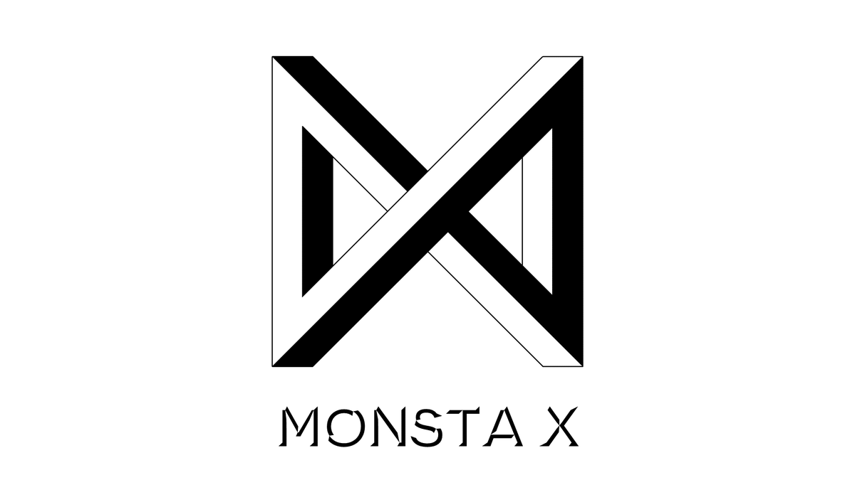
The logo is & #39;MX& #39; but also a |x| - absolute value functions - in which the value of x is always absolute no matter the variants.
Follow - the first korean comeback since logo change - has another scientific: the Minkowski spacetime light cone. The light cone also looks like an X.
Follow - the first korean comeback since logo change - has another scientific: the Minkowski spacetime light cone. The light cone also looks like an X.
The irony of it all though... We had people saying they are copying another group because of the Absolute X logo when, in fact, it means they always stay true to themselves.
Vertical lines with slanted ends are not copying, that thought shows you know nothing about design https://abs.twimg.com/emoji/v2/... draggable="false" alt="🤡" title="Clownsgesicht" aria-label="Emoji: Clownsgesicht">
Vertical lines with slanted ends are not copying, that thought shows you know nothing about design
Well, back to what matters, as of now, there is no new official logo for the members but I made a font based on the group logo. If anyone is interested, I can send the a download link  https://abs.twimg.com/emoji/v2/... draggable="false" alt="👉" title="Rückhand Zeigefinger nach rechts" aria-label="Emoji: Rückhand Zeigefinger nach rechts">
 https://abs.twimg.com/emoji/v2/... draggable="false" alt="👈" title="Rückhand Zeigefinger nach links" aria-label="Emoji: Rückhand Zeigefinger nach links">

 Read on Twitter











 https://abs.twimg.com/emoji/v2/... draggable="false" alt="👈" title="Rückhand Zeigefinger nach links" aria-label="Emoji: Rückhand Zeigefinger nach links">" title="Well, back to what matters, as of now, there is no new official logo for the members but I made a font based on the group logo. If anyone is interested, I can send the a download link https://abs.twimg.com/emoji/v2/... draggable="false" alt="👉" title="Rückhand Zeigefinger nach rechts" aria-label="Emoji: Rückhand Zeigefinger nach rechts">https://abs.twimg.com/emoji/v2/... draggable="false" alt="👈" title="Rückhand Zeigefinger nach links" aria-label="Emoji: Rückhand Zeigefinger nach links">" class="img-responsive" style="max-width:100%;"/>


