Today I& #39;m trying to do a mini lit review on communicating uncertainty in maps of species distributions. It& #39;s astounding how many papers don& #39;t bother to do this at all. Can& #39;t think of other areas where point estimates alone are acceptable. Why is this okay with maps?
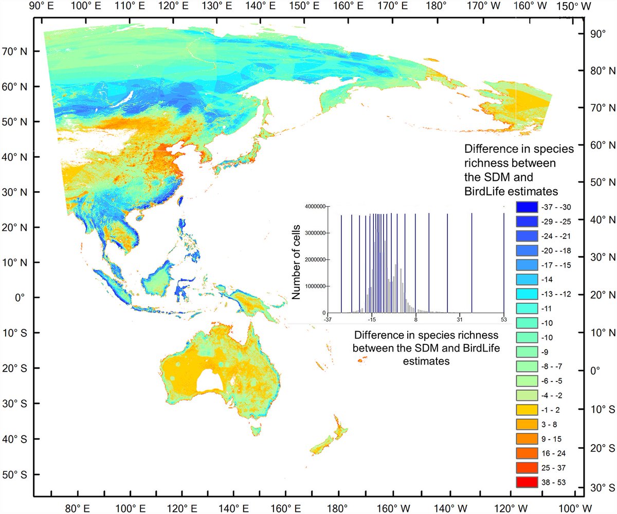
I can& #39;t use this map unless I know the uncertainty in the predictions of each method
This type of map is great, for me it is one of the key outputs of the analysis. but the paper is missing another map - of uncertainty in these estimates
I& #39;m not trying to pick on any particular papers. Seems to me like statisticians have to do a better job of providing the tools to do this and for emphasising the importance.
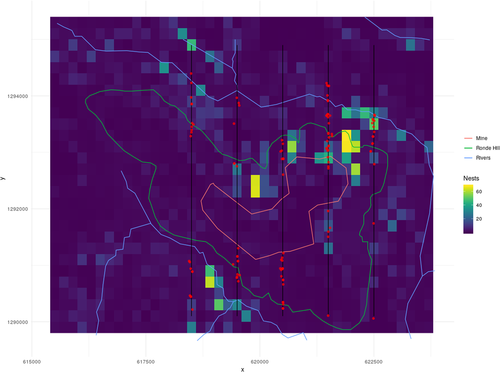
Also - if you put the uncertainty maps in the supplementary materials, that& #39;s fine if someone like me is willing to search high and low for them. But all I do after I find it is put them next to the point estimate map - they only make sense next to each other
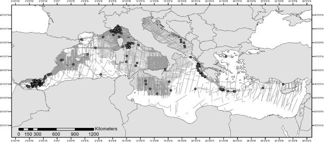
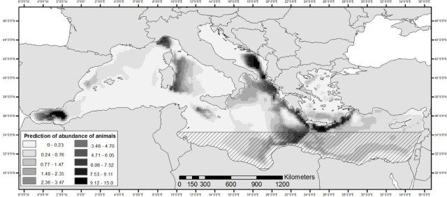
This paper knows uncertainty is important. But they& #39;ve drawn an arbitrary line across an area where they have low sampling effort. But sampling effort is varying outside that area as well. A map of spatially varying uncertainty would be nice
The caption for that figure includes "Results in striped areas (Aegean Sea and South-eastern Mediterranean) are not very reliable due to very small sample size."

 Read on Twitter


