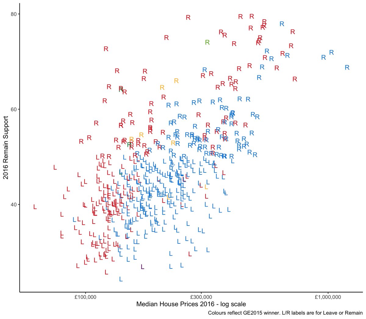
With four weeks to go to election day, time to focus on two things British people really care about: house prices and Brexit. Regular readers will know my own obsession on this topic, summed up in this figure, showing support for Remain vs house prices in 2016 by constituency 1/n
It& #39;s a strong positive relationship, which we also in wards, and across regions. House prices are logged btw and the colour reflects who held the seat in 2015 and L and R stand for Leave and Remain. By and large Remainia has more expensive houses than Leaveland. 2/n
Why? I refer you to my paper with @davidrkadler, open access at https://www.tandfonline.com/doi/full/10.1080/01402382.2019.1615322">https://www.tandfonline.com/doi/full/... and with data at https://benwansell.com/data/ .">https://benwansell.com/data/&quo... All supported by my @ERC_Research grant (thanks!). 3/n
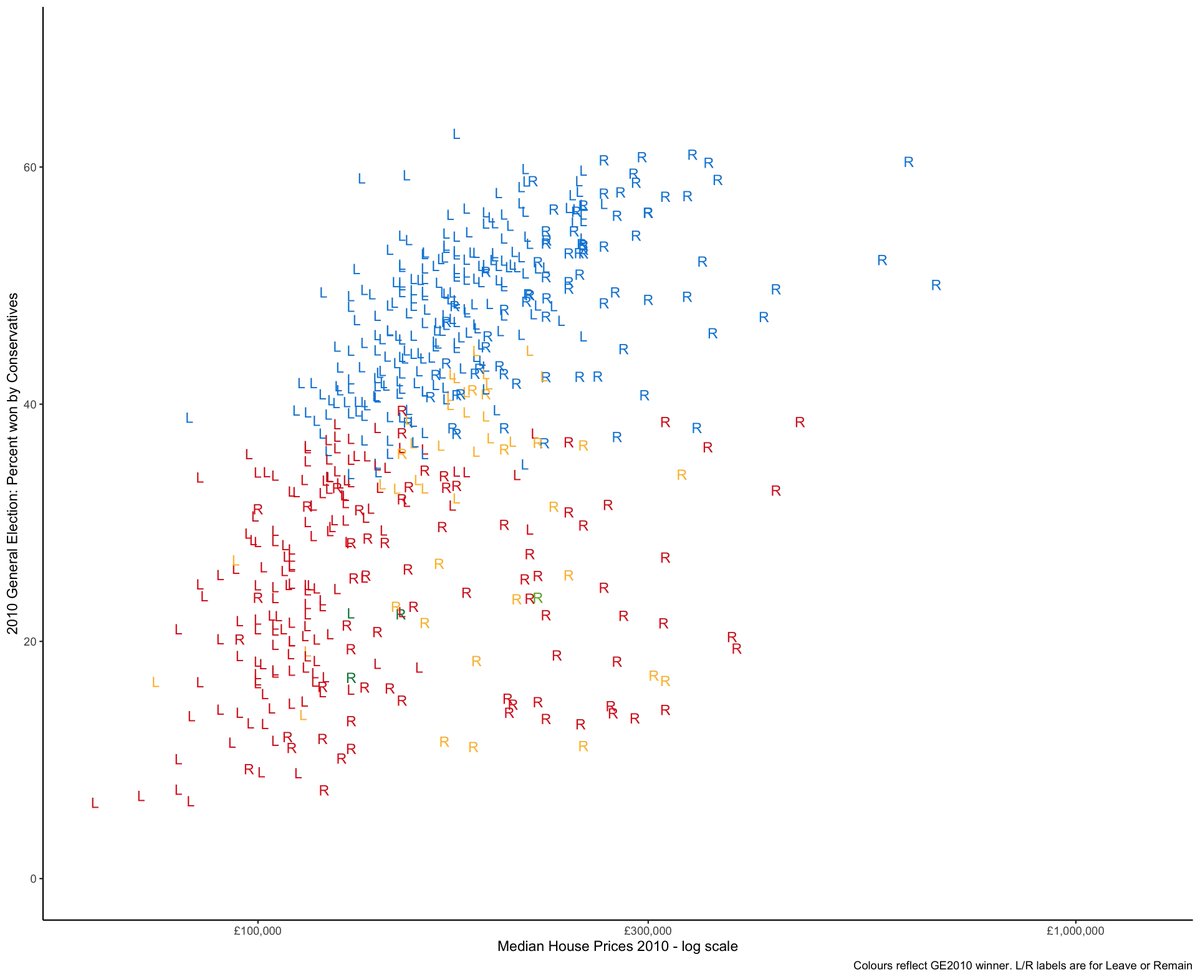
But what I& #39;m interested in today is whether there has been a connection between average wealth at the constituency level (in housing) and standard left-right voting since 2010. So let& #39;s have a look-see. Here is the figure for 2010 (with 2010 prices, votes, etc). 4/n
We see by and large a positive relationship. We also see that places that voted Remain in 2016 had higher 2010 house prices. So while there is a broad Conservative vote / house price correlation, already there is a group in bottom right that are expensive and vote Labour 5/n
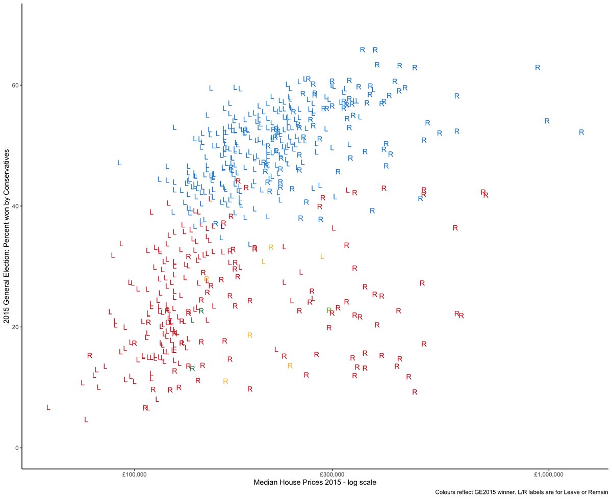
But my general view on this is that in the deep dark lost history of 2010 there was a residential wealth / Tory vote correlation that was fairly strong. Now let& #39;s turn to 2015. A couple of things going on. House prices becoming more diffuse and the correlation weakening. 6/n
We see even more separation of the (year) later Remain voting areas from the trend line elsewhere. These are the areas that experienced the QE related second housing boom and are largely in London / SE. And they& #39;re voting Labour more. 7/n
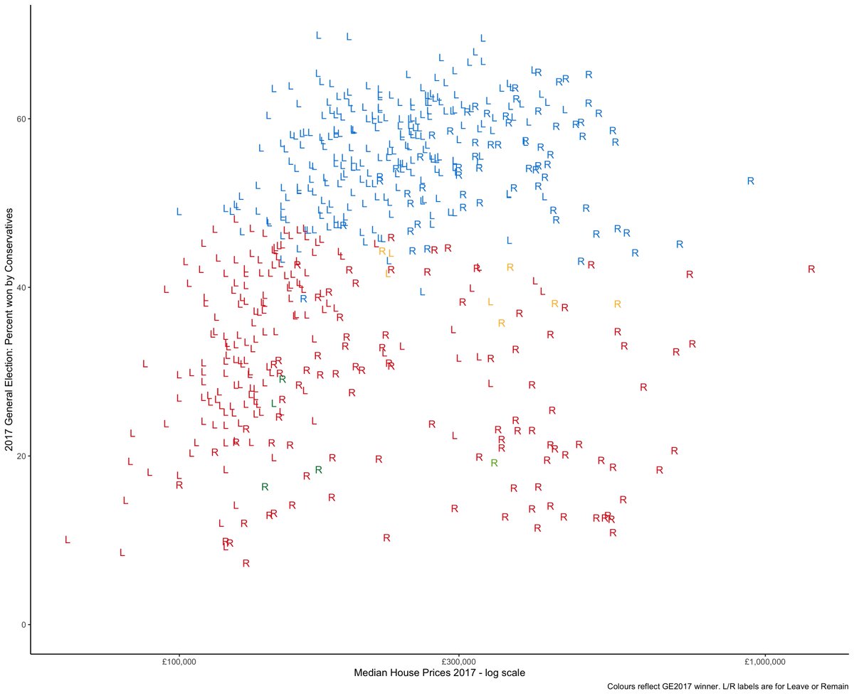
Now let& #39;s head to the 2017 Election. Getting really messy now. The Conservatives are winning in areas with average national house prices and Labour are splitting into poorer Labour Leave areas and wealthier Remain areas. There& #39;s barely a correlation b/w Cons vote and prices 8/n
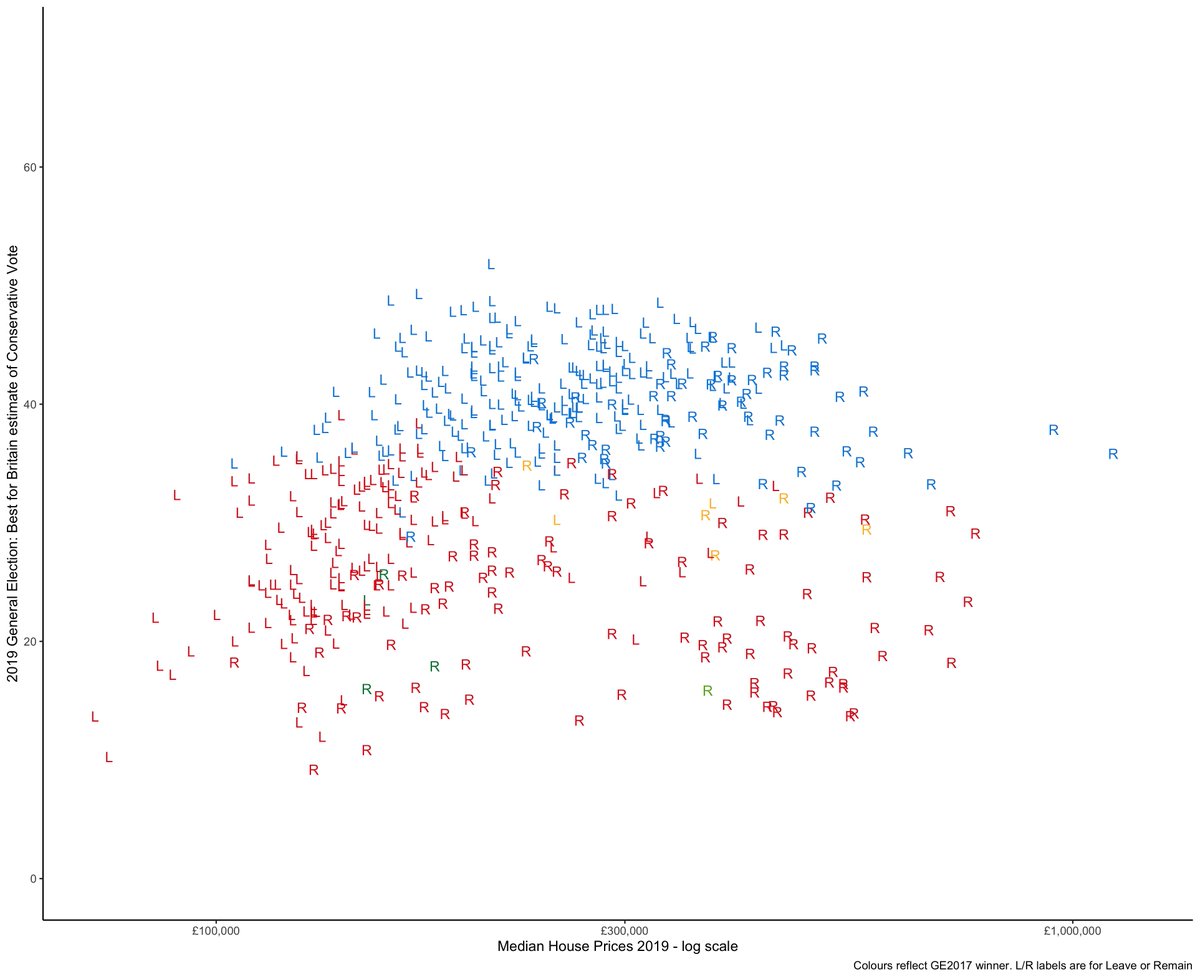
And as for today? Well we don& #39;t know yet. Don& #39;t worry, we will. But we do have the @BestForBritain MRP poll. I& #39;ll plot Tory support from that poll vs current house prices. It, um, looks like a brain. The Brexit Brain if you will. The correlation b/w Cons & house prices is nil 9/n
The Brexit Brain graph shows that local wealth might have stopped mattering in UK general elections. The parties aren& #39;t yet completely divided based on Brexit support but they are getting there. And there support bases are becoming equally diverse in terms of local wealth. 10/n
So is this the end of class politics? Not really, because Brexit is connected to other types of class politics than wealth, including status perceptions, types of profession, self-employment, etc. But this helps explain why the GE map of 2010 and 2019 will look so different n/n.

 Read on Twitter