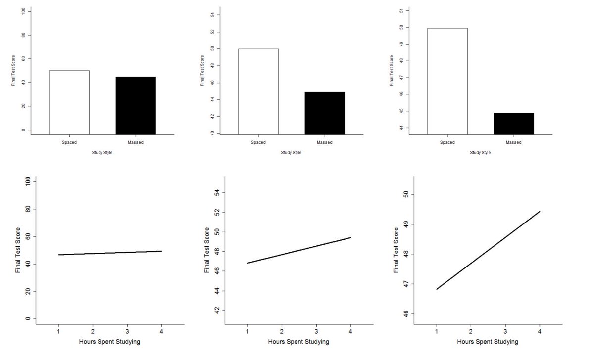
Should the y-axis always go to 0? Is the answer different for line charts and bar charts?
A newly published article by at @Meta_Psy by @JessiWittPhD collected empirical evidence about y-axis scaling in #dataviz #datavis. https://open.lnu.se/index.php/metapsychology/article/view/895/2084
1/">https://open.lnu.se/index.php...
A newly published article by at @Meta_Psy by @JessiWittPhD collected empirical evidence about y-axis scaling in #dataviz #datavis. https://open.lnu.se/index.php/metapsychology/article/view/895/2084
1/">https://open.lnu.se/index.php...
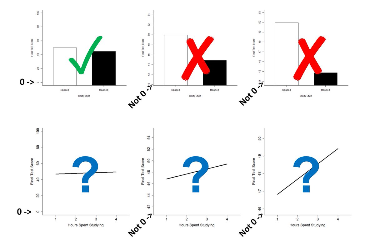
A common belief is that bar charts communicate more accurately if the y-axis goes to zero but that y-axes can be cropped for line charts. 2/
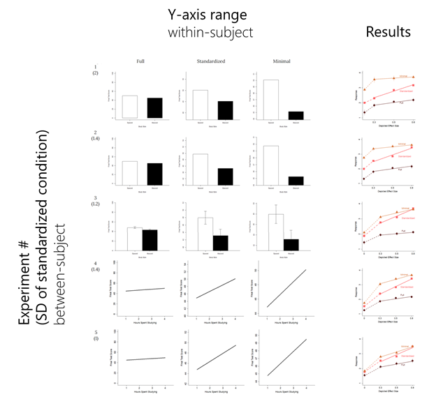
This article suggest that both assumptions are wrong… or at least incomplete. The experiments asked subjects to report an effect size (difference over standard deviation) between two values displayed as bars or a line and with different y-axis scales. 3/
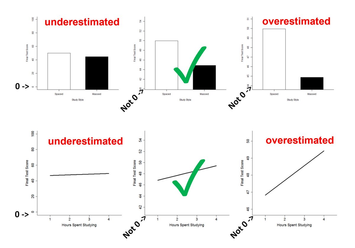
The results showed that for a y-axis with a wide range (“full” condition), people reported a smaller effect size. When the y-axis had a narrow range (“minimal” condition), people reported a larger effect size. Different responses despite showing the same data. 4/
And this bias was present no matter what graph type was used. Bar chart. Line chart. Error bars. No error bars. Always a response bias… despite effect size not even making sense without error bars! 5/
So when estimating the difference and variance between aggregated values, people can be biased in either direction by the scale of the y-axis. 6/
Meta-Psychology requires open practices for all submissions.
Data and materials: https://osf.io/hw2ac
Reviews">https://osf.io/hw2ac&quo... and decision letters: https://osf.io/hxk2u ">https://osf.io/hxk2u&quo...
All reviewers (including me!) are named in the decision letters and in the header of the article for accountability. 7/
Data and materials: https://osf.io/hw2ac
Reviews">https://osf.io/hw2ac&quo... and decision letters: https://osf.io/hxk2u ">https://osf.io/hxk2u&quo...
All reviewers (including me!) are named in the decision letters and in the header of the article for accountability. 7/
Last, but not least, this article’s analyses underwent a reproducibility check by @tobiasmueh. So reported results were recomputed and verified. 8/8

 Read on Twitter


