THREAD:
Some further detail to the graphic produced by ESPN and a look at team quality in the Premier League.
Please RT, like and follow if you enjoy this sort of context. https://twitter.com/ESPNFC/status/1194284484658704385">https://twitter.com/ESPNFC/st...
Some further detail to the graphic produced by ESPN and a look at team quality in the Premier League.
Please RT, like and follow if you enjoy this sort of context. https://twitter.com/ESPNFC/status/1194284484658704385">https://twitter.com/ESPNFC/st...
Firstly, I try to avoid chances created as a team metric. Whilst it is good as it indicates shots generated from passes – always useful to know – it disregards shots generated from dribbles, quick reactions to deflections and rebounds and more. So, I prefer using shots.
Secondly, teams play different amount of minutes per game. Whilst football is officially a 90-minute game teams do not play an equal amount. This is because injury and dead ball time differs in various games. So, accurate per-90 stats that account for this are preferable.
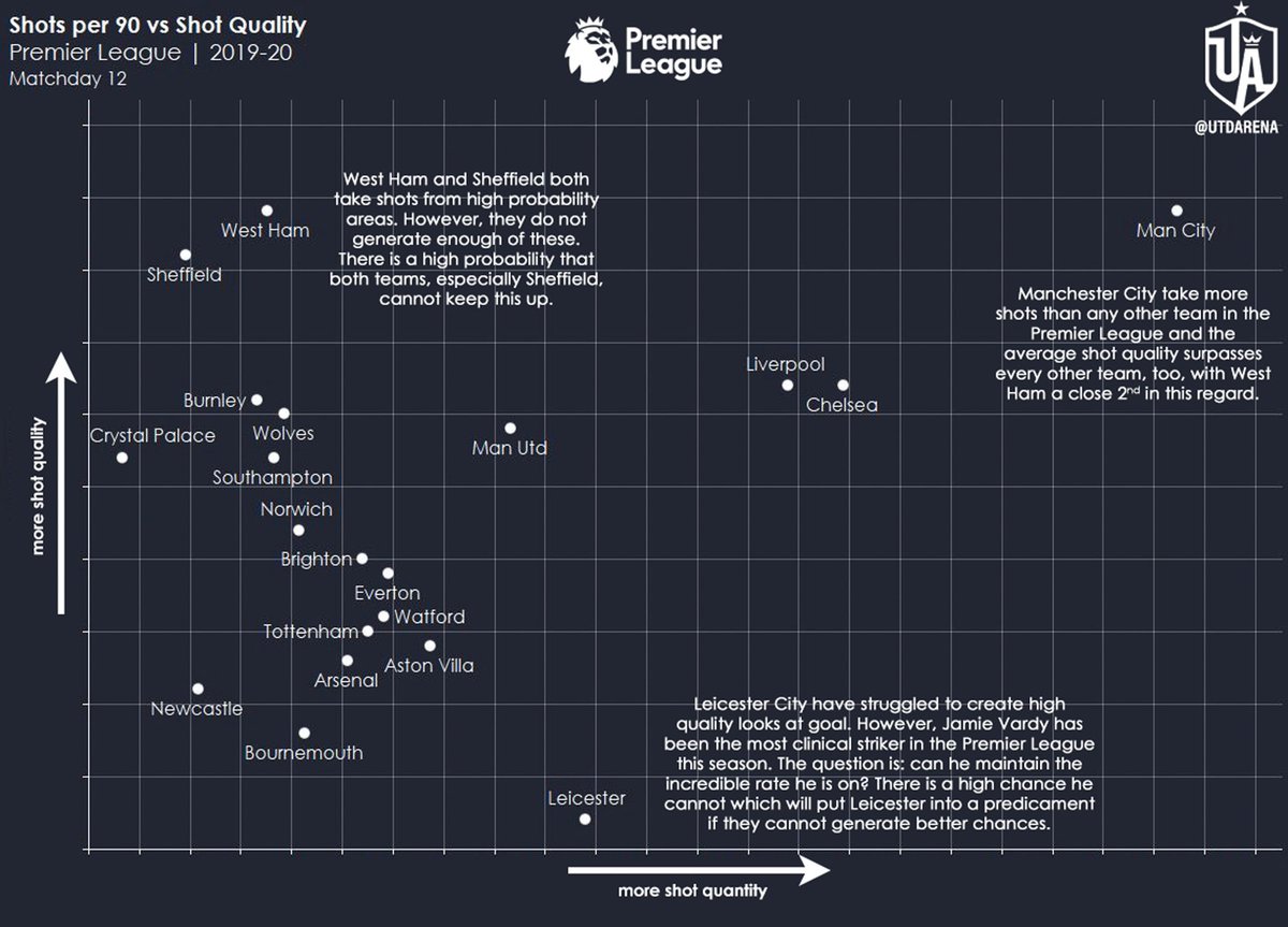
Thirdly, whilst it is useful to ascertain shot quantity – there is a correlation between shooting more and scoring more – it is also useful to understand shot quality. This allows teams to know if they are creating ‘good looks’ (shots) or just generic, low-probability shots.
I will mention some points in a series of tweets regarding this graph, however, have a look first and foremost to get a general understanding of team placement, the axis, etc.
Generally speaking:
Top–Right: high quantity + high quality
Bottom–Right: high quantity + low quality
Top–Left: low quantity + high quality
Bottom–Left: low quantity + low quality
Top–Right: high quantity + high quality
Bottom–Right: high quantity + low quality
Top–Left: low quantity + high quality
Bottom–Left: low quantity + low quality
As one can see: Manchester City are the best in the Premier League at generating high quality looks. Also, they generate them at a far greater degree than any other team. This is why they are so dangerous offensively.
Big chances + often = fear factor!
Big chances + often = fear factor!
Look at Sheffield and West Ham on the top left. Both teams create high probability shots but they do not create enough of them. This is one of the reasons why Sheffield are 5th at the moment which comes along with their stellar defensive record (though overachieved).
What about Leicester City? They are generating the lowest quality shots in the league yet find themselves 2nd. How? Well, Jamie Vardy can answer that. This season, his non-penalty xG is 4.33-4.43 whilst he has scored 10 non-penalty goals.
Insane clinical finishing.
Insane clinical finishing.
Lastly, look at the cluster of teams on the left-hand side. Now, they are mostly gathered there due to Manchester City stretching the axis. However, their individual values are very similar. Look at Tottenham and Arsenal. It is a perilous situation for both Pochettino and Emery.
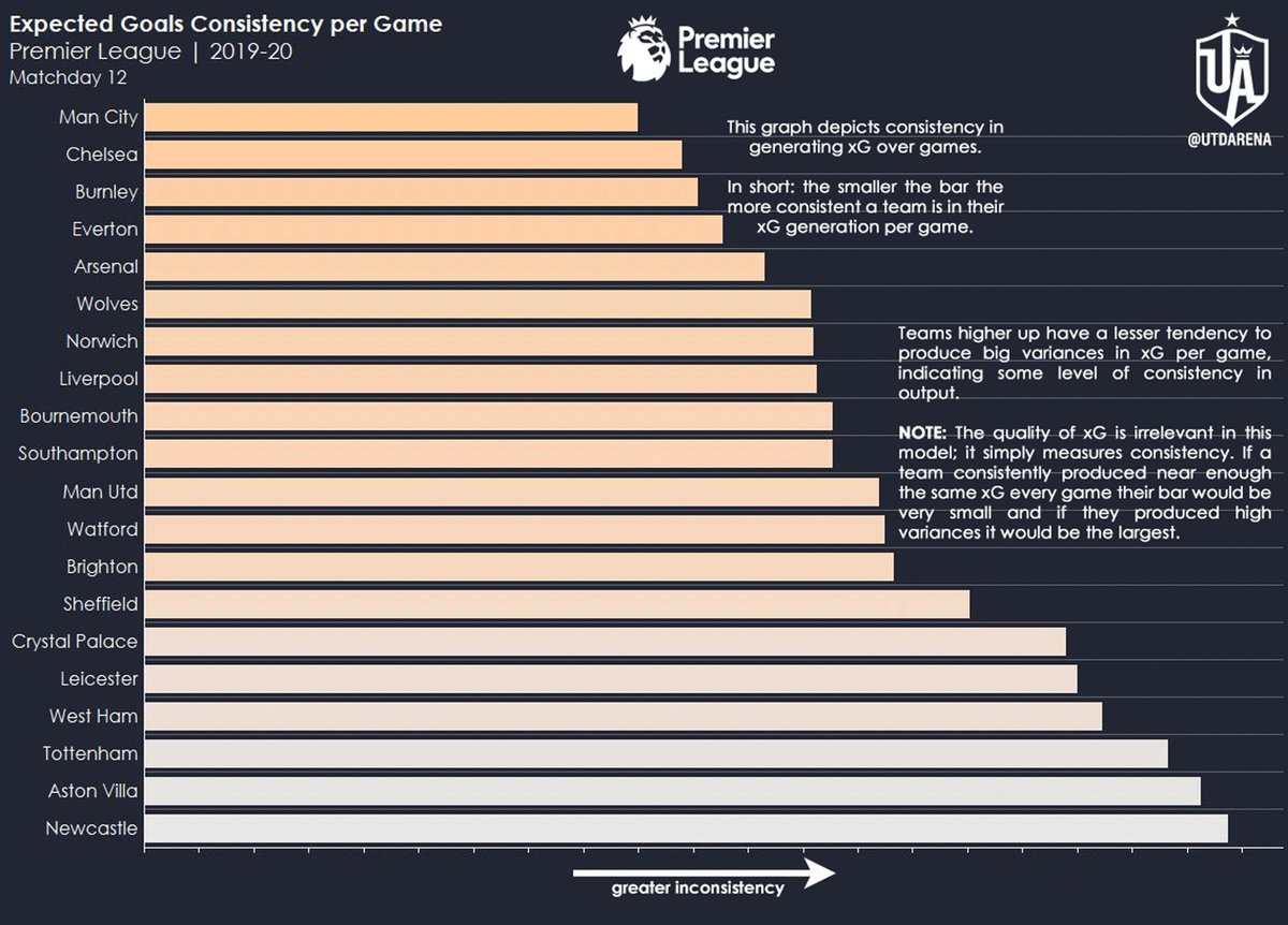
Also, it is important for us to see how consistently teams are generating their xG per game. This is because a team may have an xG of 20 overall in 10 games but 10 may have come from 2 games (5.00 per/g) with the left over 10 coming from the 8 other games (1.25 per/g).
So, we may look at an xG of 20 in 10 games and perceive it to be quite impressive but a large amount of that was generated in two games which would inflate the overall number. Consequently, it would give the wrong impression about the team& #39;s overall ability.
So, I have produced this graph. Again, have a look. In particular, read the notes on the right of the bars which give some general information.
Here, we can see Manchester City are, again, 1st. This is because they tend to generate xG with the smallest variances between them i.e. they are consistent in their shot quality and quantity as a whole per game. It isn& #39;t the case that their xG is dominated by a few games.
However, this is the case with Newcastle, Aston Villa and Tottenham. Why is this important? Someone may look at a team& #39;s overall xG and come to a “conclusion”. However, when they delve into it they notice that it is based on one or two big performances whilst the rest is average.
So, they will not over-analyse the team, saying “their xG is [insert number] which means they are a [description] team”. Rather, they can go further and say “this team tends to be inconsistent every game so we need to delve deeper into ‘what’, ‘when’, ‘where’, ‘why’ and ‘how’.”
Also, note how high Chelsea are. This is a testament to the work Lampard has done there. He has put into place a system at the club that allows them to maintain a higher degree of consistency in their xG generation which is already quite solid for the season.
Manchester United are in the middle. This would indicate that their xG is, at times, based on a group of games being similar but, again, a couple of games being dominant e.g. vs Norwich and vs Brighton. So, United& #39;s overall xG does not tell the full picture.
Notice Liverpool do not feature as highly on either in relation to their league position. This is because they are overachieving their xG. However, this is not from fortune but rather the sheer amount of quality they have on the pitch who do not need high quality looks to score.
Warning:
The sample size is only 12 games which, whilst large enough to draw patterns, is still too small to draw confident conclusions. Personally, I will wait until 19 games are up as each team would have played each other once. At 38-games, the sample is beautiful.
The sample size is only 12 games which, whilst large enough to draw patterns, is still too small to draw confident conclusions. Personally, I will wait until 19 games are up as each team would have played each other once. At 38-games, the sample is beautiful.
So, there you have it. A few thoughts from me, a couple of graphs and a bit of an explanation.
I hope it all makes sense. If not, please drop a message and I will reply. Alternatively, please send a DM if that is more comfortable for you.
I hope it all makes sense. If not, please drop a message and I will reply. Alternatively, please send a DM if that is more comfortable for you.
End of Thread.

 Read on Twitter


