This year, a number of #NaNoWriMo2019 folks are trying out the "Comic Sans" trick. There& #39;s something magical about Comic Sans makes it easier to write with.
As a UI/UX designer, not only can I tell you *why* it works, I can tell you how to get the effect from any font. A thread.
As a UI/UX designer, not only can I tell you *why* it works, I can tell you how to get the effect from any font. A thread.
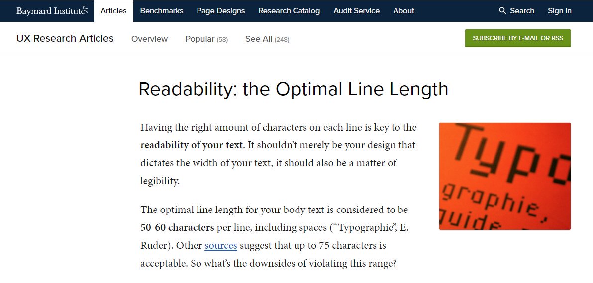
Our brains get exhausted when lines of text are too long. Researchers place the "sweet spot" at around 50-60 characters (i.e. letters, symbols, and spaces) per line.
Though you can comfortably go up to 75 characters per line, which is what you& #39;re more likely to find in novels.
Though you can comfortably go up to 75 characters per line, which is what you& #39;re more likely to find in novels.
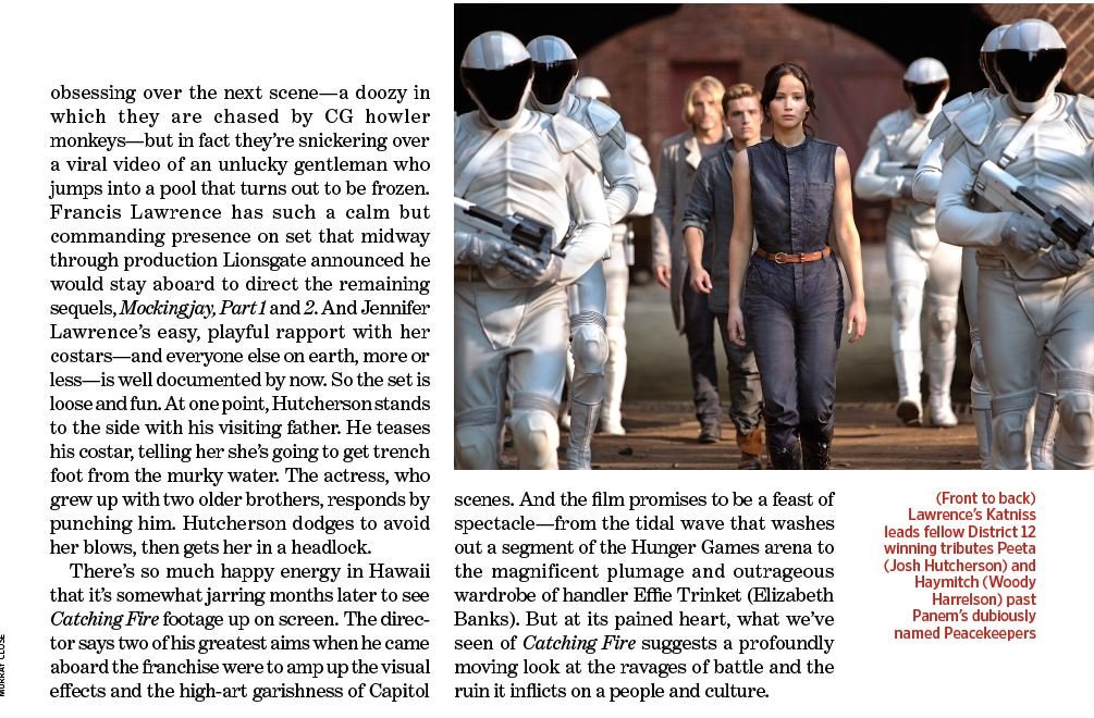
This is why magazines and newspapers use columns. Columns allow them to print text very small without the characters-per-line becoming massive and exhausting.
(But you also don& #39;t want too few characters-per-line, as in this caption that went too long to support the small width.)
(But you also don& #39;t want too few characters-per-line, as in this caption that went too long to support the small width.)
If you open up Google Docs or Word, your default text size is 11pt.
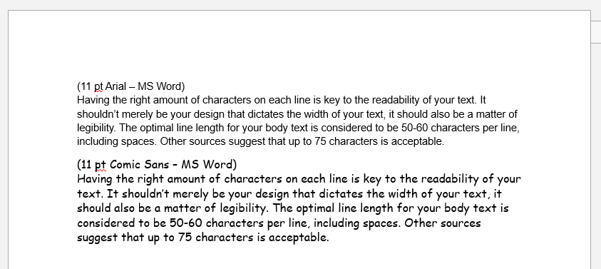
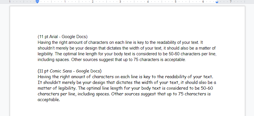
Arial in 11pt is 90-100 chars-per-line.
Calibri 11pt is 95-105 chars-per-line.
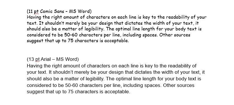
Comic Sans 11pt is 75-85 chars-per-line - nearly the sweet spot!
(At least in Word; in Docs its less bold, resulting in 85-95.)
Arial in 11pt is 90-100 chars-per-line.
Calibri 11pt is 95-105 chars-per-line.
Comic Sans 11pt is 75-85 chars-per-line - nearly the sweet spot!
(At least in Word; in Docs its less bold, resulting in 85-95.)
In theory, you can even bump it up to 18pt to achieve that ultimate sweet spot of 50-60, but writing in such large text might weird you out. It& #39;d be better to achieve 50-60 characters by writing in a two-column document, but your novel will probably be single-column 75ish anyway.
Another subtle thing: Mac/iOS and PC/Windows renders text differently. In short, Windows is garbage at rendering text, though you’re unlikely to notice unless you regularly use both like I do.
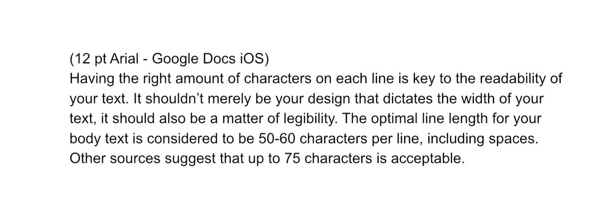
(In an odd quirk, Docs iOS displays 12pt Arial with the chars-per-line of 13pt on PC.)
(In an odd quirk, Docs iOS displays 12pt Arial with the chars-per-line of 13pt on PC.)
When I& #39;m writing in Docs on PC, I like to bump up the magnification of the browser to 125% so the text looks a little smoother. Whether that actually helps my writing, I don& #39;t know...I just hate looking at the text less.
Anyways, feel free to experiment with different point sizes and magnifications (and maybe even margin widths) to find what feels good to you.
Just make sure you& #39;re not writing those single-column paragraphs in 11pt (or smaller), because it sucks!
Just make sure you& #39;re not writing those single-column paragraphs in 11pt (or smaller), because it sucks!
Wow, this thread blew up jigger than I ever expected. Here’s a link to my Patreon: https://www.patreon.com/acriticalhit ">https://www.patreon.com/acritical...
Wow, I just noticed the typo that autocorrect overlooked. Sigh.

 Read on Twitter