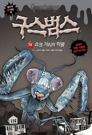
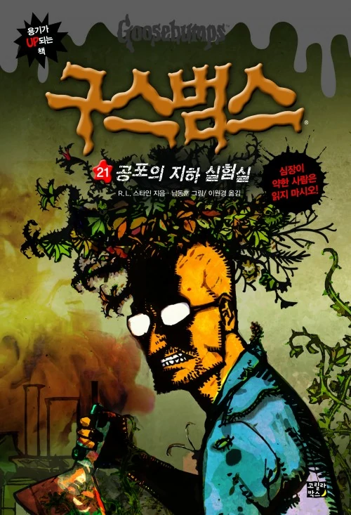
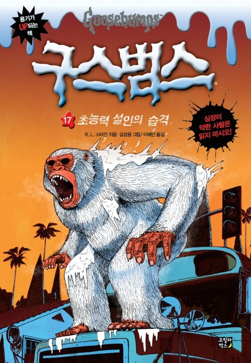
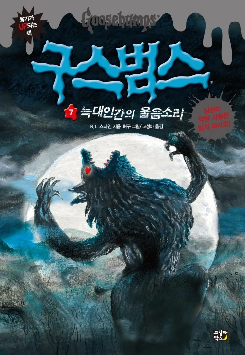
The UK thread was fun to do, so let& #39;s take a look at some more international Goosebumps covers, starting with the Korean releases, which saw 26 entries.
Now, I really like these. They& #39;ve got a interesting, somewhat abstract style to them.
Let& #39;s rank them worst to best.
Now, I really like these. They& #39;ve got a interesting, somewhat abstract style to them.
Let& #39;s rank them worst to best.
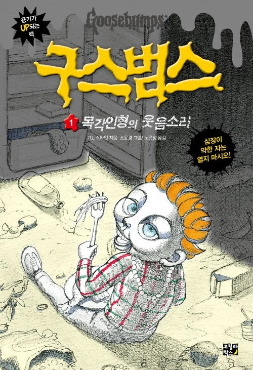
26. It Came from Beneath the Sink!
I think all these covers are pretty solid, but this definitely the weakest of the bunch. It& #39;s not a bad cover, but doesn& #39;t seem to have anything to with the book& #39;s plot, unless the monster behind Kat is supposed to be their take on the Grool?
I think all these covers are pretty solid, but this definitely the weakest of the bunch. It& #39;s not a bad cover, but doesn& #39;t seem to have anything to with the book& #39;s plot, unless the monster behind Kat is supposed to be their take on the Grool?
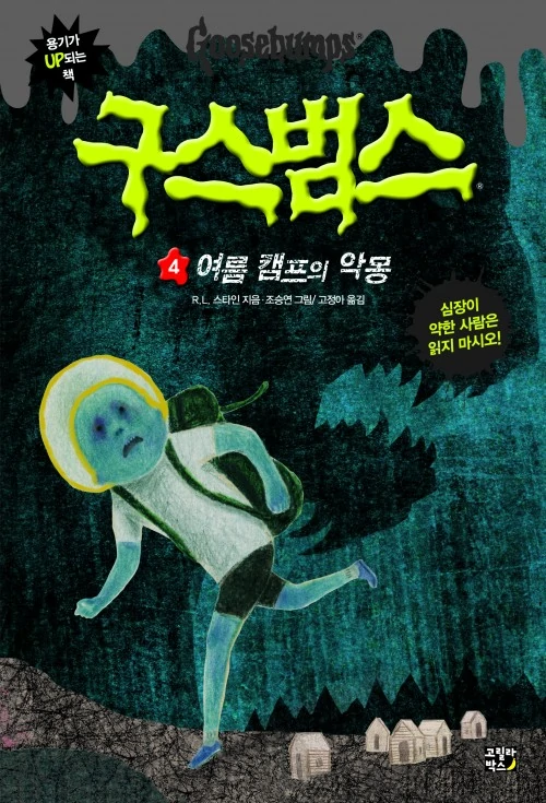
25. Welcome to Camp Nightmare
Not bad, but it& #39;s a bit difficult to tell what& #39;s even going on here. Like, what& #39;s with Billy here? I guess they were going for emphasis on the alien part of this book, but it doesn& #39;t quite hit the mark.
Not bad, but it& #39;s a bit difficult to tell what& #39;s even going on here. Like, what& #39;s with Billy here? I guess they were going for emphasis on the alien part of this book, but it doesn& #39;t quite hit the mark.
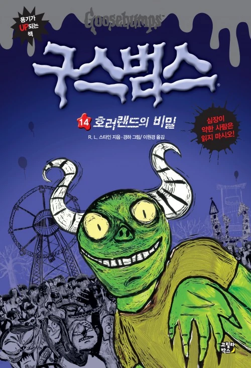
24. One Day at HorrorLand
This one has some interesting elements, but doesn& #39;t really have that & #39;scary& #39; feeling to it. It& #39;s just a bit too sketch-like for me, though others might like that style.
This one has some interesting elements, but doesn& #39;t really have that & #39;scary& #39; feeling to it. It& #39;s just a bit too sketch-like for me, though others might like that style.
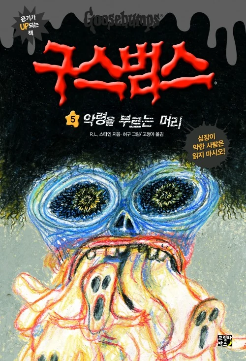
23. How I Got My Shrunken Head
Neat style, but not very pleasant to look at. I do like the surreal feeling this cover has though, it feels like someone sketching out a nightmare they just had.
Neat style, but not very pleasant to look at. I do like the surreal feeling this cover has though, it feels like someone sketching out a nightmare they just had.
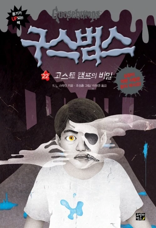
22. Ghost Camp
This one& #39;s alright. It seems to depict the book& #39;s possession scene, and I like how it shows the protoplasm. It& #39;s a bit simplistic, but it does what it needs to and still manages to have a level of creepiness to it.
This one& #39;s alright. It seems to depict the book& #39;s possession scene, and I like how it shows the protoplasm. It& #39;s a bit simplistic, but it does what it needs to and still manages to have a level of creepiness to it.
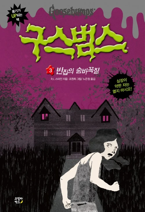
21. Welcome to Dead House
I like this one, it has some nice color choices and an abstract feel to it. Only problem is it& #39;s a little simplistic, but otherwise it& #39;s a solid cover.
I like this one, it has some nice color choices and an abstract feel to it. Only problem is it& #39;s a little simplistic, but otherwise it& #39;s a solid cover.
20. The Haunted Car
This is the only one of the 26 here to be from Series 2000 instead of the original series. Overall, it& #39;s pretty cool looking. I like the style and how the car is given eyes and fangs. I also like how the tree limbs around it look like hands.
This is the only one of the 26 here to be from Series 2000 instead of the original series. Overall, it& #39;s pretty cool looking. I like the style and how the car is given eyes and fangs. I also like how the tree limbs around it look like hands.
19. Night of the Living Dummy
A pretty eerie take on Mr. Wood, and I like this depicts his rampage around the Powell household.
A pretty eerie take on Mr. Wood, and I like this depicts his rampage around the Powell household.
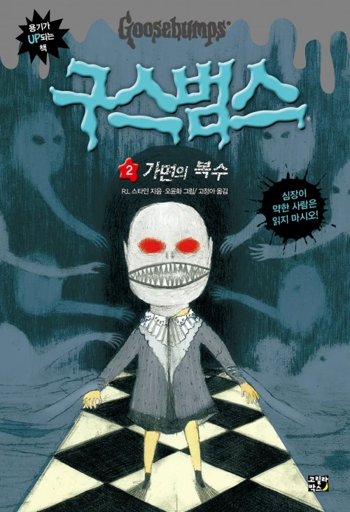
18. The Haunted Mask
Might be a bit simplistic for some, but I like this cover quite a bit. I think this take on the mask is neat, and I like how the cover depicts what I assume to be the Unloved ones reaching out for Carly Beth.
Might be a bit simplistic for some, but I like this cover quite a bit. I think this take on the mask is neat, and I like how the cover depicts what I assume to be the Unloved ones reaching out for Carly Beth.
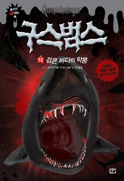
17. Deep Trouble
Cool looking shark, and the surprising appearance of blood. Solid cover, but doesn& #39;t quite have that feeling of danger to it, and I wish it were set underwater.
Cool looking shark, and the surprising appearance of blood. Solid cover, but doesn& #39;t quite have that feeling of danger to it, and I wish it were set underwater.
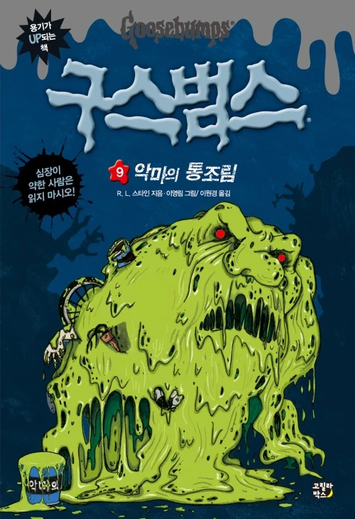
16. Monster Blood
A cool take on Monster Blood. I like the style here, and the different objects poking out of the MB.
A cool take on Monster Blood. I like the style here, and the different objects poking out of the MB.
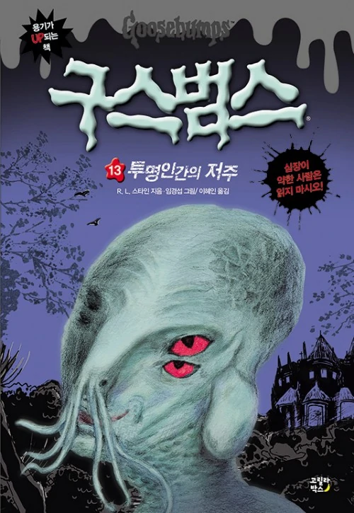
15. My Best Friend is Invisible
Really cool and eerie design for the aliens in this book, but it does spoil the twist.
Really cool and eerie design for the aliens in this book, but it does spoil the twist.
13. Stay Out of the Basement
I really like this one. It& #39;s a neat take on Dr. Brewer& #39;s clone and still has an element of intrigue to it.
I really like this one. It& #39;s a neat take on Dr. Brewer& #39;s clone and still has an element of intrigue to it.
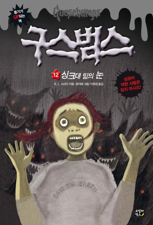
12. The Abominable Snowman of Pasadena
Takes inspiration from the Jacobus cover, but puts a new spin on it. I like how the Abominable Snowman looks rather intimidating here.
Takes inspiration from the Jacobus cover, but puts a new spin on it. I like how the Abominable Snowman looks rather intimidating here.
11. The Werewolf of Fever Swamp
Solid cover with an interesting style. Love how the werewolf looks here.
Solid cover with an interesting style. Love how the werewolf looks here.
9. Phantom of the Auditorium
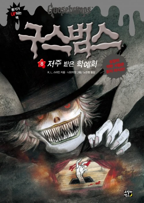
A really interesting, and pretty scary looking take on the Phantom. I like the colors here, and how the Phantom looms over what looks to be a depiction of his own death through the stage trapdoor. Great cover.
A really interesting, and pretty scary looking take on the Phantom. I like the colors here, and how the Phantom looms over what looks to be a depiction of his own death through the stage trapdoor. Great cover.
8. Beware, the Snowman
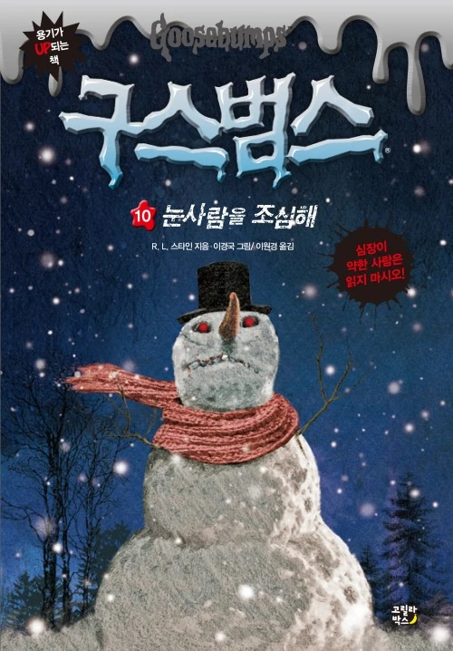
This one is just nice to look at. It feels like a painting and has this nice subtle eeriness to it, with the dead trees and droplets of snow. I think I like this one better than the Jacobus cover.
This one is just nice to look at. It feels like a painting and has this nice subtle eeriness to it, with the dead trees and droplets of snow. I think I like this one better than the Jacobus cover.
7. Be Careful What You Wish For...
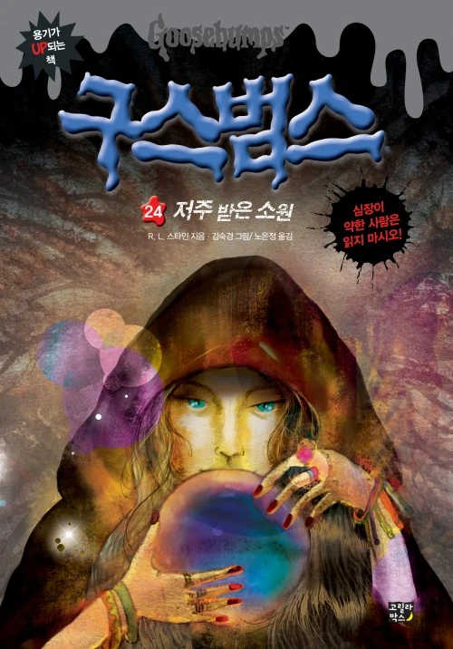
Now this one is actually really pretty to look at. It& #39;s not scary, but has this mystical vibe to it that I really like. I love the colors here, and the design of Clarissa. This is probably my favorite cover for this book in particular.
Now this one is actually really pretty to look at. It& #39;s not scary, but has this mystical vibe to it that I really like. I love the colors here, and the design of Clarissa. This is probably my favorite cover for this book in particular.
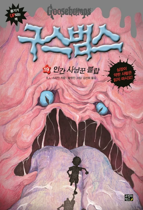
6. The Blob That Ate Everyone
This one& #39;s just a lot of fun. It& #39;s similar to the Jacobus and Dorman covers, but still manages to stand on its own as a solid cover. I like how massive the Blob is presented as herel
This one& #39;s just a lot of fun. It& #39;s similar to the Jacobus and Dorman covers, but still manages to stand on its own as a solid cover. I like how massive the Blob is presented as herel
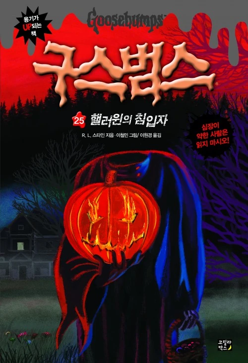
5. Attack of the Jack-O& #39;-Lanterns
I wasn& #39;t sure whether to place this higher or lower, but I& #39;ll place it right at number 5. It& #39;s a really solid cover that sells the book& #39;s plot pretty well. I love the look of the Pumpkin Head here, and the eerie background environment.
I wasn& #39;t sure whether to place this higher or lower, but I& #39;ll place it right at number 5. It& #39;s a really solid cover that sells the book& #39;s plot pretty well. I love the look of the Pumpkin Head here, and the eerie background environment.
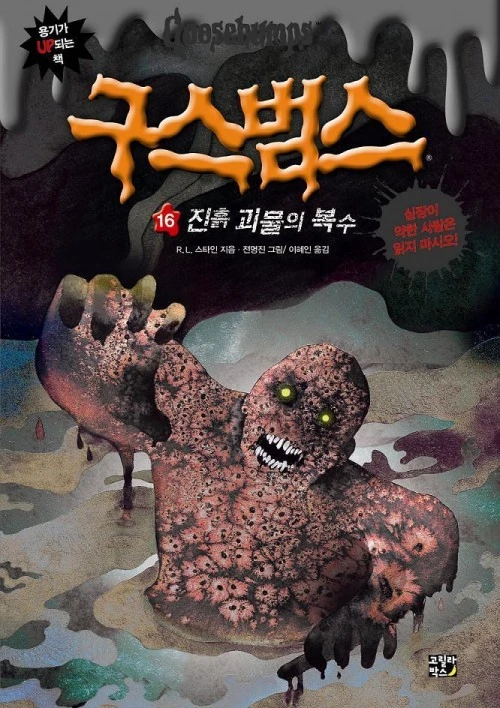
4. You Can& #39;t Scare Me!
While not as ominous as the Jacobus cover, this one is still a worthy contender. I like how the background is pretty to focus on our Mud Monster here, who looks fantastic and scary. Love those beady yellow eyes too.
While not as ominous as the Jacobus cover, this one is still a worthy contender. I like how the background is pretty to focus on our Mud Monster here, who looks fantastic and scary. Love those beady yellow eyes too.
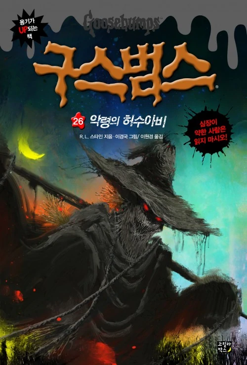
3. The Scarecrow Walks at Midnight
Now this cover doesn& #39;t mess around. The scarecrow looks absolutely demonic and I love it. Fantastic cover.
Now this cover doesn& #39;t mess around. The scarecrow looks absolutely demonic and I love it. Fantastic cover.
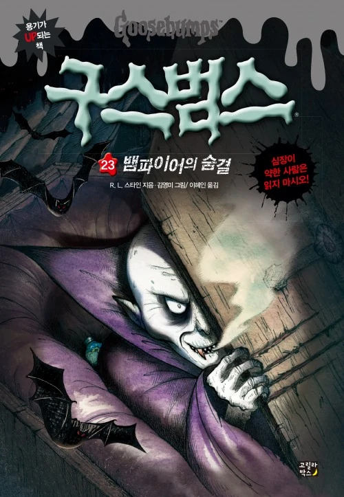
2. Vampire Breath
This one& #39;s great, I love the Gothic feel it has, and the overall style of the cover. I like the Nosferatu-esque design of Count Nightwing here. It& #39;s similar to the Jacobus cover, but I feel it manages to do it better.
This one& #39;s great, I love the Gothic feel it has, and the overall style of the cover. I like the Nosferatu-esque design of Count Nightwing here. It& #39;s similar to the Jacobus cover, but I feel it manages to do it better.
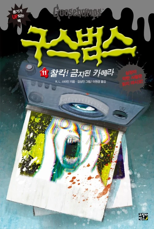
1. Say Cheese and Die!
I think most of the covers for Say Cheese and Die are great, and this is no exception. It& #39;s genuinely disturbing to look at, with the photo of the screaming person coming out of the camera, and what looks like blood. It& #39;s a perfect horror cover.
I think most of the covers for Say Cheese and Die are great, and this is no exception. It& #39;s genuinely disturbing to look at, with the photo of the screaming person coming out of the camera, and what looks like blood. It& #39;s a perfect horror cover.
There& #39;s been a few new books translated to Korean since I made this thread, or missed mentioning. So I& #39;m going to update this thread with my thoughts on each. Not ranking them this time, just giving general opinions.
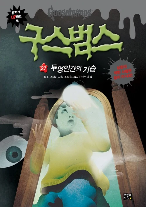
Let& #39;s Get Invisible!
This cover& #39;s pretty cool in my opinion, it feels very abstract and nightmarish. The floating eye and lack of detail on the focal character here give it a really eerie feel that I like, which I think fits the book nicely.
This cover& #39;s pretty cool in my opinion, it feels very abstract and nightmarish. The floating eye and lack of detail on the focal character here give it a really eerie feel that I like, which I think fits the book nicely.
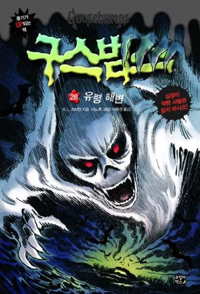
Ghost Beach:
A really neat re-interpretation of Jacobus& #39; classic cover that does its own thing as well. Our spirit here has an awesome presence to it. I like how warped this cover feels, it really has some "motion" to it with the way the spirit is twisting with the sky and bats.
A really neat re-interpretation of Jacobus& #39; classic cover that does its own thing as well. Our spirit here has an awesome presence to it. I like how warped this cover feels, it really has some "motion" to it with the way the spirit is twisting with the sky and bats.
The Ghost Next Door:
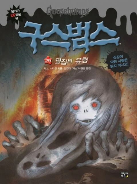
This is an absolutely terrifying depiction of Shadow Danny, playing up more of the "ghost kid" angle I feel with the face, which just looks super eerie. The way he& #39;s sort of tearing off his ghostly mask as the book describes is great, plus the burning house.
This is an absolutely terrifying depiction of Shadow Danny, playing up more of the "ghost kid" angle I feel with the face, which just looks super eerie. The way he& #39;s sort of tearing off his ghostly mask as the book describes is great, plus the burning house.
A Night in Terror Tower:
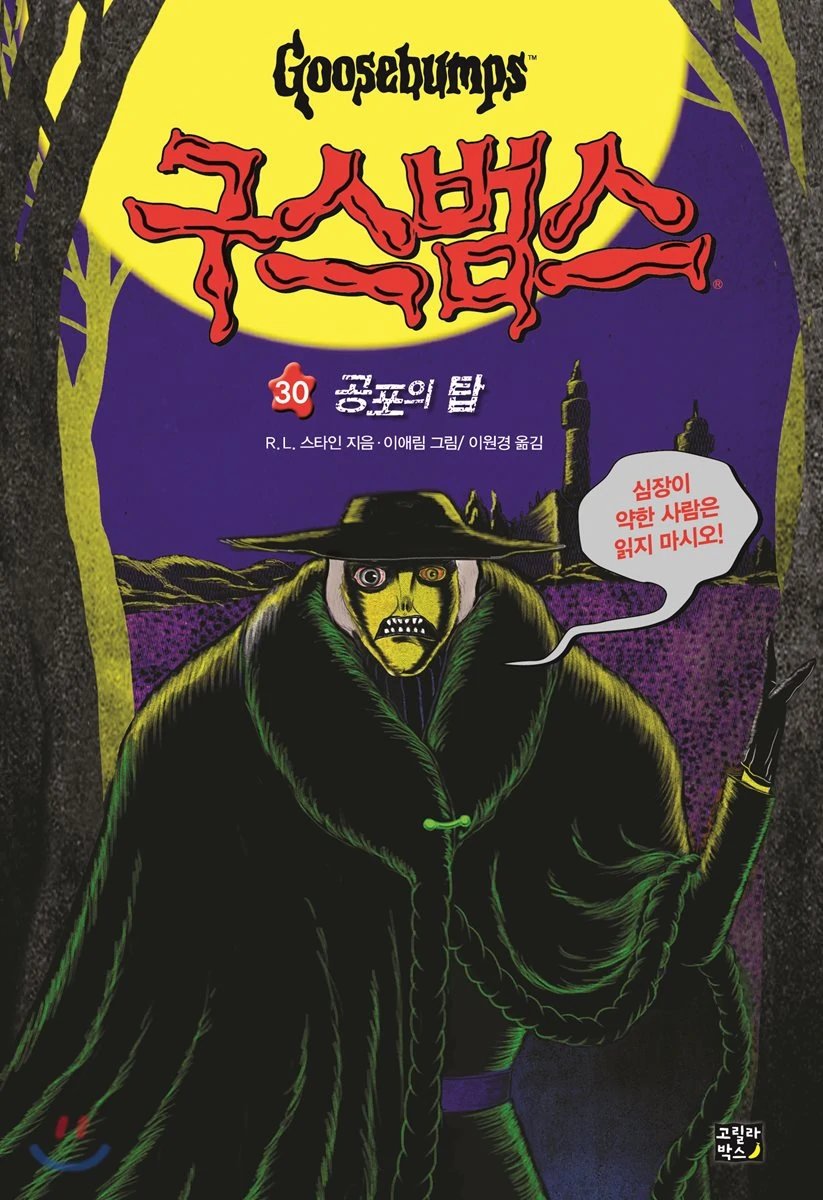
I like the color palette used here a lot, and the wild look of the executioner. There& #39;s something off-putting about the combination of these yellows, purples, and greens. It has an old horror comic vibe to it, which is cool, given they inspired Stine.
I like the color palette used here a lot, and the wild look of the executioner. There& #39;s something off-putting about the combination of these yellows, purples, and greens. It has an old horror comic vibe to it, which is cool, given they inspired Stine.
Attack of the Graveyard Ghouls:
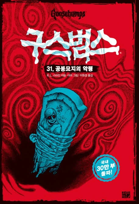
Another nice usage of color, with the intense red of the background, and the ghostly blue of the tombstone and the sinister-looking ghoul. The swirls make things feel really disorienting, giving this one a dream-like quality to it as well.
Another nice usage of color, with the intense red of the background, and the ghostly blue of the tombstone and the sinister-looking ghoul. The swirls make things feel really disorienting, giving this one a dream-like quality to it as well.
Return of the Mummy:
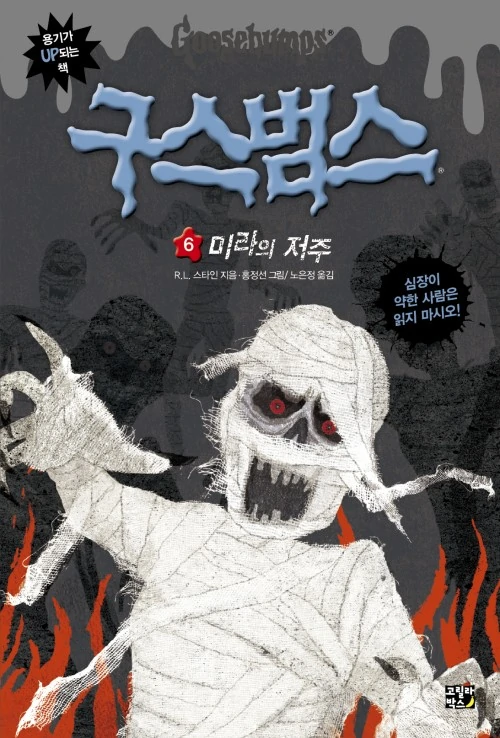
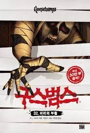
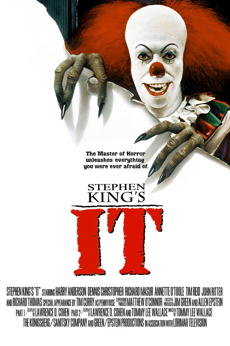
I like this cover. It feels reminiscent of some horror posters, the way the mummy is reaching out through the layer of bandages for the reader. The poster for the 90s IT mini-series came to mind, specifically.
I like this cover. It feels reminiscent of some horror posters, the way the mummy is reaching out through the layer of bandages for the reader. The poster for the 90s IT mini-series came to mind, specifically.
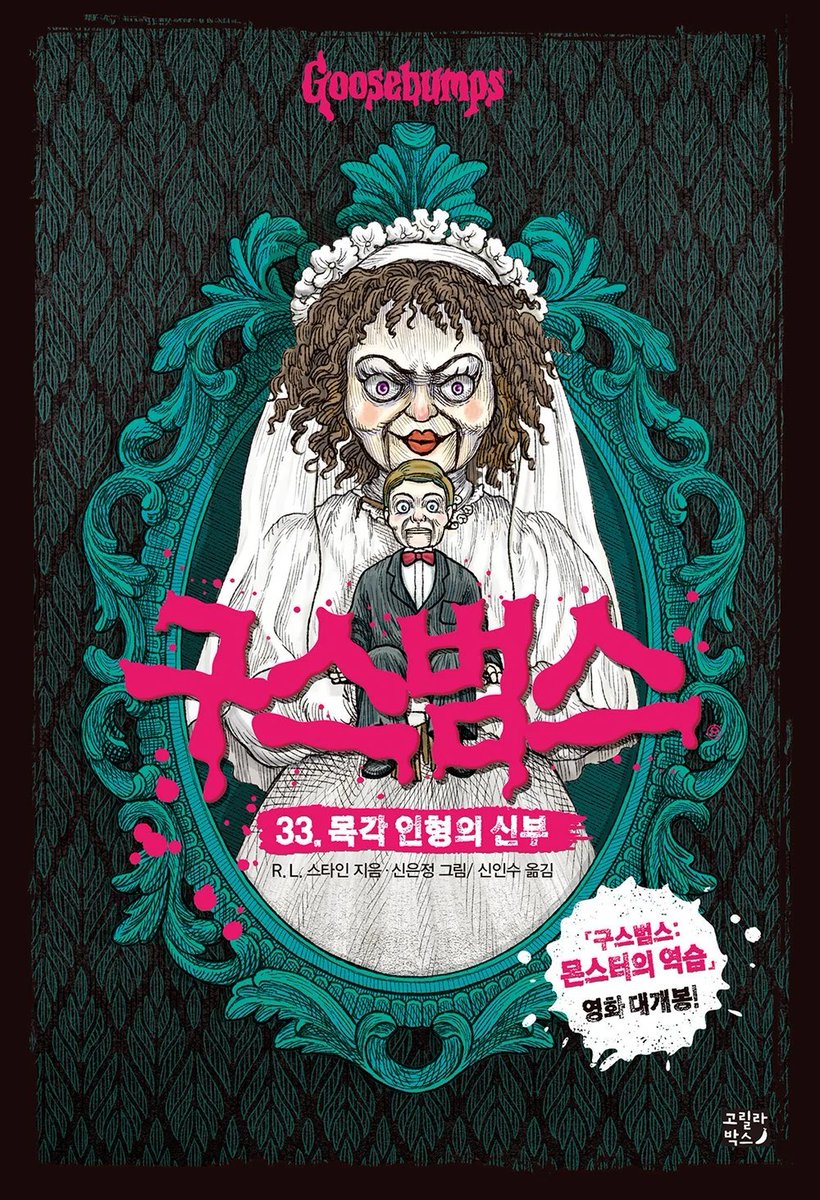
Bride of the Living Dummy
Really cool, nicely detailed cover. I like the texture of everything here, and how the frame makes it feel like a wedding photograph. Mary-Ellen looks perfectly creepy here, towering over Slappy, who looks like he& #39;s begun to regret his marriage.
Really cool, nicely detailed cover. I like the texture of everything here, and how the frame makes it feel like a wedding photograph. Mary-Ellen looks perfectly creepy here, towering over Slappy, who looks like he& #39;s begun to regret his marriage.
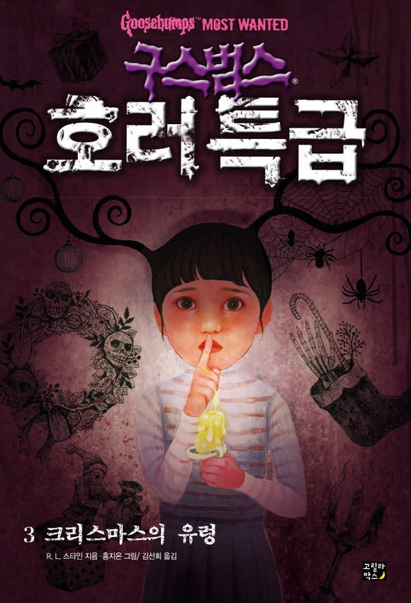
The 12 Screams of Christmas:
This one& #39;s from the Goosebumps Most Wanted series. It& #39;s pretty eerie, have to say. I like how we have the candlelight illuminating the girl here, with the background with its nightmarish Christmas drawings, which are nicely detailed.
This one& #39;s from the Goosebumps Most Wanted series. It& #39;s pretty eerie, have to say. I like how we have the candlelight illuminating the girl here, with the background with its nightmarish Christmas drawings, which are nicely detailed.
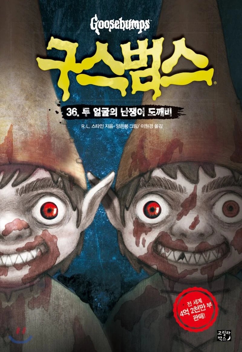
Revenge of the Lawn Gnomes:
This cover isn& #39;t messing around, and I love that. These are some murderous, man-eating gnomes. That& #39;s terrifying. The frozen, grinning expression and red eyes isn& #39;t helping either.
This cover isn& #39;t messing around, and I love that. These are some murderous, man-eating gnomes. That& #39;s terrifying. The frozen, grinning expression and red eyes isn& #39;t helping either.
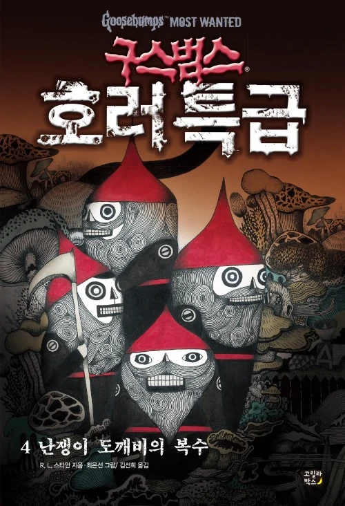
Planet of the Lawn Gnomes:
I don& #39;t know if these gnomes are as creepy as the last cover, but they& #39;re still terrifying. The weird texture of their beards is off-putting. The gnomes look inanimate, but yet alive. And those mushrooms scattered around feel uncomfortable to the eye.
I don& #39;t know if these gnomes are as creepy as the last cover, but they& #39;re still terrifying. The weird texture of their beards is off-putting. The gnomes look inanimate, but yet alive. And those mushrooms scattered around feel uncomfortable to the eye.
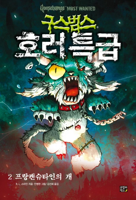
Frankenstein& #39;s Dog:
This cover is really eye-catching and full of life. Part of me likes it more than the Dorman cover, since I feel the dog has more of a presence here- it takes up the majority of the cover, while the background full of sparks just adds to that. Great cover.
This cover is really eye-catching and full of life. Part of me likes it more than the Dorman cover, since I feel the dog has more of a presence here- it takes up the majority of the cover, while the background full of sparks just adds to that. Great cover.
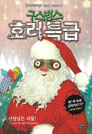
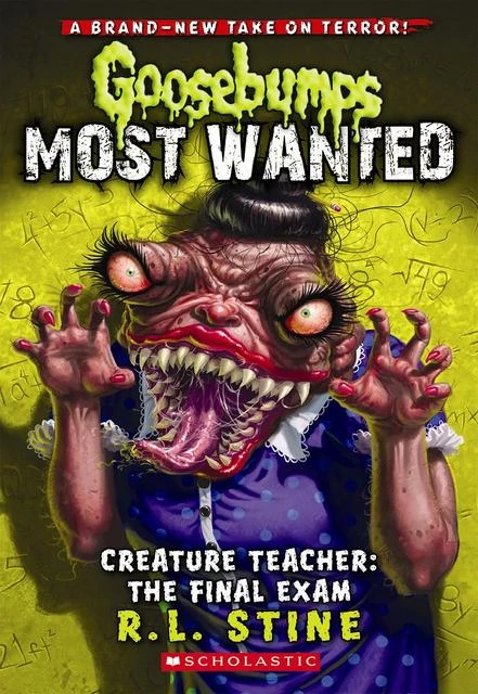
Creature Teacher: The Final Exam.
I& #39;m not really sure what happened with this cover. It& #39;s not a bad cover on its own per se, I like the goofiness of it, but it doesn& #39;t match the content of the book at all, which isn& #39;t even set at winter or Christmas time.
I& #39;m not really sure what happened with this cover. It& #39;s not a bad cover on its own per se, I like the goofiness of it, but it doesn& #39;t match the content of the book at all, which isn& #39;t even set at winter or Christmas time.
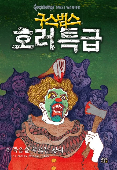
A Nightmare on Clown Street
A nice, creepy-looking clown as our central focus, with these ghostly-looking clowns in the background surrounding him. The colors used here again feel displeasing, but still work. Plus we get some blood!
A nice, creepy-looking clown as our central focus, with these ghostly-looking clowns in the background surrounding him. The colors used here again feel displeasing, but still work. Plus we get some blood!
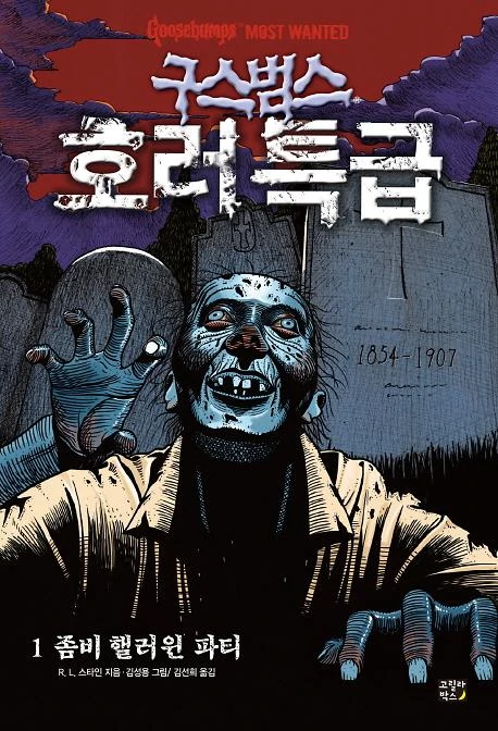
Zombie Halloween:
Now, this one& #39;s horrifying. The level of detail given to the zombie is great, and I like the crosshatched-looking texture of his skin, along with the pale and shadowy blues. The backdrop of tombstones leading up to the bloody red sky is fantastic.
Now, this one& #39;s horrifying. The level of detail given to the zombie is great, and I like the crosshatched-looking texture of his skin, along with the pale and shadowy blues. The backdrop of tombstones leading up to the bloody red sky is fantastic.
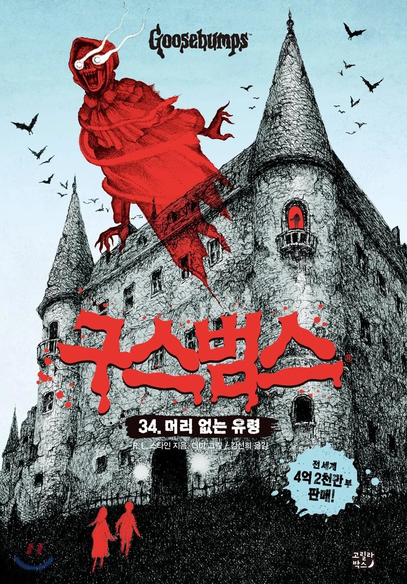
The Headless Ghost:
I like how small and simplistic the kids look in relation to this massive castle-like house. There& #39;s a real level of danger coming from it, with the specter looming over, and the figure at the window. I like that contrast between the monochrome and the reds.
I like how small and simplistic the kids look in relation to this massive castle-like house. There& #39;s a real level of danger coming from it, with the specter looming over, and the figure at the window. I like that contrast between the monochrome and the reds.

 Read on Twitter