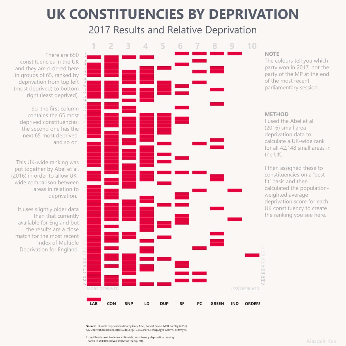
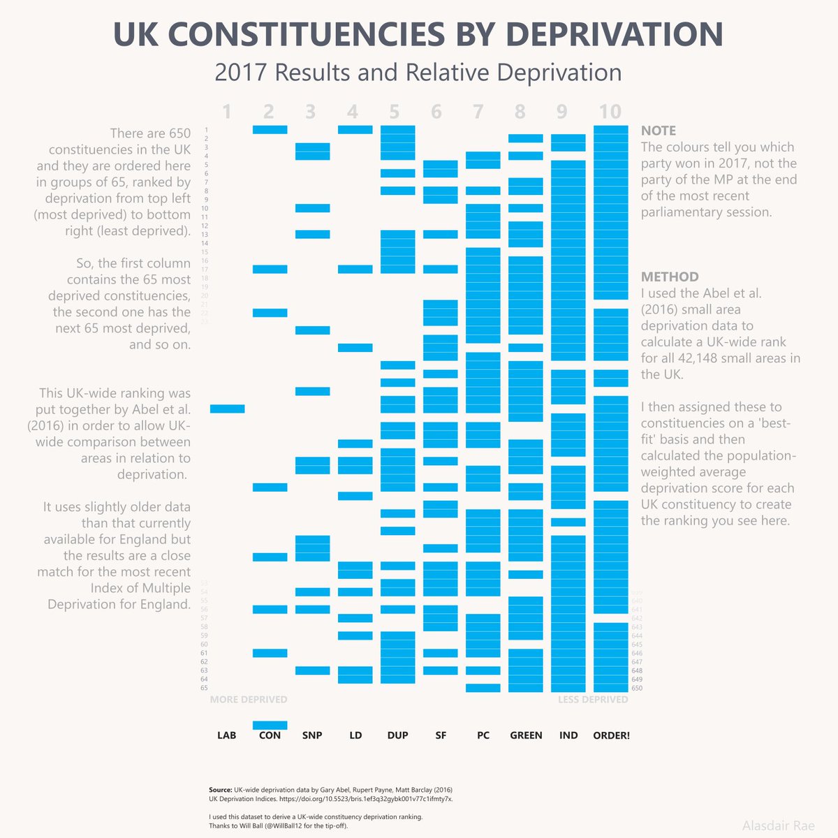
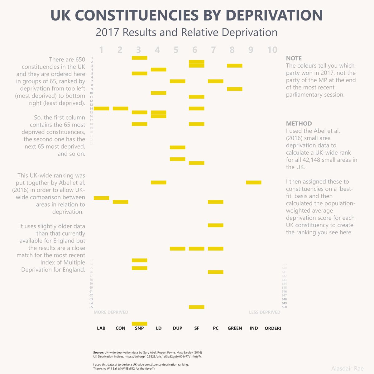
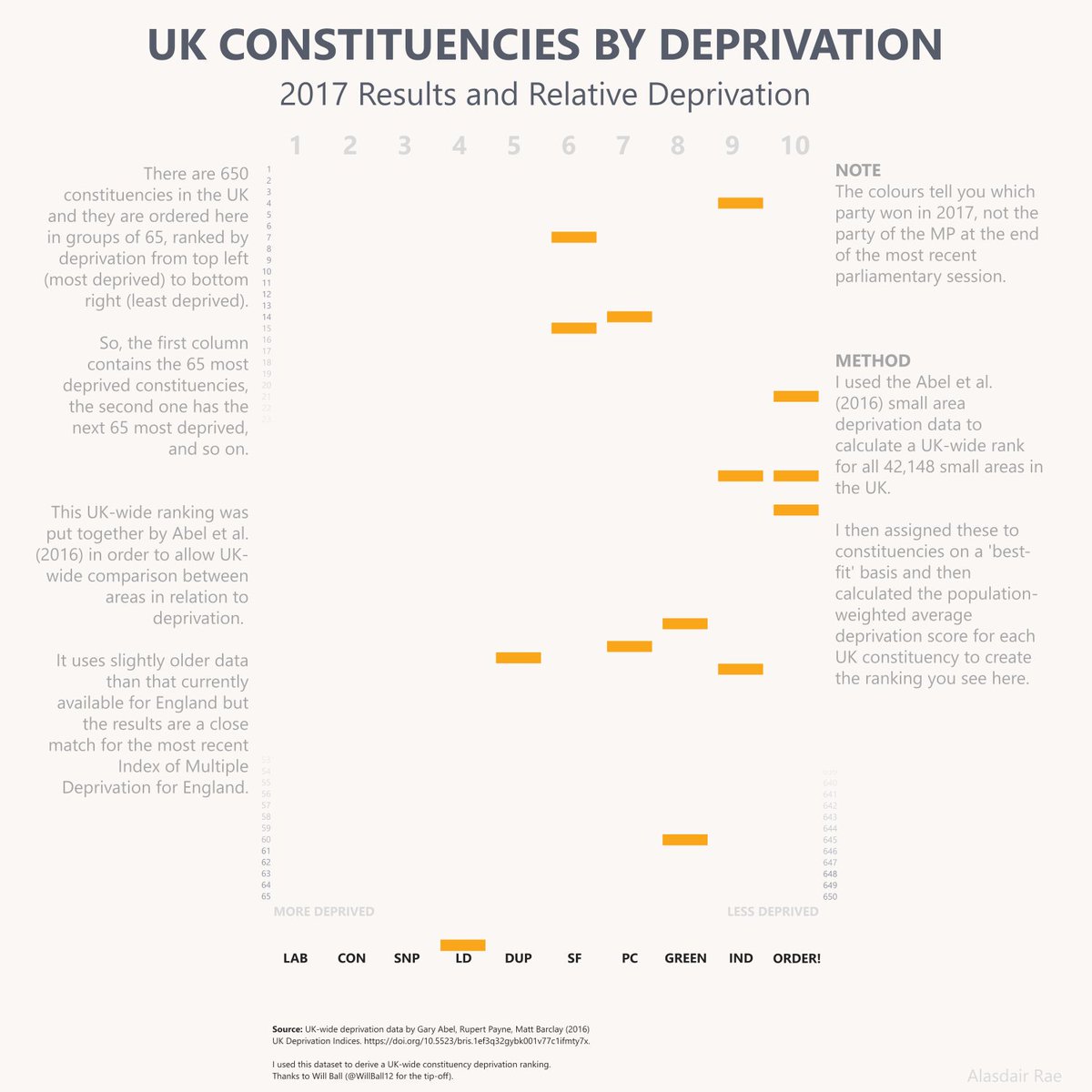
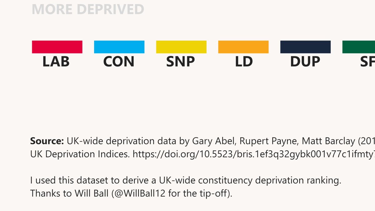
A UK-wide version of that & #39;constituency by deprivation& #39; chart. All 650 constituencies, with names. Wanted to see what it looked like, so here it is.
Giant version: http://ajrae.staff.shef.ac.uk/img/uk_imd_with_labels_LAYOUT_v4_50pct.png
Notes">https://ajrae.staff.shef.ac.uk/img/uk_im... on the image have source and method. More info here: http://www.statsmapsnpix.com/2019/11/a-deprivation-by-constituency-chart.html">https://www.statsmapsnpix.com/2019/11/a...
this is where I live, so just a reminder of social mix within areas although most in left hand column contain the most deprived areas of the UK (but broadly this UK-wide ranking is what I would expect)
and thanks for the tip, @WillBall12
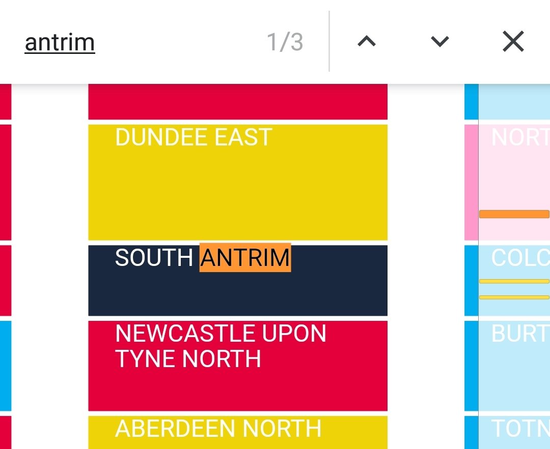
can& #39;t find the constituency you& #39;re looking for?
Search this basic text version of the graphic to find it
http://ajrae.staff.shef.ac.uk/img/constit_deprivation.html">https://ajrae.staff.shef.ac.uk/img/const...
Search this basic text version of the graphic to find it
http://ajrae.staff.shef.ac.uk/img/constit_deprivation.html">https://ajrae.staff.shef.ac.uk/img/const...
if you& #39;re interested in the population mix within constituencies, these profiles show the distribution of areas in each deprivation decile in each constituency, with more deprived areas on left
http://ajrae.staff.shef.ac.uk/img/constit_dep_deciles.png
[probably">https://ajrae.staff.shef.ac.uk/img/const... need to zoom image on desktop to see clearly]
http://ajrae.staff.shef.ac.uk/img/constit_dep_deciles.png
[probably">https://ajrae.staff.shef.ac.uk/img/const... need to zoom image on desktop to see clearly]
and this was one of the things that made me take a closer look at all this in the first place, a couple of years ago https://twitter.com/undertheraedar/status/873948896401215493?s=20">https://twitter.com/underther...
the full thing cleaned up, with individual parties isolated, as a looping gif
last note on this before I get back to more pressing issues - the individual party chart frames and gif now added to blog post on all this, which includes data notes: http://www.statsmapsnpix.com/2019/11/a-deprivation-by-constituency-chart.html">https://www.statsmapsnpix.com/2019/11/a...

 Read on Twitter

![if you& #39;re interested in the population mix within constituencies, these profiles show the distribution of areas in each deprivation decile in each constituency, with more deprived areas on left https://ajrae.staff.shef.ac.uk/img/const... need to zoom image on desktop to see clearly] if you& #39;re interested in the population mix within constituencies, these profiles show the distribution of areas in each deprivation decile in each constituency, with more deprived areas on left https://ajrae.staff.shef.ac.uk/img/const... need to zoom image on desktop to see clearly]](https://pbs.twimg.com/media/EIelHkGXsAIN0wL.jpg)
![if you& #39;re interested in the population mix within constituencies, these profiles show the distribution of areas in each deprivation decile in each constituency, with more deprived areas on left https://ajrae.staff.shef.ac.uk/img/const... need to zoom image on desktop to see clearly] if you& #39;re interested in the population mix within constituencies, these profiles show the distribution of areas in each deprivation decile in each constituency, with more deprived areas on left https://ajrae.staff.shef.ac.uk/img/const... need to zoom image on desktop to see clearly]](https://pbs.twimg.com/media/EIelHkDWwAMpDey.jpg)
