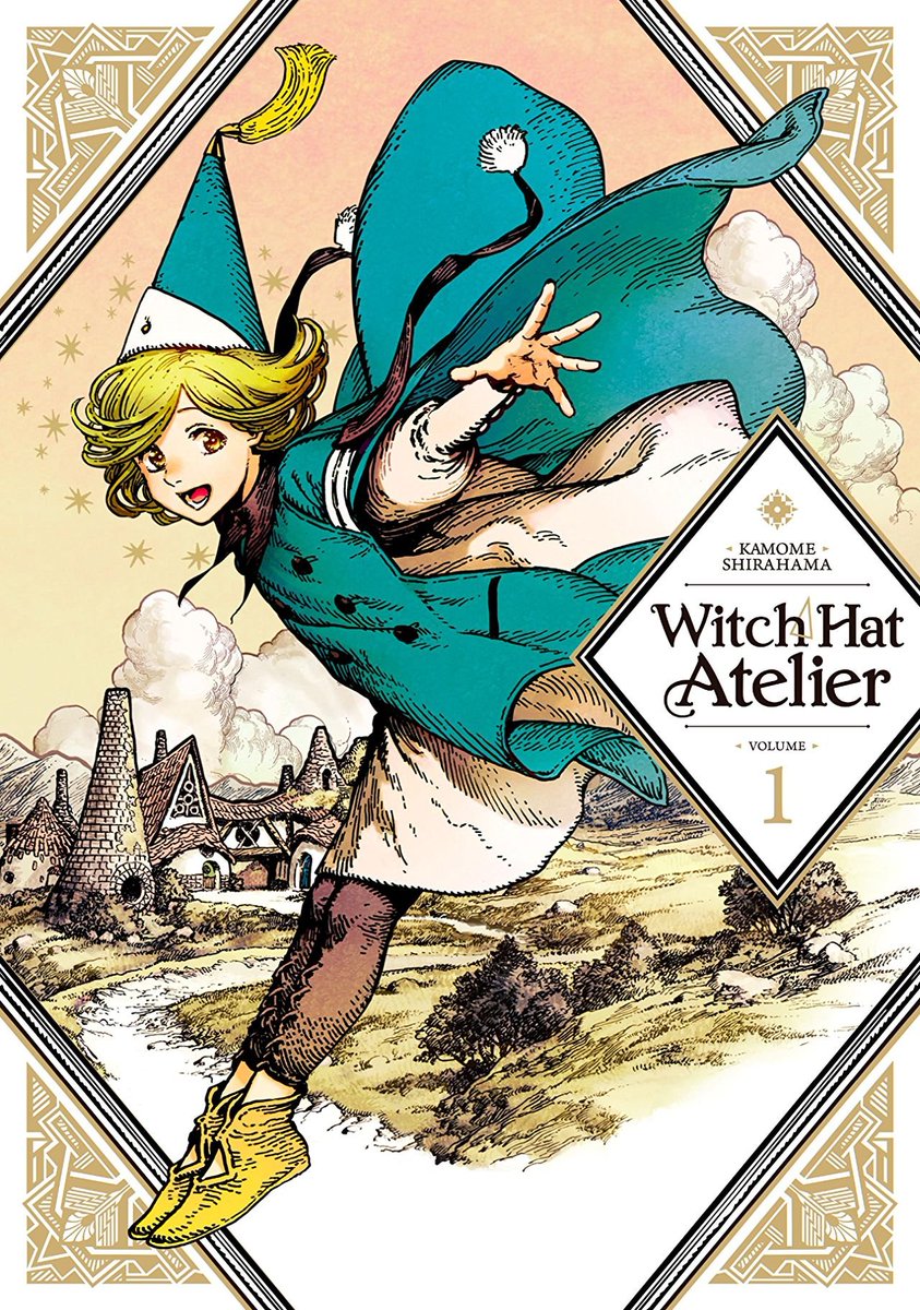
I’m dedicating this inaugural #ShoutoutSaturday to Lys Blakeslee’s lettering work on Witch Hat Atelier from @KodanshaUSA.
Lys makes several intentional choices throughout the series that I want to highlight in this thread.
#manga #lettering
Lys makes several intentional choices throughout the series that I want to highlight in this thread.
#manga #lettering
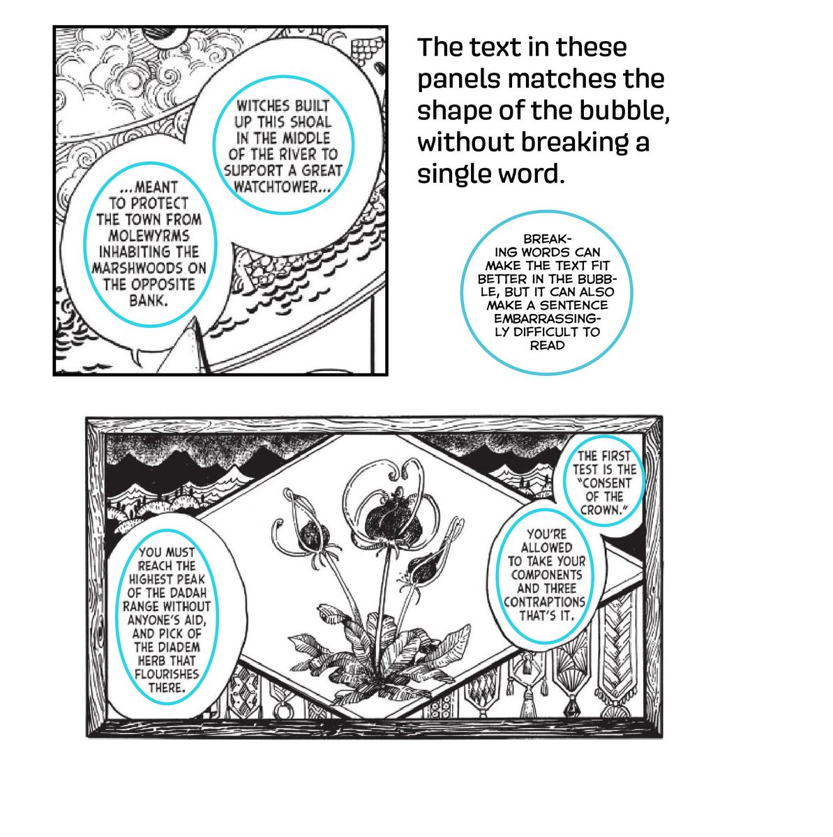
The dialog font, Samaritan Tall, is a very smart choice. It complements the art style, and its narrow width makes the story a breeze to read
Witch Hat has many fantasy titles and names, and the letterer is actively making the story easier to read just by their choice in font
Witch Hat has many fantasy titles and names, and the letterer is actively making the story easier to read just by their choice in font
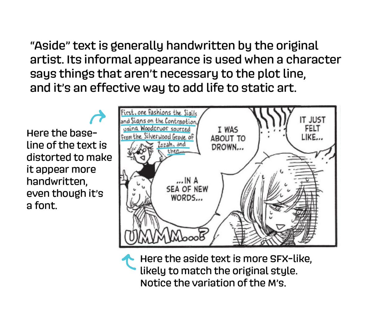
The aside text in Witch Hat Atelier is especially well done. Instead of leaving the text to be uniform and lifeless, the letterer matches the tone of the art with several techniques, like distortion and whitespace.
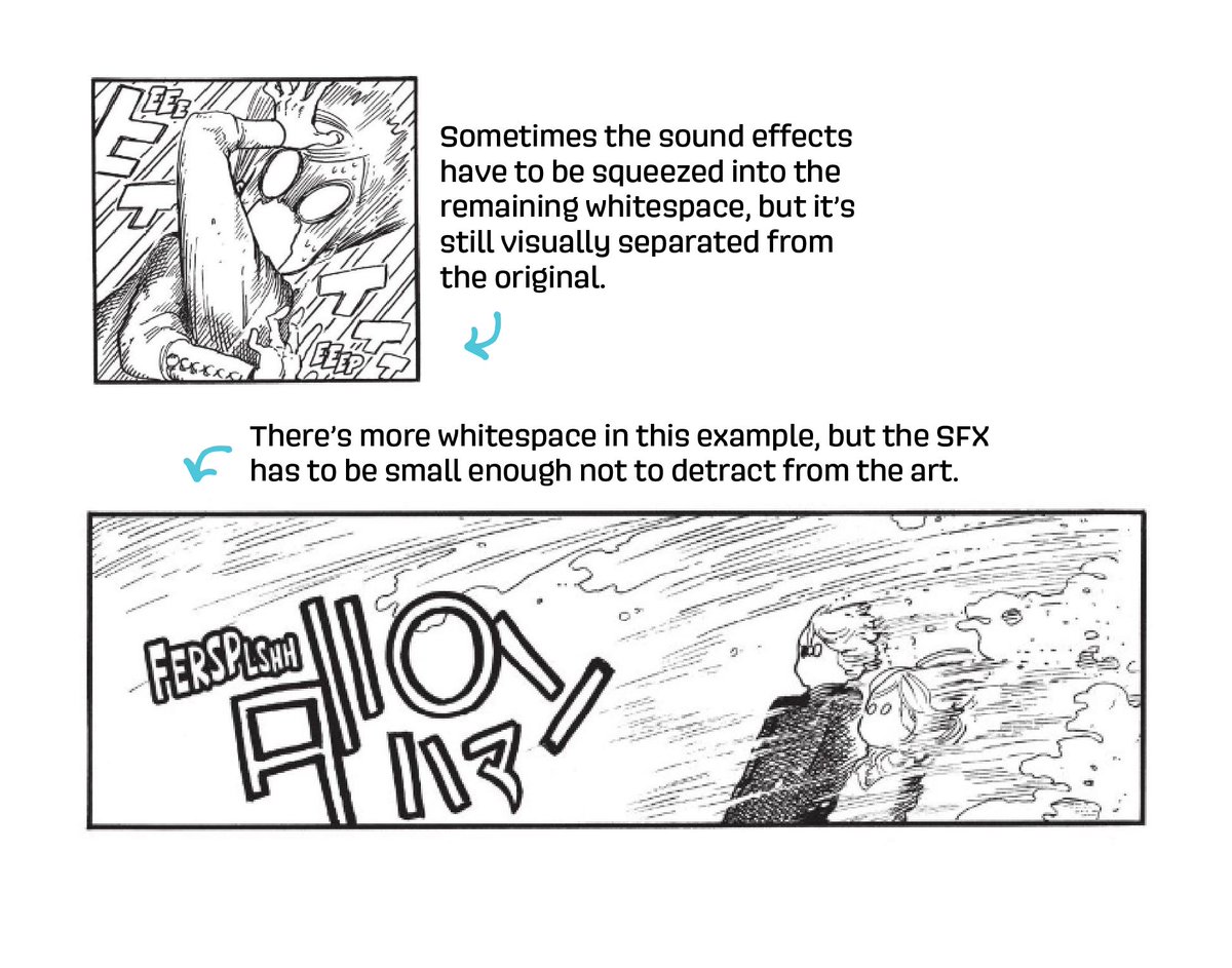
Like many Kodansha titles, Witch Hat Atelier has subtitled sound effects. The letterer expertly mimics the original art style, creating animated words that you can almost hear.
All of these techniques combined mean that the translated text matches so seamlessly into the pages that the reader can immerse themselves into this beautifully illustrated book. This is what we mean by "good" lettering.
I only highlighted the lettering in this thread, but every comic is the result of the hard work of several people. Here are the credits from the copyright page:
Art: Komame Shirahama
Translation: Stephen Kohler
Lettering: Lys Blakeslee
Editing: Ajani Oloye
Art: Komame Shirahama
Translation: Stephen Kohler
Lettering: Lys Blakeslee
Editing: Ajani Oloye
*Kamome Shirahama apologies!

 Read on Twitter


