There’s been lots of discussion lately, led by @jamesaknight and @brucemillington on here, around the value of sectional times so I thought I’d take a moment to highlight what we’ve been doing with the data provided by @TPDZone and @arenaracingco on http://attheraces.com"> http://attheraces.com .
Sectionals aren’t the be all and end all of form study, but rather like archive video they are a useful tool that can add to the overall picture. They can be used to confirm suspicions and debunk preconceptions.
We ( @AtTheRaces) first published sectional times back in 2016 and since then the service has been extended to all 12 ARC Flat courses - that& #39;s around 42% of the entire UK flat fixture list. Sectional data from the tabs at the top of results pages on http://attheraces.com"> http://attheraces.com .
Sectional times are complex. What we think of as significant margins in a race – say two lengths – equate to just fractions of a second so when times for a race are displayed in a conventional grid everything looks pretty similar unless you know what you’re looking for.
To make this easier to visualise, we colour-coded our grid based on par or optimum times provided to us by @RowleyfileRRR , UK racing’s foremost expert on sectionals (more on him later).
The aim of the colour-coding was to show for each section how close to the optimum each horse had raced. It’s works as a cool-hot colour spectrum with blue showing slow pace and red fast.
Here’s the grid for the Easter Classic back in April. Matterhorn& #39;s two quicker opening furlongs – the first albeit slower than par – gained him a significant lead over the 2nd and his rider was able to get a breather (in green) into him from 4f–3f out.
To help make sense of the colour-coded grid, we then created a pace bar that sits above it and gives an overall impression of how the race was run. In this example – for a 6f sprint - the leaders went off fast but then slowed it down from 3f-2f out.
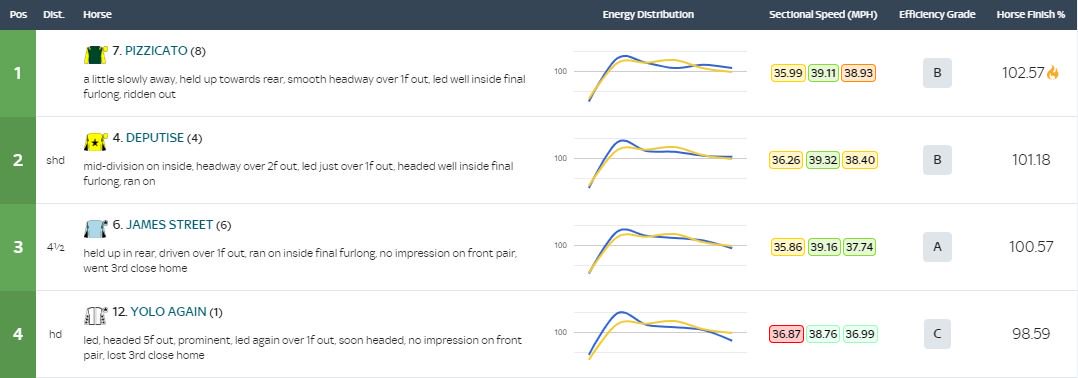
To give more insight into the data, we created a Sectional Tools tab in the same menu bar. This includes energy distribution graphs, average speeds in MPH for the race split into three sections and an efficiency score for each horse.
In this example, for the 3yo Sprint on Finals Day won by Pizzacato, the first two both raced efficiently but not so much as the third, who was beaten fair and square given his A-rating, whilst the fourth used up too much energy early on, receiving a can-do-better C grade.
Once we had a decent mass of data, we then pulled a summary of that information through onto each horse’s form profile page on ATR, appearing in the Sectional Data column.
If you use the form filters on our website, you can isolate Goring (winner of the Apprentice Handicap on the AW Card) to show just his runs on the AW and you can further filter them to show his wins and unplaced runs.
The first image below shows his wins on the AW – note they all came when the pace was even or faster. The second shows his unplaced runs and this time they show most came when there was a sedate early pace.
In many ways, the most exciting element of the development of sectional times are the by-products that will emerge. The first has been Stride Data, which we’ve been publishing on http://attheraces.com"> http://attheraces.com since early last year in the form of stride length and frequency (cadence).
This is an area that requires more research, but it seems to be broadly agreed that in terms of frequency/cadence sprinters will record higher figures than middle and long distance horses.
When Too Darn Hot met Phoenix Of Spain in the Champagne Stakes at Doncaster last year, it was noticeable that the winner possessed a higher cadence than the runner-up, suggesting he was more of a sprinter/miler than a Derby contender.
There are exceptions to the rule, notably the sprinter Kachy, who has recorded an average frequency of between 2.29 and 2.38 strides per second on each of his six starts on the AW. Those figures suggest he’d be just as good over 7f... what do you think @jdavelowe?
Stride Length is more of a physical measure, but it can still be useful in providing insight into a horse’s performance, particularly when it departs from what has otherwise been the norm in other races.
Going back to Wissahickon’s run in the Easter Classic, it’s interesting that his stride (24.78ft) was shorter on Good Friday than it was in any of his three previous wins over the same course and distance (each +25ft) – perhaps there was a reason why he wasn’t striding out fully?
A great way to learn more about sectionals and strides is to read the weekly blog from the brilliant @RowleyfileRRR on attheraces here http://www.attheraces.com/blogs/sectional-spotlight.">https://www.attheraces.com/blogs/sec...
Over the next couple of months we’re hoping to add more functionality to the sectional & stride data services we provide on http://attheraces.com"> http://attheraces.com and hopefully that will include jumps tracks. From the limited data I have seen over jumps I believe it has massive potential.
We’ve done our best to make the data accessible, but it will always require investment in terms of learning on the part of the user, which I believe has the potential to add to the enjoyment of our sport for many people.
If anyone has any thoughts on how we can improve the service please feel free to DM me.
PS. Sorry I didn& #39;t mean for all those massive ATR images to appear each time I posted a link!
I should have also added that the data can be used in other ways too, not least in how to improve the experience of watching a live race etc... but that’s probably worthy of another thread entirely!

 Read on Twitter


