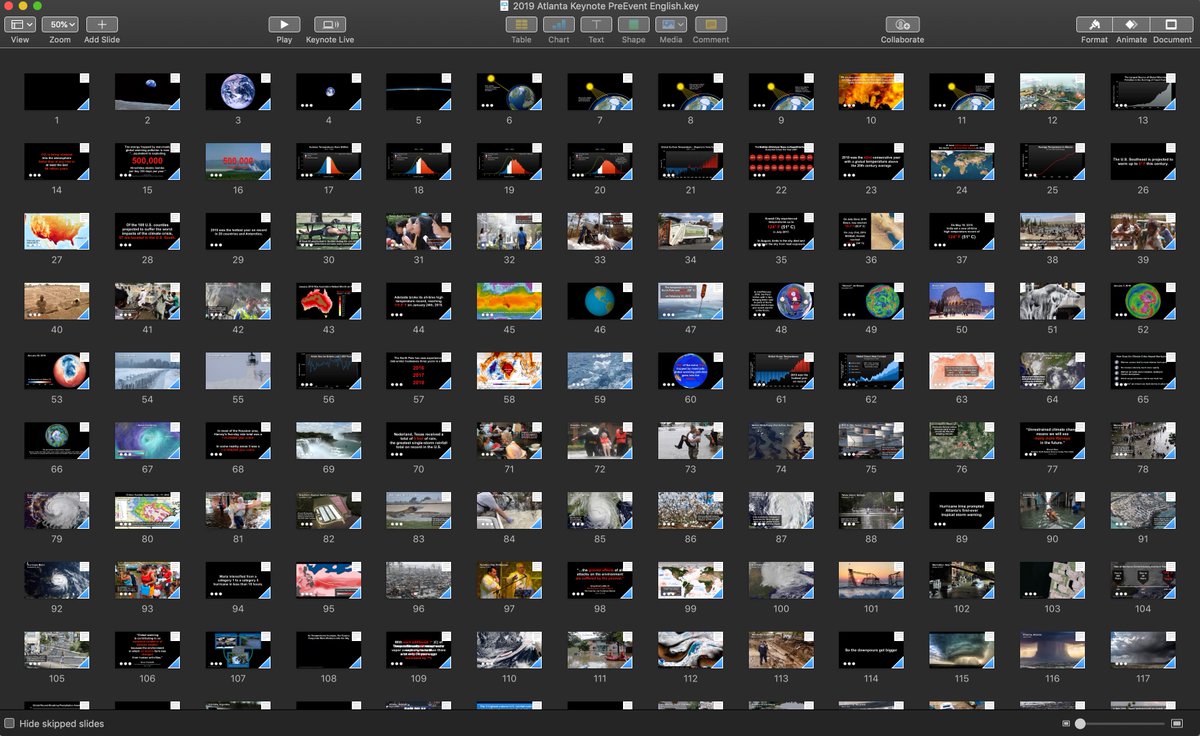
My interest in better science presentations was fired up by watching & #39;An Inconvenient Truth" way back in & #39;06 and thinking "why can& #39;t scientists share our work that way?". Thanks to @HSayani I spent the afternoon snooping thru @algore& #39;s modern slide deck and it is fascinating!
So what type of visual aids does @algore use in his & #39;climate crisis& #39; slide deck? And what design elements are commonly used throughout his presentation? Maybe there are a few good ideas we climate scientists can use in our own conference presentations and class lectures...
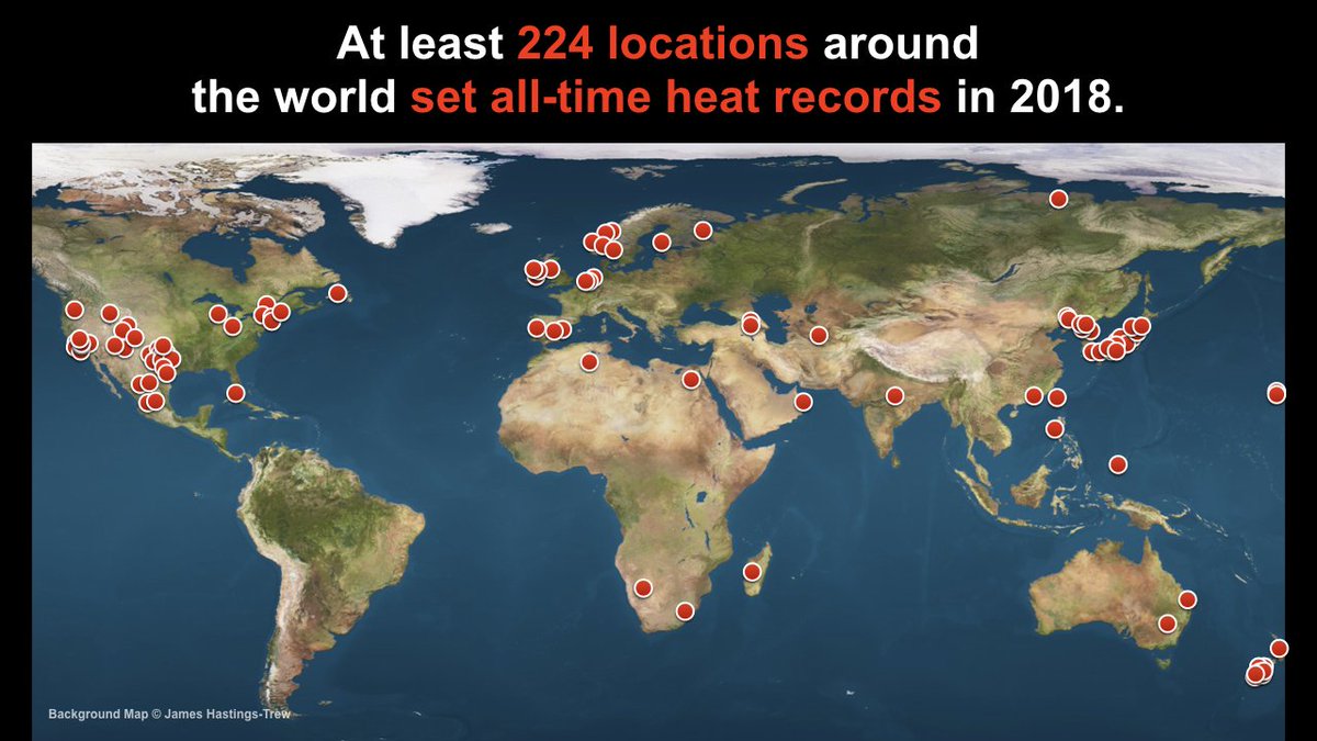
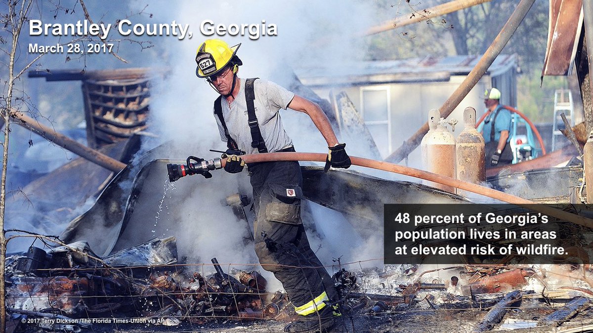
First, I guarantee the venues that host @algore have much better projection systems than our classrooms or lecture halls. But even so, he shows one image at a time, uses the entire screen, and adds only a brief text annotation.
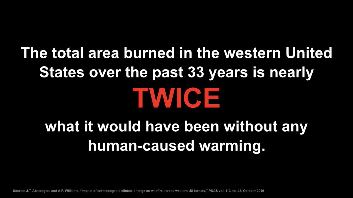
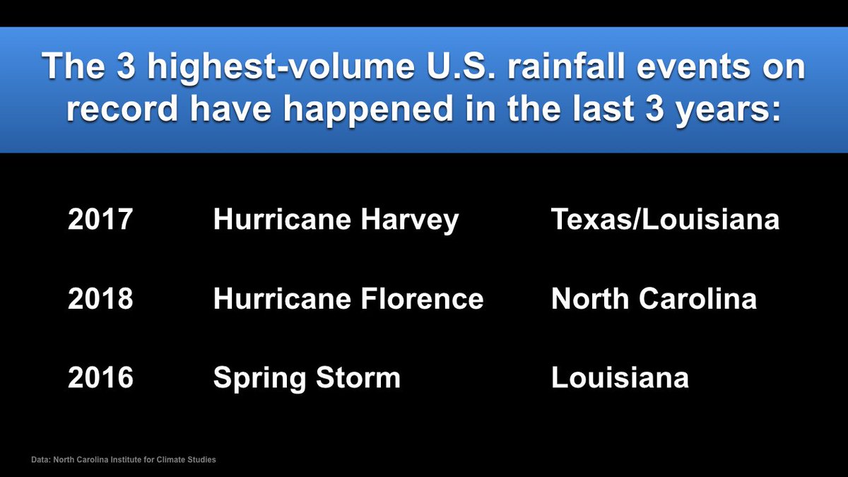
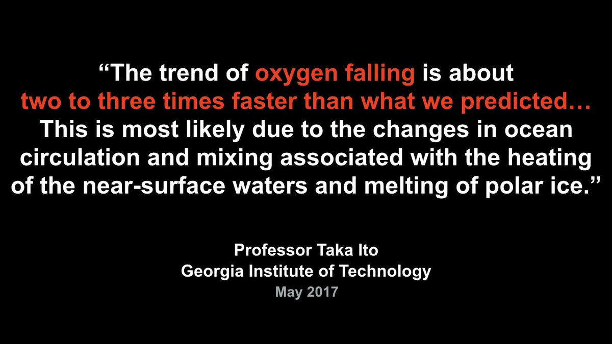
Know the & #39;7x7& #39; rule? We& #39;re told a single slide can have seven bullet points, each with phrases made up of seven words. @algore ignores that rule -- instead, his "text-heavy" slides only have one sentence each. Only one!
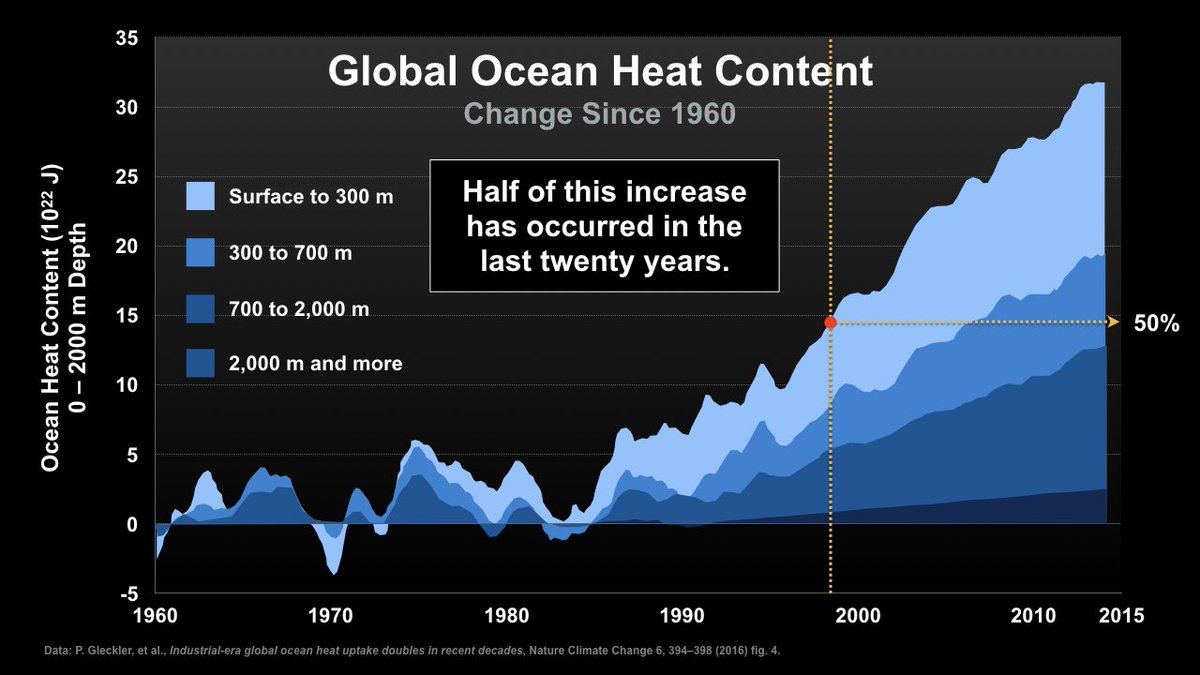
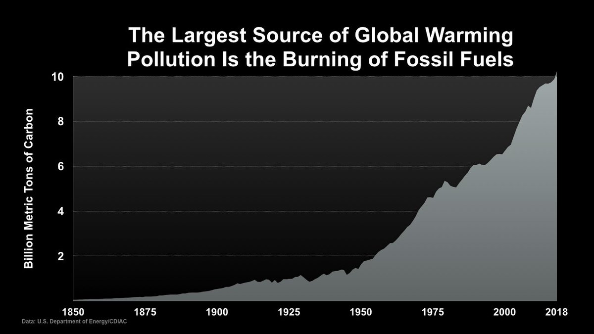
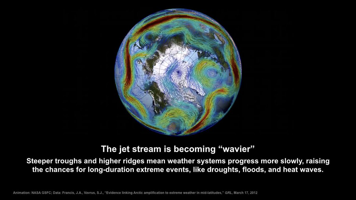
Data visualization slides follow the same principles: One graphic per slide, mainly simple time series plots or bar plots, big labels, and just a small dash of text to reinforce core take-aways.
Several slides include & #39;headline& #39; titles. Instead of just naming the content of the graphic, the text sets out the main purpose or point of the illustration.
Overall the visuals in the slide deck have a very consistent & #39;look-and-feel& #39;. Once the audience understands (and anticipates) what will be present, it should be easier for them to take up information more quickly.
That common structure is also applied to the text slides. Each one uses the same font, in the same size, with the same color (red and white on black, which gives extra emphasis to the seriousness of the subject).
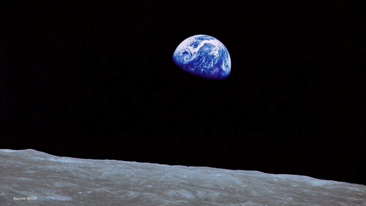
The deck includes A LOT of different sources -- probably more than 100 -- including several photographs and data graphics from @NASA and @NASAEarth. Not surprising since NASA produces the very best visual illustrations/aids in earth science education!
Finally, a lot of people have heard the & #39;one slide per minute rule& #39;. This deck scoffs at that rule. With 584 slides in a two-hour talk, it works out to (almost) 5 slides a minute (or 12s per slide). But it works because each slide is relatively easy for the audience to digest.
Anyway, that& #39;s my take on the mother-of-all-slide-sets. Even all these years later, I think most scientists, me included, can learn a lot from @algore when it comes to designing a killer talk. So the next time you& #39;re preparing a talk, please consider stealing some of these ideas!
And again, many thanks to @HSayani for finally helping me find what I was looking for so many years ago!

 Read on Twitter