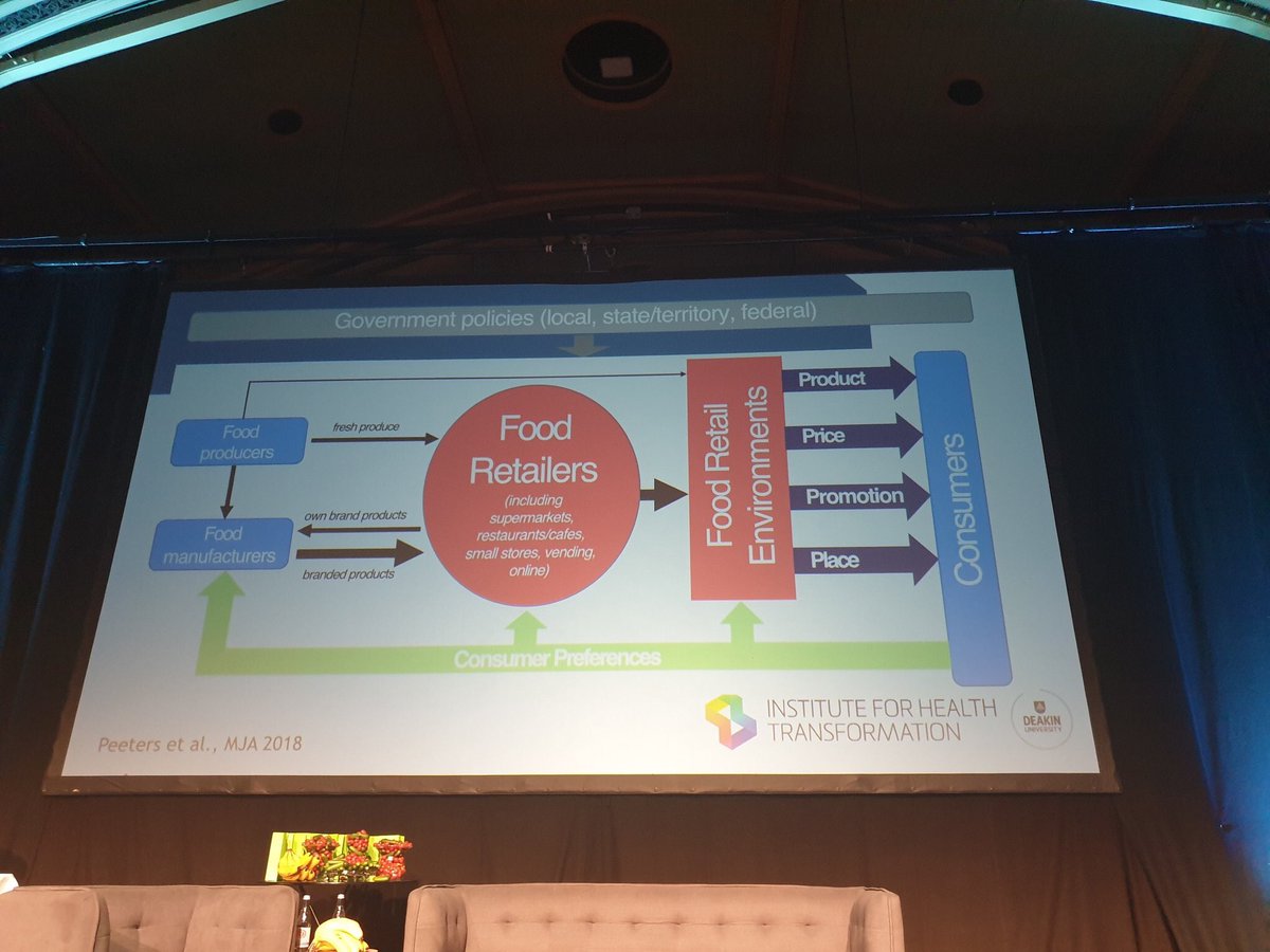
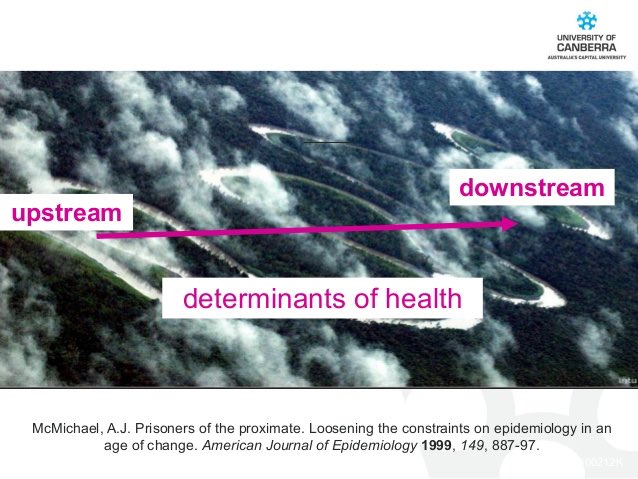
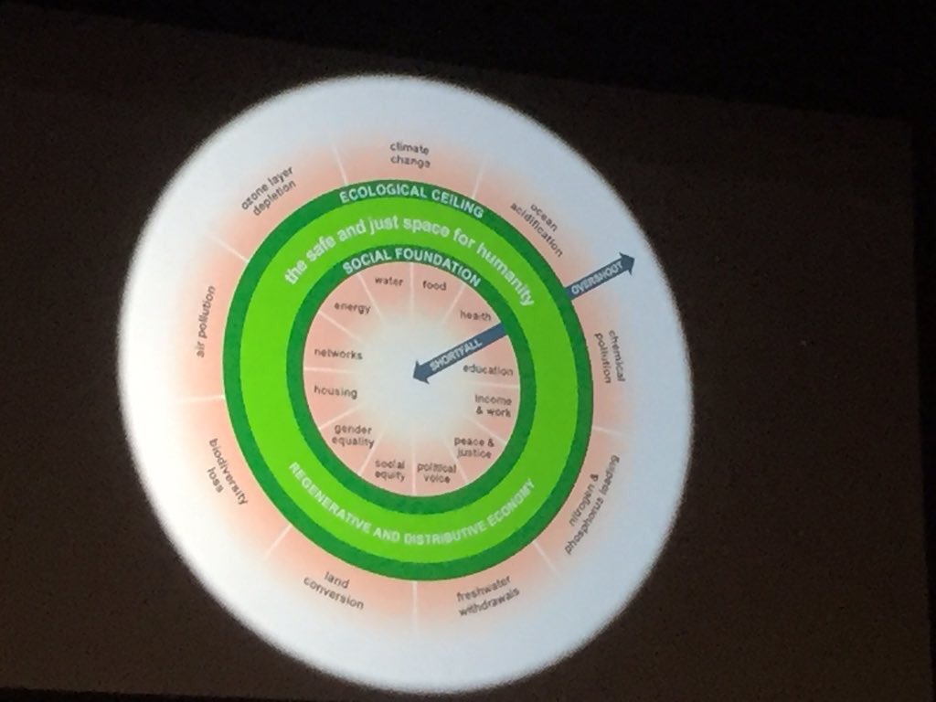
An occasional thread on meaningless graphics used by ‘public health’ academics.
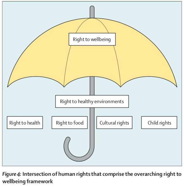
1/ An umbrella in the Lancet’s new obesity report.
1/ An umbrella in the Lancet’s new obesity report.
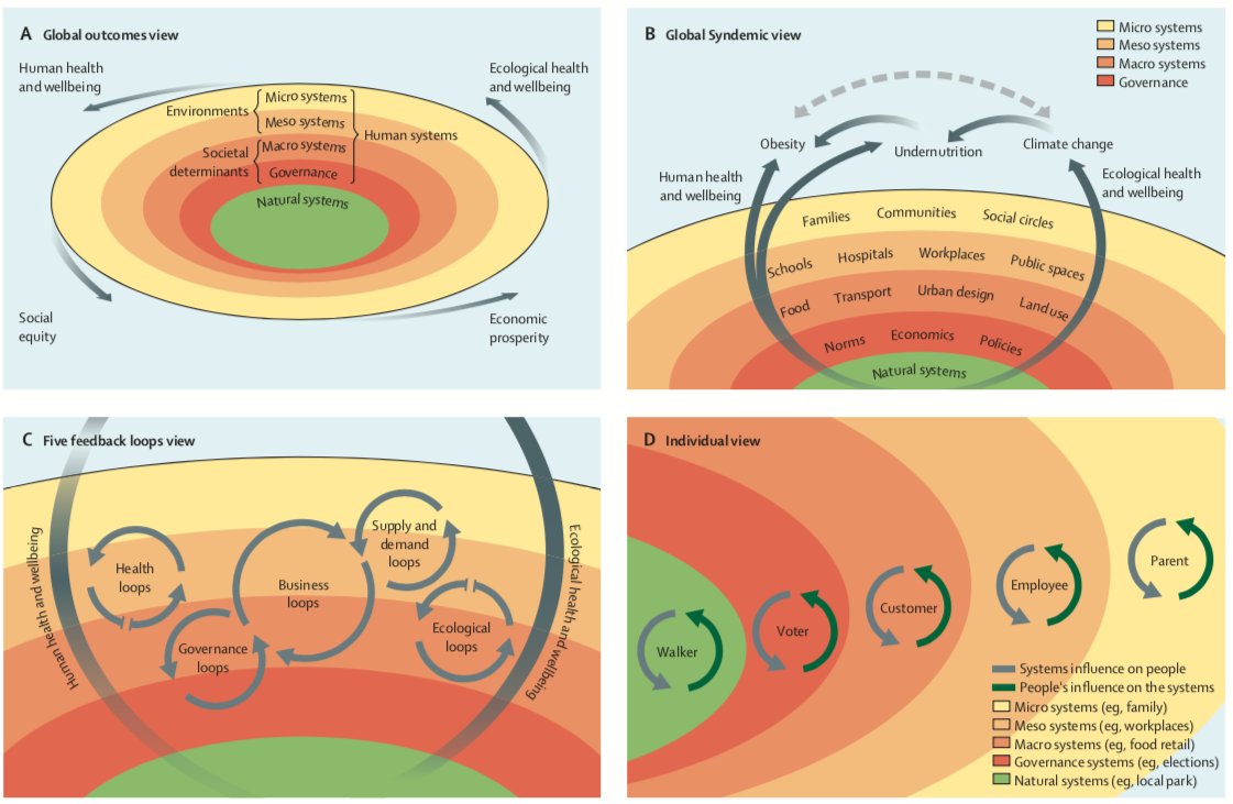
2/ The & #39;Systems Outcomes Framework’ from the same report. You could stare at this from now until the end of time and be none the wiser.
“UK sugar consumption has been falling since the 1970s? No problem, just use US data for the last bit. No one will notice.”
This graph has had a bit more attention today than it did when I first wrote about it. Originally spotted in the New Scientist. https://velvetgloveironfist.blogspot.com/2015/10/dodgiest-graph-of-year.html">https://velvetgloveironfist.blogspot.com/2015/10/d...

 Read on Twitter