All racing driver helmets should follow the basic rules of vexillology. (thread)
Too many drivers (the vast majority of them in my opinion) suffer from what I like to call KHD, or Karting Helmet Disease.
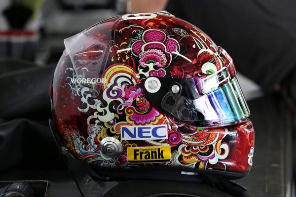
I& #39;m referring to helmet designs that are increasingly intricate for the sake of intricacy, to the point where they become less and less recognisable or meaningful.
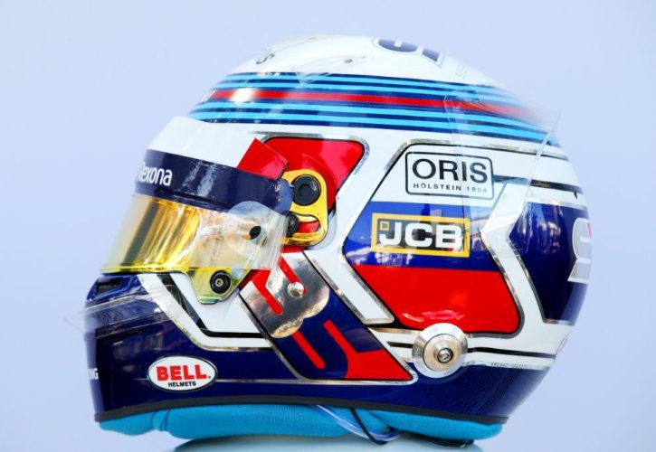
This isn& #39;t a recent phenomenon, there have always been drivers with helmets that were too complicated for their own good, but it& #39;s been getting worse. The worst offender in 2018 for me was Sergey Sirotkin.
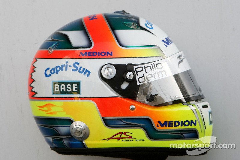
There were some clunkers as far back as I can remember, but the first I can remember that actively made me go "okay, this is getting ridiculous" was this & #39;effort& #39; by Adrian Sutil.
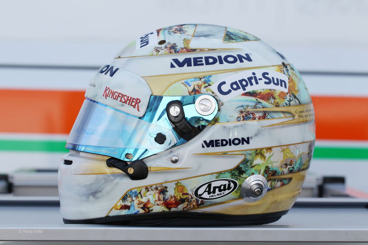
Adrian& #39;s efforts would of course go on to get worse.
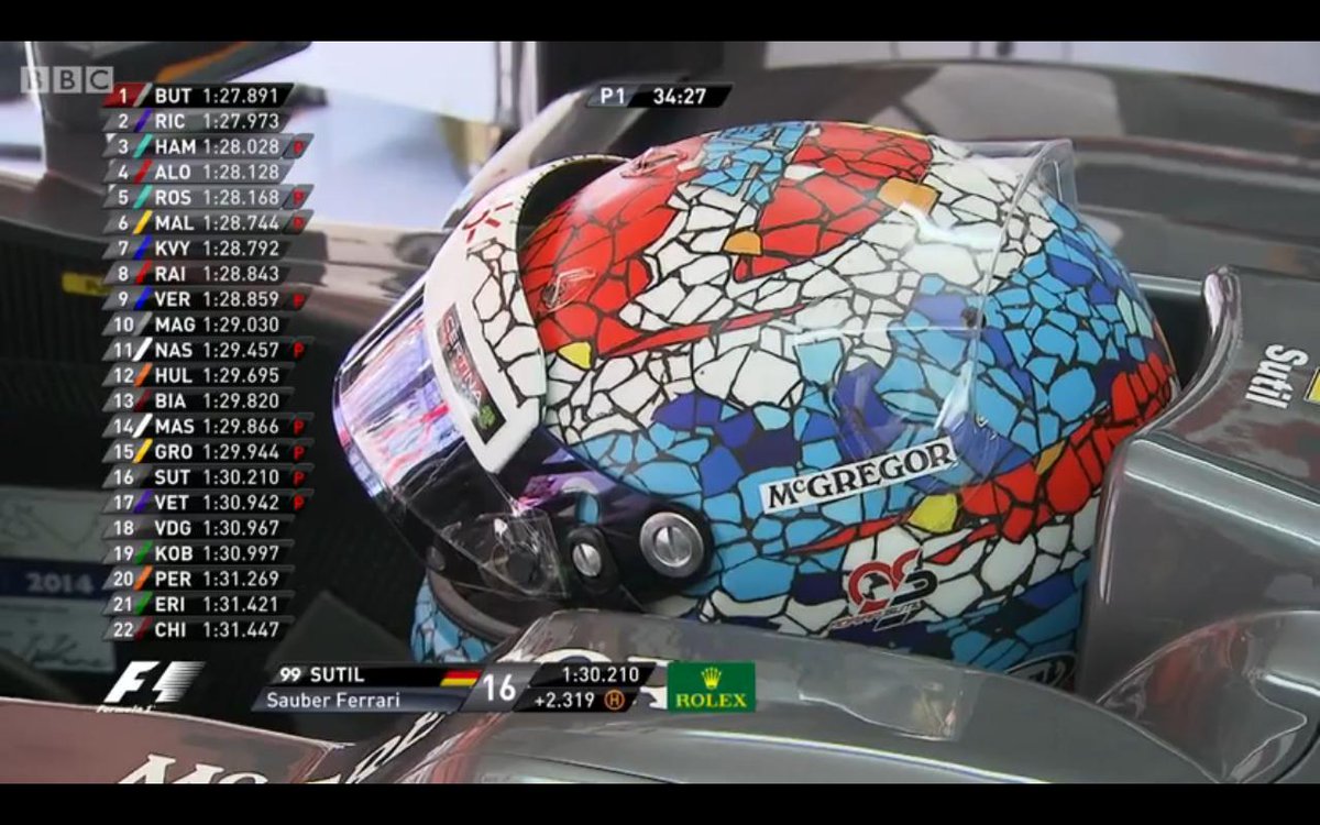
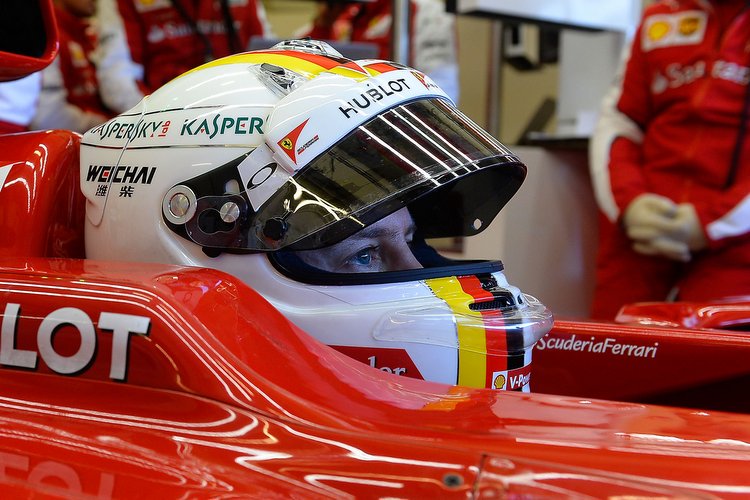
This disease reached its lowest point when Sebastian Vettel decided he would have a completely different design for every race of 2013. This was the direct catalyst for a rule mandating a limited number of changes to a driver& #39;s helmet design.
So I mentioned vexillology in the first tweet. This is the study of flags, and I feel like racing helmets could benefit from at least loosely following Ted Kaye& #39;s five rules of flag design:
1. Keep it simple, so simple a child can draw it from memory.
2. Use meaningful symbolism.
3. Use two to three basic colors.
4. No lettering or seals of any kind.
5. Be distinctive or be related.
2. Use meaningful symbolism.
3. Use two to three basic colors.
4. No lettering or seals of any kind.
5. Be distinctive or be related.
Bear with me as I go through all five and find good examples for helmets that follow each, and others that don& #39;t.
Let& #39;s do this.
Let& #39;s do this.
1. Keep it simple, so simple a child can draw it from memory.
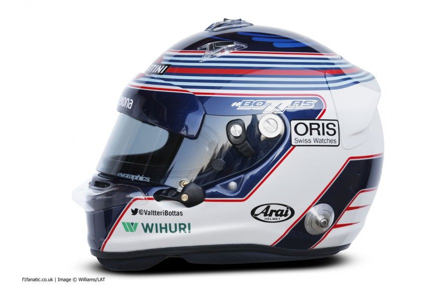
Most helmets from the last decade have failed this test. There are a blissful couple of recent exceptions though. Valtteri Bottas& #39; base design, prior to 2018 at least, is reasonably simple.
Most helmets from the last decade have failed this test. There are a blissful couple of recent exceptions though. Valtteri Bottas& #39; base design, prior to 2018 at least, is reasonably simple.
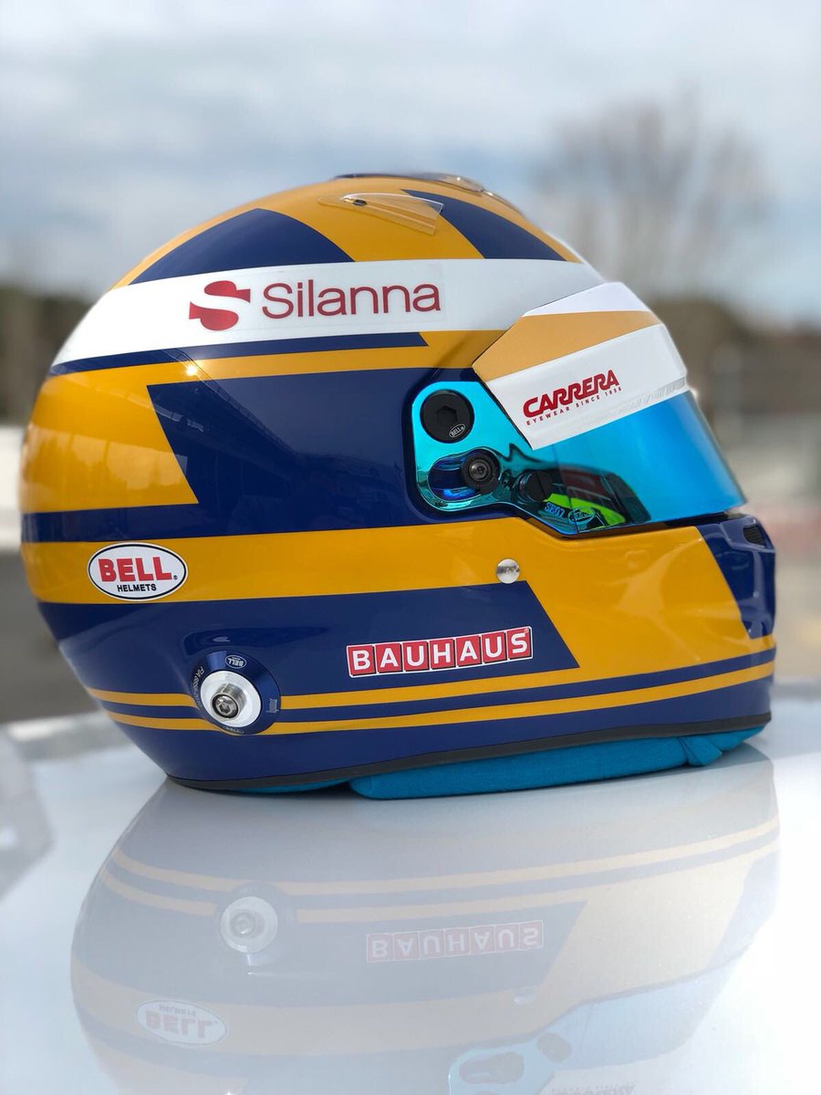
Even better, the previous worst offender of this rule has remarkably turned it around with the simplest design on the grid. Not counting all the sponsorship stuff, but more on that later.
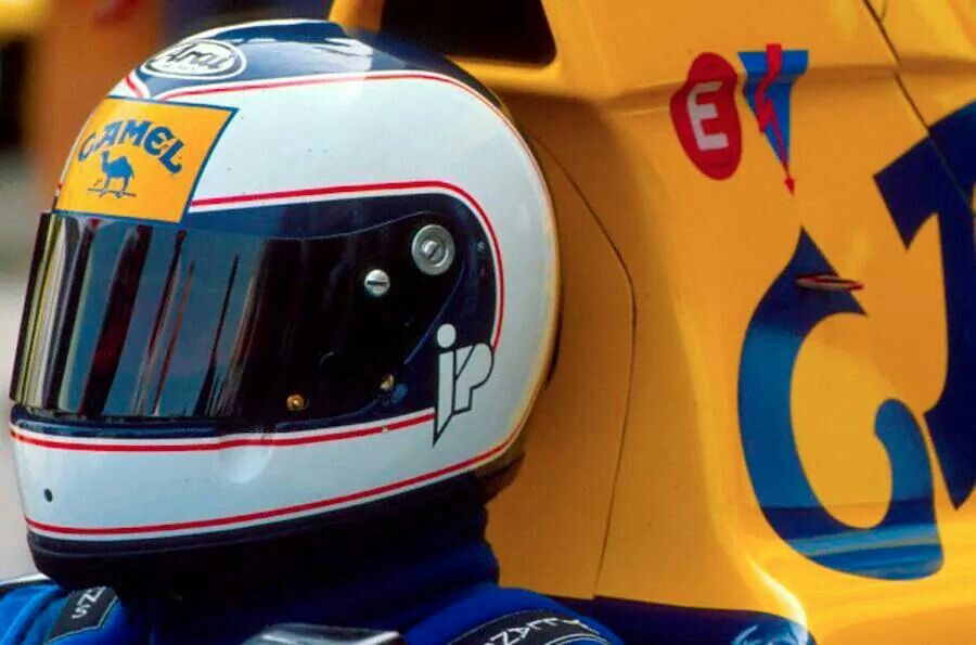
Another iconic example of doing this right is Ayrton Senna& #39;s helmet. One base colour, two stripes and minimal flourish. Simple, but effective.
And to show I& #39;m not biased exclusively against recent designs, here& #39;s Stefan Johansson failing to keep his design simple.
2. Use meaningful symbolism.
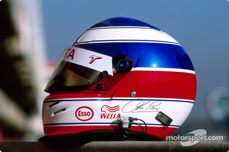
In vexillology, this means using colours that reflect a country& #39;s culture and history. In helmet design, this can be as simple as using your country& #39;s colours. I& #39;m looking at you, @Ericsson_Marcus and Olivier Panis.
In vexillology, this means using colours that reflect a country& #39;s culture and history. In helmet design, this can be as simple as using your country& #39;s colours. I& #39;m looking at you, @Ericsson_Marcus and Olivier Panis.
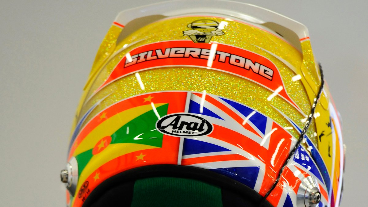
That& #39;s why even if they fall foul of most other rules, I& #39;ll give props to Lewis Hamilton& #39;s helmets that incorporate the Grenadan flag, as it& #39;s symbolic to him as the country of his ancestors.
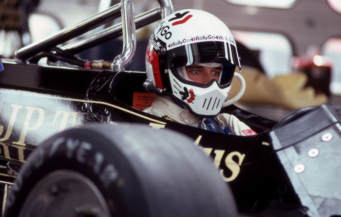
Also good: helmets similar to drivers you admire (Jean Alesi for Elio de Angelis), homages to previous family helmets (Jolyon Palmer for Jonathan Palmer)
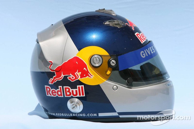
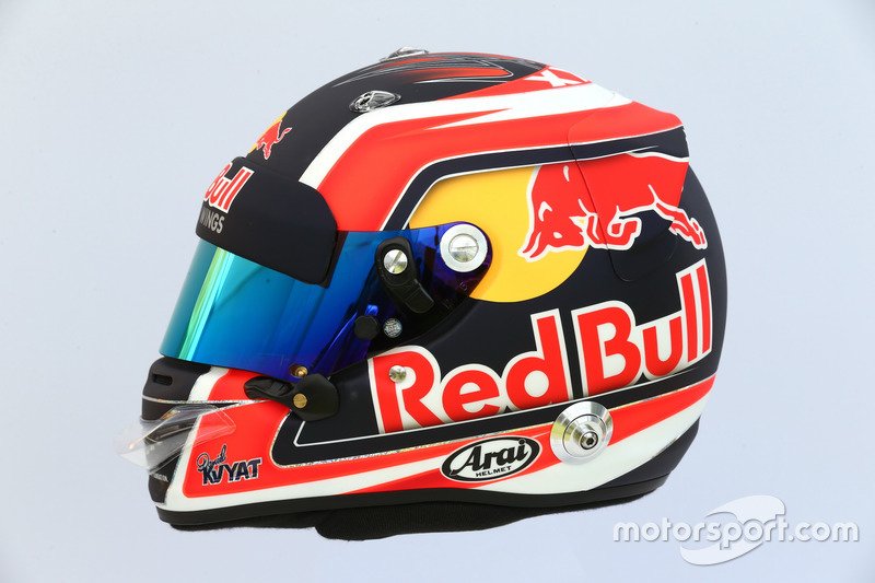
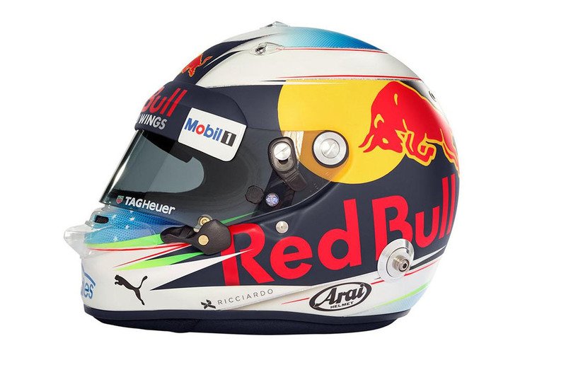
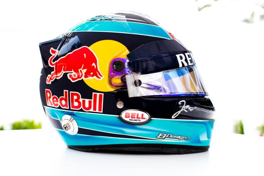
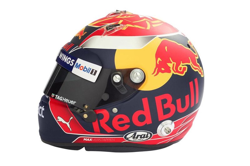
On the other end of the spectrum, you have helmets entirely dictated by sponsors (*glares in the general direction of the Red Bull junior stable*).
The worst historical offender in my view is Christian Klien& #39;s early work. Utterly devoid of any identity beyond "I get paid by an energy drink company".
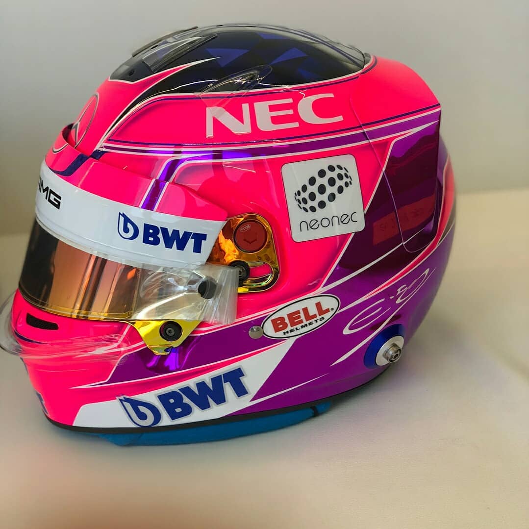
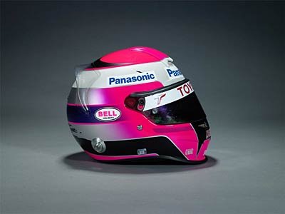
Beyond Red Bull though, I also want to bring attention to Esteban Ocon, whose usually distinctive red-and-black was converted into this pink-on-pink exercise in corporate branding.
4. No lettering or seals of any kind.
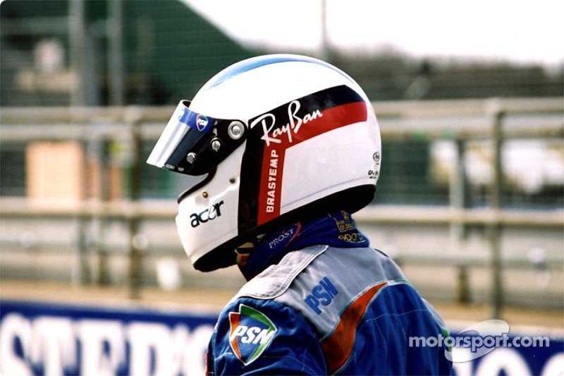
You won& #39;t find many seals on racing helmets, but lettering? You bet. I& #39;m not counting sponsorship logos, those are a very necessary evil. I& #39;m talking words that don& #39;t need to be there, like names or nicknames.
You won& #39;t find many seals on racing helmets, but lettering? You bet. I& #39;m not counting sponsorship logos, those are a very necessary evil. I& #39;m talking words that don& #39;t need to be there, like names or nicknames.
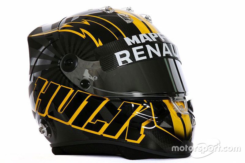
If you need to put your nickname on your helmet to be recognised, your helmet design is not good, Nico.
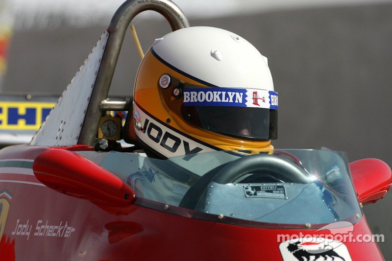
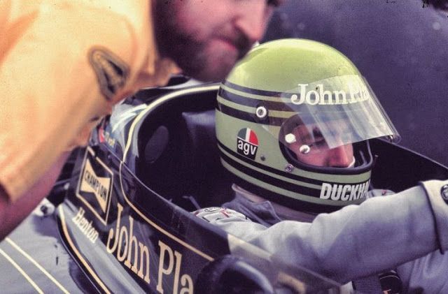
While I get putting your full name and flag in nice fine print is fine, putting your forename in bold all caps on your helmet doesn& #39;t make you cool, even if you& #39;re 1979 World Drivers& #39; Champion Jody Scheckter.
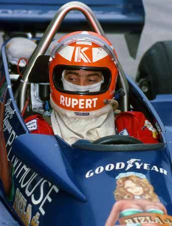
Even if you& #39;re driving a car that has a large scantily-clad woman painted on the front of it, Rupert Keegan.
At least stylise it like Jenson Button has done. It& #39;s very borderline, but I personally think it works really well, so I don& #39;t care tbh.
And finally 5. Be distinctive or be related.
"Be related" extends to the homages I mentioned in the symbolism bit, so I& #39;ll focus on "Be distinctive" here.
Make your helmet recognisably yours!
"Be related" extends to the homages I mentioned in the symbolism bit, so I& #39;ll focus on "Be distinctive" here.
Make your helmet recognisably yours!
The Red Bull/Toro Rosso drivers have a tough time of this. Without looking at the fine writing with their names, can you instinctively tell which of these belongs to Daniil Kvyat, Max Verstappen, Jean-Éric Vergne and Daniel Ricciardo?
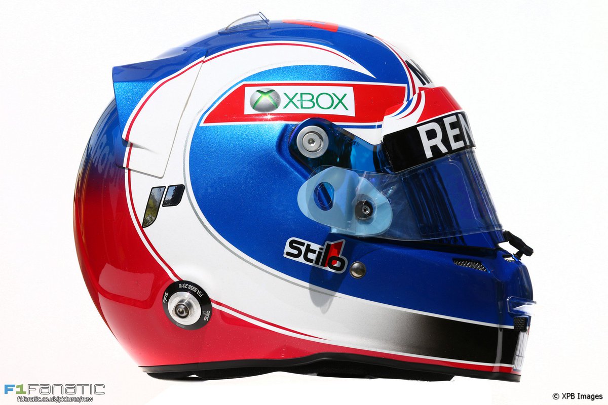
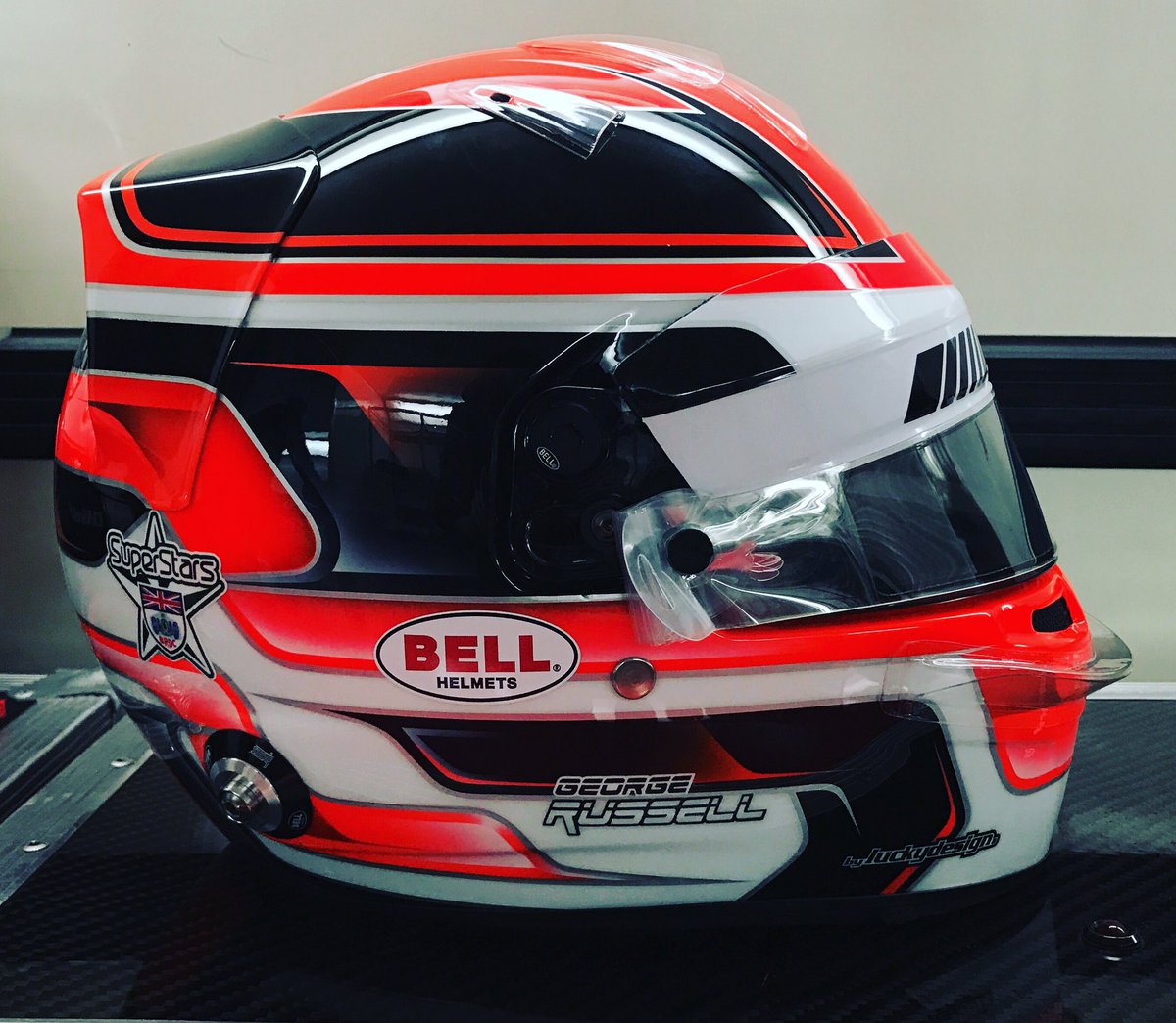
Just because your helmet has & #39;interesting& #39; flourishes and cascades doesn& #39;t mean it& #39;s distinctive. Everyone has those. I don& #39;t think I could reliably name this one as 100% belonging to George Russell (not including the name on it, which is too small to recognise at speed).
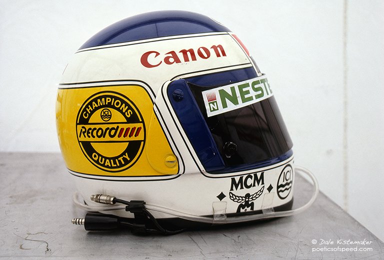
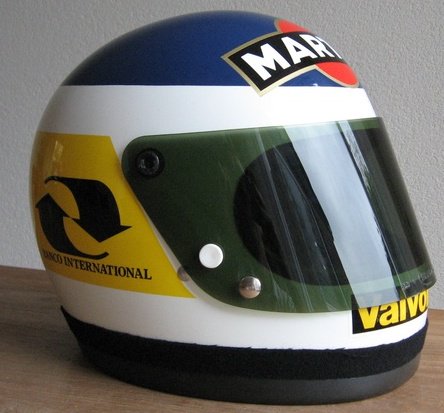
This isn& #39;t a new thing, by the way. I& #39;ve always struggled with distinguishing Michele Alboreto, Keke Rosberg and Carlos Reutemann.
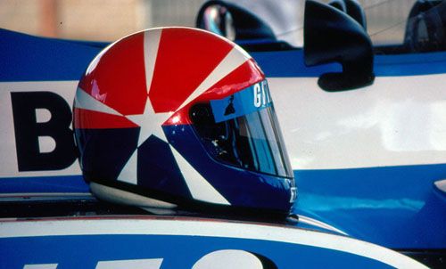
It& #39;s not hard to be distinctive! You can have a simple but unusual pattern like Heinz-Harald Frentzen or Eddie Cheever.

 Read on Twitter