We passed 2000 followers!u2028u2028 https://abs.twimg.com/emoji/v2/... draggable="false" alt="🥳" title="Partying face" aria-label="Emoji: Partying face">
 https://abs.twimg.com/emoji/v2/... draggable="false" alt="🎊" title="Konfettiball" aria-label="Emoji: Konfettiball">
 https://abs.twimg.com/emoji/v2/... draggable="false" alt="🎉" title="Partyknaller" aria-label="Emoji: Partyknaller">
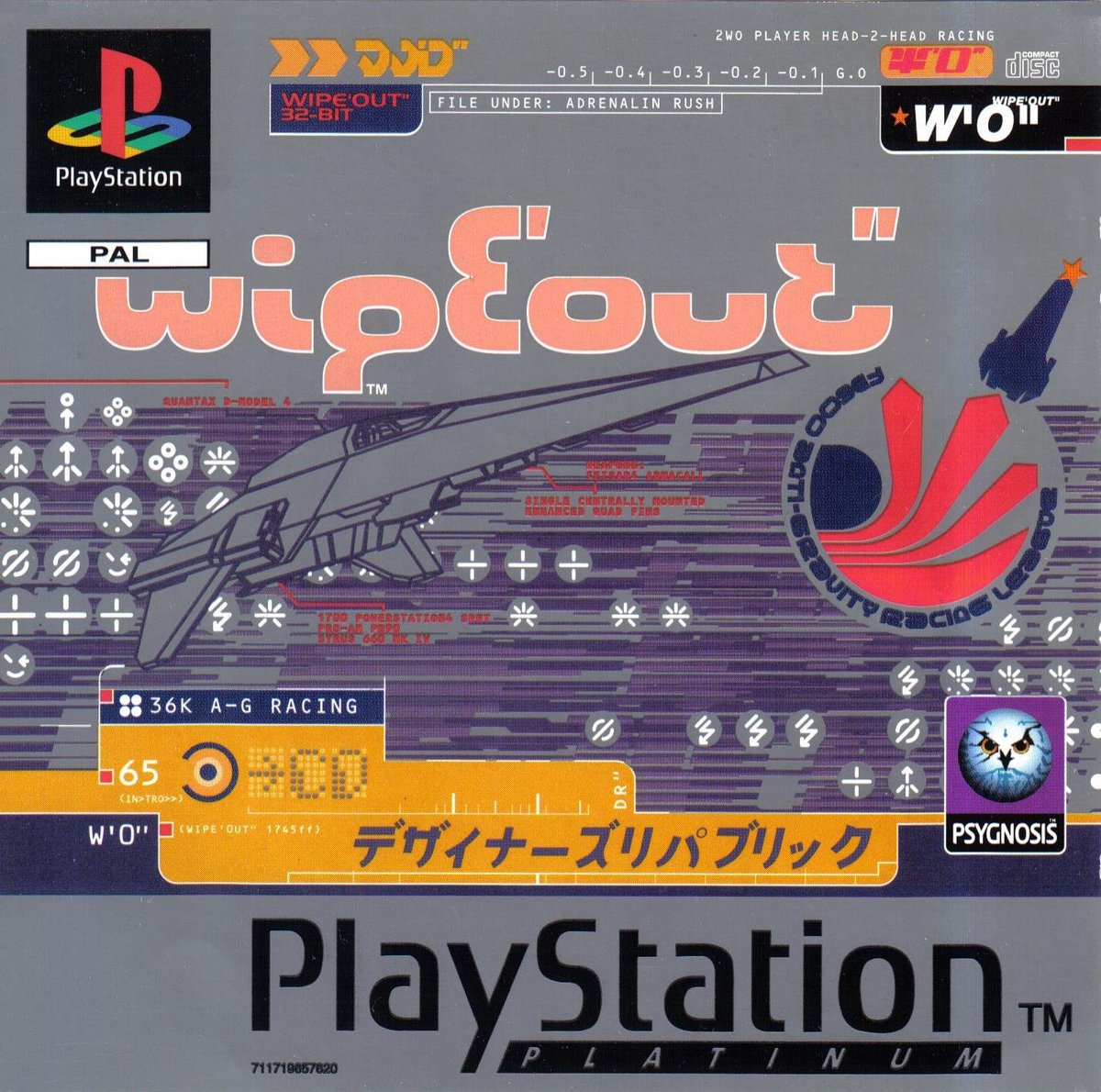
Wipeout Logo Thread:u2028Wipeout was an influential futuristic racing game, released in 1995, with art direction by The Designers Republic and a stellar soundtrack. What& #39;s in a logo? We will focus on tDR& #39;s Wipeout logo and its inspirations.
Wipeout Logo Thread:u2028Wipeout was an influential futuristic racing game, released in 1995, with art direction by The Designers Republic and a stellar soundtrack. What& #39;s in a logo? We will focus on tDR& #39;s Wipeout logo and its inspirations.
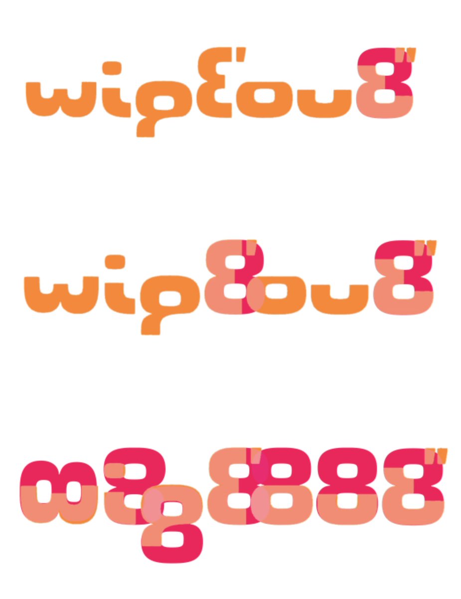
The Wipeout logo was designed by The Designers Republic in 1995, a landmark studio in Y2K graphic design. Upon looking at the design closely, one can notice these letters are actually made from partial 8 glyphs. Below are the overlays of the Wipeout logo with Eurostile’s 8 glyph.
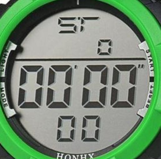
So why the repeating 8s? In an LCD screen, all numerals in a 7-segment display are created with the 8 numeral.
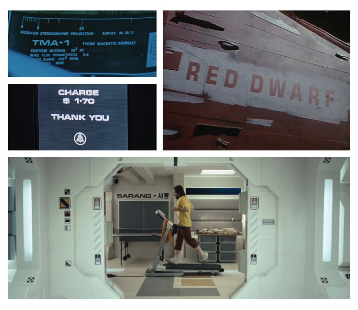
And finally, why is the typography set in Eurostile? Eurostile, and its predecessor Microgramma, has been established in the sci-fi canon since the late 60s as a symbol of futurism, as seen in user interfaces, signage, and in interiors. Wipeout is set in a futuristic world.
I contacted Ian Anderson, the head of tDR about this over a year ago, and he was able to confirm it.
Successful design is always intentional. Every decision here made in the Wipeout logo has a logical connection back to racing, and within the in-game universe of Wipeout. This teaches us a lesson to always make sure your design decisions hold weight.
Hope you enjoyed learning about the Wipeout logo!
My twitter is @FroyoTam, insta is: http://instagram.com/froyotam ,">https://instagram.com/froyotam&... and my design portfolio is http://froyotam.info"> http://froyotam.info .
My twitter is @FroyoTam, insta is: http://instagram.com/froyotam ,">https://instagram.com/froyotam&... and my design portfolio is http://froyotam.info"> http://froyotam.info .

 Read on Twitter
 https://abs.twimg.com/emoji/v2/... draggable="false" alt="🎊" title="Konfettiball" aria-label="Emoji: Konfettiball">https://abs.twimg.com/emoji/v2/... draggable="false" alt="🎉" title="Partyknaller" aria-label="Emoji: Partyknaller">Wipeout Logo Thread:u2028Wipeout was an influential futuristic racing game, released in 1995, with art direction by The Designers Republic and a stellar soundtrack. What& #39;s in a logo? We will focus on tDR& #39;s Wipeout logo and its inspirations." title="We passed 2000 followers!u2028u2028https://abs.twimg.com/emoji/v2/... draggable="false" alt="🥳" title="Partying face" aria-label="Emoji: Partying face">https://abs.twimg.com/emoji/v2/... draggable="false" alt="🎊" title="Konfettiball" aria-label="Emoji: Konfettiball">https://abs.twimg.com/emoji/v2/... draggable="false" alt="🎉" title="Partyknaller" aria-label="Emoji: Partyknaller">Wipeout Logo Thread:u2028Wipeout was an influential futuristic racing game, released in 1995, with art direction by The Designers Republic and a stellar soundtrack. What& #39;s in a logo? We will focus on tDR& #39;s Wipeout logo and its inspirations." class="img-responsive" style="max-width:100%;"/>


