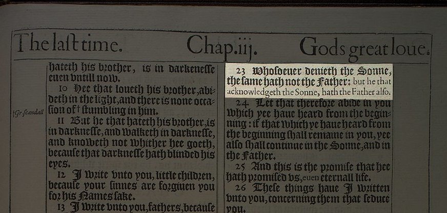
Here is a 1611 printing of the King James Bible, showing 1 John 2.23. Notice how the second half of the verse is in smaller roman type rather than larger blackletter.
Why? One of the translators’ principles was to put words that were needed to complete the meaning in smaller roman type. (See https://amzn.to/2P8rMYQ )">https://amzn.to/2P8rMYQ&q... Later, when the main text was set in roman type, printers used italics to mark these words. That’s what you find today.
But 1 John 2.23 is an exceptional case. That’s because the second half of the verse is not required to complete the meaning in the way most words set in roman type are. Instead, this is a textual variant.
You will not find these words in the Geneva Bible of 1599, for example. The Geneva Bible, of course, was not popular with King James I of England and it helped lead to the King James Bible in 1611.
But the KJV translators did not use Erasmus. They most often were influenced by the Theodore Beza’s 1598 edition of the Greek New Testament (see Irena Backus https://amzn.to/2TXI5vd ,">https://amzn.to/2TXI5vd&q... p. 34)
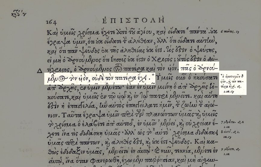
Here it is in the margin of Stephanus’s beautiful 1550 edition. Note the small Greek letters under the marginal reading, specifying which Greek witnesses in which the second part of the verse is found.
If I can see right, Stephanus cites δ, ι, ια, and ιγ. According to J. K. Elliott ( https://doi.org/10.1017/S0028688509000150),">https://doi.org/10.1017/S... these represent the following manuscripts. Note that one is now lost.
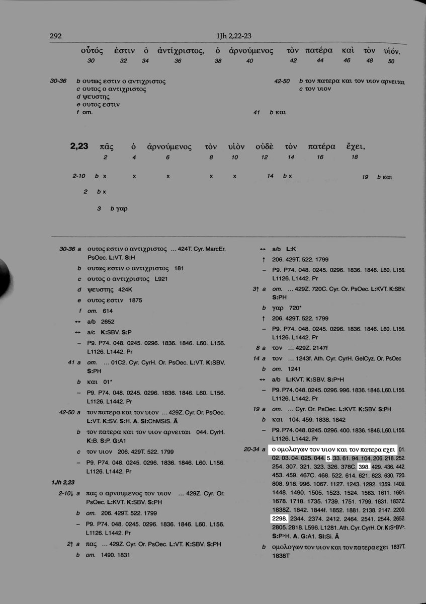
Sure enough, all three of these are cited in the Editio Critica Maior along with lots of other witnesses though not, I should note, with the majority of the Byzantine witnesses.
Why the variant here? Probably a simple case of homoioteleuton wherein scribes skipped from the ending on one word to the same ending on another (here τὸν πατέρα ἔχει to τὸν πατέρα ἔχει) and accidentally left out what’s in between.
For more on that, see here …http://evangelicaltextualcriticism.blogspot.com/2018/04/two-important-shorter-byzantine.html">https://evangelicaltextualcriticism.blogspot.com/2018/04/t...
What is interesting is that the KJV translators were aware of this variant and rather than deciding for or against, they seem to have used their normal way of showing things NOT found in the Greek (roman type) to mark something that MAY not be in the original.
As far as I know (and please correct me if you know), this is the only example where they used this typographical change to mark a variation in the Greek.
Here’s my KJV in @Logos which is “based upon the Pure Cambridge Edition first published around 1900. It has been carefully typeset to remove any typographical errors and accurately reflects the original text.” What I wonder is whether current print KJV editions have italics here.
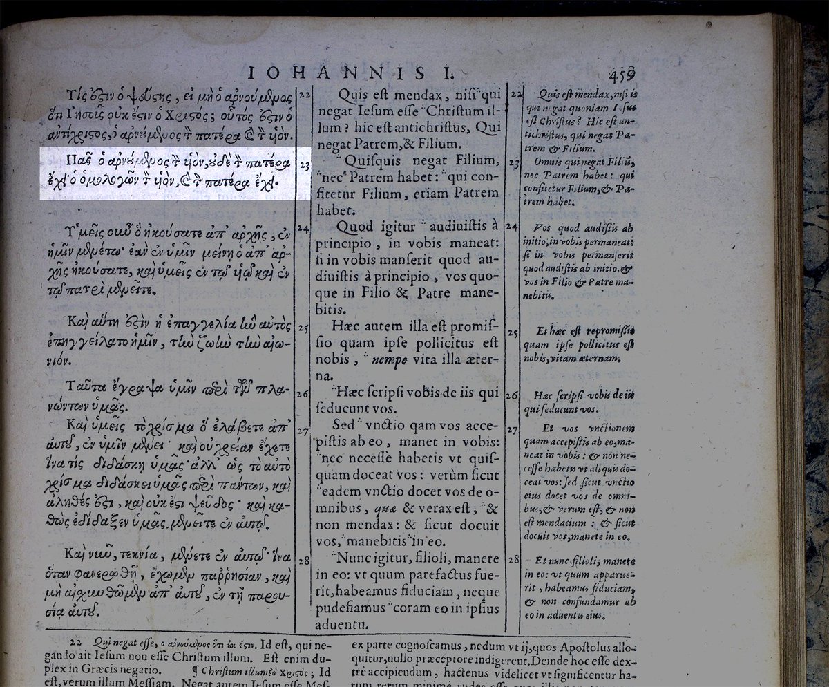
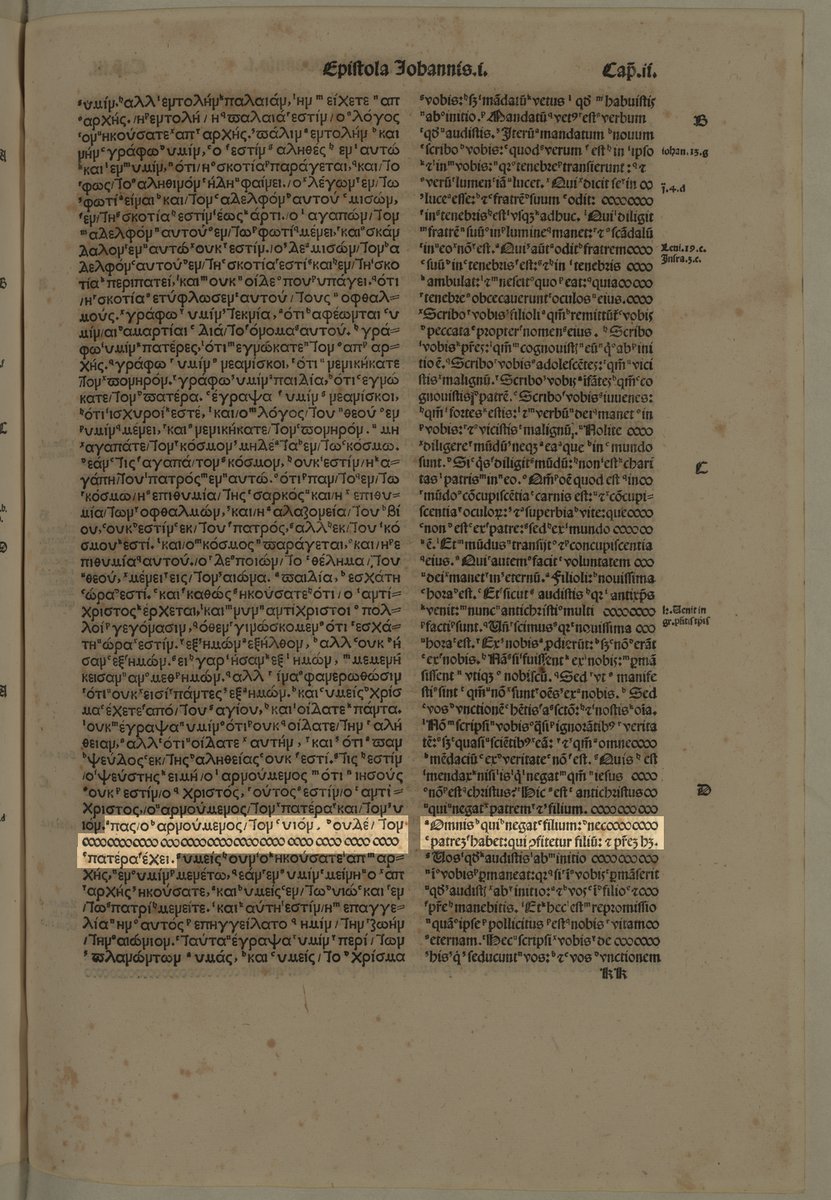
Also, note that just a year after his 1550 edition, Stephanus puts the longer form of 1 Jn 2.23 in the main text. This is, incidentally, the first time this is ever marked as verse 23 since this edition is the source of modern New Testament versification. (Photo credit to @CSNTM)
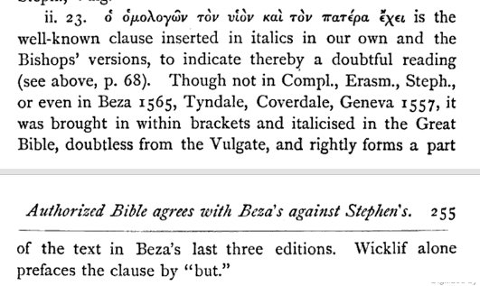
Addendum: here is the master of the KJV himself, F. H. A. Scrivener on 1 John 2.23 confirming that this is probably the only instance of this use of roman/italic type (see https://goo.gl/DxzJPb )">https://goo.gl/DxzJPb&qu...
Naturally, if I had just read Scrivener first, I would have saved myself all that work. But where’s the fun in that?

 Read on Twitter