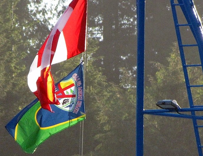
Alright, let& #39;s do this.
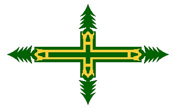
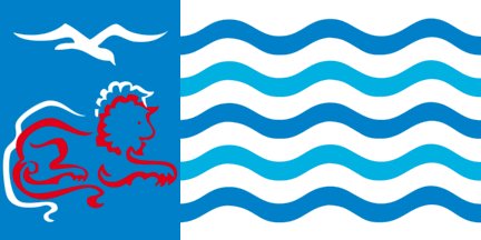
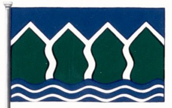
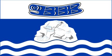
In this thread, I& #39;m going to rank every single municipal flag in British Columbia.
In this thread, I& #39;m going to rank every single municipal flag in British Columbia.
1. Feel VERY free to mute this thread. It will go on for a while.
2. All images/information comes from the invaluable Flags Of The World website: https://fotw.info/flags/ca-bc-.html
3.">https://fotw.info/flags/ca-... Here& #39;s all the information on scoring/rankers/miscellaneous stuff you may or may not find interesting.
2. All images/information comes from the invaluable Flags Of The World website: https://fotw.info/flags/ca-bc-.html
3.">https://fotw.info/flags/ca-... Here& #39;s all the information on scoring/rankers/miscellaneous stuff you may or may not find interesting.
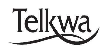
130. TELKWA (1.38 points)
- Just wrote their name on a piece of paper
- Great letterhead, terrible flag
- Seriously, why did you make this a flag, there& #39;s no need
- Just wrote their name on a piece of paper
- Great letterhead, terrible flag
- Seriously, why did you make this a flag, there& #39;s no need
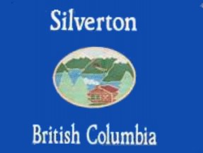
129: SILVERTON (1.5 points)
- Looks like a VHS tape or cover a children& #39;s book
- Those things are not flags
- The logo could be for anywhere in B.C.
- Looks like a VHS tape or cover a children& #39;s book
- Those things are not flags
- The logo could be for anywhere in B.C.
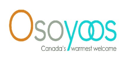
128: OSOYOOS (1.96 points)
- "Let& #39;s dress up the typeface," said a foolish person
- why are there three colours
- what is happening with the two Os coming together
- "Let& #39;s dress up the typeface," said a foolish person
- why are there three colours
- what is happening with the two Os coming together
127: SQUAMISH (2.00 points)
- Squamish is trademarked?!?
- Overlapping of the lettering = bad
- Not to belabour the point, but a banner and flag are different things
- Squamish is trademarked?!?
- Overlapping of the lettering = bad
- Not to belabour the point, but a banner and flag are different things
126: SALMON ARM (2.01 points)
- This is a logo for a car company, not a flag for a city
- tails on the A and M in "Arm" are VERY aggressive
- This is a logo for a car company, not a flag for a city
- tails on the A and M in "Arm" are VERY aggressive
125: SLOCAN (2.1 points)
- The flag website we& #39;re using has some that are clearly done in MS Paint as representations, so we don& #39;t know how 100% accurate this is, but still: no.
- Way too busy; looks vaguely like a graphic from Oregon Trail
- Five separate lines of text!
- The flag website we& #39;re using has some that are clearly done in MS Paint as representations, so we don& #39;t know how 100% accurate this is, but still: no.
- Way too busy; looks vaguely like a graphic from Oregon Trail
- Five separate lines of text!
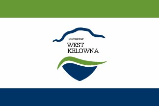
124: WEST KELOWNA (2.4 points)
- Our first "let& #39;s put our logo between two bars" flags. GET READY FOR MORE
- Bars are too skinny, text is too busy
- Our first "let& #39;s put our logo between two bars" flags. GET READY FOR MORE
- Bars are too skinny, text is too busy
123: METCHOSIN (2.5 points)
- We scored this, but then the image mysteriously disappeared from the Flag website, so we couldn& #39;t find it. Sorry!
- We scored this, but then the image mysteriously disappeared from the Flag website, so we couldn& #39;t find it. Sorry!
122: PEMBERTON (2.58 points)
- Again, a banner is different than a flag
- Stop putting your names on flags
- Very generic, the "blue green and mountains!" thing is very overplayed in B.C. graphic design
- Again, a banner is different than a flag
- Stop putting your names on flags
- Very generic, the "blue green and mountains!" thing is very overplayed in B.C. graphic design
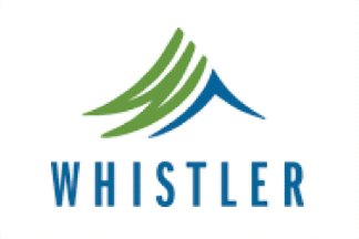
121: WHISTLER (2.58 points)
- did pemberton and whistler use the same company to design their flags
- very corporate feel
- the trees look like a "W", that& #39;s not bad!
- did pemberton and whistler use the same company to design their flags
- very corporate feel
- the trees look like a "W", that& #39;s not bad!
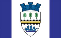
120: KENT (2.67 points)
- The text should be smaller than the logo
- This is fine, as far as logos go, but is not really a flag
- Just a big old "meh"
- The text should be smaller than the logo
- This is fine, as far as logos go, but is not really a flag
- Just a big old "meh"
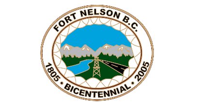
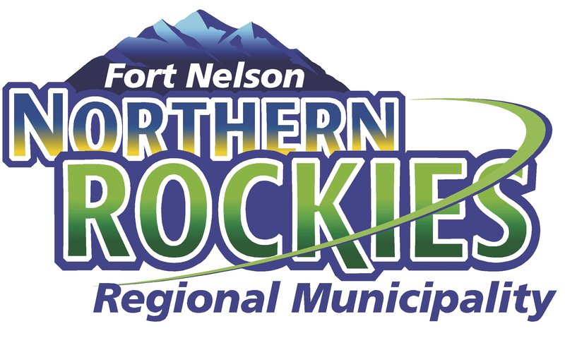
119: FORT NELSON (2.7 points)
- Would be a good sticker or pin
- Delighted as the inclusion of a transmission tower
- The more recent flag for the actual municipality wasn& #39;t on the site, but is below average in very different ways
- Would be a good sticker or pin
- Delighted as the inclusion of a transmission tower
- The more recent flag for the actual municipality wasn& #39;t on the site, but is below average in very different ways
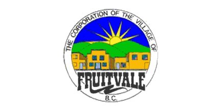
118: FRUITVALE (2.81 points)
- Say it with me: Too. Much. Text.
- One of our rankers is from Fruitvale, he& #39;s very cross that the buildings are not up to date, and thinks a flag should not have elements that are subject to change
- Ooh, a rising sun! Bet we won& #39;t see that again!
- Say it with me: Too. Much. Text.
- One of our rankers is from Fruitvale, he& #39;s very cross that the buildings are not up to date, and thinks a flag should not have elements that are subject to change
- Ooh, a rising sun! Bet we won& #39;t see that again!
117: TUMBLER RIDGE (2.9 points)
- The "TR" is the worst thing here, hiding a perfectly good mountain
- That "R" certainly goes on for a while
- Why did they change from their previous flag? It wasn& #39;t great, but it was certainly more memorable/frightening
- The "TR" is the worst thing here, hiding a perfectly good mountain
- That "R" certainly goes on for a while
- Why did they change from their previous flag? It wasn& #39;t great, but it was certainly more memorable/frightening
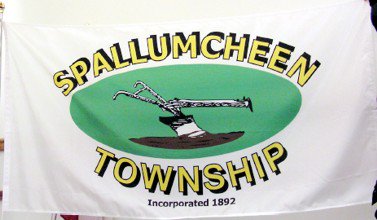
116: SPALLUMCHEEN (2.91 points)
- The shadowing on the text is certainly a choice!
- Stop putting when your town was incorporated on your flag, all of you
- The brown soil is weird, and the yoke looks like a hand
- The shadowing on the text is certainly a choice!
- Stop putting when your town was incorporated on your flag, all of you
- The brown soil is weird, and the yoke looks like a hand
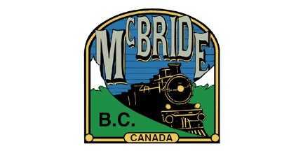
115: MCBRIDE (3.0 points)
- Choo choo!
- NUMTOT special
- <3 the completely unnecessary "B.C." in the bottom left
- Points for trying
- Choo choo!
- NUMTOT special
- <3 the completely unnecessary "B.C." in the bottom left
- Points for trying
114: GOLDEN (3.06 points)
- I get why there& #39;s the "golden" ribbon around the sides, but no
- There are good thoughts here, but overall far too busy
- I get why there& #39;s the "golden" ribbon around the sides, but no
- There are good thoughts here, but overall far too busy
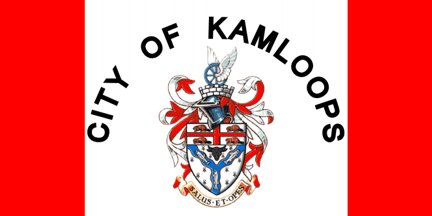
113: KAMLOOPS (3.19 points)
- Whyyyyyyy did you put the name of the city on here
- Otherwise it would just be another version of "a boring colonial crest does not equal a flag", which you& #39;ll start seeing more of
- Whyyyyyyy did you put the name of the city on here
- Otherwise it would just be another version of "a boring colonial crest does not equal a flag", which you& #39;ll start seeing more of
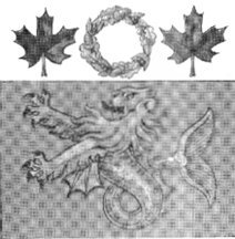
112: CITY OF NORTH VANCOUVER (3.25 points)
- The lions are sad? Concerned? Why are they red?
- Wavy lines denoting the ocean? Yeah, get ready for lots of those, some on flags that are good!
- This is just a crest though, not a flag, so
- The lions are sad? Concerned? Why are they red?
- Wavy lines denoting the ocean? Yeah, get ready for lots of those, some on flags that are good!
- This is just a crest though, not a flag, so
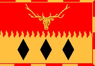
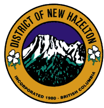
111: NEW HAZELTON (3.26 points)
- https://abs.twimg.com/emoji/v2/... draggable="false" alt="👏" title="Applaus-Zeichen" aria-label="Emoji: Applaus-Zeichen"> logos
  https://abs.twimg.com/emoji/v2/... draggable="false" alt="👏" title="Applaus-Zeichen" aria-label="Emoji: Applaus-Zeichen"> aren& #39;t
  https://abs.twimg.com/emoji/v2/... draggable="false" alt="👏" title="Applaus-Zeichen" aria-label="Emoji: Applaus-Zeichen"> flags
- Mountain is far too detailed for a flag
- Flowers are pretty though
-
- Mountain is far too detailed for a flag
- Flowers are pretty though
110: UCLUELET (3.3 points)
- Says the name twice!
- Feels like the badge for a swimming program
- is the whale trying to escape?
- Says the name twice!
- Feels like the badge for a swimming program
- is the whale trying to escape?
109: RUSHMERE (3.33 points)
- ROAR
- Is the bear happy or angry?
- I am aware Rushmere is not a municipality, it wasn& #39;t in my song, but it was on the flag website and the bear is fun
- ROAR
- Is the bear happy or angry?
- I am aware Rushmere is not a municipality, it wasn& #39;t in my song, but it was on the flag website and the bear is fun
108: ENDERBY (3.38 points)
- Looks like the beginning of a choose your own adventure book
- Also looks like a bumper sticker
- Points for doing the whole "we& #39;re near water!" thing from a different perspective
- Looks like the beginning of a choose your own adventure book
- Also looks like a bumper sticker
- Points for doing the whole "we& #39;re near water!" thing from a different perspective
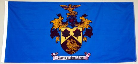
107: SMITHERS (3.4 points)
- Too many dark colours
- Still just a crest
- Why is the "Town of Smithers" thing on a pretend scroll, this is a flag
- Too many dark colours
- Still just a crest
- Why is the "Town of Smithers" thing on a pretend scroll, this is a flag
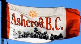
106: ASHCROFT (3.45 points)
- The gang& #39;s all here!
- a LOT going on here
- seriously, why do all of these things have to say "B.C." on them, WE ALL KNOW WHAT PROVINCE WE& #39;RE IN
- What& #39;s the deal with the star, why is it yellow
- The gang& #39;s all here!
- a LOT going on here
- seriously, why do all of these things have to say "B.C." on them, WE ALL KNOW WHAT PROVINCE WE& #39;RE IN
- What& #39;s the deal with the star, why is it yellow
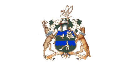
105: SAANICH (3.5 points)
- Still just a coat of arms, but this one is sort of graceful
- Why is a man vacuuming his carpet at the bottom
- Wait, are there chains around the animals& #39; necks?
- Still just a coat of arms, but this one is sort of graceful
- Why is a man vacuuming his carpet at the bottom
- Wait, are there chains around the animals& #39; necks?
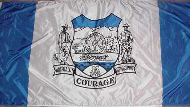
104: WILLIAMS LAKE (3.57 points)
- COURAGE
- You can barely read the "hospitality" and "opportunity" because it& #39;s so squished in, just like everything in this flag
- This could have been good with like 65% of the elements removed
- COURAGE
- You can barely read the "hospitality" and "opportunity" because it& #39;s so squished in, just like everything in this flag
- This could have been good with like 65% of the elements removed
103: QUALICUM BEACH (3.58 points)
- Spacing on "BEACH" is not good
- Very bland, but not the worst "shield+text" example out there
- Spacing on "BEACH" is not good
- Very bland, but not the worst "shield+text" example out there
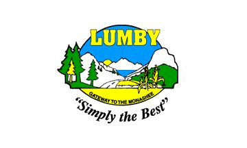
102: LUMBY (3.64 points)
- I have several questions about "Simply The Best" being in quotes
- Also, don& #39;t put that right under "Gateway to the Monashee", choose one
- Why is one of the trees yellow?
- Strong font for LUMBY though
- I have several questions about "Simply The Best" being in quotes
- Also, don& #39;t put that right under "Gateway to the Monashee", choose one
- Why is one of the trees yellow?
- Strong font for LUMBY though
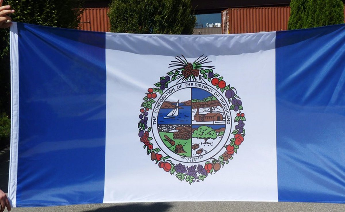
101: PEACHLAND (3.67 points)
- So many fruits! And so few of them actual peaches!
- The panels look like sub-games on a menu screen for an early-90s computer game
- So many fruits! And so few of them actual peaches!
- The panels look like sub-games on a menu screen for an early-90s computer game
We shall take a brief break before we begin the Top 100 so I can eat some food and you can all question my sanity
100: CUMBERLAND (3.69 points)
- France, but with coal!
- The thing around the mining stuff is too small, get rid of it
- still confused about the blue and red bars to be honest
- France, but with coal!
- The thing around the mining stuff is too small, get rid of it
- still confused about the blue and red bars to be honest
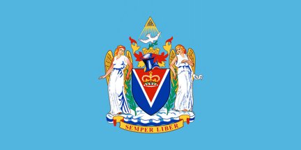
99: VICTORIA (3.7 points)
- So about that illuminati thing at the top
- What& #39;s going on with the guy to the right, he seems overly pleased about something
- Is that a knight& #39;s helmet at the top, but on fire?
- overall very on brand for Victoria
- So about that illuminati thing at the top
- What& #39;s going on with the guy to the right, he seems overly pleased about something
- Is that a knight& #39;s helmet at the top, but on fire?
- overall very on brand for Victoria
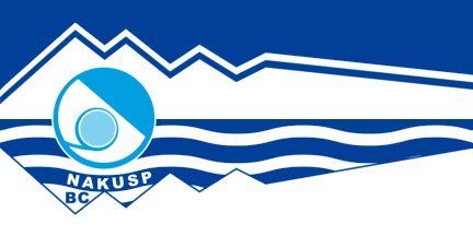
98: NAKUSP (3.71 points)
- The town had a perfectly good flag (image one), and then got rid of it for something very corporate and bland (image two), I AM OUTRAGED
- Now it looks like a hotel logo, I& #39;m sad
- Points for doing the mountains/ocean thing in a way that makes an N
- The town had a perfectly good flag (image one), and then got rid of it for something very corporate and bland (image two), I AM OUTRAGED
- Now it looks like a hotel logo, I& #39;m sad
- Points for doing the mountains/ocean thing in a way that makes an N
97: FORT ST. JAMES (3.72 points)
- Enjoy how it makes it seem like it& #39;s near the ocean, when it is definitely not
- A decent job with the sun/mountain/water tropes, even if it& #39;s all very generic
- Enjoy how it makes it seem like it& #39;s near the ocean, when it is definitely not
- A decent job with the sun/mountain/water tropes, even if it& #39;s all very generic
96: SALMO (3.75 points)
- So indy it hurts
- Salmo has a giant penny and the world& #39;s oldest telephone booth, but instead they choose to highlight the town& #39;s welcome sign
- What& #39;s going on with those trees
- So indy it hurts
- Salmo has a giant penny and the world& #39;s oldest telephone booth, but instead they choose to highlight the town& #39;s welcome sign
- What& #39;s going on with those trees
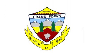
95: GRAND FORKS (3.76 points)
- Another one where the website we took the images from may have MS Painted it in a way that skews our opinion, but still: a bit too much happening
- Why did some leave that coal all alone
- Another one where the website we took the images from may have MS Painted it in a way that skews our opinion, but still: a bit too much happening
- Why did some leave that coal all alone
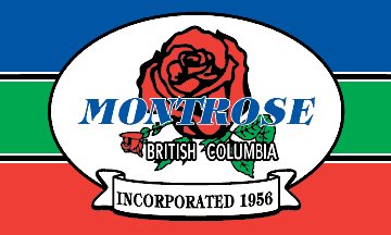
94: MONTROSE (3.77 points)
- Flags should not have names; if they do have names, flags should not have italics
- The flag was designed by a councillor, but not "officially adopted" by Montrose, I demand to know the backstory there
- The rose is bold and not bad!
- Flags should not have names; if they do have names, flags should not have italics
- The flag was designed by a councillor, but not "officially adopted" by Montrose, I demand to know the backstory there
- The rose is bold and not bad!
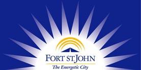
93: FORT ST. JOHN (3.78 points)
- Too many elements do not a good logo make
- Is that a sun *within* a sun?
- Get points for gusto, lose points for gradient
- Too many elements do not a good logo make
- Is that a sun *within* a sun?
- Get points for gusto, lose points for gradient
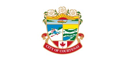
92: COURTENAY (3.83 points)
- Coat of arms alert, but not a bad one!
- Still too many elements though
- Also Mt. Washington is not part of Courtenay, you don& #39;t get points for that
- Coat of arms alert, but not a bad one!
- Still too many elements though
- Also Mt. Washington is not part of Courtenay, you don& #39;t get points for that
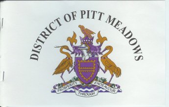
91: PITT MEADOWS (3.84 points)
- The usual spiel about putting your name/crest/coat on the flag
- The words say "Prosperity through endeavour", which...what?
- Purple and gold is an okay colour scheme!
- The usual spiel about putting your name/crest/coat on the flag
- The words say "Prosperity through endeavour", which...what?
- Purple and gold is an okay colour scheme!
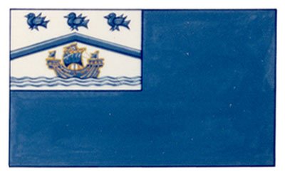
90: WEST VANCOUVER (3.85 points)
- Everyone thinks about bluebirds when West Vancouver is mentioned, right?
- Does the ship represent wealth?
- Clever way of taking a banner of the arms and making a flag out of it, even though that& #39;s not how it& #39;s supposed to go
- Everyone thinks about bluebirds when West Vancouver is mentioned, right?
- Does the ship represent wealth?
- Clever way of taking a banner of the arms and making a flag out of it, even though that& #39;s not how it& #39;s supposed to go
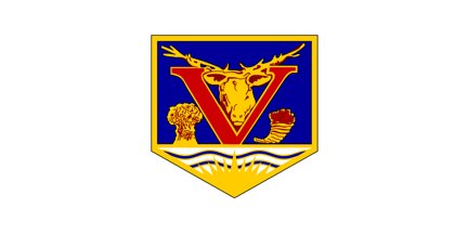
88: VERNON (3.9 points)
- BOLD
- Is that a cow or a moose?
- What is it with Vernon and SMASHMOUTH symbols? https://twitter.com/j_mcelroy/status/1006723899235528704">https://twitter.com/j_mcelroy...
- BOLD
- Is that a cow or a moose?
- What is it with Vernon and SMASHMOUTH symbols? https://twitter.com/j_mcelroy/status/1006723899235528704">https://twitter.com/j_mcelroy...
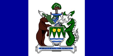
87: KELOWNA (3.92 points)
- Oh look, another shield
- Why did they use highlighter over the motto
- Are the bear and giant seahorse going to rumble? Or take over the world?
- Oh look, another shield
- Why did they use highlighter over the motto
- Are the bear and giant seahorse going to rumble? Or take over the world?
86: OAK BAY (3.94 points)
- Can& #39;t find a better image, but just imagine this centred, but with more red
- That sea lion is fierce
- Can& #39;t find a better image, but just imagine this centred, but with more red
- That sea lion is fierce
85: PORT HARDY (3.95 points)
- The tagline isn& #39;t the worst (North Coast Trail + Inside Passage ferry)
- Looks like your printer ran out of ink but you still had to print it
- The tagline isn& #39;t the worst (North Coast Trail + Inside Passage ferry)
- Looks like your printer ran out of ink but you still had to print it
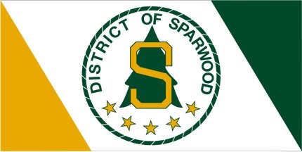
84: SPARWOOD (3.96 points)
- Gooooooooo Spartans!
- The diagonal lines are fine
- S + Name + Stars + Circle = TOO MUCH
- Gooooooooo Spartans!
- The diagonal lines are fine
- S + Name + Stars + Circle = TOO MUCH
83: REVELSTOKE (4.01 points)
- Brought to you by Rickard& #39;s Red!
- The date at the bottom of the R is infuriating
- The rest is perfectly adequate
- Brought to you by Rickard& #39;s Red!
- The date at the bottom of the R is infuriating
- The rest is perfectly adequate
82: FRASER LAKE (4.06 points)
- Gradients! Loads of them! Too many!
- Sunset is nice, but why is the swan in a different time zone?
- Microsoft Powerpoint Presents: Fraser Lake
- Gradients! Loads of them! Too many!
- Sunset is nice, but why is the swan in a different time zone?
- Microsoft Powerpoint Presents: Fraser Lake
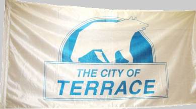
81: TERRACE (4.08 points)
- What was your your favourite thing from Nelvana as a kid, mine was probably Rupert
- Not bad, but in need of an update
- What was your your favourite thing from Nelvana as a kid, mine was probably Rupert
- Not bad, but in need of an update
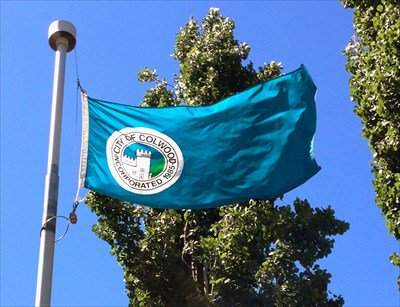
80: COLWOOD (4.17 points)
- We were very divided on the colour palette
- Points for not sticking the main stuff in the centre of the flag
- Nice use of the X-Men Castle
- Again, nobody cares when you were incorporated
- We were very divided on the colour palette
- Points for not sticking the main stuff in the centre of the flag
- Nice use of the X-Men Castle
- Again, nobody cares when you were incorporated
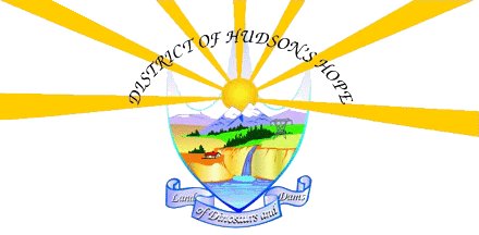
79: HUDSON& #39;S HOPE (4.31 points)
- What a hot mess of a flag
- "Land of Dinosaurs and Dams" HECK YEAH
- It& #39;s not good in any technical sense of the word, but they went for it and that& #39;s admirable
- What a hot mess of a flag
- "Land of Dinosaurs and Dams" HECK YEAH
- It& #39;s not good in any technical sense of the word, but they went for it and that& #39;s admirable
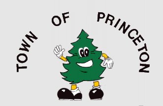
78: PRINCETON (4.32 points)
- Honestly, what an adorable tree
- but why are his feed dislocated from his body
- Apparently, "Peter is of mixed heritage as his father is a pine, and his mother is a fir/spruce."
- A good retro T-Shirt, regrettably not a good flag
- Honestly, what an adorable tree
- but why are his feed dislocated from his body
- Apparently, "Peter is of mixed heritage as his father is a pine, and his mother is a fir/spruce."
- A good retro T-Shirt, regrettably not a good flag
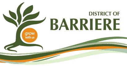
77: BARRIERE (4.33 points)
- Grow with us!
- The color scheme looks like a 2004 web interface for submitting property tax adjustments
- The tree looks like a dancing artichoke
- Grow with us!
- The color scheme looks like a 2004 web interface for submitting property tax adjustments
- The tree looks like a dancing artichoke
76: PORT MOODY (4.42 points)
- Trees! Railroads! Giant ships (?) Castles (??)
- Why isn& #39;t the ship on water?
- An excellent example of why not to simply transfer your heraldic stuff over, because there& #39;s good elements but it defeats itself
- Trees! Railroads! Giant ships (?) Castles (??)
- Why isn& #39;t the ship on water?
- An excellent example of why not to simply transfer your heraldic stuff over, because there& #39;s good elements but it defeats itself
I& #39;ve got a bachelor party to help plan now (you may all make obvious jokes here), so we& #39;ll wait for a couple hours to kick off the top 75.
Or maybe we& #39;ll wait until tomorrow!
Or maybe we& #39;ll wait until tomorrow!
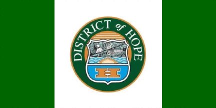
75: HOPE (4.43 points)
- The very definition of "not good, but not terrible"
- What is going on in the middle there above the sun
- Have a big H or type out your full name, don& #39;t do both, please and thank you
- The very definition of "not good, but not terrible"
- What is going on in the middle there above the sun
- Have a big H or type out your full name, don& #39;t do both, please and thank you
74: HIGHLANDS (4.43 points)
- Oh look, more green/blue/white
- The arbutus tree is actually representative of the region, and is done in a graphically pleasing way!
- One of the best examples of "please, don& #39;t put your name on the flag, otherwise it would be good" in all of B.C.
- Oh look, more green/blue/white
- The arbutus tree is actually representative of the region, and is done in a graphically pleasing way!
- One of the best examples of "please, don& #39;t put your name on the flag, otherwise it would be good" in all of B.C.
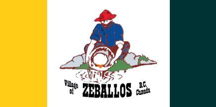
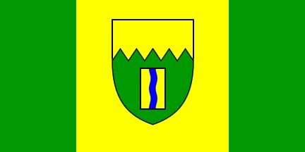
73: ZEBALLOS (4.46 points)
- The gold pan looks like an egg yolk
- I understand why green and yellow were used for the sides; that doesn& #39;t make it a great choice
- The gold pan looks like an egg yolk
- I understand why green and yellow were used for the sides; that doesn& #39;t make it a great choice
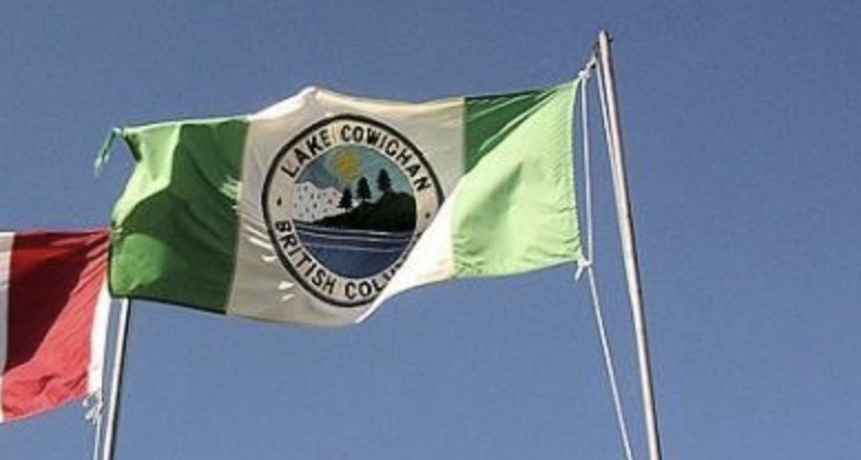
72: LAKE COWICHAN (4.48 points)
- So crunchy
- Indeed, that is a lake in the middle
- There& #39;s potential in the design, but for the 100th time, text = nope
- So crunchy
- Indeed, that is a lake in the middle
- There& #39;s potential in the design, but for the 100th time, text = nope
71: KIMBERLEY (4.5 points)
- Not to belabour the point, but yellow and green don& #39;t mix well
- Rectangle in the middle represents Kimberley itself, so why is it just 5% of the flag?
- This is the worst "good" flag — doesn& #39;t break any cardinal rules, but doesn& #39;t come together
- Not to belabour the point, but yellow and green don& #39;t mix well
- Rectangle in the middle represents Kimberley itself, so why is it just 5% of the flag?
- This is the worst "good" flag — doesn& #39;t break any cardinal rules, but doesn& #39;t come together
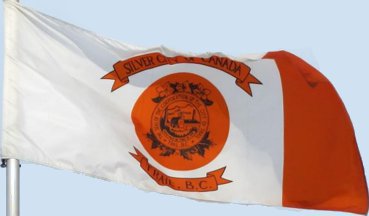
70: TRAIL (4.51 points)
- By law, every image of Trail must include the smelter
- You can& #39;t read it, but apparently the text inside the circle says "Gold must be tried by fire," which is pretty cool
- The fact you can& #39;t read it, or really see anything, is, um, a problem
- By law, every image of Trail must include the smelter
- You can& #39;t read it, but apparently the text inside the circle says "Gold must be tried by fire," which is pretty cool
- The fact you can& #39;t read it, or really see anything, is, um, a problem
69: HOUSTON (4.52 points)
- A lot of bold choices were made in this flag, and that& #39;s to be commended
- Sadly, none of them come fully together
- Get rid of the H and the trees and you might have something really good here. MIGHT.
- A lot of bold choices were made in this flag, and that& #39;s to be commended
- Sadly, none of them come fully together
- Get rid of the H and the trees and you might have something really good here. MIGHT.
68: STEWART (4.58 points)
- OH MY GOODNESS such ParticipACTION vibes coming through here
- Imagine this flag without the text
- Very much enjoying the piece of the tri-force stuck in the middle
- OH MY GOODNESS such ParticipACTION vibes coming through here
- Imagine this flag without the text
- Very much enjoying the piece of the tri-force stuck in the middle
67: SATURNA ISLAND (4.6 points)
- Comes from "Generic Eastern European Country Flag Starter Set"
- Apparently the symbol has both a sheep, orca, wild goat, eagle AND wine tankard inside of it
- Nobody who sees the flag is passing will know that
- Comes from "Generic Eastern European Country Flag Starter Set"
- Apparently the symbol has both a sheep, orca, wild goat, eagle AND wine tankard inside of it
- Nobody who sees the flag is passing will know that
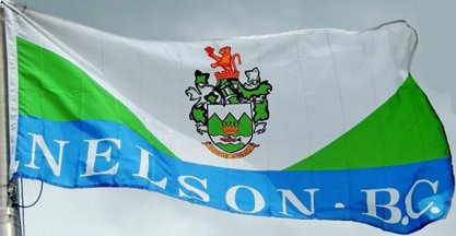
66: NELSON (4.63 points)
- The giant text at the bottom of the flag is trolling me
- Mountains as green triangles is pretty clever
- Overall, in spite of the text and the crest, the scheme is bold enough to be somewhat decent
- The giant text at the bottom of the flag is trolling me
- Mountains as green triangles is pretty clever
- Overall, in spite of the text and the crest, the scheme is bold enough to be somewhat decent
65: CENTRAL SAANICH (4.65 points)
- A modern looking coat of arms!
- Carmen Miranda hat represents agriculture, but also amuse me
- Very competent as far as coat of arms flags go (but you still shouldn& #39;t do this with flags)
- A modern looking coat of arms!
- Carmen Miranda hat represents agriculture, but also amuse me
- Very competent as far as coat of arms flags go (but you still shouldn& #39;t do this with flags)
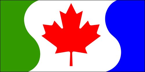
64: PORT CLEMENTS (4.66 points)
- "What if we just put our own flag on top of the Canadian flag?"
- Trees are generally bigger than maple leafs, we get that, right?
- Still, not a crest and not a logo. Progress!
- "What if we just put our own flag on top of the Canadian flag?"
- Trees are generally bigger than maple leafs, we get that, right?
- Still, not a crest and not a logo. Progress!
63: NEW WESTMINSTER (4.67 points)
- Con: it& #39;s a crest. Pro: the crest actually fills up the space
- The 4 classic New Westminster activities: trees, fish, boating, and whatever that top right thing is
- Hot take: crests would be better if there were less than 4 things in them
- Con: it& #39;s a crest. Pro: the crest actually fills up the space
- The 4 classic New Westminster activities: trees, fish, boating, and whatever that top right thing is
- Hot take: crests would be better if there were less than 4 things in them
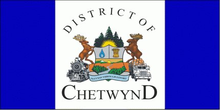
62: CHETWYND (4.69 points)
- TRUCKS AND TRAINS
- THE MOOSE IS ON TOP OF LOGS, ON TOP OF A TRUCK, TREMENDOUS
- THERE ARE TWO SUNS
- may be my favourite guilty pleasure flag of the entire thing
- TRUCKS AND TRAINS
- THE MOOSE IS ON TOP OF LOGS, ON TOP OF A TRUCK, TREMENDOUS
- THERE ARE TWO SUNS
- may be my favourite guilty pleasure flag of the entire thing
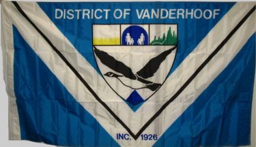
61: VANDERHOOF (4.7 points)
- What are the people walking towards, I& #39;m scared
- One of the worst examples of putting the incorporation date into the flag
- The V is certainly gimmicky, but also not that shabby!
- What are the people walking towards, I& #39;m scared
- One of the worst examples of putting the incorporation date into the flag
- The V is certainly gimmicky, but also not that shabby!
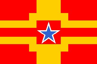
60: LANGLEY CITY (4.71 points)
- Go Dallas Cowboys!
- Looks like the flag of a made-up country in Street Fighter 2
- Or maybe the flag of a southwestern US State?
- Go Dallas Cowboys!
- Looks like the flag of a made-up country in Street Fighter 2
- Or maybe the flag of a southwestern US State?
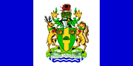
59: 100 MILE HOUSE (4.72 points)
- The house in the middle is cute
- Wait, there& #39;s also a stagecoach on top of the hat?
- And there are poppies on the animals?
- when did this flag become a cut scene from alice and wonderland
- The house in the middle is cute
- Wait, there& #39;s also a stagecoach on top of the hat?
- And there are poppies on the animals?
- when did this flag become a cut scene from alice and wonderland
58: Salt Spring Island (4.75 points)
- ok wow
- This is not "good", in a traditional sense, but it is extremely "Salt Spring"
- Honestly, if the Canadian flag was replaced by something else, you might have something here
- ok wow
- This is not "good", in a traditional sense, but it is extremely "Salt Spring"
- Honestly, if the Canadian flag was replaced by something else, you might have something here
57: PORT COQUITLAM (4.78 points)
- What.... what is happening with the fish in a circle
- Why are there fish on the right, but also fish up top
- These are good ideas and a good colour scheme, but it didn& #39;t come together
- What.... what is happening with the fish in a circle
- Why are there fish on the right, but also fish up top
- These are good ideas and a good colour scheme, but it didn& #39;t come together
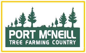
56: PORT MCNEILL (4.79 points)
- It is very important you read the explanation of how this flag came to be
- That is all
- Small-town mayors are great
- It is very important you read the explanation of how this flag came to be
- That is all
- Small-town mayors are great
55: COQUITLAM (4.83 points)
- Try looking at this flag once you think of it as a face
- When you think of Coquitlam, French fortresses come to mind, right?
- There are solid thoughts here, but it is too busy
- Try looking at this flag once you think of it as a face
- When you think of Coquitlam, French fortresses come to mind, right?
- There are solid thoughts here, but it is too busy
54: RICHMOND (4.86 points)
- https://abs.twimg.com/emoji/v2/... draggable="false" alt="📣" title="Anfeuerungsmegafon" aria-label="Emoji: Anfeuerungsmegafon"> STOP PUTTING YOUR COAT OF ARMS IN THE MIDDLE OF FLAGS
  https://abs.twimg.com/emoji/v2/... draggable="false" alt="📣" title="Anfeuerungsmegafon" aria-label="Emoji: Anfeuerungsmegafon">
- The rest is fine, honestly, if overly busy on the fish design
-
- The rest is fine, honestly, if overly busy on the fish design
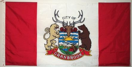
53: CRANBROOK (4.88 points)
- MOAR TRUCKS (we aren& #39;t complaining)
- Very 80s, nice hand-drawn feel to the "CRANBROOK" signing
- Pretty good for a "official arms in middle of flag" situation
- MOAR TRUCKS (we aren& #39;t complaining)
- Very 80s, nice hand-drawn feel to the "CRANBROOK" signing
- Pretty good for a "official arms in middle of flag" situation
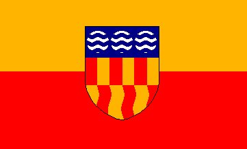
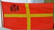
52: LANGFORD (4.92 points)
- A few B.C. flags use red and orange to highlight Spanish colonialism; but the scheme is hard to pull off
- I& #39;m from Victoria, but I can& #39;t understand the symbolism they& #39;re going for with all the stuff in the middle, but your mileage may vary
- A few B.C. flags use red and orange to highlight Spanish colonialism; but the scheme is hard to pull off
- I& #39;m from Victoria, but I can& #39;t understand the symbolism they& #39;re going for with all the stuff in the middle, but your mileage may vary
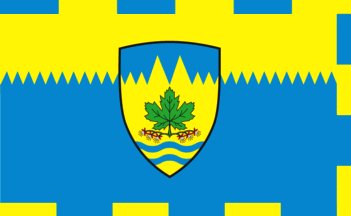
51: MAPLE RIDGE (4.95 points)
- We& #39;re fully into our "you understand what makes a bad flag, but not what makes a good flag" portion of the rankings
- The dashed border is...interesting. Yeah, interesting!
- Still too much going on though
- We& #39;re fully into our "you understand what makes a bad flag, but not what makes a good flag" portion of the rankings
- The dashed border is...interesting. Yeah, interesting!
- Still too much going on though
We& #39;ll wrap it up there for the night, before relaunching tomorrow!
Unsure if we& #39;ll just finish it then, or do 10 a day for the week to draw out the drama/silliness.
This has been ... fun? I think/hope?
Unsure if we& #39;ll just finish it then, or do 10 a day for the week to draw out the drama/silliness.
This has been ... fun? I think/hope?
TIME TO BEGIN THE TOP 50 MUNICIPAL FLAGS OF BRITISH COLUMBIA
10 EVERY DAY, TOP 10 ANNOUNCED FRIDAY
YOU& #39;RE ALL INTO THIS WAY TOO MUCH AND I LOVE YOU FOR IT
10 EVERY DAY, TOP 10 ANNOUNCED FRIDAY
YOU& #39;RE ALL INTO THIS WAY TOO MUCH AND I LOVE YOU FOR IT
50: POUCE COUPE (5.0 points)
- The bigger wheat in the middle is the king wheat, it won a competition, this is now canon
- Why does the farm have a white picket fence?
- The name in the flag is particularly egregious in this one
- The bigger wheat in the middle is the king wheat, it won a competition, this is now canon
- Why does the farm have a white picket fence?
- The name in the flag is particularly egregious in this one
49: LYTTON (5.04 points)
- Only B.C. flag to feature Greek pottery
- Look out gold rush-era camel, there& #39;s an oncoming train!
- "All great flags have a comma in them," said nobody
- All in all, weirdly captivating
- Only B.C. flag to feature Greek pottery
- Look out gold rush-era camel, there& #39;s an oncoming train!
- "All great flags have a comma in them," said nobody
- All in all, weirdly captivating
48: NORTH COWICHAN (5.08 points)
- A perfectly fine port of a coat of arms into a flag, but
- That coat of arms in the middle is a face and now it is haunting my dreams
- The dogwood flowers are eyes
- The fish is a nose
- The bottom river is a smile
- ahhhhhhhhhhhhhhhhhhhhhhhhh
- A perfectly fine port of a coat of arms into a flag, but
- That coat of arms in the middle is a face and now it is haunting my dreams
- The dogwood flowers are eyes
- The fish is a nose
- The bottom river is a smile
- ahhhhhhhhhhhhhhhhhhhhhhhhh
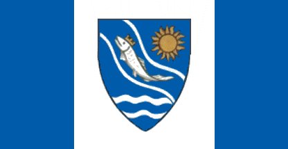
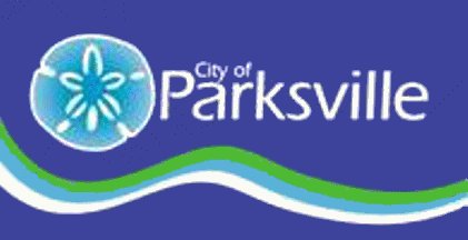
47: PARKSVILLE (5.1 points)
- Delighted by the crown on the fish, along with the smile
- The sun is also nice
- This is actually a pretty good lazy flag
- Apparently there are two Parksville flags, but the second one is just a banner, so we& #39;ll ignore it
- Delighted by the crown on the fish, along with the smile
- The sun is also nice
- This is actually a pretty good lazy flag
- Apparently there are two Parksville flags, but the second one is just a banner, so we& #39;ll ignore it
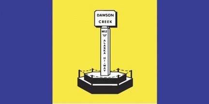
46: DAWSON CREEK (5.13 points)
- Novel way of getting your name on the flag!
- Your name is still on the flag
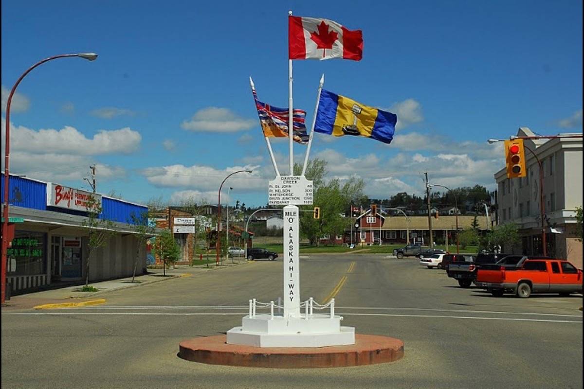
- Also, the main place where this flag is flown is THE SYMBOL ON THE FLAG ITSELF
- You could rank this higher and I would not complain
- Novel way of getting your name on the flag!
- Your name is still on the flag
- Also, the main place where this flag is flown is THE SYMBOL ON THE FLAG ITSELF
- You could rank this higher and I would not complain
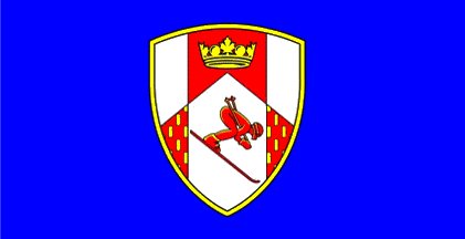
45: ROSSLAND (5.14 points)
- It& #39;s a pretty good shield in the middle, but it& #39;s still Another Flag That& #39;s Just Some Other Symbol Transported over
- Solid combination of simplicity + strong colours though
- feels like i& #39;m wearing nothing at all
- It& #39;s a pretty good shield in the middle, but it& #39;s still Another Flag That& #39;s Just Some Other Symbol Transported over
- Solid combination of simplicity + strong colours though
- feels like i& #39;m wearing nothing at all
44: PRINCE RUPERT (5.15 points)
- The red triangle is so unnecessary and yet so wonderful
- So is the weird green swoop into the shield, I get the symbolism but honestly why
- You might think that green swoop is an exaggeration, but I assure you it is very real
- The red triangle is so unnecessary and yet so wonderful
- So is the weird green swoop into the shield, I get the symbolism but honestly why
- You might think that green swoop is an exaggeration, but I assure you it is very real
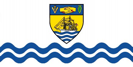
43: SIDNEY (5.2 points)
- Why are there two sets of waves?
- Only Sidney is known for ... people holding hands
- This is a "town shield flag" in disguise, but it& #39;s a good disguise
- Why are there two sets of waves?
- Only Sidney is known for ... people holding hands
- This is a "town shield flag" in disguise, but it& #39;s a good disguise
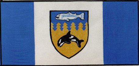
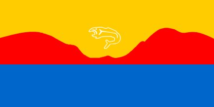
42: SAYWARD (5.25 points)
- Why is the sturgeon so angry?
- If it& #39;s in water, is the Orca in golden water?
- Seriously, how many more flags are going to be "town shield, surrounded by two bars"?
- Why is the sturgeon so angry?
- If it& #39;s in water, is the Orca in golden water?
- Seriously, how many more flags are going to be "town shield, surrounded by two bars"?
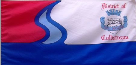
41: COLDSTREAM (5.28 points)
- So much potential!
- "So much potential!" is a nice way of saying they didn& #39;t fully get there
- "Ye Olde District Of Coldstream" font is unnecessary
- Unsure why the red in the top left is needed
- So much potential!
- "So much potential!" is a nice way of saying they didn& #39;t fully get there
- "Ye Olde District Of Coldstream" font is unnecessary
- Unsure why the red in the top left is needed
We& #39;ll be back at it tomorrow with #31 through #40!
We& #39;ve got 12 island flags remaining, 13 Lower Mainland flags, and 15 from the rest of B.C. — a nice mix!
(this might be my dumbest "stats tweet" ever)
We& #39;ve got 12 island flags remaining, 13 Lower Mainland flags, and 15 from the rest of B.C. — a nice mix!
(this might be my dumbest "stats tweet" ever)
hello twitter
are you ready
ready for more flags
flags from british columbia cities
because here we go
are you ready
ready for more flags
flags from british columbia cities
because here we go
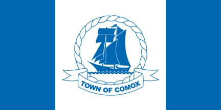
40: COMOX (5.31 points)
- Hey look, a simple colour scheme makes things nicer!
- Also look: a minimal crest in the middle is better than a complex one!
- Having said that, it& #39;s still super generic
- Hey look, a simple colour scheme makes things nicer!
- Also look: a minimal crest in the middle is better than a complex one!
- Having said that, it& #39;s still super generic
39: VIEW ROYAL (5.4 points)
- Spot the secret face in the crown!
- 91 municipalities in and we& #39;re getting somewhere with the graphic design on these
- And the gold trim on the blue sides? Not bad!
- But booooo to the name on the flag, and "we have ships!" is not a unique thing
- Spot the secret face in the crown!
- 91 municipalities in and we& #39;re getting somewhere with the graphic design on these
- And the gold trim on the blue sides? Not bad!
- But booooo to the name on the flag, and "we have ships!" is not a unique thing
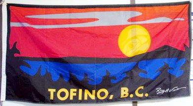
38: TOFINO (5.42)
- This screams Tofino
- Very nice postcard design, or for hanging in your van! Not really a flag tho
- Still, fun colours and fairly unique design
- Get rid of the name
- Also get rid of the signature, FLAGS DO NOT HAVE SIGNATURES
- This screams Tofino
- Very nice postcard design, or for hanging in your van! Not really a flag tho
- Still, fun colours and fairly unique design
- Get rid of the name
- Also get rid of the signature, FLAGS DO NOT HAVE SIGNATURES
37: NANAIMO (5.44 points)
- Does a weirdly good job at communicating Nanaimo& #39;s brand of "strangely colonial in a way nobody finds charming" without even having to use words
- Ironic in 2018 that the 2nd biggest city on Vancouver Island celebrates coal on its flag
- Does a weirdly good job at communicating Nanaimo& #39;s brand of "strangely colonial in a way nobody finds charming" without even having to use words
- Ironic in 2018 that the 2nd biggest city on Vancouver Island celebrates coal on its flag
36: MERRITT (5.46 points)
- The ground is green and the sky is yellow and hazy and there& #39;s not much else there, you nailed it
- Looks like it comes from a generic flag starter pack
- BUT! This flag follows the rules, and should be commended for doing so
- The ground is green and the sky is yellow and hazy and there& #39;s not much else there, you nailed it
- Looks like it comes from a generic flag starter pack
- BUT! This flag follows the rules, and should be commended for doing so
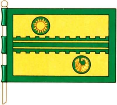
35: ARMSTRONG (5.56 points)
- Intriguing! 10% too busy, but intriguing!
- It& #39;s weird how many flags have a cornucopia in it, right?
- Needs like 10% more spacing between the circles and the railroad
- Yes, that& #39;s a railroad
- Intriguing! 10% too busy, but intriguing!
- It& #39;s weird how many flags have a cornucopia in it, right?
- Needs like 10% more spacing between the circles and the railroad
- Yes, that& #39;s a railroad
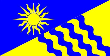
34: PENTICTON (5.58 points)
- Did the city have two different proposed flags and just smash them together?
- Did you know many B.C. cities are near water and have access to the sun?
- We& #39;re so done with heraldic suns
- Did the city have two different proposed flags and just smash them together?
- Did you know many B.C. cities are near water and have access to the sun?
- We& #39;re so done with heraldic suns
33: MISSION (5.6 points)
- This looks like an AWESOME weapon for a teenage mutant ninja turtle
- Like, way better than Donatello& #39;s lame stick
- "Trees and Jesus" is an odd combination
- Weird, but certainly distinctive, and maybe really good?
- This looks like an AWESOME weapon for a teenage mutant ninja turtle
- Like, way better than Donatello& #39;s lame stick
- "Trees and Jesus" is an odd combination
- Weird, but certainly distinctive, and maybe really good?
32: LIONS BAY (5.75 points)
- The red is jarring, and the contrast with the second lion is weird
- Transition from the blue background on the left to the white for the other two panels is also not great
- We& #39;re now fully into flags everyone on our team was OK with!
- The red is jarring, and the contrast with the second lion is weird
- Transition from the blue background on the left to the white for the other two panels is also not great
- We& #39;re now fully into flags everyone on our team was OK with!
31: NORTH VANCOUVER DISTRICT (5.79 points)
- Wavy. TOO wavy.
- blue green white water mountains b.c. special yay!!!!!
- The geometric pattern is actually good though
- Wavy. TOO wavy.
- blue green white water mountains b.c. special yay!!!!!
- The geometric pattern is actually good though
Tomorrow, we go through the 30th to 21st best municipal flags of British Columbia.
(there& #39;s a first time for all sentences)
I& #39;m sort of sad we& #39;ve said goodbye to the truly weird/bad ones, but excited we can start celebrating Good Flags for the rest of the week.
(there& #39;s a first time for all sentences)
I& #39;m sort of sad we& #39;ve said goodbye to the truly weird/bad ones, but excited we can start celebrating Good Flags for the rest of the week.
WHO& #39;S READY FOR TALKING ABOUT BC MUNICIPAL FLAGS?
MORE THAN ANY OTHER TIME IN OUR HISTORY?
YEAH. IT& #39;S WEIRD.
BUT LET& #39;S COUNT DOWN #30- #21
MORE THAN ANY OTHER TIME IN OUR HISTORY?
YEAH. IT& #39;S WEIRD.
BUT LET& #39;S COUNT DOWN #30- #21
30: WHITE ROCK (5.8 points)
- Textures on the rock = wow
- Is that a sea cucumber? Because it looks like a sea cucumber
- You had two good ideas, and you needed to choose one
- You clearly know this is White Rock, and that gets you points
- Textures on the rock = wow
- Is that a sea cucumber? Because it looks like a sea cucumber
- You had two good ideas, and you needed to choose one
- You clearly know this is White Rock, and that gets you points
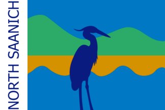
29: NORTH SAANICH (5.81 points)
- sine wave generators are cool
- the "NORTH SAANICH" on the left makes me so angry, because the rest of the flag follows the rules! And is pretty good!
- honestly, that& #39;s a cool looking bird
- sine wave generators are cool
- the "NORTH SAANICH" on the left makes me so angry, because the rest of the flag follows the rules! And is pretty good!
- honestly, that& #39;s a cool looking bird
28: ANMORE (5.82 points)
- The "A" is really frustrating and detracts from the flag
- We think
- Ugh this flag was honestly very divisive, but the "A" is too on the nose. PROBABLY.
- I& #39;m not sure how the hummingbird relates to Anmore, but we approve
- The "A" is really frustrating and detracts from the flag
- We think
- Ugh this flag was honestly very divisive, but the "A" is too on the nose. PROBABLY.
- I& #39;m not sure how the hummingbird relates to Anmore, but we approve
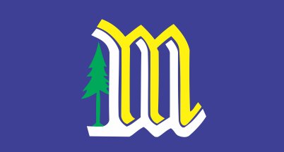
27: MACKENZIE (5.84 points)
- are the m and w making love
- The tree is superfluous, but also very essential to the purpose of mackenzie, so we& #39;re split
- It *fits* for the town, but also is trying like 10% too hard
- are the m and w making love
- The tree is superfluous, but also very essential to the purpose of mackenzie, so we& #39;re split
- It *fits* for the town, but also is trying like 10% too hard
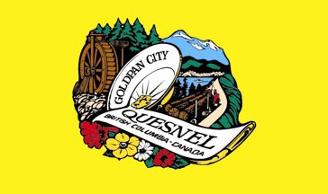
26: QUESNEL (5.85 points)
- honestly, the best "worst" flag
- look at how the gold panning plate and the name form a q!
- simply delightful
- reminder: not *actually* a good flag
- but still, tremendous
- honestly, the best "worst" flag
- look at how the gold panning plate and the name form a q!
- simply delightful
- reminder: not *actually* a good flag
- but still, tremendous
25: BURNS LAKE (5.86 points)
- if they got rid of the trees and the burns lake it& #39;d be good
- *twin peaks theme plays*
- after hours and hours of staring at flags, legitimately jarring to see a flag that alludes to b.c.& #39;s pre-colonial history, but THAT& #39;S ANOTHER STORY
- if they got rid of the trees and the burns lake it& #39;d be good
- *twin peaks theme plays*
- after hours and hours of staring at flags, legitimately jarring to see a flag that alludes to b.c.& #39;s pre-colonial history, but THAT& #39;S ANOTHER STORY
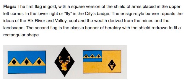
24: FERNIE (5.89 points)
- THIS IS FROM FERNIE& #39;S WEBSITE, AND I& #39;M SORRY, YOU CAN& #39;T HAVE TWO FLAGS, YOU HAVE TO CHOOSE
- 1st flag (on the left) is better, much more distinctive, etc.
- Fernie is still a coal-based economy today, so we& #39;ll allow the design
- But two flags = no
- THIS IS FROM FERNIE& #39;S WEBSITE, AND I& #39;M SORRY, YOU CAN& #39;T HAVE TWO FLAGS, YOU HAVE TO CHOOSE
- 1st flag (on the left) is better, much more distinctive, etc.
- Fernie is still a coal-based economy today, so we& #39;ll allow the design
- But two flags = no
23: CAMPBELL RIVER (5.95 points)
- So, a lot going on here
- From our judging panel: "I dated somebody from port alberni and they described themselves as the poor man& #39;s cambpell river," and this flag is not helping
- Lots of good elements! Pick, like, two!
- So, a lot going on here
- From our judging panel: "I dated somebody from port alberni and they described themselves as the poor man& #39;s cambpell river," and this flag is not helping
- Lots of good elements! Pick, like, two!
22: CHILLIWACK (5.95 points)
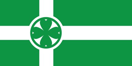
- Here& #39;s the thing: it& #39;s not bad!
- Two colours, waves well in the wind, picks a theme (green heart of B.C.) and sticks with it
- but, looks too much like the flag of "kekistan", a fictional country championed by white nationalists, so, gets docked
- Here& #39;s the thing: it& #39;s not bad!
- Two colours, waves well in the wind, picks a theme (green heart of B.C.) and sticks with it
- but, looks too much like the flag of "kekistan", a fictional country championed by white nationalists, so, gets docked
21: SURREY (6.0 points)
- YAY THE BEAVER
- In recent years Surrey has downplayed the "official" flag, and has highlighted the second thing
- The second thing is not a flag! It& #39;s bad!
- The first flag has problems (aka: only a crest), but waves+beaver+peace arch = very solid
- YAY THE BEAVER
- In recent years Surrey has downplayed the "official" flag, and has highlighted the second thing
- The second thing is not a flag! It& #39;s bad!
- The first flag has problems (aka: only a crest), but waves+beaver+peace arch = very solid
TOMORROW: THE FIRST HALF OF THE TOP 20 MUNICIPAL FLAGS IN BRITISH COLUMBIA
COUNTING DOWN TO THE TOP 10
WHICH ARE ANNOUNCED FRIDAY
IT& #39;S FRANKLY TERRIFYING HOW MUCH THIS HAS BECOME *A THING*
COUNTING DOWN TO THE TOP 10
WHICH ARE ANNOUNCED FRIDAY
IT& #39;S FRANKLY TERRIFYING HOW MUCH THIS HAS BECOME *A THING*
well i guess it& #39;s time to rank some more flags
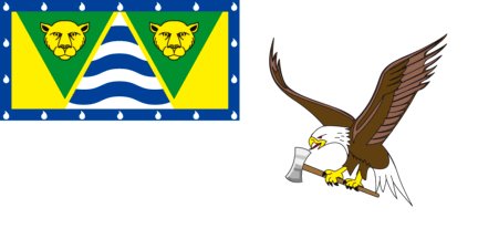
20: PORT ALICE (6.08 points)
- THE EAGLE IS LICKING AN AXE HECK YES
- THERE ARE ALSO TWO ANGRY COUGARS; DON& #39;T MESS WITH PORT ALICE
- Digging the amount of white space around the eagle
- The two parts don& #39;t come together at all though, which is unfortunate
- THE EAGLE IS LICKING AN AXE HECK YES
- THERE ARE ALSO TWO ANGRY COUGARS; DON& #39;T MESS WITH PORT ALICE
- Digging the amount of white space around the eagle
- The two parts don& #39;t come together at all though, which is unfortunate
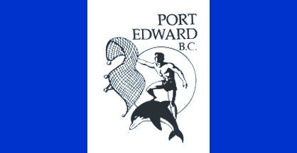
19: PORT EDWARD (6.08 points)
- We& #39;re ranking the old flag (on the left), because it& #39;s amazing
- Like it& #39;s a ripped dude on a dolphin catching the same dolphin?
- Even the "Port Edward B.C." is sort of endearing on this
- The new flag looks very generic, boo
- We& #39;re ranking the old flag (on the left), because it& #39;s amazing
- Like it& #39;s a ripped dude on a dolphin catching the same dolphin?
- Even the "Port Edward B.C." is sort of endearing on this
- The new flag looks very generic, boo
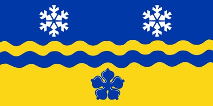
18: PRINCE GEORGE (6.17 points)
- Simple, symmetrical, strong colours, but with interesting wrinkles: hey look ma, a real flag!
- I get the desire for both snowflakes and a flower, but they& #39;re too similar in shape and it& #39;s jarring
- also blue flowers are strange
- Simple, symmetrical, strong colours, but with interesting wrinkles: hey look ma, a real flag!
- I get the desire for both snowflakes and a flower, but they& #39;re too similar in shape and it& #39;s jarring
- also blue flowers are strange
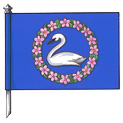
17: CRESTON (6.22 points)
- Elegant, which is a weird but neat quality in a flag
- Swans are well known to Creston, the flag has a swan: straightforward = good
- Just a little too basic to make the Top 16 though (which may or may not become part of a bracket on CBC later on)
- Elegant, which is a weird but neat quality in a flag
- Swans are well known to Creston, the flag has a swan: straightforward = good
- Just a little too basic to make the Top 16 though (which may or may not become part of a bracket on CBC later on)
16: KITIMAT (6.25 points)
- whoa graphic design has entered the building
- It regrettably has its name, but in a modern typeface, so I& #39;m not that mad!
- Logo represents both the geography (snow!) and industry (aluminum!)
- Not *really* a flag, but there& #39;s so much good here
- whoa graphic design has entered the building
- It regrettably has its name, but in a modern typeface, so I& #39;m not that mad!
- Logo represents both the geography (snow!) and industry (aluminum!)
- Not *really* a flag, but there& #39;s so much good here
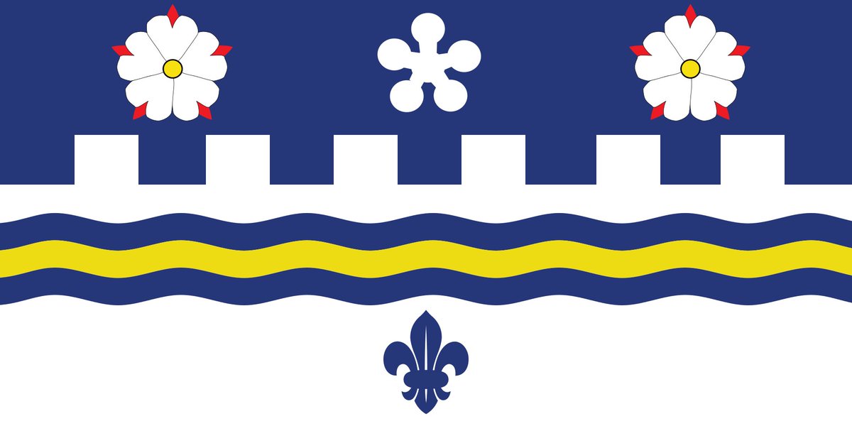
15: LANGLEY TOWNSHIP (6.36 points)
- Dogwood, waves, green blue white colour scheme: yep, this is a B.C. flag
- But the borders make an L, which is clever!
- AND Langley is at the crossroads of the lower mainland, so
- But "waves" and "Langley" don& #39;t really go hand in hand
- Dogwood, waves, green blue white colour scheme: yep, this is a B.C. flag
- But the borders make an L, which is clever!
- AND Langley is at the crossroads of the lower mainland, so
- But "waves" and "Langley" don& #39;t really go hand in hand
14: MIDWAY (6.5 points)
- noooo it& #39;s another face staring at me
- like, if the boogeyman from the nightmare before christmas was canadian, but also a flag
- but it& #39;s also distinctive! and clearly connects with the geography!
- noooo it& #39;s another face staring at me
- like, if the boogeyman from the nightmare before christmas was canadian, but also a flag
- but it& #39;s also distinctive! and clearly connects with the geography!
13: GIBSONS (6.56 points)
- so the fish is going to be divisive
- But look beyond the fish! Those are great colours and a unique, memorable design
- Okay, look back at the fish
- This is why it& #39;s not in the top ten
- so the fish is going to be divisive
- But look beyond the fish! Those are great colours and a unique, memorable design
- Okay, look back at the fish
- This is why it& #39;s not in the top ten
12: BELCARRA (6.61 points)
- Three good ideas on one flag, not coming together but not making things worse
- It comes the banner of arms, which was only designed in 2005, which explains why it actually looks modern
- All fits in with Belcarra nicely too!
- Three good ideas on one flag, not coming together but not making things worse
- It comes the banner of arms, which was only designed in 2005, which explains why it actually looks modern
- All fits in with Belcarra nicely too!
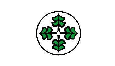
11: PORT ALBERNI (6.64 points)
- Weirdest compass ever
- But clean and with a direct message (we take in trees, and export the lumber around the world)
- Not super super great, but does well given our marking rubric
- Weirdest compass ever
- But clean and with a direct message (we take in trees, and export the lumber around the world)
- Not super super great, but does well given our marking rubric
Tomorrow.
At noon.
(Because I have plans in the evening)
The 10 best municipal flags in British Columbia.
Be there.
And by "there" I mean "here".
On Twitter.
This over dramatic trope has worn out its welcome.
At noon.
(Because I have plans in the evening)
The 10 best municipal flags in British Columbia.
Be there.
And by "there" I mean "here".
On Twitter.
This over dramatic trope has worn out its welcome.
I& #39;m not going to show the remaining flags (so they remain a surprise to people), but if you want to look ahead, the Top 10 (in alphabetical order) are:
Abbotsford
Alert Bay
Burnaby
Castlegar
Delta
Duncan
Gabriola Island
Oliver
Sooke
Vancouver
Abbotsford
Alert Bay
Burnaby
Castlegar
Delta
Duncan
Gabriola Island
Oliver
Sooke
Vancouver
I& #39;ve looked at every municipal flag in British Columbia, and with my friends ranked every single one.
Here are the top 10.
Here are the top 10.
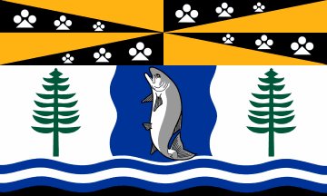
10: DUNCAN (6.75 points)
- The motif is not bad!
- Gets in geography, local culture, AND indigenous representation (salmon represent the five First Nations around Cowichan)
- A little too busy, a little too dark
- The motif is not bad!
- Gets in geography, local culture, AND indigenous representation (salmon represent the five First Nations around Cowichan)
- A little too busy, a little too dark
9: ALERT BAY (6.88 points)
- By FAR the most adorable flag in British Columbia
- Yay Orcas!
- Remember when we called Orcas "Killer Whales" way more often?
- Your mileage on the aesthetics may vary: most of us loved this flag, a couple didn& #39;t, and that& #39;s fine!
- By FAR the most adorable flag in British Columbia
- Yay Orcas!
- Remember when we called Orcas "Killer Whales" way more often?
- Your mileage on the aesthetics may vary: most of us loved this flag, a couple didn& #39;t, and that& #39;s fine!
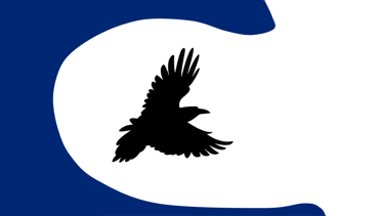
8: GABRIOLA ISLAND (7.06 points)
- Is the raven trying to escape a tsunami? Because if so, it& #39;s a goner
- The blue is actually supposed to represent the famed rock galleries, which is hard for non-Islanders to tell
- But still! A nontraditional design that really works
- Is the raven trying to escape a tsunami? Because if so, it& #39;s a goner
- The blue is actually supposed to represent the famed rock galleries, which is hard for non-Islanders to tell
- But still! A nontraditional design that really works
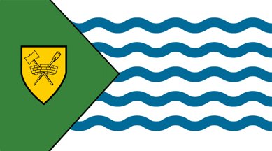
7: VANCOUVER (7.1 points)
- Axes, castles and paddles: what everyone thinks about when Vancouver is mentioned
- Follows all the rules for flags, plus throws in a couple nice wrinkles with the waves and the triangle
- In spite of that, not super bold or inspiring
- Axes, castles and paddles: what everyone thinks about when Vancouver is mentioned
- Follows all the rules for flags, plus throws in a couple nice wrinkles with the waves and the triangle
- In spite of that, not super bold or inspiring
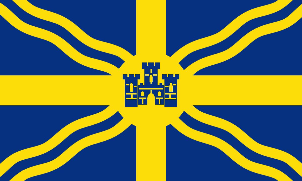
6: CASTLEGAR (7.17 points)
- Has a nice, timeless quality that is geographically appropriate
- Honestly, my favourite flag (i was outvoted)
- I get what they were going for, but there are no giant castles in Castlegar, so
- I& #39;ll take "rejected flags of Sweden" for $200, Alex
- Has a nice, timeless quality that is geographically appropriate
- Honestly, my favourite flag (i was outvoted)
- I get what they were going for, but there are no giant castles in Castlegar, so
- I& #39;ll take "rejected flags of Sweden" for $200, Alex
5: DELTA (7.31 points)
- BOLD
- But also, straightforward? (Triangle is the Greek letter for Delta, also represents the three communities)
- Circle represents the sun, and frankly may be unnecessary
- Probably the only flag that could fit in with the beautiful ones in Japan
- BOLD
- But also, straightforward? (Triangle is the Greek letter for Delta, also represents the three communities)
- Circle represents the sun, and frankly may be unnecessary
- Probably the only flag that could fit in with the beautiful ones in Japan
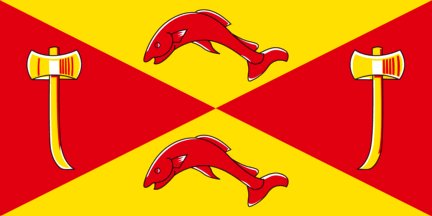
4: SOOKE (7.4 points)
- Now THIS is a flag
- Manages to make red and yellow Spanish colour scheme work
- Looks both traditional and modern!
- Now THIS is a flag
- Manages to make red and yellow Spanish colour scheme work
- Looks both traditional and modern!
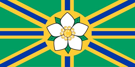
3: ABBOTSFORD (7.52 points)
- Honestly, this should be British Columbia& #39;s flag, intuitively works better
- We need to use the dogwood more in our iconography
- The blue bars add some nice texture
- Extremely competent, but didn& #39;t 100% wow anyone
- Honestly, this should be British Columbia& #39;s flag, intuitively works better
- We need to use the dogwood more in our iconography
- The blue bars add some nice texture
- Extremely competent, but didn& #39;t 100% wow anyone
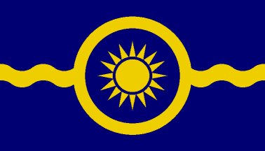
2: OLIVER (7.67 points)
- On the nose, but simple and pretty (oliver is very warm)
- The waves add just enough flair
- Nobody had any complaints, but just enough people liked the winner more
- And that winner is...
- On the nose, but simple and pretty (oliver is very warm)
- The waves add just enough flair
- Nobody had any complaints, but just enough people liked the winner more
- And that winner is...
1: BURNABY (7.89 points)
- Really bold, but it all comes together
- Little tips of white at the end of the feathers are *chef& #39;s kiss*
- Discs are Burnaby and Deer Lake, the water above and below are the Inlet and the Fraser, so many good details!
- I can& #39;t believe I did this
- Really bold, but it all comes together
- Little tips of white at the end of the feathers are *chef& #39;s kiss*
- Discs are Burnaby and Deer Lake, the water above and below are the Inlet and the Fraser, so many good details!
- I can& #39;t believe I did this
If you want to read the entire thread ranking 130 municipal flags in British Columbia, click here: https://threadreaderapp.com/thread/1066885174112047104.html">https://threadreaderapp.com/thread/10...
Thanks to everyone who found this ridiculously long thread so entertaining!
I& #39;m not sure doing something like this while launching a multi-month reporting project was *smart*, but it was a lot of fun.
I& #39;m not sure doing something like this while launching a multi-month reporting project was *smart*, but it was a lot of fun.

 Read on Twitter








 logos https://abs.twimg.com/emoji/v2/... draggable="false" alt="👏" title="Applaus-Zeichen" aria-label="Emoji: Applaus-Zeichen"> aren& #39;t https://abs.twimg.com/emoji/v2/... draggable="false" alt="👏" title="Applaus-Zeichen" aria-label="Emoji: Applaus-Zeichen"> flags- Mountain is far too detailed for a flag- Flowers are pretty though" title="111: NEW HAZELTON (3.26 points) - https://abs.twimg.com/emoji/v2/... draggable="false" alt="👏" title="Applaus-Zeichen" aria-label="Emoji: Applaus-Zeichen"> logos https://abs.twimg.com/emoji/v2/... draggable="false" alt="👏" title="Applaus-Zeichen" aria-label="Emoji: Applaus-Zeichen"> aren& #39;t https://abs.twimg.com/emoji/v2/... draggable="false" alt="👏" title="Applaus-Zeichen" aria-label="Emoji: Applaus-Zeichen"> flags- Mountain is far too detailed for a flag- Flowers are pretty though" class="img-responsive" style="max-width:100%;"/>



















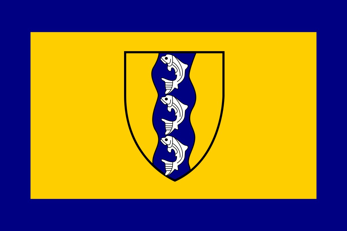 STOP PUTTING YOUR COAT OF ARMS IN THE MIDDLE OF FLAGS https://abs.twimg.com/emoji/v2/... draggable="false" alt="📣" title="Anfeuerungsmegafon" aria-label="Emoji: Anfeuerungsmegafon">- The rest is fine, honestly, if overly busy on the fish design" title="54: RICHMOND (4.86 points)- https://abs.twimg.com/emoji/v2/... draggable="false" alt="📣" title="Anfeuerungsmegafon" aria-label="Emoji: Anfeuerungsmegafon"> STOP PUTTING YOUR COAT OF ARMS IN THE MIDDLE OF FLAGS https://abs.twimg.com/emoji/v2/... draggable="false" alt="📣" title="Anfeuerungsmegafon" aria-label="Emoji: Anfeuerungsmegafon">- The rest is fine, honestly, if overly busy on the fish design" class="img-responsive" style="max-width:100%;"/>
