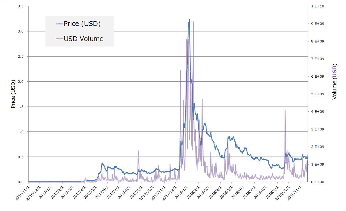
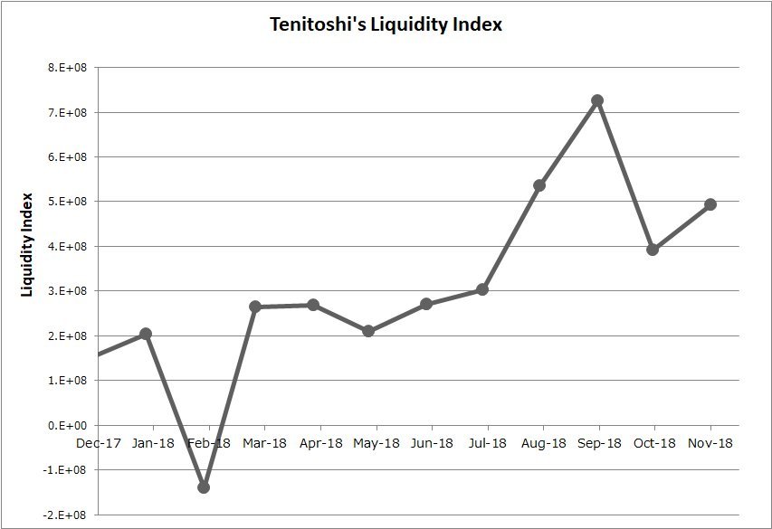
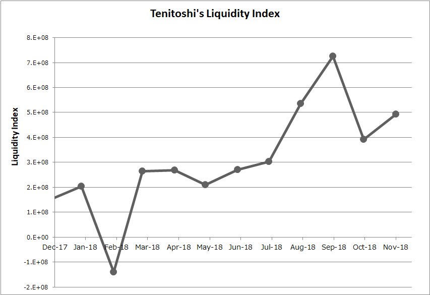
I& #39;ve developed a new index to monitor market liquidity instead of simple “trade volume”. It enables us to assess “net” liquidity provision. With this index, I found a jump on XRP liquidity growth at Aug 2018. Might be consistent with the Q3 XRP report: Institutional Investors.  https://abs.twimg.com/emoji/v2/... draggable="false" alt="😉" title="Winking face" aria-label="Emoji: Winking face">
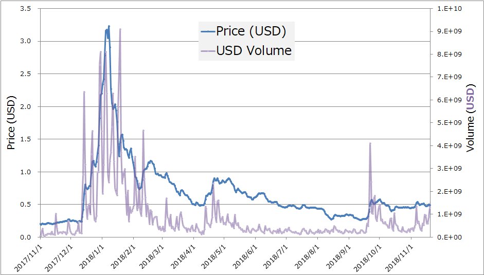
Compare with the traditionl trading volume as below. We could not find such a significant change at August this year. But the new index (tentatively called "Tenitoshi Liquidity Index" https://abs.twimg.com/emoji/v2/... draggable="false" alt="😉" title="Winking face" aria-label="Emoji: Winking face">) clearly shows it.
Growth in market liquidity is a key for XRP adoption as a bridge asset because it facilitates to currency conversions: Fiat/XRP. Traditionally "trading volume" has been used to assess liquidity. However it does not seem to work well especially for crypto markets.
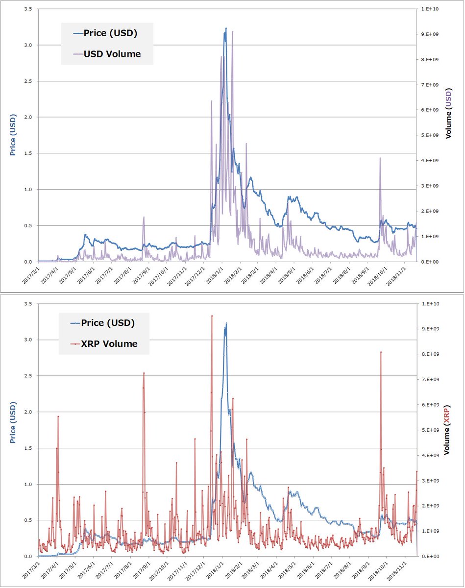
Because trade volume is also strongly affected by appreciation and volatility. So we can hardly find an effect of liquidity provision by investors getting into the markets: volume varies with price hikes & drops. Also many spikes are seen along with big volatility. (See the Fig.)
Here I offer a new index that extracts a component of essential liquidity provided by market makers & takers, based on trade volume. To compute it the following historical data were used:
daily XRP prices (Open, High, Low, Close) & Volume (in USD for all).
https://coinmarketcap.com/currencies/ripple/historical-data/">https://coinmarketcap.com/currencie...
daily XRP prices (Open, High, Low, Close) & Volume (in USD for all).
https://coinmarketcap.com/currencies/ripple/historical-data/">https://coinmarketcap.com/currencie...
This method is based on an empirical assumption that trade volume can be expressed in terms of a function with variables:
① Market price of asset
② Sudden (short-lived) volume increase in response to pump & dump
③ Base volume independent from market environment like ① and ②
① Market price of asset
② Sudden (short-lived) volume increase in response to pump & dump
③ Base volume independent from market environment like ① and ②
What the index aims to measure is "③ base volume", which I also call “net liquidity”. This is tied to essential liquidity that Ripple is targeting and incentivizing. So capturing this component could help to measure how much liquidity provision is proceeding for XRP adoption.
①Market price of asset
Gross trade volume is strongly affected by asset value. The higher price of XRP, the larger volume. This price effect is a little bit bothering, because appreciation (or depreciation) makes it difficult to assess the value of “base liquidity (③)”.
Gross trade volume is strongly affected by asset value. The higher price of XRP, the larger volume. This price effect is a little bit bothering, because appreciation (or depreciation) makes it difficult to assess the value of “base liquidity (③)”.
For example, if one experiences an increase (decrease) in volume along with price hike (drop), s/he would wonder “is the increase (decrease) in volume caused only by the price hike (drop)? Or includes any reflection that more investors comes in (out)?”
Fortunately this problem can be very easily solved. We only need to shift our way to think about trades from fiat-based circulation to XRP-based one. Since daily amount of XRP circulating in markets is almost constant regardless of price, the XRP-basis relieves us of a headache.
The graphs above show the XRP-based volume (red-colored) at lower half. It was obtained by converting from the USD-based data given at CoinMarketCap.
You will notice that a "baseline" of the volume seems nearly constant regardless of price cahnges.
You will notice that a "baseline" of the volume seems nearly constant regardless of price cahnges.
Now we have cleared the price effect.
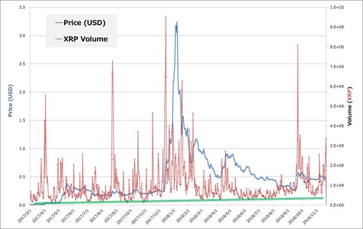
In the XRP volume (red line), you can find a very rough and gentle uptrend on the baseline as guided by a green line. But numerous spikes makes it hard to figure out its precise trend, especially during huge pumps and dumps.
In the XRP volume (red line), you can find a very rough and gentle uptrend on the baseline as guided by a green line. But numerous spikes makes it hard to figure out its precise trend, especially during huge pumps and dumps.
Besides, it& #39;s not clear whether the baseline (=③base volume) also keeps even during huge pumps & dumps. In general, spikes in volume appear with large volatility, because the more price moves, the more investors change their positions. My challenge was to elminate those spikes.
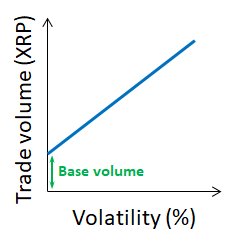
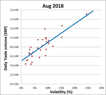
Assuming the existence of base volume independent from market environments, we can build a simple model about volatility (%) vs trade volume. Gross trade volume (blue line) increases with a rise of volatility, which starts from the base volume (green arrow) at zero volatility.
If we compare it with actual data, this model seems to agree well. The graph shows the actual data of Aug 2018, which plots daily volumes vs volatilty.
By fitting the data points with linear function, we can obtain its Y-intercept, which corresponds to the base volume (③)!
By fitting the data points with linear function, we can obtain its Y-intercept, which corresponds to the base volume (③)!

 Read on Twitter
 " title="I& #39;ve developed a new index to monitor market liquidity instead of simple “trade volume”. It enables us to assess “net” liquidity provision. With this index, I found a jump on XRP liquidity growth at Aug 2018. Might be consistent with the Q3 XRP report: Institutional Investors. https://abs.twimg.com/emoji/v2/... draggable="false" alt="😉" title="Winking face" aria-label="Emoji: Winking face">" class="img-responsive" style="max-width:100%;"/>
 ) clearly shows it." title="Compare with the traditionl trading volume as below. We could not find such a significant change at August this year. But the new index (tentatively called "Tenitoshi Liquidity Index"https://abs.twimg.com/emoji/v2/... draggable="false" alt="😉" title="Winking face" aria-label="Emoji: Winking face">) clearly shows it." class="img-responsive" style="max-width:100%;"/>


