1/6 WAKE UP COLORADO!
It's Saturday morning, 7/18. Time to get up and take a
L K!!!
K!!!
New Chart for *YOU* to analyze & tell *ME* what you see! Next few pages, I will point out what is being plotted
It's up for your interpretation! No Hurricane Commentary!

It's Saturday morning, 7/18. Time to get up and take a
L
 K!!!
K!!!New Chart for *YOU* to analyze & tell *ME* what you see! Next few pages, I will point out what is being plotted
It's up for your interpretation! No Hurricane Commentary!
2/6
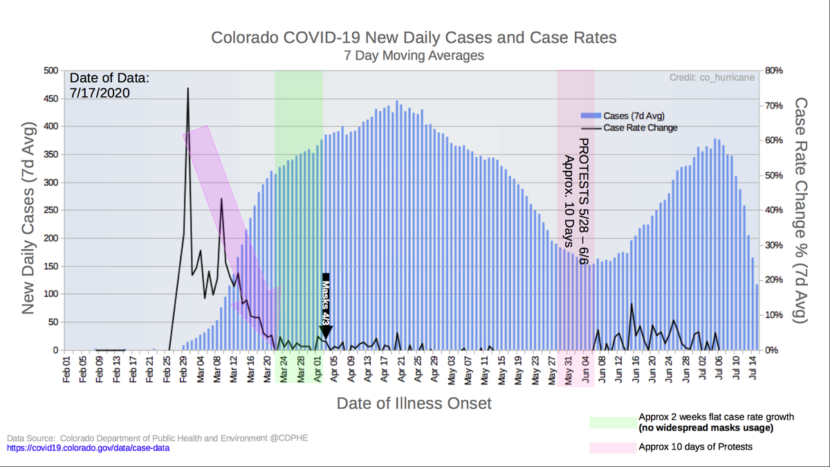
What's plotted:
- New Daily Cases (7d Avg) are blue columns
-- Plotted agains left y-axis
- 7d Average Case Rate as & (Growth/Spread) black line
-- Plotted on the right y-axis
- All case dates are "Date of Illness Onset"
-- When the individual began to feel sick
What's plotted:
- New Daily Cases (7d Avg) are blue columns
-- Plotted agains left y-axis
- 7d Average Case Rate as & (Growth/Spread) black line
-- Plotted on the right y-axis
- All case dates are "Date of Illness Onset"
-- When the individual began to feel sick
3/6
A few Annotations:
- BIG Purple Arrow (What does that mean???)
- Green Highlight Area: Mask usage not adopted!
- Black Arrow: first time @govofco introduced masks
- Red Highlight Area: Approx 10d of Protests
A few Annotations:
- BIG Purple Arrow (What does that mean???)
- Green Highlight Area: Mask usage not adopted!
- Black Arrow: first time @govofco introduced masks
- Red Highlight Area: Approx 10d of Protests
4/6
So discuss among yourselves w/ a reply
What do YOU see? Ask yourself the following questions:
1. The "spike" in case rate/spread, followed by BIG purple area & approx. 2 weeks of green bliss. What does that all mean?
2. Mask order on 4/3; what do you think prompted it?
So discuss among yourselves w/ a reply
What do YOU see? Ask yourself the following questions:
1. The "spike" in case rate/spread, followed by BIG purple area & approx. 2 weeks of green bliss. What does that all mean?
2. Mask order on 4/3; what do you think prompted it?
5/6
3. "Summer of Tyranny" from mid-April until end of May.
4. Red highlighted area, followed by some black line movement/"spikes". Mean anything to you?
5. Where we are today. Just the other day, @govofco & his team stated we're seeing a "surge" in cases. Do you?
3. "Summer of Tyranny" from mid-April until end of May.

4. Red highlighted area, followed by some black line movement/"spikes". Mean anything to you?
5. Where we are today. Just the other day, @govofco & his team stated we're seeing a "surge" in cases. Do you?
6/6
So this is a "Thought Experiment".
I know *EXACTLY* what I see! Curious if anyone sees the same thing!
This is a very straightforward, easy to understand chart and plot of cases and case rate (growth/spread), with a few "key" timeframes and dates.
Your turn Colorado...
So this is a "Thought Experiment".
I know *EXACTLY* what I see! Curious if anyone sees the same thing!
This is a very straightforward, easy to understand chart and plot of cases and case rate (growth/spread), with a few "key" timeframes and dates.
Your turn Colorado...

 Read on Twitter


