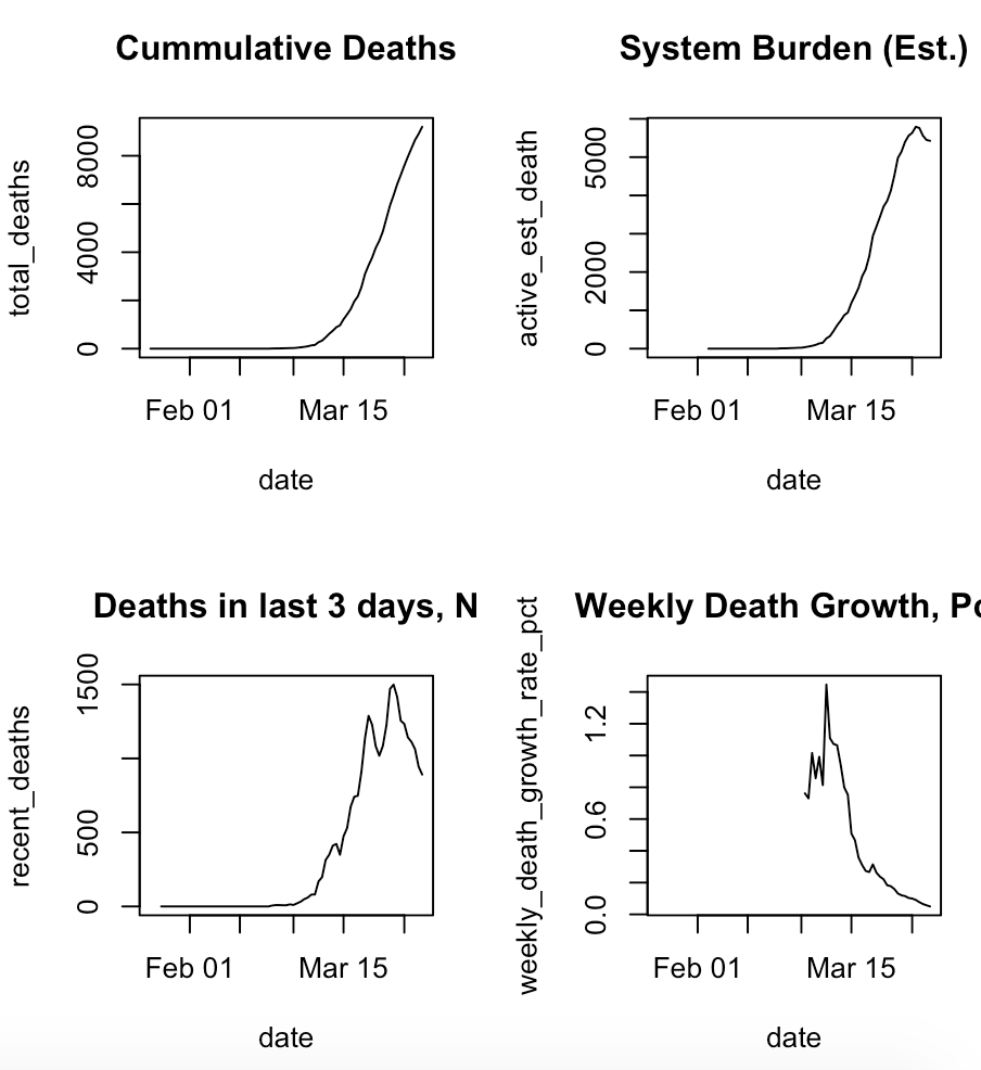
With the focus on possible good news over the last few days, let& #39;s step back and think about the the various measures of COVID and how they fit together, using my handy hand-drawn charts
You& #39;re used to seeing the charts of cases over time; that& #39;s top left. It& #39;s nice, but doesn& #39;t help you see & #39;bending the curve.& #39; It will go up.
What we really want to do is & #39;bend the curve& #39; on active cases/deaths. That curve *starts* to bend when there& #39;s a peak in new cases/deaths.
What we really want to do is & #39;bend the curve& #39; on active cases/deaths. That curve *starts* to bend when there& #39;s a peak in new cases/deaths.
Here& #39;s what& #39;s actually happened in Lombardy.
They& #39;ve actually leveled off their estimated active cases/system burden (here, deaths in last 14 days as a proxy since we don& #39;t have this IRL)
They& #39;ve actually leveled off their estimated active cases/system burden (here, deaths in last 14 days as a proxy since we don& #39;t have this IRL)

 Read on Twitter


